Theme (dark / light)
ThemeProvider decides the effective theme and writes data-tempest-theme="dark" (or "light") on <html>. The --tempest-* CSS tokens react to that attribute, so switching the theme is switching one attribute — no component needs to know the theme changed. See the tokens in src/styles/colors.css.
Why an attribute, not class=\"dark\"?
Using data-tempest-theme (instead of the class="dark" convention) avoids clashing with the app's classes and enables partial scoping: you can apply a different theme to a subtree (preview, portal, docs) without touching the rest of the page. It is the only theming mechanism the SDK supports.
Setup
Wrap your tree in ThemeProvider. The default mode is "system", which follows the operating system preference:
import { StrictMode } from "react";
import { createRoot } from "react-dom/client";
import { ThemeProvider } from "tempest-react-sdk";
import "tempest-react-sdk/styles.css";
import { App } from "./App";

createRoot(document.getElementById("root")!).render(
  <StrictMode>
    <ThemeProvider defaultTheme="system">
      <App />
    </ThemeProvider>
  </StrictMode>,
);
Available modes: "light", "dark", "system". In "system" mode the provider listens to prefers-color-scheme and reacts to OS changes in real time. The user's choice is persisted in localStorage["tempest-theme"] (disable with storageKey={null}).
Theme toggle
useTheme() reads and mutates the theme. A complete toggle:
import { useTheme } from "tempest-react-sdk";

export function ThemeToggle() {
  const { theme, resolvedTheme, setTheme, toggle } = useTheme();

  return (
    <div>
      <button onClick={toggle}>{resolvedTheme === "dark" ? "🌙 Dark" : "☀️ Light"}</button>

      {/* or control all three modes explicitly */}
      <select value={theme} onChange={(event) => setTheme(event.target.value as typeof theme)}>
        <option value="light">Light</option>
        <option value="dark">Dark</option>
        <option value="system">System</option>
      </select>
    </div>
  );
}
What each field means:
theme: the user's raw preference —"light","dark"or"system".resolvedTheme: the theme actually applied — always"light"or"dark"(never"system").setTheme(next): writes the preference (and persists it).toggle(): inverts theresolvedTheme. In"system"mode it flips to the opposite of what is applied.
Use resolvedTheme to render, theme for the selector
When deciding which icon/image to show, read resolvedTheme (it is always concrete). Reserve theme for reflecting the choice in a three-option selector.
No-flash (avoiding the wrong-theme flash)
There is a classic problem: the HTML paints before React mounts, so for an instant the user sees the default theme before ThemeProvider corrects it. The fix is a synchronous inline script in the <head>, before any CSS, that applies the attribute on first paint.
themeInitScript() returns exactly that snippet. In a Vite index.html:
<!doctype html>
<html lang="en">
  <head>
    <meta charset="UTF-8" />
    <!-- Applies data-tempest-theme before paint. Paste the output of themeInitScript() here. -->
    <script>
      (function () {
        try {
          var key = "tempest-theme";
          var def = "system";
          var stored = localStorage.getItem(key);
          var mode = stored || def;
          var resolved =
            mode === "dark" || mode === "light"
              ? mode
              : matchMedia("(prefers-color-scheme: dark)").matches
                ? "dark"
                : "light";
          document.documentElement.setAttribute("data-tempest-theme", resolved);
        } catch (e) {}
      })();
    </script>
  </head>
  <body>
    <div id="root"></div>
    <script type="module" src="/src/main.tsx"></script>
  </body>
</html>
If you render the HTML via SSR/React (Next, Remix, etc.), inject it with dangerouslySetInnerHTML to keep the generated string in sync with the SDK:
import { themeInitScript } from "tempest-react-sdk";

export function Head() {
  return <script dangerouslySetInnerHTML={{ __html: themeInitScript() }} />;
}
The script must be synchronous and run early
Do not use defer, async, or move the script to the end of <body> — it has to run before the first paint, otherwise the flash returns. getInitialTheme() exposes the same resolution logic for when you want the computed theme in JS without injecting the script.
Customizing tokens
The --tempest-* tokens are the only theming API. Override them anywhere in the cascade — one for the light theme, another inside the dark-theme selector:
:root {
  --tempest-primary: #ff3366;
  --tempest-radius-md: 6px;
}

[data-tempest-theme="dark"] {
  --tempest-primary: #ff6688;
}
Tokens are public API
Because apps depend on these names, changing/removing a token is a breaking change — that is why they follow the SDK's semantic versioning.
createTheme — a whole brand from one color
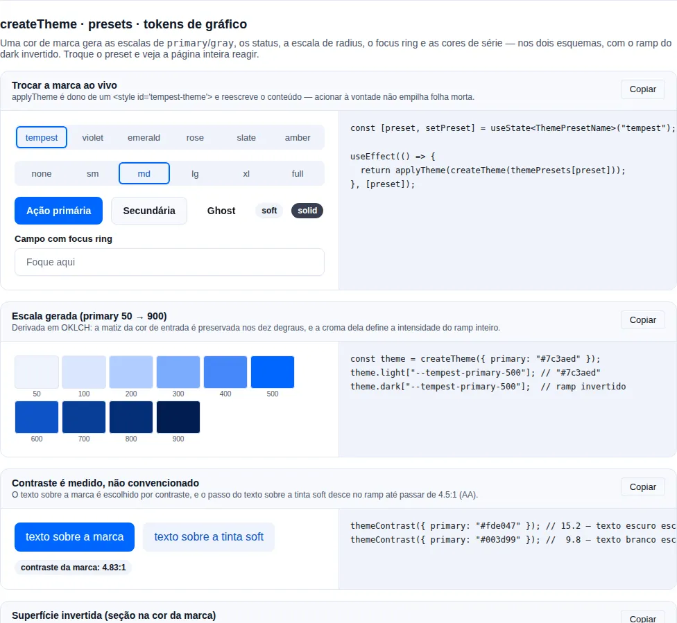
Overriding token by token is fine for a one-off tweak. To change the brand, it is ~30 values for primary alone (ten steps × light/dark, plus the hover/active/soft aliases) — and the dark ramp inversion is easy to get wrong by hand. createTheme generates all of it:
import { applyTheme, createTheme } from "tempest-react-sdk";

const theme = createTheme({ primary: "#7c3aed" });

applyTheme(theme);
That's it: all 132 components pick up the new brand, in light and dark.
What it generates
const theme = createTheme({
  primary: "#7c3aed",          // 50→900 scale + hover/active/soft/foreground/focus-ring
  gray: "#6b7280",             // surfaces, borders and text
  success: "#16a34a",          // each status becomes -fg / -bg / -border / -solid
  danger: "#dc2626",
  chart: ["#7c3aed", "#0ea5e9", "#22c55e"],  // --tempest-chart-1..N + -count (see Charts)
  radius: "lg",                // "none" | "sm" | "md" | "lg" | "xl" | "full"
});

theme.light; // { "--tempest-primary-500": "#7c3aed", … } — your color, exactly
theme.dark;  // same, with the ramp inverted
theme.css;   // ":root { … }\n\n[data-tempest-theme=\"dark\"] { … }"
Only the families you pass are generated — everything else still comes from the SDK's colors.css. A theme is a patch, not a fork of the palette.
The focus ring is not derived by transparency — and why that matters
A generated theme's --tempest-focus-ring-color is opaque, and the ramp
step is measured, not fixed: the generator starts at 500 and walks up
the ramp until the ring clears the 3:1 WCAG 2.2 SC 1.4.11 asks for on all
four surfaces (--tempest-bg, --tempest-surface, -2, -3), in both
schemes.
A tinted ring has no contrast of its own — it has the contrast of whatever it composites over. Measured across twelve brands, four surfaces and both themes (96 pairings):
| ring | pairings above 3:1 |
|---|---|
500 at alpha 0.35 (the default through 0.63.0) |
3 of 96 |
500 opaque |
58 of 96 |
| step picked by measurement | 96 of 96 |
Opaque alone does not fix it, which is what the measured step covers: the
purple #8100D7 passes at 7.20:1 in light and fails at 1.91:1 in dark,
and a yellow fails at 1.43:1 in light. When the brand already clears the floor
at 500, the ring is your exact color — the walk is a fallback, not a
recolour.
focusRingAlpha is still there for a translucent ring over a background you
control; below 1 it logs a warning in a development build.
The selected-state indicator is derived alongside it — and never takes an alpha
createTheme also emits --tempest-selected-indicator, by the same method:
walk the brand ramp until the ink clears 3:1 against all four surfaces, in
both schemes. It is the ink SegmentedControl, Command, DropdownMenu and
ContextMenu mark the active item with.
It is its own token rather than an alias of the ring for two reasons. Focus
and selection are different states — an app may want different colors. And
focusRingAlpha does not reach it: a translucent ring over a background
you control is a legitimate choice; a translucent state indicator is the
defect the token ends.
The detail and the measurement — including why --tempest-primary-soft
(1.03:1 to 1.61:1 against --tempest-bg across twelve brands) does not serve
— is in Selected state.
Step 500 is exactly the color you passed
The scale is anchored at 500: your brand's lightness becomes the fixed
point and both halves of the ramp are rescaled around it. Without that, 500
was forced onto the curve's target lightness and #7c3aed came back as
#9161fe — same hue, same chroma, re-lightened. It looks fine in isolation
and is wrong anyway: the one color the designer handed over is the one the
buttons have to be. A very light brand (yellow) or a very dark one (navy)
simply gets a shorter run on the crowded side, and the ramp stays monotonic.
Why OKLCH and not HSL
The scale is derived in OKLCH because HSL lightness is not perceptual: a yellow and a blue at the same HSL L read as visibly different brightness, and that is exactly what makes a generated palette look broken for some colors. In OKLCH, the 500 step of any brand sits in the same visual place.
The text-on-soft step is measured, not conventional
--tempest-primary-on-soft is not pinned to 600: the SDK measures contrast against the 50 tint and walks down the ramp until it clears 4.5:1 (AA for body text). This is not fussiness — the default blue only reaches 4.37:1 at 500 over its own tint, and a generated emerald stops at 4.41:1 at 600. Both would miss AA by a hair.
Bundled presets
import { applyTheme, createTheme, themePresets } from "tempest-react-sdk";

applyTheme(createTheme(themePresets.violet));

// or start from one and tweak it
applyTheme(createTheme({ ...themePresets.emerald, radius: "full" }));
Available presets: tempest (the SDK default), violet, emerald, rose, slate, amber. Each one is an options object — data, not CSS — so you can persist the chosen name in localStorage and resolve it with getThemePreset(name), which returns undefined for an unknown name instead of blowing up at boot.
Switching themes at runtime
import { applyTheme, createTheme, getThemePreset } from "tempest-react-sdk";
import { useEffect, useState } from "react";

export function BrandPicker() {
  const [brand, setBrand] = useState(() => localStorage.getItem("brand") ?? "tempest");

  useEffect(() => {
    const preset = getThemePreset(brand);
    if (!preset) return;
    localStorage.setItem("brand", brand);
    return applyTheme(createTheme(preset));
  }, [brand]);

  return (
    <select value={brand} onChange={(event) => setBrand(event.target.value)}>
      {["tempest", "violet", "emerald", "rose", "slate", "amber"].map((name) => (
        <option key={name} value={name}>{name}</option>
      ))}
    </select>
  );
}
applyTheme is idempotent: it owns a single <style id="tempest-theme"> and rewrites its content, so a brand picker can fire as often as it likes without stacking dead stylesheets in <head>. The return value is the disposer (used as the effect cleanup above).
Theming one subtree
Pass selector/darkSelector to createTheme and id/target to applyTheme to paint only part of the screen — handy for a brand preview:
applyTheme(
  createTheme({ primary: "#e11d48", selector: ".preview", darkSelector: '.preview[data-tempest-theme="dark"]' }),
  { id: "preview-theme" },
);
No JS: paste the generated CSS
theme.css is text. If you prefer a static theme (zero JS on the critical path), generate it once and paste it into the app's global CSS:
node -e "import('tempest-react-sdk').then(({ createTheme }) => console.log(createTheme({ primary: '#7c3aed' }).css))" > src/brand.css
Auditing your brand's contrast
import { contrastRatio, createColorScale, themeContrast } from "tempest-react-sdk";

themeContrast({ primary: "#fde047" }); // 15.2 — dark text was picked automatically

const scale = createColorScale("#7c3aed");
contrastRatio(scale[500], "#ffffff");  // assert it in your own test if the brand is a requirement
--tempest-primary-foreground (and --tempest-text-on-primary) is picked by measured contrast between white and the dark gray — hardcoding white would produce unreadable buttons for light brands (yellow, lime, cyan).
The color conversions, on their own
createTheme does the whole job, but the conversions it uses internally are
exported for when you need just one — lightening a badge, building an overlay,
comparing two colors in a test of your own:
import { hexToOklch, hexToRgb, hexToRgbaString, oklchToHex } from "tempest-react-sdk";

const { l, c, h } = hexToOklch("#7c3aed"); // lightness, chroma, hue
oklchToHex({ l: l + 0.1, c, h }); // 10% lighter, same hue and saturation

hexToRgbaString("#7c3aed", 0.12); // "rgb(124 58 237 / 0.12)" — overlay/hover
hexToRgb("#7c3aed"); // { r, g, b } in 0–1, for your own math
rgbToHex({ r: 0.49, g: 0.23, b: 0.93 }); // back to "#7c3aed"
Two more come from the contrast side, and they are what createTheme uses to
pick a readable foreground instead of hardcoding white:
import { readableForeground, relativeLuminance } from "tempest-react-sdk";

relativeLuminance("#fde047"); // 0.83 — WCAG relative luminance, the input to contrastRatio
readableForeground("#fde047"); // the dark foreground: white on this yellow is unreadable
Why OKLCH and not HSL
Lightening in HSL changes the perceived color: hsl(240 100% 50%) and
hsl(60 100% 50%) declare the same "lightness" and look nothing alike in
brightness. OKLCH is perceptually uniform, so l + 0.1 lightens by the same
amount at any hue — which is why createTheme's scale comes out even
instead of collapsing in the yellows. oklchToHex also walks chroma down
until the color fits the sRGB gamut, rather than handing back a clipped hex.
Inverse surface (a section in the brand color)
Hero, call-to-action band, footer: a section painted in the brand color inside a light page. The components inside it have to invert — a light primary button labelled in the brand, light text, a focus ring that separates from the fill. Overriding half a dozen tokens by hand leaves the rest of the palette on the page's values, and that is where the section breaks.
The surface is opt-in — most apps never paint a section in the brand, so
nobody pays for it without asking. Load the sheet once and put tone="inverse"
on the Section (or the data-tempest-tone="inverse" attribute on any
element):
import "tempest-react-sdk/styles/inverse.css";
import { Button, Section, SectionHeader } from "tempest-react-sdk";

export function FinalCta() {
    return (
        <Section tone="inverse" style={{ padding: 48 }}>
            <SectionHeader
                eyebrow="Ready?"
                title="Get started"
                description="No credit card, cancel any time."
            />
            <Button>Create account</Button>
            <Button variant="outline">Talk to sales</Button>
        </Section>
    );
}
Done: the fill becomes the brand, the primary Button turns light with the
label in the brand color, outline and ghost go light, and the focus ring,
Input, Card, Badge and the muted/subtle text now hold against the
inverted fill. 🚀
What changes inside the section
The [data-tempest-tone="inverse"] block redefines every color token the
components read — 96 of them: surfaces, borders, the three text levels, the
action color and its states, soft, focus, the selected indicator, the
primary-50…900 ramp (which Tag and Sidebar read raw), the four statuses,
chart and syntax colors, shadows. The list is not from memory: the test reads
colors.css and fails if a color token appears with no value on the inverse
surface.
Left out on purpose: the gray-* ramp and --tempest-neutral-on-solid — the
pair of the neutral solid Badge/Alert. The gray ramp is fixed across themes
(the dark block does not override it either), and the pair stays the one the
page measured.
A :where([data-tempest-tone="inverse"]) rule paints the fill and the text color
on the element itself, at zero specificity: the attribute alone is a complete
section, and a background you set on the same element wins without a fight.
Measured contrast, not picked
Every value is derived from the brand and measured against the fill it will
sit on, like the rest of createTheme. Measured across 14 brands (the twelve of
the focus-ring test plus two navies):
| pair | floor | worst case |
|---|---|---|
| text over the four surfaces and the glow | 7:1 | ≥ 7 on all |
muted text over the four surfaces and the glow |
4.5:1 | ≥ 4.5 on all |
subtle text over bg, surface and the glow |
4.5:1 | ≥ 4.5 on all |
| focus ring and selected indicator | 3:1 | ≥ 3 on all |
| primary button label at rest, hover and active | 4.5:1 | ≥ 4.5 on all |
The glow is the fill lifted 0.1 in OKLCH lightness toward the text: a section
is rarely one flat color. The landing that opened #409 lays a radial gradient of
#1f3f8f at 55% over the navy #03184b, and subtle text measured only
against the flat fill dropped to 3.64:1 there. Measuring the glow too, the same
token lands at 5.01:1 on it.
Measured in the browser (Chromium, built gallery, 04/10/2026, 390 and 1280 px, light and dark page theme — identical numbers in all four):
| brand | fill | title | muted |
subtle |
ring | primary button |
|---|---|---|---|---|---|---|
SDK (#0066ff) |
#042e75 |
12.71 | 9.60 | 7.28 | 6.95 | 12.71 |
landing (#03184b) |
#03184b |
16.99 | 10.62 | 6.63 | 6.31 | 16.99 |
The fill is your brand — when it can carry it
The fill is your brand's 500 whenever it can carry the scheme. When it cannot,
the generator walks the ramp one step at a time until it can: white on #0066ff
measures 4.83:1, which barely clears AA for the title and leaves no room for
muted and subtle to clear it too. That is why the SDK's default blue gets the
800 (#042e75) while a navy keeps its 500.
| brand | fill step |
|---|---|
#03184b, #1e2a5a, #111111, #FFD400, #a3e635, #fafafa |
500 — the brand itself |
#8100D7, #4f46e5 |
700 |
#0066ff, #dc2626, #ec4899, #f97316 |
800 |
#22d3ee |
400 · #14b8a6 300 |
The text direction follows the fill: a dark brand gets white text, a light brand
(yellow, lime) gets dark text — the same pick createTheme makes for
--tempest-primary-foreground. The section's color-scheme follows too, so the
scrollbar, autofill and a native <select> popup match the fill, not the page.
Deeper surfaces, not lighter ones
On the page, a raised surface moves toward the text (gray on white, lighter
gray on black). On a mid-tone brand that spends exactly the contrast the
text needs. On the inverse surface, a Card in a navy band is a deeper navy,
and in a yellow band a paler yellow: every surface carries the text at least
as well as the fill does.
Solid values, not alpha over white
rgb(255 255 255 / 0.1) seems to follow any background, and that is exactly
why it has no contrast of its own — it has the contrast of whatever is below.
It is the defect the translucent focus ring had. The inverse tokens are solid
and measured; tolerance to a varying fill comes from the glow measured above,
not from alpha.
Dark theme
The inverse surface is the same in light and dark: the values are literal colors, not references to the page's ramp. A band in the brand color is the brand in both themes — and a brand with no dark variant (the common landing case) has nothing to decide.
Without the import
The styles/inverse.css sheet stays out of colors.css, tokens.css and
styles.css: it is 96 declarations most apps never use (measured, they took the
tokens.css + scoped.css foundation from 3.05 to 3.44 kB brotli for
everyone). One rule for every way of importing the SDK: the surface exists when
this sheet — or a theme generated with inverse, below — is loaded.
With neither, the attribute matches nothing and the section keeps the page's
tokens: legible, just not inverted. Measured in the browser, a Section
tone="inverse" without the sheet shows its title at 17.75:1 and its description
at 7.69:1 in the light theme (17.51 and 9.11 in dark) — an ordinary section.
Your brand, with createTheme
The sheet carries the surface of the SDK's blue. For your brand, hand the
generator to createTheme — no sheet needed:
import { applyTheme, createInverseSurface, createTheme } from "tempest-react-sdk";

const theme = createTheme({ primary: "#03184b", inverse: createInverseSurface });

theme.inverse?.["--tempest-bg"]; // "#03184b" — your brand is the fill
applyTheme(theme);
Why the generator, and not inverse: true
With a flag, createTheme would have to import the generator, and every app
that generates a theme would load it. Measured with npx size-limit:
{ createTheme } alone is 3.35 kB brotli, and with the generator inside it
was 4.86 kB. Passing the function, only whoever imports it pays.
Statuses and chart colors the theme names (danger, chart…) reach the inverse
surface too. To scope it to another selector, use inverseSelector. Without
inverse, the theme comes out as always — two blocks, and no theme.inverse.
Pasted static CSS
If you paste createTheme's output into a .css file (see
No JS), generate it with
inverse: createInverseSurface so the file carries your brand's block.
Back to the page's tokens
A contact form, a price, a testimonial: sometimes a region inside the band
needs to be page again — a white Card in a navy hero. Inside the inverse
surface every descendant inherits the inverted tokens, so the Card comes out
navy. Mark the region with data-tempest-tone="default" (or
<Section tone="default">):
import "tempest-react-sdk/styles/inverse.css";
import { Button, Card, Input, Section, SectionHeader } from "tempest-react-sdk";

export function ContactHero() {
    return (
        <Section tone="inverse" style={{ padding: 48 }}>
            <SectionHeader title="Talk to us" />
            <Card data-tempest-tone="default" title="Contact">
                <Input label="Email" name="email" />
                <Button>Send</Button>
            </Card>
        </Section>
    );
}
The Card is the page's again — light in the light theme, dark in the dark
one, with your brand and your :root overrides. Measured in the browser
(Chromium, 2026-10-04): of 28 computed values of a Card, an Input and a
Button, 0 differ from the same trio outside the band, in the light theme, the
dark one and a dark subtree. Without the attribute, 25 of 28 differed in light
and 18 of 28 in dark.
Put the attribute on the surface itself (the Card) so it floats on the
band. On a wrapper, the whole wrapper becomes a block in the page's background —
a :where() rule paints background-color and color on it, at zero
specificity, as on the inverse section.
How it works — and the two alternatives measured
A custom property inherits from the parent, so a rule cannot "skip" the
section and read :root again — and scoping the inverse block away from the
region (@scope (…) to (…), :not()) changes nothing: the region still
inherits what the section declared. Measured with @scope: the same 25 of 28
in light.
What works is saving the page's value before the section overrides it.
Every element a theme is declared on (:root, [data-tempest-theme] and
createTheme's selectors) copies each token the surface redefines into a
--tempest-default-* twin. A var() inside a custom property resolves on
the element that declares it, so the twin keeps the page's value and crosses
the section untouched. The region reads its tokens back from the twins.
| approach | cost (brotli) | who pays | with a brand override on :root |
|---|---|---|---|
--tempest-default-* twins (chosen) |
+821 B in inverse.css |
only who loads the surface | 0 of 28 differ |
| one block per theme with the SDK's values | +1257 B | only who loads the surface | 3 of 28 differ |
the region in colors.css's selectors |
+15 B | every app | 3 of 28 differ |
tokens.css and styles.css ship the same bytes as before. { createTheme }
without inverse grows 40 B brotli (3346 → 3386), handing the selectors to
the generator; the code that writes the rules lives in the generator. Numbers
from npx size-limit on 0.74.0 + this change; the 1257 B and 15 B ones from
zlib.brotliCompressSync over each alternative's CSS.
With createTheme, the rules come along when you pass
inverse: createInverseSurface, written for your selector and
darkSelector — a theme scoped to #app is restored too.
Recap
<Section tone="inverse">ordata-tempest-tone="inverse"on any element: fill in the brand, every color token inverted.- Text ≥ 7:1,
mutedandsubtle≥ 4.5:1, ring ≥ 3:1 — measured on a glow 0.1 lighter than the fill too. - The fill is the
500when it can carry it; otherwise the nearest step that can. - The same in the light and the dark theme.
- Opt-in:
import "tempest-react-sdk/styles/inverse.css"for the SDK's blue, orcreateTheme({ primary, inverse: createInverseSurface })for your brand. With neither, the section keeps the page's tokens. data-tempest-tone="default"(or<Section tone="default">) inside the band brings the page's tokens back — light or dark, with your brand.NavbarandAppBartaketone="inverse"for a bar in the brand color with buttons and links inside;tone="primary"only paints the background — see A bar in the brand color.
App CSS integration + theme-color
SDK components read data-tempest-theme. If your app's own CSS already keys the theme off a different attribute (e.g. [data-theme="dark"]), you don't need a sync effect — pass an array to attribute and the provider writes the resolved theme to all of them:
<ThemeProvider attribute={["data-tempest-theme", "data-theme"]}>
  <App />
</ThemeProvider>
To keep the browser chrome / PWA status bar in sync, pass themeColor — the provider updates <meta name="theme-color"> with the resolved theme's color (the meta tag must already exist in <head>):
<ThemeProvider themeColor={{ light: "#1f7a3f", dark: "#0f1411" }}>
  <App />
</ThemeProvider>
Why this exists
Apps mixing their own CSS with SDK components used to write a hook just to mirror the theme onto data-theme and update the meta tag. attribute (array) + themeColor cover both cases in the provider itself.
Partial scope
Pass target to apply the theme to a specific subtree instead of <html> — useful for a preview or portal that needs an independent theme:
<ThemeProvider target={() => document.getElementById("preview")} defaultTheme="dark">
  <Preview />
</ThemeProvider>
Recap
ThemeProviderwritesdata-tempest-themeon<html>(or thetargetelement); the--tempest-*tokens react on their own.- Modes:
"light","dark","system"— the last followsprefers-color-schemelive. The choice persists inlocalStorage["tempest-theme"]. useTheme()givestheme(raw preference),resolvedTheme(alwayslight/dark),setThemeandtoggle.- Inline the
themeInitScript()synchronously in<head>, before the CSS, to kill the wrong-theme flash. - Customize the look by overriding the
--tempest-*tokens; usetargetfor subtree theming.
See also
- Components — they all consume the tokens
- Styles — full catalog of the
--tempest-*tokens - App Providers — mounting the theme alongside Query and i18n