Styles & Design Tokens
The SDK exposes a set of CSS Custom Properties (--tempest-*) that control the
entire appearance of the components. Consumer apps customize the theme by
overriding these tokens — there's no need to touch CSS Modules.
import "tempest-react-sdk/styles.css";
Done. Everything below is already available in your application.
Override tokens on :root
The only way to theme is to redefine the --tempest-* tokens in your own CSS.
Put your overrides in a :root (or a subtree for partial scoping) after
the import — never edit the SDK's CSS Modules.
Tokens are a public API
The --tempest-* names are part of the SDK's semver contract. See the
versioning policy at the end of the page before
you depend on a specific token.
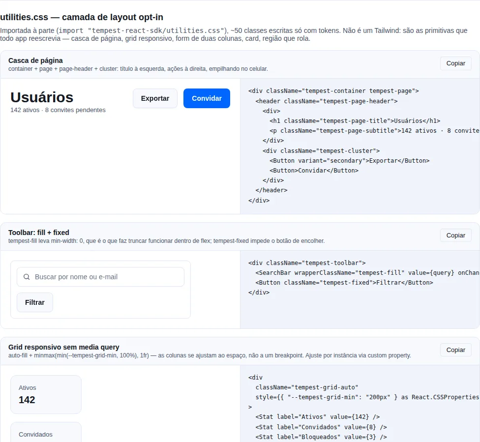
Section utilities-css of the gallery — run it locally to interact.
Summary
- Color
- Brand — primary tints
- Neutrals — gray scale
- Status — triplets (fg/bg/border/solid)
- Data viz — series colors
- Generating the palette with
createTheme - Typography
- Spacing
- Radius
- Elevation (shadow)
- Motion
- The document surface
color-scheme— the surfaces the browser paints- Focus ring
- Selected state
- Z-index
- Density —
data-tempest-density - Dark theme —
data-tempest-theme - Components — available variants
- When your app already has its own layout
- Focus on your own elements
- The plugin —
tempestStyles() - Opt-in utility layer —
utilities.css
Importing less CSS
Every component carries its own CSS. import { Button } brings the button's
markup and the button's stylesheet with it — you list no sheets, and there is no
global component sheet to import:
// src/main.tsx — the two foundation lines, and nothing else
import "tempest-react-sdk/styles/tokens.css";
import "tempest-react-sdk/styles/scoped.css";
Measured in a Vite app mounting Button, Card and Badge:
| What the app imports | raw | brotli |
|---|---|---|
styles.css (the whole sheet) |
241.73 kB | 29.15 kB |
| foundation + the components mounted | 27.40 kB | 4.49 kB |
same, with tempestStyles() narrowing the tokens |
21.86 kB | 3.37 kB |
The same app under webpack, with no plugin at all: 28.53 kB raw / 4.88 kB brotli.
The cut depends on neither a plugin nor a bundler — every published
*.module.js imports its component's sheet, and sideEffects: ["**/*.css"] in
package.json is what lets a bundler drop the sheet of a component the app never
reaches.
Outside a bundler, use the loader the package ships
The .css import that makes this work is the one Node cannot load:
node -e "import('tempest-react-sdk')" dies with
ERR_UNKNOWN_FILE_EXTENSION. Vite, webpack, Rspack, Parcel and esbuild
resolve that import; bare Node, a loose .mjs script and Jest's require()
do not. The SDK is client-side only and always runs behind a bundler, so no
real app consumer is left out — but your script, your test runner and any
read of the surface by introspection are.
For those, the package ships the piece instead of telling you to write it:
node --import tempest-react-sdk/node-css-loader your-script.mjs
Or from inside the script, before the first import of the package:
import "tempest-react-sdk/node-css-loader";

const sdk = await import("tempest-react-sdk");
console.log(Object.keys(sdk).length);
It resolves every stylesheet to an empty module, for import and
require — nothing about the styles is emulated, which is the correct answer
in a context that paints nothing.
Under Vitest, createViteConfig already handles it: it includes
tempestVitest(), which makes Vitest transform the SDK instead of handing it
to Node. With a vitest.config.ts of your own, add the plugin — without it the
suite dies with Unknown file extension ".css" (details in
Testing with Vitest). Under Jest, map
the extension to a stub, which is the same configuration any project with CSS
Modules already carries:
// jest.config.js
export default {
  moduleNameMapper: { "\\.css$": "<rootDir>/test/css-stub.js" },
};
With test/css-stub.js exporting an empty object (module.exports = {}).
Same render, less CSS
Measured in a real browser, 37 selectors compared with transition disabled, in
light and dark: the computed styles of the whole styles.css and of the
per-component path are identical. What changes is how much CSS arrives, not
what it does.
styles.css is still published
One line, all 132 components, and nothing breaks: the bundler deduplicates the
sheet a component imports against the one you imported. It costs bytes, never
correctness — the same trade auto.css makes.
You still need the foundation
The foundation is the one thing a component does not bring, and that is not an
oversight: the tokens live in :root, and a per-component sheet repeating them would
put N blocks of equal specificity against your app's own :root — createTheme and
any override of yours would stop winning. Measured, inlining them costs +14 kB
raw to give back 351 B brotli, so the trade is bad in bytes too.
It comes in four pieces, and which combination to use depends on who owns the document — the two lines above are the answer for an app with its own layout, and When your app already has its own layout carries the table of all four and the reason for each.
Importing a sheet by hand
The older paths still stand, for the case a bundler's scan cannot reach the
component — a render through dangerouslySetInnerHTML, markup assembled by another
package, a page that only exists at runtime:
import "tempest-react-sdk/styles/core.css";
import "tempest-react-sdk/styles/component/Button.css";
import "tempest-react-sdk/styles/forms.css";
| Entry | What it brings | When |
|---|---|---|
styles.css |
everything | one line, and the weight does not bother you |
styles/core.css |
foundation, zero components | always, alongside any of the others |
styles/inverse.css |
the SDK blue's inverse surface — opt-in, not in styles.css |
you paint a section in the brand and do not generate the theme with inverse |
styles/<Group>.css |
a whole family | you use most of it |
styles/component/<Component>.css |
one component | you want the minimum |
Groups available: actions, advanced, br, chat, data, editor,
feedback, forms, geo, icons, identity, layout, media,
navigation, overlay, utility.
Prefer styles/component/<X>.css over styles/<X>.css
styles/<Component>.css exists and works — it is a one-line @import of the
file under component/. But two component names collide with a group name on a
case-insensitive file system: Chat.css with chat.css, Layout.css with
layout.css. On macOS and Windows the group wins, so those two imports hand back
the whole family instead of the component — more bytes, never fewer rules. The
component/ path does not have that problem by construction, and it is the path
the component itself uses.
The split is exact, not a prune
Every class is hashed per CSS module (tempest_[local]_[hash]), and every
dist/**/*.module.js carries its source path alongside the names that module
declares — attributing a rule to a component is a lookup, not a guess. The build
fails if any rule names classes from two modules, which is what would make the
split a guess — and it is also what guarantees the order the sheets arrive in does
not matter.
When your app already has its own layout
core.css is the foundation and a global reset at once, and the reset claims
the whole document:
*, ::before, ::after { box-sizing: border-box }
:where(html, body) { height: 100% }
:where(#root) { min-height: 100% }
:where(#root:has(> :only-child)) { height: 100% }
body { margin: 0; background: var(--tempest-bg); color: var(--tempest-text) }
button { background: none; border: 0; padding: 0 }
:where(ul, ol)[class] { list-style: none; margin: 0; padding: 0 }
In an app the SDK builds end to end, that is exactly what you want. In an app
that already has its own layout, it is the SDK taking over the document surface —
your button loses its border and background, your list loses its markers, body
loses its colour.
The obvious way out — drop the import — is worse, for a reason that is not
visible at first: the components are written against the reset.
.tempest_button relies on button { background: none; border: 0 }, every width
calculation relies on box-sizing: border-box, the fields rely on
font-family: inherit. Without the reset the problem is not polish, it is the
box model.
So the foundation ships as three pieces rather than one:
| Entry | What it carries | Touches your markup? |
|---|---|---|
styles/tokens.css |
the 220 --tempest-* tokens (373 declarations, counting dark and the densities) + color-scheme |
no — paints no markup |
styles/scoped.css |
the reset confined to :where([class*="tempest_"]) |
no — inside components only |
styles/base.css |
the global reset (html, body, #root, button…) |
yes, that is its job |
styles/core.css |
tokens + base, as it always was |
yes |
An app with its own layout swaps core.css for two lines:
import "tempest-react-sdk/styles/tokens.css";
import "tempest-react-sdk/styles/scoped.css";
color-scheme travels with the tokens, not the reset
It is not a custom property, but it is what tells the browser to paint its
own surfaces — scrollbar, <select> popup, autofill, date picker — in the
active theme. No .tempest_* rule can reach those. Leaving it with the global
reset would give you the SDK's colours with the browser's chrome still light.
:where() is what keeps this a republish
Every selector in scoped.css is the original wrapped in
:where([class*="tempest_"]), which contributes zero specificity. Each
rule weighs exactly what it weighed globally, so an app override that used to
win still wins.
Focus on your own elements
base.css declared :focus-visible unscoped, so every focusable element on
the page — yours included — got the SDK's ring. scoped.css does not, by design:
it reaches the node carrying a tempest_ class and whatever is inside it, and
nothing else.
What your elements inherit instead is not "nothing": it is the user agent's ring.
Measured in Chromium, an app <button> over #14213d: outline: rgb(16,16,16)
auto 1px — 1.19:1. Invisible focus, in practice.
Migrating from core.css to the scoped pair without reading this regresses accessibility
There is no error, no warning and no visual difference. The page looks the same
until somebody navigates by keyboard. If your app declares no :focus-visible
of its own, declare one as you migrate.
One rule brings the SDK's ring back to your markup, on the same tokens:
:focus-visible {
    outline: var(--tempest-focus-ring-width) solid var(--tempest-focus-ring-color);
    outline-offset: var(--tempest-focus-ring-offset);
}
Writing it is opt-in, which is the point of scoping — but the step is mechanical and always has the same right answer, so it is spelled out here rather than left to be worked out.
color-scheme reaches the document through the attribute, not the sheet
The UA ring above came out rgb(16,16,16) — the light scheme value — even
with color-scheme: dark inherited. If you scope the theme to a subtree instead
of putting data-tempest-theme on <html>, the surfaces the browser paints
stay in the light scheme.
The plugin — tempestStyles()
Each component's sheet now arrives on its own, so the plugin is no longer there to assemble an import list. It is there for the piece that is left: the foundation.
tokens.css is 220 tokens, and an app mounting three components reads 105 of them.
The other 115 are bytes nothing on the page can consult — and now that components no
longer drag the whole sheet along, that surplus is the single largest item of CSS the
app downloads. Measured on the Button + Card + Badge app: 2516 B brotli of
tokens against 1689 B for every component sheet put together.
The plugin reads the sheets the app will load, closes over the tokens they consult —
an alias like --tempest-primary: var(--tempest-primary-500) brings its target along
— and emits only those:
// vite.config.ts
import { defineConfig } from "vite";
import react from "@vitejs/plugin-react";
import { tempestStyles } from "tempest-react-sdk/vite";

export default defineConfig({
    plugins: [react(), tempestStyles()],
});
// src/main.tsx — one line, forever
import "tempest-react-sdk/styles/auto.css";
| What the app imports | brotli |
|---|---|
tokens.css + scoped.css + the 3 sheets |
4.49 kB |
auto.css with the plugin |
3.37 kB |
The @import of the component sheets is still there and costs nothing: the bundler
deduplicates it against the sheet the component imported itself — measured, the
Button base rule appears once in the served CSS.
Options
tempestStyles({
    dir: "src",            // where to scan. Default: "src"
    reset: "scoped",       // "scoped" | "global" | "none". Default: "scoped"
    tokens: "used",        // "used" | "all". Default: "used"
    include: ["Toast"],    // names the scan cannot see
});
reset |
Emits | When |
|---|---|---|
"scoped" |
tokens + scoped.css |
your app owns its layout (default) |
"global" |
tokens + base.css |
the SDK mounts the whole page |
"none" |
tokens | your app already has an equivalent reset |
tokens |
Emits | When |
|---|---|---|
"used" |
only the tokens the sheets reach | default |
"all" |
the whole tokens.css |
your app reads tokens where the scan does not look |
The cut scans your CSS too
You are free to read --tempest-* in CSS of your own — it is documented, and
cutting a token your .app-card consults would not make the sheet smaller, it
would leave the property with no value. So the scan covers the .css/.scss/
.less files under dir, not only the .tsx ones.
A token name built at runtime falls back to the whole sheet
style={{ color: `var(--tempest-${tone})` }} names a token no static scan can
know. The plugin detects the construction and emits the whole tokens.css —
serving more than asked for, never less than needed. It is the same design as the
namespace-import fallback below. A token read from outside dir (another package,
a <style> block in index.html) is what tokens: "all" is for.
Without the plugin, auto.css is still correct
tempest-react-sdk/styles/auto.css is a real file, which without the plugin
resolves to the complete sheet. Dropping the plugin costs bytes, never
correctness — the same design as tempest-react-sdk/icons/virtual.
A namespace import turns the scan off
import * as sdk from "tempest-react-sdk" resolves sdk.Button at runtime, so no
static set of names is knowable. The plugin detects that and falls back to the
complete sheet rather than serving too little — if you want the cut, import by
name.
Color
Brand — primary tints
Scale 50 (lightest) → 900 (darkest). Use --tempest-primary as the canonical
action color.
--tempest-primary-50: #eef4ff;
--tempest-primary-100: #d9e6ff;
--tempest-primary-500: #0066ff; /* === --tempest-primary */
--tempest-primary-700: #003d99;
--tempest-primary-900: #001f4d;
Aliases:
--tempest-primary= primary-500--tempest-primary-hover= primary-600 in light, primary-600 in dark (the dark ramp is inverted, so 600 is lighter than 500)--tempest-primary-active= primary-700--tempest-primary-soft= primary-50 (tinted background for soft buttons/badges)--tempest-primary-foreground=#ffffffin light,#1f0606in dark (text color on top of primary)--tempest-primary-on-soft= primary-600 in light, primary-700 in dark (text/icon color on top of--tempest-primary-soft)
Text on a saturated fill: *-on-solid
--tempest-danger-on-solid·--tempest-info-on-solid=#ffffffin light,#1f0606in dark--tempest-success-on-solid·--tempest-warning-on-solid=#1f0606in both themes--tempest-neutral-on-solid=#ffffffin both themes (the neutral fill is--tempest-gray-700, and the gray ramp does not invert)
#ffffff on a status fill is not safe, and never was
Measured against the light theme's own fills — the default — white on
--tempest-success-solid is 3.30:1 and on --tempest-warning-solid
3.19:1. Mid-green and amber simply cannot carry white text; every design
system that ships them puts dark text on top. In the dark theme, where the fills
are lighter, all of them fail: primary 3.68:1, danger 3.76:1, info
3.68:1, success 2.28:1, warning 2.15:1.
So the text colour is a token per status rather than a hardcoded #ffffff. The
dark ink is a near-black tinted toward its own hue (#1f0606), not pure black —
it reads as part of the swatch instead of a hole in it.
In dark, hover and active go lighter
The primary scale is inverted for the dark theme (300 is the darkest step, 900
the lightest), so reaching for 400/300 on hover made the button get darker
under the pointer — the light-theme gesture applied to a dark surface. It also
made the fill outrun its own text: no single foreground cleared 4.5:1 against
#3b82f6, #2563eb and #1a4399 at once. Going up the ramp fixes both.
A test holds this
src/styles/contrast.test.ts computes the ratio of every (text, fill) pair
the SDK renders, straight from colors.css, in both themes. Redefine the palette
and drop a pair below 4.5:1 and the test fails — instead of the problem showing
up in someone's product. jsdom's axe does not catch this: it disables
color-contrast because there is no paint.
And a browser sweep covers the rest
The test above measures the pairs the SDK declares. What it cannot see is
what a page composes: text over a tinted surface, over an overlay, over an
image. For that, e2e/gallery.spec.ts runs axe in real Chromium across a
four-cell matrix — light and dark, at 1280px and 390px — and reads
both lists axe returns.
Reading incomplete is the point. color-contrast lands there, not in
violations, whenever axe cannot resolve what is behind the text — which is
exactly the tinted-surface case. A sweep that reads only violations is
looking in the drawer the finding is not in.
The measured numbers per cell live in e2e/axe-baseline.json, and the test
fails when one grows past the slack — two nodes, or 2% for the big rules.
The slack has the same design as the coverage floors, and the same reason:
the gallery renders demos that depend on the clock, so the same build
measured twice does not always report the same count. Measured: 87 and then
88 color-contrast incomplete nodes, with nothing changed in between. It is a ratchet, not an allowlist: the gallery
renders 67 demo sections and carries real accessibility debt, and failing all
of it would leave the build red forever — which is how a gate gets deleted. A
drop does not fail; the numbers are there to be lowered.
Measuring contrast without disabling transition gives a false positive
Flipping data-tempest-theme starts the color transition on every component
that declares one, so reading getComputedStyle a frame or two later samples
the animation: the outgoing theme's foreground against the incoming
theme's background. Measuring the VideoPlayer that way gave 7.32 and then
2.33 between runs — and 2.33 looks exactly like a real defect.
Inject *{transition:none!important} before measuring, and check that
light → dark → light returns the same number. If it does not, the measurement
is wrong, not the CSS.
Two names for one job is the gap a defect walks through
The dark theme shipped 73 contrast violations, measured in Chromium, and the three causes were the same thing from different angles: a text token nobody validated against the surface it lands on.
| Cause | Measured | Fix |
|---|---|---|
--tempest-text-subtle in dark |
4.04:1 over surface, 4.37 over bg |
#6f7889 → #7b849a (4.79 / 5.19) |
--tempest-primary-contrast in Scheduler |
token does not exist, so the #fff fallback always won → 3.67:1 |
points at --tempest-primary-foreground |
--tempest-text-on-primary |
declared white in :root and never overridden in dark → 3.67:1 |
follows var(--tempest-primary-foreground) |
--tempest-primary-foreground was already right — somebody measured the
3.68:1 and fixed it, writing in colors.css that "all 16 uses" pointed at
it. The measurement was right; the count was not: AppBar used the twin and
Scheduler used a name that does not exist.
If you redefine the palette, redefine both names. And prefer the
canonical one: --tempest-text-on-primary exists for compatibility and
follows the other.
A var() with a fallback hides a token that does not exist
The CSS analysis in tempest doctor does not report var() with a
fallback, on purpose: without that rule the knob idiom
(var(--tempest-card-padding, 1rem)) produced 43 false positives and the
tool would be ignored. The price is this blind spot —
var(--tempest-primary-contrast, #fff) compiles, runs, and paints white
forever.
When writing a var() with a fallback, ask whether the name is a knob
(the consumer defines it) or a purpose token (the SDK defines it). In
the second case the fallback is hiding a typo.
Text on primary-soft uses primary-on-soft, not primary
--tempest-primary over --tempest-primary-soft yields 4.37:1 — WCAG AA
asks for 4.5:1 on text. That is why --tempest-primary-on-soft exists
(~6:1). If you redefine the palette, redefine both: overriding only
--tempest-primary leaves the selected states (Toggle, ToggleGroup,
ListTile, Stepper, NavigationRail, FileUpload) out of compliance.
To swap the entire brand:
:root {
  --tempest-primary-500: #7c3aed; /* purple */
  --tempest-primary-600: #6d28d9;
  --tempest-primary-700: #5b21b6;
  --tempest-primary-soft: #ede9fe;
}
Neutrals — gray scale
--tempest-gray-50: #f8f9fb;
--tempest-gray-500: #667085;
--tempest-gray-900: #101828;
Semantic aliases:
| Token | Use |
|---|---|
--tempest-bg |
Canvas background |
--tempest-surface |
Cards, headers, footers |
--tempest-surface-2 |
Elevated surface (chip, button hover) |
--tempest-surface-3 |
More elevated surface |
--tempest-border |
Default border |
--tempest-border-strong |
Higher-contrast border |
--tempest-text |
Primary text |
--tempest-text-muted |
Secondary text |
--tempest-text-subtle |
Tertiary text (placeholders) |
Status — triplets (fg/bg/border/solid)
Each status (success, warning, danger, info) exposes 4 colors:
--tempest-success-fg:     /* text over soft bg */ --tempest-success-bg: /* tinted soft background */
  --tempest-success-border: /* outline border */ --tempest-success-solid: /* solid fill */;
Shortcuts:
--tempest-success— main color (same as the darksuccesssolid in light, lighter in dark).--tempest-danger-hover— variation for hover on danger solid.
Components that accept appearance="soft|solid|outline" (Badge, Alert, etc.)
automatically pick the right combination.
Data viz — series colors
Eight categorical colors in cycle order, plus the chart chrome:
| Token | Use |
|---|---|
--tempest-chart-1 … -8 |
Series colors, applied by index (they cycle) |
--tempest-chart-grid |
Grid lines |
--tempest-chart-axis |
Axis lines and labels |
The eight are spaced by hue — they are categorical, not a ramp. For a sequential or diverging scale, use --tempest-primary-*.
The tempest-react-sdk/charts module reads these tokens at runtime and re-resolves when the theme flips, so overriding them moves the charts without touching a single prop:
:root {
  --tempest-chart-1: #0f766e;
  --tempest-chart-2: #f97316;
}
Do not pass var() as a series color
Recharts applies color as an SVG presentation attribute, where var() is not resolved. That is why the SDK reads the token via getComputedStyle and hands over a literal color. Details in Charts › Colors and theming.
Generating the palette with createTheme
Writing a brand's ~30 values by hand (ten steps × light/dark + aliases) is tedious and easy to get wrong in dark, where the ramp inverts. createTheme derives all of it from one color, in OKLCH:
import { applyTheme, createTheme } from "tempest-react-sdk";

applyTheme(createTheme({ primary: "#7c3aed", radius: "lg" }));
It emits the same tokens documented on this page — it is sugar over the token API, not a second theming system. Full guide in Theme › createTheme.
Syntax colours (--tempest-code-*)
CodeBlock paints with ten tokens of its own: comment · punctuation · string · number · keyword · literal · function · tag · attribute · property.
Do not reuse the chart ramp for text
It is tempting — the eight series colours already exist and are already validated. But they are validated at the mark floor: 3:1, which is what WCAG asks of a graphical element. A syntax colour is text, and text needs 4.5:1. Measured as text in a browser, a keyword in --tempest-chart-1 came out at 3.47:1 on the dark surface and a string in --tempest-chart-3 at 2.03:1 on the light one. Both pass as marks and fail as text.
Each code token was solved in OKLCH: fix the hue, then search for the highest lightness (in dark mode, the lowest) that still clears AA against both grounds the token can land on — the block surface, and a highlighted line once the 10% primary wash composites over it. Solving against the surface alone is not enough: the highlight moves the ground, and a keyword measured 4.17:1 on it.
src/styles/colors.contrast.test.ts reads colors.css and re-checks every token in both modes against both grounds. If you override these tokens in your app, redo that arithmetic.
Typography
Families
--tempest-font-sans:    /* system stack */ --tempest-font-mono: /* monospace stack */
  --tempest-font-display: /* === sans, override for heading */;
Sizes
| Token | Pixels |
|---|---|
--tempest-text-2xs |
10px |
--tempest-text-xs |
12px |
--tempest-text-sm |
13px |
--tempest-text-base |
14px |
--tempest-text-md |
15px |
--tempest-text-lg |
16px |
--tempest-text-xl |
18px |
--tempest-text-2xl |
20px |
--tempest-text-3xl |
24px |
--tempest-text-4xl |
30px |
--tempest-text-5xl |
36px |
--tempest-text-6xl |
48px |
Line heights
--tempest-leading-none|tight|snug|normal|relaxed|loose (1.0 → 1.9).
Weights
--tempest-weight-regular|medium|semibold|bold|extrabold (400 → 800).
Letter spacing
--tempest-tracking-tight|normal|wide|wider|widest.
Spacing
Base 4px. Goes from 0 up to 24 (96px).
--tempest-space-0: 0 --tempest-space-1: 4px --tempest-space-2: 8px --tempest-space-3: 12px
  --tempest-space-4: 16px --tempest-space-5: 20px --tempest-space-6: 24px --tempest-space-7: 28px
  --tempest-space-8: 32px --tempest-space-10: 40px --tempest-space-12: 48px --tempest-space-16: 64px
  --tempest-space-20: 80px --tempest-space-24: 96px;
Radius
--tempest-radius-xs: 2px --tempest-radius-sm: 4px --tempest-radius-md: 8px /* default controls */
  --tempest-radius-lg: 12px /* default cards */ --tempest-radius-xl: 16px /* modals */
  --tempest-radius-2xl: 24px --tempest-radius-full: 9999px;
Elevation (shadow)
--tempest-shadow-xs:    /* hairline, controls at rest */ --tempest-shadow-sm: /* default card */
  --tempest-shadow-md: /* card hover, dropdown */ --tempest-shadow-lg: /* drawer, popover */
  --tempest-shadow-xl: /* modal */ --tempest-shadow-inner: /* tracks, sunken inputs */;
Shadows are automatically darker in the dark theme.
Motion
Duration
--tempest-duration-instant: 0ms --tempest-duration-fast: 120ms /* hover, focus */
  --tempest-duration-base: 180ms /* default enter/leave */ --tempest-duration-slow: 280ms
  /* drawer, modal */ --tempest-duration-slower: 420ms;
Easing
--tempest-ease-linear
--tempest-ease-in
--tempest-ease-out
--tempest-ease-in-out
--tempest-ease-emphasized  /* enter animations */
--tempest-ease-bounce
Composite shortcuts
--tempest-transition-color:      /* color + bg + border, fast */ --tempest-transition-shadow:
  /* box-shadow, base */
  --tempest-transition-transform: /* transform, fast */
  --tempest-transition-base: /* everything above + opacity */;
Reduced motion
@media (prefers-reduced-motion: reduce) zeroes out all token durations
automatically. Components that use heavy keyframes (modal, drawer, toast,
tooltip, skeleton) also detect it and disable their specific animations.
The document surface
Before any component, styles.css claims the body:
:where(html, body) {
    height: 100%;
}

:where(#root) {
    min-height: 100%;
}

:where(#root:has(> :only-child)) {
    height: 100%;
}

body {
    margin: 0;
    background-color: var(--tempest-bg);
    color: var(--tempest-text);
}
That is three promises, and it is worth knowing which is which.
The margin. The user agent gives body an 8px margin. That is not
cosmetic next to AppShell, which is min-height: 100dvh: the document then
measures 100dvh + 16px, so a page that fits the viewport opens with a
vertical scrollbar.
The paint. ThemeProvider writes data-tempest-theme on <html> and the
tokens live on :root, but that alone paints nothing — it only declares. Without
the rule above, the area behind the shell stays white in the dark theme, framing
the content on all four sides, and any element with no background of its own
resolves up to a white body.
The height chain. height: 100% is a percentage, and a percentage needs a
parent with a resolved height. Without all three links, a percentage-height shell
collapses onto its content instead of filling the viewport.
#root only takes the fixed height when it has a single child. A fixed
height on #root also fixes the containing block of every child, and a sticky
element cannot leave its own containing block: a Navbar placed directly in
#root, next to a long <main>, scrolled away after one viewport (#406). With
min-height, #root grows with the content and the bar stays at the top. A
full-screen shell (Page, Resizable, a <div style="height: 100%"> of yours)
is the single child of #root, while a sticky bar always has a sibling — the
content below it —, and :only-child is what tells the two cases apart.
Measured in Chromium and Firefox at 1440×900, with scrollY 1261 for the bar
(probe using the published components, getBoundingClientRect().top and
offsetHeight):
Layout inside #root |
height: 100% (before) |
min-height: 100% only |
current |
|---|---|---|---|
Navbar + long <main> — bar top |
−417px | 0 | 0 |
AppShell with long content — bar top |
−1261px | −1261px | 0 |
short Page, single child |
900px | 271px | 900px |
Resizable, single child |
900px | 24px | 900px |
<div style="height: 100%">, single child |
900px | 120px | 900px |
The AppShell row is a different defect that looked the same: the navbar
wrapper was a block exactly as tall as the bar, so the sticky Navbar inside it
had nowhere to stick. The wrapper is now display: contents, and the Navbar's
own sticky prop decides.
A full-screen shell with a sibling in #root
:only-child counts elements, not in-flow boxes. A position: fixed toast
or banner rendered next to the shell in #root makes #root grow with
its content again, and a short Page stops filling the viewport (900px →
212px, same measurement). The SDK's overlays portal to body and do not
count. For a third-party overlay, wrap the shell and the overlay in a single
element, or bring the fixed height back with a rule of your own:
#root { height: 100%; }
In an app with a Navbar directly in #root, that rule brings the #406
defect back.
Switching the display of #root to grid or flex, which would fill the viewport
with any number of children, was measured and rejected: a child with
max-width: 600px; margin: 0 auto shrinks to its content width (32px), and
every child is stretched to the viewport height.
Zero specificity on the height chain
#root is markup this sheet does not draw — the id is your convention,
not the SDK's. So the chain goes inside :where(), which adds no
specificity: any rule of yours beats it without !important.
#root { height: auto; }
Changing the background is one declaration
body is a 0-0-1 selector. An app that wants a different background — an
image, a gradient, a brand colour — overrides it normally:
body { background: linear-gradient(180deg, #0b0d12, #14171f); }
What the reset does not decide
The document's type family. The SDK declares --tempest-font-sans but does
not apply it to body: which font the whole page renders in is the app's
call, and an SDK that imposed it would cap anyone shipping their own.
body { font-family: var(--tempest-font-sans); }
color-scheme — the surfaces the browser paints
Tokens do not reach everything. The <select> dropdown popup, the scrollbar, the
autofill wash, the date picker, the input[type=number] spinner and the default
canvas are drawn by the user agent, from a single property:
:root {
    color-scheme: light;
}

[data-tempest-theme="dark"] {
    color-scheme: dark;
}
The SDK ships both. You do not have to do anything — but it is worth knowing they
are there, because it is what explains why an <input> with no styling at all
inside your app already comes out dark in the dark theme.
Reading prefers-color-scheme is not declaring color-scheme
Two different things with similar names, and confusing them cost 58 releases.
ThemeProvider always read the media query to resolve the "system"
mode. Declaring the property is what tells the browser which palette to paint
the things it draws itself from.
Measured in Chromium with data-tempest-theme="dark" on and the property
absent: getComputedStyle(document.documentElement).colorScheme came back
"normal", a class-less <select> painted #efefef and a class-less
<input> painted #ffffff, both carrying the dark theme's #f1f3f8 text —
1.03:1 and 1.11:1.
Partial scope works
The declaration goes on the attribute selector rather than in a media query, so a dark subtree inside a light page gets dark native controls too:
<aside data-tempest-theme="dark">
    <select><!-- dark popup --></select>
</aside>
The reset and your markup
styles.css ships a modern reset, and one of its rules reaches elements the SDK
does not draw:
img, svg, video, canvas, audio, iframe, embed, object {
    display: block;
    max-width: 100%;
}
Making media block-level removes the phantom gap under an inline image, which is
why every modern reset has this rule. But a user-agent <button> centres its
content with text-align: center, and text-align only reaches inline boxes —
so a lone icon inside a button of yours would sit flush against the left
edge.
The SDK ships the counterweight alongside it:
:where(button, a, label, summary) > svg:only-child {
    margin-inline: auto;
}
Zero specificity, on purpose
:where() adds no specificity, so any rule of yours beats this one
without !important. Centred is the default; a different alignment is one
ordinary declaration:
.toolbar button > svg { margin-inline: 0; }
Only for a lone icon
:only-child keeps the rule to the icon-only button. An icon beside a label
already lives in a flex row of yours, where margin: auto would shove the
text — that case keeps whatever alignment you gave it.
Focus ring
--tempest-focus-ring-color: #0052cc;
--tempest-focus-ring-width: 3px;
--tempest-focus-ring-offset: 2px;
A global :focus-visible applied in reset.css (and, on the scoped path, in
scoped.css). Interactive components — Button, interactive Card, Tabs, Pagination
— reapply the ring from the same tokens.
The dark theme uses #60a5fa. Neither is the theme's --tempest-primary, and
that is deliberate: in light they would be the same colour, so the ring around a
primary Button became the fill's own ink separated by 2px — a halo, not a ring. In
dark, #3b82f6 drops to 3.73:1 against --tempest-surface-3, and that margin
disappears the moment the ring lands on an app surface the SDK never measured
against.
The ring colour has to be opaque
Through 0.60.0 these tokens were semitransparent, and that alone is why they failed: a tinted ring has no contrast of its own — it has the contrast of whatever is underneath. Measured, the old value gave 1.60:1 in the light theme and 2.08:1 in dark, against the 3:1 WCAG 2.2 (SC 1.4.11, Non-text Contrast) asks of a non-text indicator.
If you override the token, override it with an opaque colour and check the number.
To customise per subtree (a white-label theme, say):
.my-app {
    /* opaque, and measured against the surfaces the ring can land on */
    --tempest-focus-ring-color: #7c3aed;
}
tokens.css is a prerequisite, not an optional companion
The reset's var() does carry a fallback (currentColor), but it rescues your
app's markup, not the SDK's components: they declare the ring with
var(--tempest-focus-ring-color) and no fallback — 59 such uses — so with the
token undefined those declarations are invalid at computed-value time and drop to
outline: none. Measured in Chromium: Button and Input lose the ring
entirely.
Load tokens.css whenever you load scoped.css or base.css.
What to measure against
The ring is drawn wherever a focusable element is, and a component nests as deep
as the app puts it. Measure your colour against all four surfaces —
--tempest-bg, --tempest-surface, --tempest-surface-2,
--tempest-surface-3 — not against one. Fixing a single background is how a
token passes its own test and fails inside a card.
src/styles/focus-ring.contrast.test.ts does precisely that for the SDK's
tokens, in both themes, and fails the build below 3:1 — including if the colour
goes back to carrying alpha.
Selected state
--tempest-selected-indicator: #0052cc; /* dark: #60a5fa */
The ink a component uses to say "this one is selected": the active segment of SegmentedControl, the highlighted row of Command, DropdownMenu and ContextMenu.
It exists because a surface cannot do that job. The four surfaces are one short step apart by design:
| pair | light | dark |
|---|---|---|
bg vs surface |
1.053:1 | 1.085:1 |
bg vs surface-2 |
1.112:1 | 1.225:1 |
bg vs surface-3 |
1.240:1 | 1.416:1 |
Not even the extremes of the ramp reach the 3:1 WCAG 2.2 SC 1.4.11 asks of a non-text indicator — and widening the step to make one would ruin every card stacked on a background.
A brand tint does not fix it either — which is why this token is not --tempest-primary-soft
The intuitive answer is to mark selection with --tempest-primary-soft, which is what ToggleGroup, ListTile, TreeView and NavigationRail do. Measured across the twelve brands of the theme guard, --tempest-primary-soft lands between 1.03:1 and 1.61:1 against --tempest-bg in both schemes: it differs in hue, and WCAG contrast does not count hue.
So the indicator is a saturated ink drawn on top of the tint — a border on SegmentedControl, a left bar in the three menus — rather than a swapped background. The tint stays; it reinforces the signal instead of being it.
A theme generated by createTheme emits this token the same way it derives the focus ring: walk the brand ramp until the ink clears 3:1 against all four surfaces, in both schemes. Unlike the ring, it never takes an alpha — focusRingAlpha does not reach it, because a translucent indicator has the contrast of whatever it composites over, which is the defect this token ends.
.my-app {
    /* opaque, and measured against the four surfaces */
    --tempest-selected-indicator: #7c3aed;
}
The guard
src/styles/selected-indicator.contrast.test.ts measures the token against the four surfaces in both themes and also pins the numbers above — so if "just use surface-2, that is two steps" comes back as a proposal, the assertion that fails it is already written. src/styles/selected-indicator.usage.test.ts keeps the four components drawing the state with the token, and every other component off it.
Z-index
--tempest-z-base: 0 --tempest-z-raised: 10 --tempest-z-dropdown: 1000 --tempest-z-sticky: 1020
  --tempest-z-overlay: 1050 --tempest-z-modal: 1100 --tempest-z-popover: 1150
  --tempest-z-toast: 1200 --tempest-z-tooltip: 1300;
Density — data-tempest-density
An attribute applied to any element (usually <html> or <body>) adjusts the
height, padding, font-size, and radius of every control in the subtree.
<html data-tempest-density="compact"></html>
Values: compact | comfortable (default) | spacious.
Controlled tokens:
--tempest-control-height-xs..xl
--tempest-control-padding-xs..xl
--tempest-control-font-xs..xl
--tempest-control-radius
--tempest-control-gap
--tempest-control-caret-offset
--tempest-control-caret-size
Button, Input, Select, and Textarea already read these tokens — just swap the attribute on the root and everything resizes together.
Dark theme — data-tempest-theme
<html data-tempest-theme="dark"></html>
An attribute applied to any element enables the dark theme only in that subtree. Color tokens (primary scale, neutrals, status, focus ring, shadow) are all overridden.
Use it together with <ThemeProvider> (tempest-react-sdk/theme) for
persistence + flash prevention.
Use data-tempest-theme=\"dark\", not class=\"dark\"
The SDK's dark mode toggles on the data-tempest-theme attribute, never on a
dark class. This lets you scope the dark theme to a specific subtree instead
of the whole document — something the class convention can't do.
Components — available variants
Button
<Button variant="primary | secondary | danger | success | ghost | soft | outline | link" />
<Button size="xs | sm | md | lg | xl" />
<Button iconOnly aria-label="..." />
<Button pill />
<Button loading />
Badge
<Badge
  variant="neutral | primary | success | warning | danger | info"
  appearance="soft | solid | outline"
  size="sm | md | lg"
  shape="pill | square"
  dot
/>
Alert
<Alert variant="neutral | info | success | warning | danger"
       appearance="soft | solid | outline"
       title="..."
       description="..."
       icon={<Icon />}
       onClose={() => ...} />
Card
<Card elevation="flat | default | raised | elevated"
      interactive
      title="..."
      actions={...}
      footer={...} />
Input
<Input size="sm | md | lg" />
Spinner
<Spinner size="xs | sm | md | lg | xl" />
Divider
<Divider
  orientation="horizontal | vertical"
  variant="solid | dashed"
  label="OR"
  align="start | center | end"
/>
Kbd
<Kbd size="sm | md | lg">Ctrl</Kbd>
Importing tokens in CSS-in-JS
The tempest_ prefix avoids collisions
The classes generated by the CSS Modules come out prefixed with tempest_, so
they never collide with your app's CSS or with Tailwind/Stitches/Linaria
running side by side. You only interact with the --tempest-* tokens — you
never need to know the class names.
CSS Modules is the SDK's only styling strategy
Components are styled with CSS Modules plus --tempest-* tokens, full stop.
There is no headless mode and no class hook (data-tempest-classname) for
Tailwind/Stitches/Linaria to take over the styling — and none is planned.
Keeping two styling paths would double every component's surface and dilute
the tokens.
What you can do: run your favourite utility framework side by side in the
rest of the app, read the SDK's tokens with var(--tempest-*), and customise
the SDK by overriding those tokens on :root.
Since the tokens are CSS Custom Properties, any solution (styled-components,
emotion, vanilla-extract, Tailwind arbitrary values) reads them with
var(--tempest-*):
import styled from "styled-components";

const Card = styled.div`
  background: var(--tempest-bg);
  border: 1px solid var(--tempest-border);
  border-radius: var(--tempest-radius-lg);
  padding: var(--tempest-space-5);
  box-shadow: var(--tempest-shadow-sm);
`;
Tailwind via theme.extend.colors:
// tailwind.config.js
module.exports = {
  theme: {
    extend: {
      colors: {
        tempest: {
          primary: "var(--tempest-primary)",
          bg: "var(--tempest-bg)",
          border: "var(--tempest-border)",
        },
      },
    },
  },
};
Opt-in utility layer — utilities.css
Components are styled with CSS Modules, which solves the inside of them. What was left for the app was the around: the page shell, a two-column form, a row of actions, a card, a region that scrolls sideways. Every app rewrote that CSS.
utilities.css is that layer, written only in --tempest-* tokens — so it follows the theme, including whatever createTheme emits and dark mode.
// src/main.tsx
import "tempest-react-sdk/styles.css";
import "tempest-react-sdk/utilities.css"; // opt-in
Why opt-in and not part of styles.css
It ships ~50 global class names. An app that already has its own layout system should not pay for them, and injecting global classes into someone's page uninvited is rude. Cost if you opt in: 1.13 KB brotli.
This is not a Tailwind, and it is not becoming one
The layer holds a handful of layout primitives — there is no (and no plan for) p-4 mt-2 text-sm bg-blue-500 for every possible value. The consolidated decision still holds: CSS Modules + tokens is the components' styling strategy. This is a tool for the app's code, not a second way to style the SDK.
Layout
| Class | What it does | Tune with |
|---|---|---|
.tempest-container |
Centers, caps the width, applies gutters that respect the safe area | --tempest-container-width, --tempest-container-gutter |
.tempest-stack |
Vertical flow with a single gap | --tempest-stack-gap |
.tempest-cluster |
Horizontal group that wraps instead of overflowing | --tempest-cluster-gap |
.tempest-row |
Horizontal group that does not wrap (toolbars, inline fields) | --tempest-row-gap |
.tempest-center |
Centers the child on both axes | — |
.tempest-spread |
Pushes first and last child apart (title ↔ actions) | --tempest-row-gap |
.tempest-grid-auto |
Responsive card grid with no media query (auto-fill + minmax) |
--tempest-grid-min, --tempest-grid-gap |
.tempest-sidebar-layout |
Sidebar + content; collapses to one column below 768px | --tempest-sidebar-width, --tempest-sidebar-gap |
.tempest-form-grid |
Two-column form that collapses below 640px | --tempest-form-columns, --tempest-form-gap |
.tempest-form-span |
Field taking the full row of the form grid | — |
.tempest-fill |
Takes the remaining flex space (with min-width: 0, so truncation works) |
— |
.tempest-fixed |
Never shrinks below its content (an icon button next to a growing field) | — |
Spacing, text, surfaces, scrolling
| Group | Classes |
|---|---|
| Gap | .tempest-gap-{0,1,2,3,4,5,6,8,10,12} |
| Padding | .tempest-pad-{0,2,3,4,6,8}, .tempest-pad-block, .tempest-pad-inline |
| Text | .tempest-truncate, .tempest-clamp-{2,3,4}, .tempest-text-{muted,subtle}, .tempest-text-{xs,sm,base,lg,xl,2xl}, .tempest-weight-{medium,semibold,bold}, .tempest-numeric |
| Surfaces | .tempest-card, .tempest-panel, .tempest-inset, .tempest-divider |
| Scrolling | .tempest-scroll-x, .tempest-scroll-y |
| Media | .tempest-aspect-video, .tempest-aspect-square |
| Misc | .tempest-visually-hidden, .tempest-no-select, .tempest-busy |
.tempest-numeric exists for one specific reason
font-variant-numeric: tabular-nums stops a column of numbers from dancing as values change (proportional digits have different widths). Use it on value tables, live counters and Stat.
.tempest-scroll-x around a wide table
Without it, a wide table makes the page scroll horizontally — the most common mobile layout defect there is. With it, the scrolling stays inside the region.
A whole page, assembled
export function UsersPage() {
  return (
    <div className="tempest-container tempest-page">
      <header className="tempest-page-header">
        <div>
          <h1 className="tempest-page-title">Users</h1>
          <p className="tempest-page-subtitle">142 active · 8 pending invites</p>
        </div>
        <div className="tempest-cluster">
          <Button variant="secondary">Export</Button>
          <Button>Invite</Button>
        </div>
      </header>

      <div className="tempest-toolbar tempest-toolbar-sticky">
        <SearchBar className="tempest-fill" placeholder="Search by name or email" />
        <Select className="tempest-fixed" options={roles} />
      </div>

      <div className="tempest-card tempest-scroll-x">
        <DataTable data={users} columns={columns} />
      </div>

      <div className="tempest-grid-auto" style={{ "--tempest-grid-min": "220px" } as React.CSSProperties}>
        <Stat label="Active" value={142} />
        <Stat label="Invited" value={8} />
        <Stat label="Blocked" value={3} />
      </div>
    </div>
  );
}
Note the style={{ "--tempest-grid-min": "220px" }}: the local hooks are custom properties, so you tune per instance without writing CSS or inventing a class variant.
Widget dashboard
The layer ships a slice for this, and what sets it apart from a plain grid is that the columns react to the container width, not the viewport.
import "tempest-react-sdk/utilities.css";

export function OperationsPage() {
  return (
    <div className="tempest-container tempest-page">
      <header className="tempest-page-header">
        <div>
          <h1 className="tempest-page-title">Operations</h1>
          <p className="tempest-page-subtitle">Last 30 days</p>
        </div>
        <Badge variant="success">live</Badge>
      </header>

      {/* Tile row: fits as many as it can, no spans */}
      <div className="tempest-stat-row">
        <div className="tempest-widget-frame">
          <span className="tempest-text-muted tempest-text-xs">Orders</span>
          <strong className="tempest-text-2xl tempest-numeric">1,284</strong>
        </div>
        {/* … */}
      </div>

      {/* 12-column grid, spans keyed on container queries */}
      <div className="tempest-dashboard">
        <section className="tempest-widget tempest-widget-two-thirds">
          <div className="tempest-widget-frame">
            <div className="tempest-widget-header">
              <h2 className="tempest-widget-title">Sales per day</h2>
              <span className="tempest-text-subtle tempest-text-xs">12 days</span>
            </div>
            <div className="tempest-widget-body">
              <Sparkline data={sales} width={320} height={72} label="Sales per day" />
            </div>
          </div>
        </section>

        <section className="tempest-widget tempest-widget-third">{/* … */}</section>
        <section className="tempest-widget tempest-widget-half">{/* … */}</section>
        <section className="tempest-widget tempest-widget-half">{/* … */}</section>
      </div>
    </div>
  );
}
| Class | What it does |
|---|---|
.tempest-dashboard |
a 12-column grid and a size container (container-type: inline-size) |
.tempest-widget |
full width by default — the state a widget spends most of its life in |
.tempest-widget-half · -third · -quarter · -two-thirds |
spans that open at 40rem and 64rem of container |
.tempest-widget-tall |
grid-row: span 2 — a chart beside a stack of tiles |
.tempest-stat-row |
tile row with auto-fit, no spans. Tune with --tempest-stat-min |
.tempest-widget-frame · -header · -title · -body |
the widget's own frame |
Hooks: --tempest-dashboard-columns (12), --tempest-dashboard-gap, --tempest-widget-padding, --tempest-stat-min.
The columns belong to the container, not the viewport — and that is the point
Measured in a browser at a 1360px viewport: the same dashboard inside a 440px panel renders as a single column; at 660px the -third and the -half share a row (span 6); at 1060px -two-thirds takes span 8 beside -third at span 4, and the two halves split the next row.
A media query would give the 440px panel the desktop span, and every widget in it would be one column of squashed text. Same reason Masonry observes its container.
width: 100% on .tempest-page is not decoration
Dropped inside a flex row — a preview pane, a split view — a page container is a flex item and sizes to its content: the dashboard collapsed to about 200px while its parent had 500. Only a browser shows that; in normal flow the declaration changes nothing. Found exactly that way, building this recipe in the gallery.
min-height: 0 on -body is what lets a chart fit
A grid child defaults to min-height: auto, so a canvas reporting a tall intrinsic size pushes the row instead of fitting it — and the dashboard grows a scrollbar nobody asked for.
A user-resizable widget is a different thing
Dragging a widget's edge fights the grid: the tracks come from the grid, and a pixel width from a drag cannot coexist with that. If you need it, use Resizable in a free-form area, or store the chosen span per widget and apply the matching class — which is the version that survives a reload and fits in a URL.
Two-column form
<Form className="tempest-form-grid" onSubmit={form.handleSubmit(onSubmit)}>
  <FormField name="name" label="Name" required><Input /></FormField>
  <FormField name="email" label="Email" required><Input type="email" /></FormField>
  <FormField name="cpf" label="CPF"><CPFInput /></FormField>
  <FormField name="phone" label="Phone"><PhoneInput /></FormField>

  <FormField name="notes" label="Notes" className="tempest-form-span">
    <Textarea rows={4} />
  </FormField>

  <FormActions align="end" className="tempest-form-span">
    <Button type="submit">Save</Button>
  </FormActions>
</Form>
One column on a phone, two from 640px up, and .tempest-form-span for whatever takes the full row.
Responsive — mobile / tablet / desktop
Breakpoints
| Token | Pixels | Expected device |
|---|---|---|
--tempest-bp-xs |
480px | Small phones |
--tempest-bp-sm |
640px | Large phones |
--tempest-bp-md |
768px | Tablets |
--tempest-bp-lg |
1024px | Laptops |
--tempest-bp-xl |
1280px | Default desktop |
--tempest-bp-2xl |
1536px | Ultrawide |
useBreakpoint() / <Show> / <Hide> convention:
- mobile =
< md(< 768px) - tablet =
md..lg-1(768..1023px) - desktop =
>= lg(>= 1024px)
useBreakpoint() hook
import { useBreakpoint } from "tempest-react-sdk";

const bp = useBreakpoint();
bp.current; // "xs" | "sm" | "md" | "lg" | "xl" | "2xl"
bp.width; // pixels (0 on SSR)
bp.above("md"); // boolean
bp.below("lg"); // boolean
bp.isMobile; // < md
bp.isTablet; // md..lg-1
bp.isDesktop; // >= lg
SSR-safe — on the server it returns xs / width: 0, updating on mount.
<Show> / <Hide> components
<Show above="md">Desktop nav</Show>
<Show below="md">Mobile menu</Show>
<Show only="xl">Wide-only banner</Show>
<Show only={["md", "lg"]}>Tablet + laptop</Show>

<Hide above="lg">Hide on desktop</Hide>
Utility classes (CSS-only, no JS)
<div class="tempest-hide-mobile">desktop only</div>
<div class="tempest-show-only-mobile">mobile only</div>
<div class="tempest-hide-tablet">hide on tablets</div>
<div class="tempest-show-only-touch">touch devices only</div>
<div class="tempest-hide-print">don't print</div>
Responsive components — props
<Container> — automatic responsive padding
space-4 mobile / space-6 tablet / space-8 desktop.
<Stack> / <Grid> — props accept an object
<Stack direction={{ mobile: "vertical", desktop: "horizontal" }} gap={{ mobile: 2, desktop: 4 }} />

<Grid columns={{ mobile: 1, tablet: 2, desktop: 3 }} gap={4} />
<Modal> — fullscreen / fullscreenOnMobile / 2xl / 3xl
<Modal size="2xl" />                  // 1280px
<Modal size="3xl" />                  // 1440px
<Modal fullscreen />                  // fill viewport
<Modal fullscreenOnMobile />          // auto-fullscreen < 640px
Internal padding and radius already shrink below 640px.
<Drawer> — mobilePlacement + showHandle
// desktop: right drawer; mobile: bottom-sheet
<Drawer placement="right" mobilePlacement="bottom" showHandle />
<Table> — priority + stackOnMobile
<Table
  stackOnMobile
  columns={[
    { key: "name", header: "Name" }, // always visible
    { key: "email", header: "E-mail", priority: "tablet" }, // hidden < 768px
    { key: "role", header: "Role", priority: "desktop" }, // hidden < 1024px
  ]}
  data={users}
/>
<ToastProvider> — position
<ToastProvider position="top-right" />        // default
<ToastProvider position="bottom-center" />    // mobile-friendly default
On screens < 480px, the container automatically stretches left: 0; right: 0.
Touch targets
data-tempest-density="touch"— forces a 44px minimum height on every control.@media (pointer: coarse)applies an auto-bump onxs/sm/mdwhen the user is on a touch device (unlessdensity="compact"is explicit).Button iconOnlysizexs/smgains an invisible 8px hit-slop on all sides on pointer coarse.
Safe-area (iOS notch / Android gestures)
Available tokens:
--tempest-safe-area-top
--tempest-safe-area-right
--tempest-safe-area-bottom
--tempest-safe-area-left
Toast, the Modal overlay padding, and Drawer already consume them automatically. Remember to include this in the HTML:
<meta name="viewport" content="width=device-width, initial-scale=1, viewport-fit=cover" />
Dynamic viewport (iOS Safari address bar bug)
Modal and Drawer use dvh with a vh fallback. Apps that need full height can do
the same:
.app {
  min-height: 100vh;
  min-height: 100dvh;
}
Fluid type
For headings that scale with the viewport:
.hero-title {
  font-size: var(--tempest-text-fluid-5xl); /* clamp(32px, 24px + 4vw, 72px) */
}
Tokens: --tempest-text-fluid-sm|base|lg|xl|2xl|3xl|4xl|5xl|6xl.
Hover-only effects
transform / box-shadow hover effects (interactive Card lift, Button
elevation) sit behind @media (hover: hover) and (pointer: fine) — they don't
fire on a mobile tap.
Everything is bundled in print.css:
- Modal, Drawer, Toast, Tooltip are hidden.
- Grayscale background, cards get
page-break-inside: avoid. - Links get their
(href)appended next to them.
Use the tempest-hide-print class to hide your own elements.
Token versioning policy
Tokens are a public API. Changes break consumer apps. Policy:
- Additions (new tokens) — minor bump.
- Renames / removals — major bump. Old tokens stay as deprecated aliases for at least 1 minor before removal.
- Value changes that visibly affect appearance (primary color, default radius, font stack) — minor bump + a changelog note.
Recap
- Import
tempest-react-sdk/styles.cssonce; theme by overriding--tempest-*tokens on:root(or a subtree). - Dark mode toggles via
data-tempest-theme="dark"; density viadata-tempest-density— both scopable to any subtree. - CSS Module classes come out prefixed with
tempest_, with no collision with your app's CSS or with Tailwind/Stitches/Linaria. - Tokens are a public API under semver — additions bump minor, renames/removals bump major.