Layout
A full shell + spacing primitives + responsive utilities.
What this category is
Layout components don't draw content — they organize space. There are three levels:
- Application shell (
AppShell+Page+Container) — the responsive frame that holds the navbar, sidebar/bottom-nav, header and content. - Spacing primitives (
Stack,Grid,Divider,Spacer,Center,AspectRatio) — declarative flex/grid without writing CSS yourself. - Responsive utilities (
SafeArea,<Show>/<Hide>,ResponsiveValue) — adapt the layout per breakpoint and respect notches/system bars.
When to use: prefer these primitives over ad-hoc <div style={{ display:
"flex" }}>. They use the SDK spacing tokens (4px scale), are responsive by
construction, and keep spacing consistent across apps.
Compose from the outside in
Think AppShell → Container → Page → Stack/Grid → content. Each
layer has a single responsibility; stacking them gives a complete responsive
layout with no manual media query.
AppShell
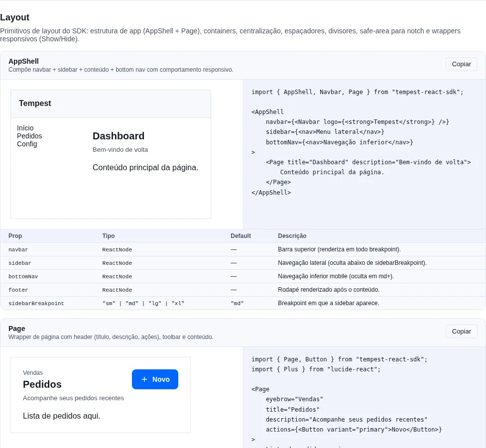
Section layout of the gallery — run it locally to interact.
When to use: as the root frame of an app with persistent navigation
(dashboard, admin panel). For a simple landing page, a Container is enough.
Composer: navbar + sidebar (desktop) / bottomNav (mobile) + main + responsive footer.
import { useState } from "react";
import {
    AppShell,
    BottomNavigation,
    Navbar,
    Page,
    Sidebar,
    type SidebarItem,
} from "tempest-react-sdk";

const NAV: SidebarItem[] = [
    { key: "dashboard", label: "Dashboard" },
    { key: "orders", label: "Orders", badge: 12 },
    { key: "customers", label: "Customers" },
];

export function Shell() {
    const [tab, setTab] = useState("dashboard");

    return (
        <AppShell
            navbar={<Navbar logo={<strong>Tempest</strong>} actions={<button>Sign out</button>} />}
            sidebar={<Sidebar items={NAV} value={tab} onChange={setTab} />}
            bottomNav={<BottomNavigation items={NAV} value={tab} onChange={setTab} />}
            footer={<small>© 2026 Tempest</small>}
            sidebarBreakpoint="md"
        >
            <Page title="Dashboard">Content for the {tab} tab</Page>
        </AppShell>
    );
}
Responsive behavior:
- >=
sidebarBreakpoint: navbar + sidebar + main + footer. - <
sidebarBreakpoint: navbar + main + bottomNav + footer (sidebar hidden).
| Prop | Type | Default |
|---|---|---|
navbar |
ReactNode |
— |
sidebar |
ReactNode |
— |
bottomNav |
ReactNode |
— |
footer |
ReactNode |
— |
sidebarBreakpoint |
"sm" \| "md" \| "lg" \| "xl" |
"md" |
The navbar sticks to the top while scrolling: its wrapper generates no box
(display: contents), so the sticky Navbar is held by the whole shell, and
sticky={false} on the Navbar still turns it off. Before the #406 fix the bar
left the screen along with the content (top: -1261px at scrollY 1261,
Chromium and Firefox at 1440×900).
sidebar disappears below the breakpoint — that is not the same as being there
Below sidebarBreakpoint the AppShell does not render the sidebar; it
expects you to pass bottomNav. If your primary navigation lives only in the
sidebar, the app has no navigation at all on mobile. Either pass bottomNav,
or open the same list in a <Drawer> from a button in the Navbar.
Page
Page wrapper with a header (eyebrow + title + description + actions) +
toolbar + content + footer.
import { Button, Page, Pagination, Table } from "tempest-react-sdk";
import { Download, Plus } from "lucide-react";

const ORDERS = [
    { id: "8421", customer: "Ana Souza", total: "$ 1,240.00" },
    { id: "8422", customer: "Bruno Lima", total: "$ 380.00" },
];

export function OrdersPage() {
    return (
        <Page
            eyebrow="Sales"
            title="Orders"
            description="Track your orders in real time"
            actions={
                <>
                    <Button variant="ghost" leftIcon={<Download size={16} />}>
                        Export
                    </Button>
                    <Button leftIcon={<Plus size={16} />}>New</Button>
                </>
            }
            footer={
                <Pagination
                    page={1}
                    totalPages={3}
                    totalItems={ORDERS.length}
                    onPageChange={() => {}}
                />
            }
        >
            <Table
                data={ORDERS}
                rowKey={(order) => order.id}
                columns={[
                    { key: "id", header: "Order" },
                    { key: "customer", header: "Customer" },
                    { key: "total", header: "Total" },
                ]}
            />
        </Page>
    );
}
| Prop | Type | Default |
|---|---|---|
title |
ReactNode |
— |
eyebrow |
ReactNode |
— |
description |
ReactNode |
— |
actions |
ReactNode |
— |
toolbar |
ReactNode |
— |
footer |
ReactNode |
— |
padded |
boolean |
true |
SectionHeader
The Page header (eyebrow + title + description + actions) as a piece of
its own, so a page with several sections gets one <h1> and many <h2> with
the same look. Page uses SectionHeader with level={1} internally, so the
two match by construction.
To make the section a landmark, wrap it in Section: it renders <section> and
wires aria-labelledby to the title id of the SectionHeader inside it on its
own. Without an accessible name a <section> is not a region — screen readers
skip it in landmark navigation. The step is always the same, so the library does
it.
import { Button, Page, Section, SectionHeader } from "tempest-react-sdk";

export function LandingPage() {
    return (
        <Page
            eyebrow="TEMPEST"
            title="Custom software"
            description="From prototype to production, with the same team."
            actions={<Button>Talk to us</Button>}
        >
            <Section>
                <SectionHeader
                    eyebrow="Solutions"
                    title="What we can build"
                    description="Apps, dashboards and integrations."
                    align="center"
                />
                <p>Solutions section content.</p>
            </Section>
            <Section>
                <SectionHeader eyebrow="Process" title="How we work" />
                <p>Process section content.</p>
            </Section>
        </Page>
    );
}
The accessibility tree comes out with one main, one level-1 heading and two
regions named "What we can build" and "How we work".
| Prop | Type | Default |
|---|---|---|
title |
ReactNode |
— |
eyebrow |
ReactNode |
— |
description |
ReactNode |
— |
actions |
ReactNode |
— |
level |
1 \| 2 \| 3 \| 4 \| 5 \| 6 |
2 |
align |
"start" \| "center" |
"start" |
id |
string |
useId() |
id goes on the title element (not on the <header>); without it, an id is
generated with useId. With every slot empty, nothing is rendered.
level is semantics, not size
The look is the same at every level: pick the level from the document
outline (one <h1> per page, <h2> for sections), not from the size you
want to see. That is what keeps the Page h1 and the section h2s alike.
Section
<section> that takes its accessible name from the SectionHeader inside it.
Accepts every <section> attribute.
- The link goes through context, so a
divor aCardbetweenSectionandSectionHeaderdoes not break it. - The first
SectionHeaderwith atitle, in render order, wins; if it unmounts, the next one takes over. - A nested
Sectionis named by its own header, not by the outer one. - An
aria-labeloraria-labelledbyyou pass wins over the automatic one. - With no titled
SectionHeader,aria-labelledbyis left off (once mounted) instead of pointing at an id that does not exist. tone="inverse"paints the section in the brand color and inverts every color token inside it (it writesdata-tempest-tone="inverse"). It is opt-in: loadtempest-react-sdk/styles/inverse.cssor generate the theme withinverse: createInverseSurface; with neither, the section keeps the page's tokens. Values and measurements are in Inverse surface.tone="default"(ordata-tempest-tone="default"on any element, such as aCard) inside an inverse section brings the page's tokens back — light or dark, whichever the page is on. It ships with the same opt-in rules; see Back to the page's tokens.
The link is there on the first render
The id belongs to Section (useId), and the first SectionHeader with a
title puts it on its own heading. So aria-labelledby is already in the
first HTML — renderToString, prerendering — and hydration does not change
the attribute. Two cases the server cannot know, because <section> is
written before its children: with no title at all, the HTML attribute points
at an id that does not exist until hydration removes it (measured in
Chromium 153: it stays the same anonymous group as no attribute, and axe
reports nothing); and with an explicit id on the first SectionHeader, the
attribute moves to that id on hydration. If you need the explicit id in
the server HTML, pass aria-labelledby to the Section.
Container
Max-width wrapper.
import { Container, Page } from "tempest-react-sdk";

export function Settings() {
    return (
        <Container size="lg">
            <Page title="Settings">Account preferences</Page>
        </Container>
    );
}
size |
Max-width |
|---|---|
"sm" |
640px |
"md" |
768px |
"lg" |
1024px |
"xl" |
1280px |
"full" |
100% |
Stack
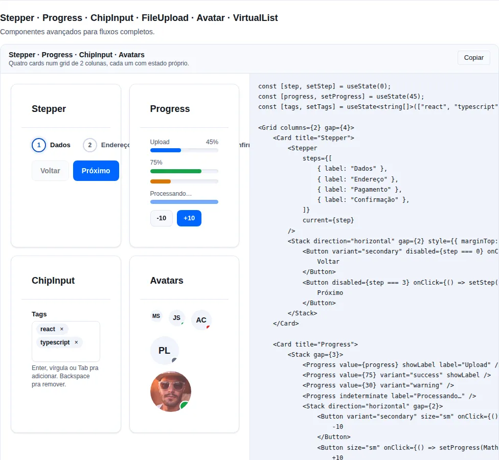
Section advanced of the gallery — run it locally to interact.
When to use: the default primitive for stacking elements in one dimension
(column or row) with uniform spacing. For a 2D grid use Grid.
Vertical or horizontal flex with gap, align, justify, wrap. Accepts
ResponsiveValue for direction and gap.
import { Card, Stack } from "tempest-react-sdk";

export function Stacked() {
    return (
        <>
            <Stack direction="vertical" gap={4}>
                <Card>One</Card>
                <Card>Two</Card>
            </Stack>

            <Stack
                direction={{ mobile: "vertical", desktop: "horizontal" }}
                gap={{ mobile: 2, desktop: 4 }}
            >
                <Card>Mobile stacks, desktop side-by-side</Card>
            </Stack>
        </>
    );
}
| Prop | Type | Default |
|---|---|---|
direction |
"vertical" \| "horizontal" (or ResponsiveValue) |
"vertical" |
gap |
number \| string (or ResponsiveValue) |
2 (8px) |
align |
"start" \| "center" \| "end" \| "stretch" |
— |
justify |
"start" \| "center" \| "end" \| "between" |
— |
wrap |
boolean |
false |
A numeric gap maps to the 4px scale (2 → 8px, 4 → 16px).
Grid
CSS Grid wrapper.
import { Card, Grid, Stat } from "tempest-react-sdk";

const METRICS = [
    { id: "revenue", label: "Revenue", value: "$ 84,200" },
    { id: "orders", label: "Orders", value: "1,204" },
    { id: "ticket", label: "Average ticket", value: "$ 69.93" },
];

export function Overview() {
    return (
        <>
            <Grid columns={3} gap={4}>
                <Card>1</Card>
                <Card>2</Card>
                <Card>3</Card>
            </Grid>

            <Grid columns={{ mobile: 1, tablet: 2, desktop: 4 }} gap={3}>
                {METRICS.map((metric) => (
                    <Stat key={metric.id} label={metric.label} value={metric.value} />
                ))}
            </Grid>

            <Grid columns="2fr 1fr" gap={6}>
                <article>Content</article>
                <aside>Sidebar</aside>
            </Grid>
        </>
    );
}
| Prop | Type | Default |
|---|---|---|
columns |
number \| string (or ResponsiveValue) |
2 |
gap |
number \| string |
4 |
A numeric columns → repeat(N, minmax(0, 1fr)). A string passes straight to
grid-template-columns.
Responsive columns with no media query
columns={{ mobile: 1, tablet: 2, desktop: 4 }} is the idiomatic way to
make a grid that becomes a list on mobile and opens columns on desktop. The
keys are mobile · tablet · desktop — ResponsiveValue does not use
the breakpoint names (sm/md/lg) that sidebarBreakpoint and
<Show above> take. The minmax(0, 1fr) avoids the classic overflow of
cells with wide content (long text, <pre>).
Divider
Horizontal/vertical separator with an optional label.
import { Divider } from "tempest-react-sdk";

export function Separators() {
    return (
        <>
            <Divider />
            <Divider variant="dashed" />
            <Divider orientation="vertical" />
            <Divider label="OR" align="center" />
        </>
    );
}
| Prop | Type | Default |
|---|---|---|
orientation |
"horizontal" \| "vertical" |
"horizontal" |
variant |
"solid" \| "dashed" \| "dotted" |
"solid" |
label |
ReactNode (horizontal only) |
— |
align |
"start" \| "center" \| "end" (label) |
"center" |
Spacer
Flex push.
import { Button, Spacer, Stack } from "tempest-react-sdk";

export function FormActionsRow() {
    return (
        <Stack direction="horizontal">
            <Button variant="ghost">Cancel</Button>
            <Spacer />
            <Button variant="primary">Save</Button>
        </Stack>
    );
}
| Prop | Type | Default |
|---|---|---|
axis |
"both" \| "x" \| "y" |
"both" |
Center
Centers children horizontally/vertically/both.
import { Center, Spinner } from "tempest-react-sdk";

export function Loading() {
    return (
        <Center axis="both" minHeight="100vh">
            <Spinner />
        </Center>
    );
}
| Prop | Type | Default |
|---|---|---|
axis |
"both" \| "horizontal" \| "vertical" |
"both" |
minHeight |
number \| string |
— |
fullWidth |
boolean |
true |
Vertical centering needs a height
axis="both" centers inside the space Center has. In a parent with no
height that space is the content's own height, and nothing appears to happen.
Pass minHeight (or give the parent a height) whenever vertical centering
matters.
AspectRatio
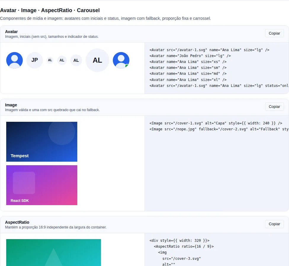
Section display-media of the gallery — run it locally to interact.
Preserves the ratio for media.
import { AspectRatio } from "tempest-react-sdk";

export function Media() {
    return (
        <>
            <AspectRatio ratio={16 / 9}>
                <img
                    src="/cover.jpg"
                    alt="Album cover"
                    style={{ width: "100%", height: "100%", objectFit: "cover" }}
                />
            </AspectRatio>

            <AspectRatio ratio={1}>
                <video src="/clip.mp4" autoPlay loop muted />
            </AspectRatio>
        </>
    );
}
| Prop | Type | Default |
|---|---|---|
ratio |
number |
16 / 9 |
Uses the native CSS aspect-ratio. Compatible with all modern browsers.
AspectRatio reserves the space before the image arrives
That is what prevents the layout jump: the box already has its final ratio, so
the text below does not move when the image loads. Which is why the child has
to fill the box — an <img> without width: 100%; height: 100% stays at its
natural size and the ratio stops applying to what you actually see.
SafeArea
Per-edge padding using env(safe-area-inset-*).
import { SafeArea } from "tempest-react-sdk";

export function Root() {
    return (
        <SafeArea edges={["top", "bottom"]}>
            <main>Content that stays clear of the notch</main>
        </SafeArea>
    );
}
| Prop | Type | Default |
|---|---|---|
edges |
("top" \| "right" \| "bottom" \| "left")[] |
["top","right","bottom","left"] |
inline |
boolean (display: contents instead of block) |
false |
Components that already handle safe-area automatically: Navbar (top),
BottomNavigation/BottomSheet (bottom), Modal.fullscreen (all), Toast
(top+bottom).
Don't stack SafeArea on components that already handle it
If you already use Navbar/BottomNavigation/Toast, don't wrap them in
SafeArea again — the padding doubles and creates a visible gap. Use
SafeArea only on custom surfaces (your own sheet or overlay).
<Show> / <Hide>
When to use: swap an entire tree by breakpoint (desktop vs. mobile nav, for
example). To merely hide via CSS without unmounting, prefer responsive CSS —
<Show>/<Hide> unmount the component from the DOM.
Conditional render based on breakpoint. SSR-safe — the first render uses xs
(mobile first), then re-renders on the client.
import { Banner, Hide, Show } from "tempest-react-sdk";

export function ByBreakpoint() {
    return (
        <>
            <Show above="md">
                <nav>Desktop navigation</nav>
            </Show>
            <Hide above="md">
                <nav>Mobile navigation</nav>
            </Hide>
            <Show below="lg">
                <Banner>Launch promo</Banner>
            </Show>
            <Show only={["sm", "md"]}>
                <p>Hint shown on tablets only</p>
            </Show>
        </>
    );
}
| Prop | Type |
|---|---|
above |
Breakpoint (xs/sm/md/lg/xl/2xl) |
below |
Breakpoint |
only |
Breakpoint \| Breakpoint[] |
only overrides above/below when set.
Show/Hide unmount — they do not hide with CSS
The decision comes from useBreakpoint, which measures window.innerWidth in
JavaScript, so crossing the breakpoint unmounts the subtree and every bit
of local state inside it is lost: a half-filled input, an open accordion, a
scroll position. To hide while keeping state, use CSS (the utilities.css
layer ships the visibility classes). And because the initial width is 0
outside the browser, a <Show above="md"> renders null on the first pass
until the effect measures — correct for an SPA, and not server rendering.
Responsive values
Stack.direction, Grid.columns, Form.layout accept ResponsiveValue<T>:
type ResponsiveValue<T> = T | { mobile?: T; tablet?: T; desktop?: T };
Falls back to the last value defined per cascading breakpoint.
General A11y
Page.titleis<h1>— only one per page for correct hierarchy. Sections below it useSectionHeader(<h2>by default) insideSection, which becomes a namedregion.AppShellwraps in a semantic<main>.<Show>/<Hide>rendernullon the server + adjust on the client (no SEO impact, the first paint may flicker).
Recap
- Compose from the outside in:
AppShell→Container→Page→Stack/Grid→ content. - Use the primitives (
Stack/Grid/Spacer/Center) instead of ad-hoc CSS flex/grid — they use the spacing tokens (4px scale) and are responsive by construction. direction/columns/layoutacceptResponsiveValue→ responsive layout without writing a media query.SafeAreaonly on custom surfaces;Navbar/BottomNavigation/Toast/Modal.fullscreenalready handle the notch.
Related pages:
- Navigation —
Navbar,Sidebar,BottomNavigationthat fill theAppShellslots. - Data entry —
Form/FormSection/FormRow/FormActionsto structure fields inside aPage. - Data —
Table/DataTable/Paginationthat live in aPage's content. - App Providers and Routing — the glue
that wraps the
AppShell.