Identity & micro
Identity components represent who or what in the UI: the person behind an account (Avatar), a grouped, recognizable block of content (Card), and the semantic typography of a keyboard shortcut (Kbd). They're small, high-frequency pieces — they show up in lists, headers, feeds — so their consistency defines the app's "face".
Reach for this page when you need to show an entity or group content, not when you need an action (actions) or pure layout (layout).
Avatar
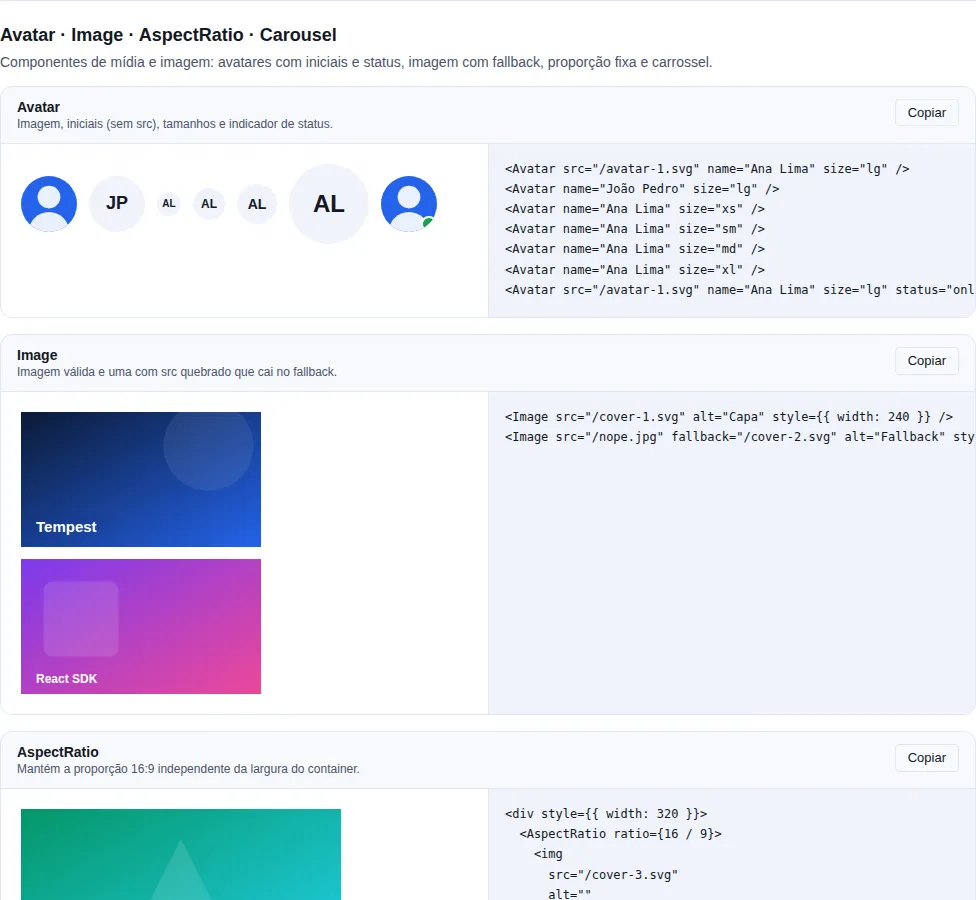
Section display-media of the gallery — run it locally to interact.
When to use: visually represent a user/entity in lists, comments, headers — with a photo when available and colored initials as fallback.
A user's photo with an automatic fallback to colored initials when there is no src or the image fails to load. Initials are derived from name (not from alt).
import { Avatar } from "tempest-react-sdk";

const user = { name: "Ana Souza", photo: "/avatars/ana.jpg" };

export function Identities() {
    return (
        <>
            <Avatar src={user.photo} name={user.name} alt={user.name} />
            <Avatar size="lg" status="online" name="Ana" />
            <Avatar name="John Smith" />
            <Avatar name="John" status="busy" size="sm" />
        </>
    );
}
| Prop | Type | Default |
|---|---|---|
src |
string |
— |
alt |
string (image alt text) |
— |
name |
string (drives the fallback initials) |
"" |
size |
"xs" \| "sm" \| "md" \| "lg" \| "xl" |
"md" |
status |
"online" \| "offline" \| "busy" |
— |
onClick |
() => void |
— |
Initials come from name, not alt
The initials fallback is computed from name. If you pass only alt, the avatar shows ? when the image fails. For a multi-word name it uses the first letter of the first and last term ("John Smith" → "JS").
Always provide alt when there's a src
When src is set, alt is what screen readers announce. Describe the person (the name), not the media — avoid "photo of…".
Card
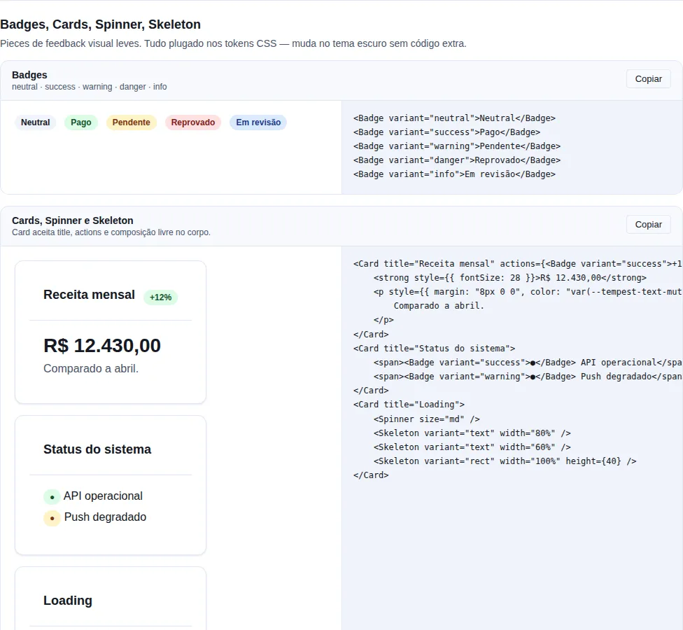
Section feedback of the gallery — run it locally to interact.
When to use: group related content into a block with visual elevation — a list item, a dashboard panel, a container for a table.
A container with header slots (title + actions) and a footer.
import { Button, Card, Pagination, Table } from "tempest-react-sdk";

const ITEMS = [{ id: "1", product: "Keyboard", quantity: 2 }];

export function Cards({ navigate }: { navigate: (to: string) => void }) {
    return (
        <>
            <Card title="Order #12345" actions={<Button variant="ghost">Edit</Button>}>
                Card content.
            </Card>

            <Card elevation="raised" interactive onClick={() => navigate("/orders/12345")}>
                Clickable card with a hover effect.
            </Card>

            <Card
                flush
                footer={<Pagination page={1} totalPages={4} onPageChange={() => {}} />}
            >
                <Table
                    data={ITEMS}
                    rowKey={(item) => item.id}
                    columns={[
                        { key: "product", header: "Product" },
                        { key: "quantity", header: "Qty." },
                    ]}
                />
            </Card>
        </>
    );
}
| Prop | Type | Default |
|---|---|---|
title |
ReactNode |
— |
actions |
ReactNode (right slot of the header) |
— |
footer |
ReactNode |
— |
elevation |
"flat" \| "default" \| "raised" \| "elevated" |
"default" |
interactive |
boolean (cursor pointer + hover ring) |
false |
flush |
boolean (zero internal padding — to host a Table) |
false |
Use flush to host tables and lists
Cards have internal padding by default. When placing a Table or a list that already has its own margins, turn on flush so the content reaches the card edges without doubled padding.
interactive makes the whole card a button
With interactive, the card gets role="button", tabIndex={0}, and keyboard handling (Enter/Space). Avoid putting other clickable elements inside an interactive card — nested clicks compete for the same gesture and confuse keyboard navigation.
Kbd
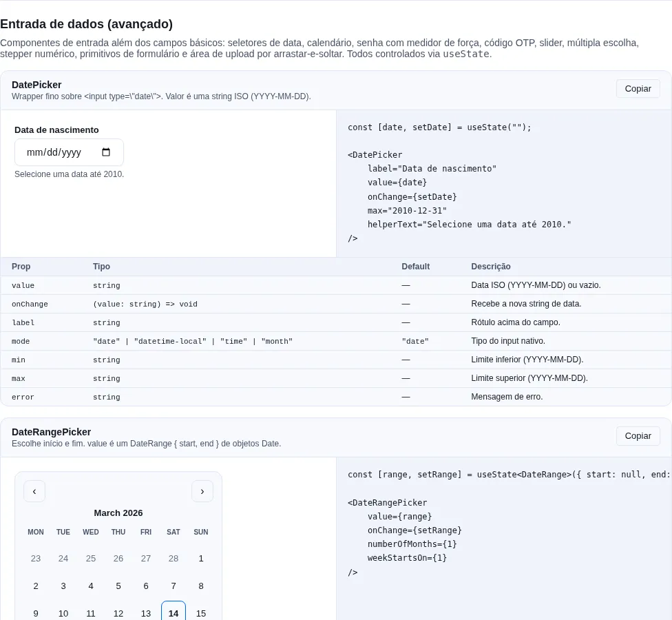
Section inputs-extra of the gallery — run it locally to interact.
When to use: display a key or combination (shortcuts, command-palette hints) with the look of a physical key.
A <kbd> styled for keyboard shortcuts.
import { Kbd } from "tempest-react-sdk";

export function Shortcut() {
    return (
        <>
            <p>
                Press <Kbd>Ctrl</Kbd>+<Kbd>K</Kbd> to open the command palette.
            </p>
            <Kbd size="lg">⌘</Kbd>
        </>
    );
}
| Prop | Type | Default |
|---|---|---|
size |
"sm" \| "md" \| "lg" |
"md" |
One <Kbd> per key
For combinations, repeat the component instead of merging it all into plain text: <Kbd>Ctrl</Kbd>+<Kbd>K</Kbd>. Each <Kbd> renders a semantic <kbd> element that screen readers announce individually.
AvatarGroup
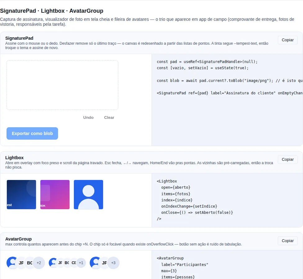
Section capture-media of the gallery — run it locally to interact.
When to use it: show several people in a small space — meeting participants, task assignees, team members.
An overlapping row of avatars with a +N chip at the end.
import { useState } from "react";
import { AvatarGroup, Drawer } from "tempest-react-sdk";

export function Participants() {
    const [open, setOpen] = useState(false);

    return (
        <>
            <AvatarGroup
                label="Participants"
                max={3}
                items={[
                    { name: "Ada Lovelace", src: "/avatars/ada.jpg" },
                    { name: "Grace Hopper" },
                    { name: "Alan Turing" },
                    { name: "Edsger Dijkstra" },
                ]}
                onOverflowClick={() => setOpen(true)}
            />
            <Drawer open={open} onClose={() => setOpen(false)}>
                Full participant list
            </Drawer>
        </>
    );
}
| Prop | Type | Default | What it does |
|---|---|---|---|
items |
AvatarGroupItem[] |
— | People in the group ({ name, src? }). |
max |
number |
4 |
How many avatars before collapsing into +N. |
size |
AvatarSize |
"md" |
Size applied to the avatars and the chip. |
label |
string |
— | Accessible name of the group. |
onOverflowClick |
() => void |
— | Makes the +N chip a focusable button (e.g. open "see all"). |
One group, one accessible name
The row is a single role="group" with one name, and each avatar exposes its person's name. Announcing seven unrelated images is noise; the +N chip carries the remaining count, so the total is never hidden from a screen reader.
The overlap is tunable
--tempest-avatar-overlap controls how much each avatar covers the previous one — the defaults are proportional to size.
Recap
| Component | Use for |
|---|---|
Avatar |
Represent a user (photo or initials) |
Card |
Group related content into an elevated block |
Kbd |
Display keys / keyboard shortcuts |
Key accessibility points:
Avatar.altdescribes the user (the name), not the media; initials come fromname.Cardwithinteractiveappliesrole="button"+ keyboard (Enter/Space) — don't nest other clickables.Kbd: repeat one per key in combinations.
Related: actions (Button inside Card.actions) · data (Card flush hosting a Table) · layout (arranging cards in a grid/stack).