Advanced: essentials
Toggles, label, expandable regions, interaction-triggered overlays and the command palette. The slice almost every screen reaches for.
Toggle
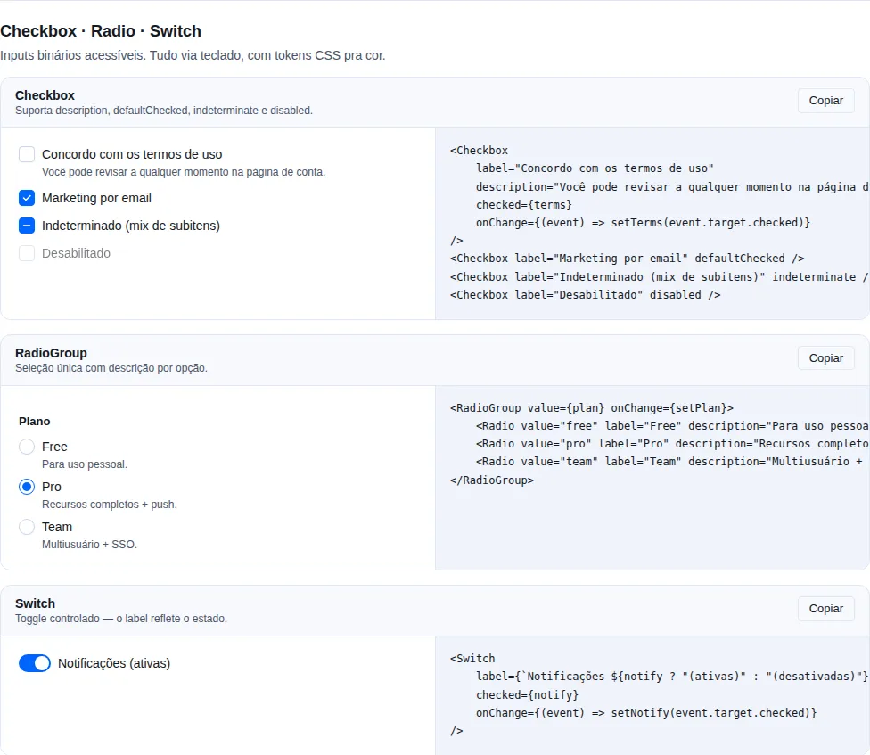
Section form-primitives of the gallery — run it locally to interact.
A two-state button — like a checkbox styled as a button. Controlled (pressed + onPressedChange) or uncontrolled (defaultPressed).
import { Toggle } from "tempest-react-sdk";

<Toggle
  defaultPressed
  variant="outline"
  size="md"
  onPressedChange={(pressed) => console.log(pressed)}
>
  Bold
</Toggle>;
| Prop | Type | Default | Description |
|---|---|---|---|
pressed |
boolean |
— | Controlled state. When provided it is controlled |
defaultPressed |
boolean |
false |
Initial state for the uncontrolled variant |
onPressedChange |
(pressed: boolean) => void |
— | Fired with the next state when activated |
size |
"sm" \| "md" \| "lg" |
"md" |
Visual size |
variant |
"default" \| "outline" |
"default" |
Visual style |
Remaining <button> props are forwarded.
A11y
Renders a native <button type="button"> exposing its state through aria-pressed and data-state="on"|"off".
ToggleGroup (+ ToggleGroupItem)
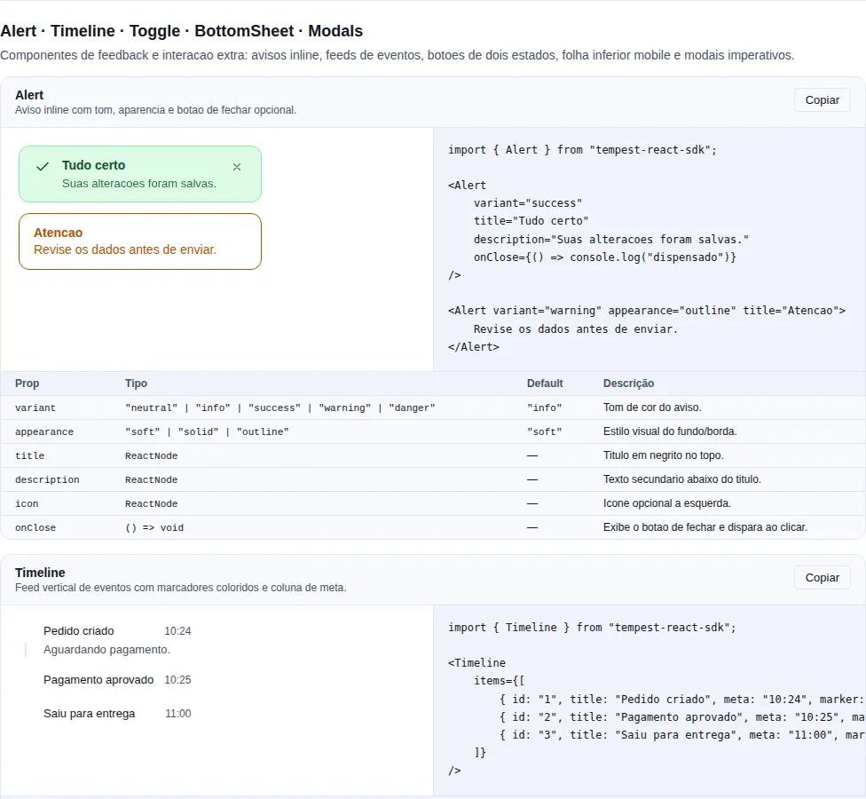
Section feedback-extra of the gallery — run it locally to interact.
A set of toggles sharing selection state via context. single mode (string value) or multiple mode (string[] value).
import { ToggleGroup, ToggleGroupItem } from "tempest-react-sdk";

<ToggleGroup type="single" defaultValue="left" onValueChange={(value) => console.log(value)}>
  <ToggleGroupItem value="left">Left</ToggleGroupItem>
  <ToggleGroupItem value="center">Center</ToggleGroupItem>
  <ToggleGroupItem value="right">Right</ToggleGroupItem>
</ToggleGroup>;
ToggleGroup:
| Prop | Type | Default | Description |
|---|---|---|---|
type |
"single" \| "multiple" |
"single" |
single keeps one value; multiple keeps a set |
value |
string \| string[] |
— | Controlled value (string for single, string[] multi) |
defaultValue |
string \| string[] |
— | Uncontrolled initial value |
onValueChange |
(value: string \| string[]) => void |
— | Fired with the next value |
children |
ReactNode |
— | ToggleGroupItem children |
ToggleGroupItem:
| Prop | Type | Default | Description |
|---|---|---|---|
value |
string |
— | Stable value identifying this item |
disabled |
boolean |
— | Disables the item |
children |
ReactNode |
— | Item content |
Single mode
In single mode, onValueChange receives "" (empty string) when nothing is selected.
Label
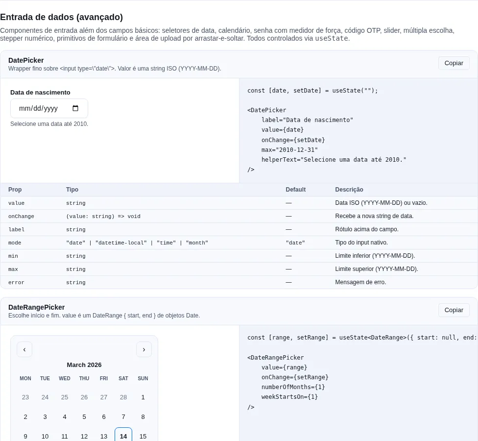
Section inputs-extra of the gallery — run it locally to interact.
A form <label>. Associate it with a control via htmlFor. When required, a decorative asterisk (aria-hidden) is appended.
import { Label } from "tempest-react-sdk";

<Label htmlFor="email" required>
  Email
</Label>;
| Prop | Type | Default | Description |
|---|---|---|---|
required |
boolean |
false |
Appends a danger-colored asterisk marking the field required |
Remaining <label> props (incl. htmlFor) are forwarded.
Collapsible
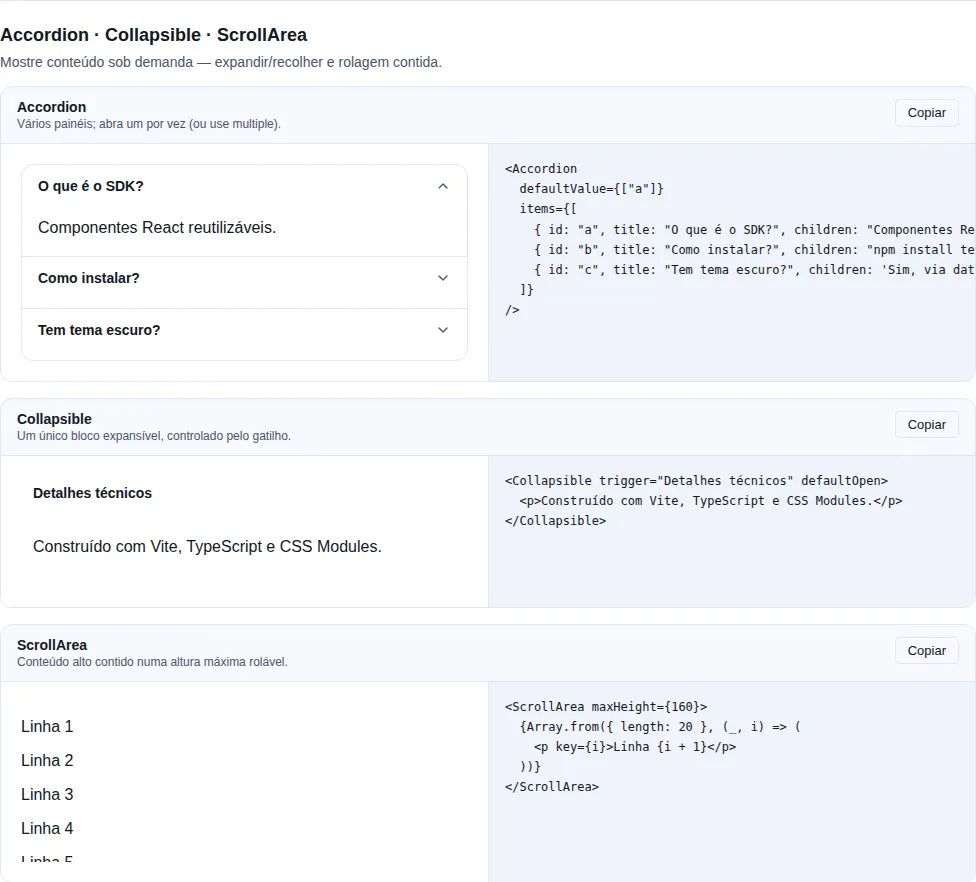
Section disclosure of the gallery — run it locally to interact.
A single expand/collapse region — a lighter alternative to Accordion for one block. Controlled (open + onOpenChange) or uncontrolled (defaultOpen).
import { Collapsible } from "tempest-react-sdk";

<Collapsible trigger="View details" defaultOpen={false}>
  <p>Content revealed when expanded.</p>
</Collapsible>;
| Prop | Type | Default | Description |
|---|---|---|---|
open |
boolean |
— | Controlled state. When provided it is controlled |
defaultOpen |
boolean |
false |
Initial state for the uncontrolled variant |
onOpenChange |
(open: boolean) => void |
— | Fired with the next state when the trigger fires |
trigger |
ReactNode |
— | Content rendered inside the trigger button |
children |
ReactNode |
— | Collapsible content, hidden while closed |
A11y
The trigger is a <button aria-expanded aria-controls> wired to a role="region" sharing the same id; the region is hidden while closed.
ContextMenu
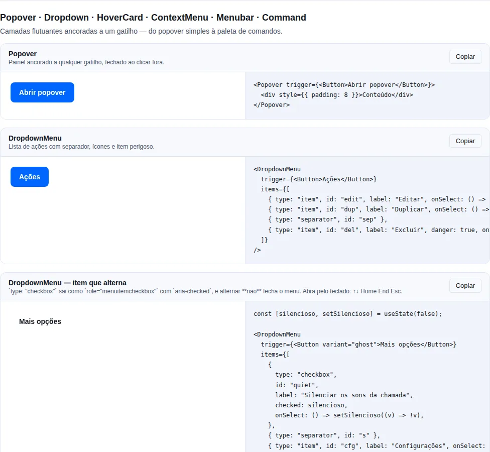
Section overlays of the gallery — run it locally to interact.
Action menu. Opens at the pointer on right click, on a long press, and — when you ask for it — on a left click; rendered through a Portal and clamped inside the viewport. Closes on outside click, Escape, scroll, resize, or selection.
import { ContextMenu } from "tempest-react-sdk";

<ContextMenu
  items={[
    { label: "Edit", onSelect: () => edit() },
    { label: "Duplicate", onSelect: () => duplicate() },
    { separator: true },
    { label: "Delete", danger: true, onSelect: () => remove() },
  ]}
>
  <div>Right-click here</div>
</ContextMenu>;
| Prop | Type | Default | Description |
|---|---|---|---|
items |
ContextMenuItem[] |
— | Menu entries — selectable items and separators |
children |
ReactNode |
— | Trigger area; the gesture anywhere within opens it |
className |
string |
— | Extra class names forwarded to the menu element |
trigger |
"contextmenu" \| "click" \| "both" |
"contextmenu" |
Which mouse gesture opens the menu |
longPressDelay |
number (ms) |
500 |
Long-press duration; 0 turns it off |
viewportMargin |
number (px) |
8 |
Gap kept between the menu and the edge of the screen |
ContextMenuItem = { label: ReactNode; onSelect?: () => void; disabled?: boolean; danger?: boolean } or { separator: true }.
Touch has no right click — and the browser hands you no substitute
Measured in Chrome with touch emulation (Pixel 7 and iPhone 13 profiles), a
900 ms hold on a plain element produces pointerdown, touchstart,
pointerup, touchend and click — and no contextmenu. A menu that
only listened for contextmenu put every action behind it out of reach on a
phone, with nothing to show for it: it simply never opens.
So the long press is the default, independent of trigger (which only
decides the mouse gesture). The timer is cancelled once the finger travels more
than 10 px — otherwise every scroll starting on the trigger would open a menu —
and the click the finger leaves behind is swallowed, so opening the menu on a
chat bubble does not also open the bubble.
The ⋮ pattern
A three-dot button should answer a left click. Wrap it with
trigger="click":
<ContextMenu trigger="click" items={items}>
  <Button variant="ghost" aria-label="More actions">⋮</Button>
</ContextMenu>
"both" keeps both buttons, for a target that accepts either.
Clamped inside the viewport
The menu is measured after it mounts and pulled back on screen. Before that,
measured at 320 px wide: a 180 px menu opened at x=235 ran to 415 — 95 px
off screen, cutting the right edge off every label.
Keyboard
The menu takes focus when it opens, so a screen reader announces the menu
instead of staying on the trigger. Arrow Up/Down walk the selectable items and
wrap, Home/End jump to the ends, Enter activates and Escape closes.
HoverCard
Content preview shown when the trigger is hovered or focused. Opens after openDelay, closes after closeDelay.
import { HoverCard } from "tempest-react-sdk";

<HoverCard trigger={<a href="/u/maria">@maria</a>} placement="bottom">
  <div>
    <strong>Maria Silva</strong>
    <p>Software engineer · 2.3k followers</p>
  </div>
</HoverCard>;
| Prop | Type | Default | Description |
|---|---|---|---|
trigger |
ReactNode |
— | Element the user hovers/focuses to reveal the card |
children |
ReactNode |
— | Card content |
openDelay |
number (ms) |
300 |
Delay before opening on mouseenter/focus |
closeDelay |
number (ms) |
150 |
Delay before closing on mouseleave/blur |
placement |
"top" \| "bottom" \| "left" \| "right" |
"bottom" |
Where the card is anchored relative to the trigger |
portal |
boolean |
true |
Card in document.body: escapes overflow and flips at the screen edge; a link in the card is the next Tab stop after the trigger |
A11y
The card is a labelled role="dialog" region; the trigger stays keyboard focusable.
Command (⌘K palette)
A ⌘K-style command palette: an overlay dialog with an input that substring-filters items (label + keywords), groups results, and supports keyboard navigation (↑/↓, Enter, Escape). Traps focus while open.
import { Command } from "tempest-react-sdk";
import { useState } from "react";

const [open, setOpen] = useState(false);

<Command
  open={open}
  onOpenChange={setOpen}
  placeholder="Type a command…"
  items={[
    { id: "new", label: "New document", group: "File", onSelect: () => create() },
    { id: "open", label: "Open…", group: "File", keywords: ["recent"], onSelect: () => openFile() },
    { id: "theme", label: "Toggle theme", group: "Preferences", onSelect: () => toggleTheme() },
  ]}
/>;
| Prop | Type | Default | Description |
|---|---|---|---|
open |
boolean |
— | Whether the palette is visible |
onOpenChange |
(open: boolean) => void |
— | Next open state (Escape, selection, backdrop click) |
items |
CommandItem[] |
— | Candidate items to filter and display |
placeholder |
string |
"Type a command…" |
Placeholder for the search input |
emptyMessage |
ReactNode |
"No results" |
Rendered when no item matches the query |
className |
string |
— | Forwarded to the dialog element |
CommandItem = { id: string; label: string; group?: string; keywords?: string[]; onSelect: () => void; icon?: ReactNode }.
Global trigger
Pair with useKeyboardShortcut("mod+k", () => setOpen(true)) to open via ⌘K / Ctrl+K.
Recap
- Essentials:
Toggle/ToggleGroupfor pressable states,Labelfor forms,Collapsiblefor a single expandable block,ContextMenu/HoverCardfor interaction-triggered overlays, andCommandfor the ⌘K palette. - All share the same controlled/uncontrolled patterns, expose keyboard A11y, and import from
tempest-react-sdk.