Overlay
Overlay components interrupt the main flow to focus attention on an isolated task — they appear on top of the page, with a backdrop, and capture focus until dismissed. Reach for them when the user needs to deal with something (edit a record, confirm, pick an option) without losing the background context, yet can't ignore it either.
The three share the same engine (portal to document.body + backdrop + Esc + focus trap + scroll lock) and differ only in anchoring and purpose:
Modal— centered, general purpose.Drawer— anchored to an edge, side panel.BottomSheet— anchored to the bottom, mobile-first.
Everything is portaled
All three render into document.body, outside the tree of the component that opens them. This avoids ancestor overflow: hidden / z-index issues, but means parent-scoped styles don't leak into the overlay.
Modal
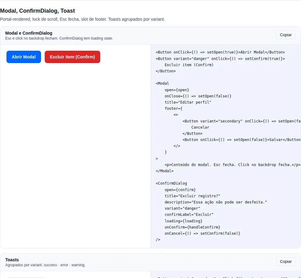
Section modal of the gallery — run it locally to interact.
When to use: a central flow that pauses context — create/edit a record, a short wizard, a form that demands full attention.
Portal + backdrop + Esc + focus trap + scroll lock.
import { useState } from "react";
import { Button, FormActions, Modal } from "tempest-react-sdk";

export function EditarPerfil({ save }: { save: () => void }) {
    const [open, setOpen] = useState(false);

    return (
        <Modal
            open={open}
            onClose={() => setOpen(false)}
            title="Edit profile"
            size="md"
            footer={
                <FormActions>
                    <Button variant="ghost" onClick={() => setOpen(false)}>
                        Cancel
                    </Button>
                    <Button onClick={save}>Save</Button>
                </FormActions>
            }
        >
            <p>The profile form goes here.</p>
        </Modal>
    );
}
| Prop | Type | Default |
|---|---|---|
open |
boolean |
— |
onClose |
() => void |
— |
title |
ReactNode |
— |
size |
"sm" \| "md" \| "lg" \| "xl" \| "2xl" \| "3xl" |
"md" |
footer |
ReactNode |
— |
fullscreen |
boolean (fills 100dvh regardless of size) |
false |
fullscreenOnMobile |
boolean (becomes fullscreen below 640px) |
false |
closeOnBackdrop |
boolean |
true |
closeOnEsc |
boolean |
true |
Safe-area in fullscreen
In fullscreen the Modal applies env(safe-area-inset-*) on all edges, respecting notch and gesture bar. Use fullscreenOnMobile so a dense modal becomes full-screen below 640px instead of cramming into a tiny card.
A11y: role="dialog" + aria-modal="true" + aria-labelledby when title
is a string. Focus is trapped inside the dialog and returns to the trigger on
close.
Drawer
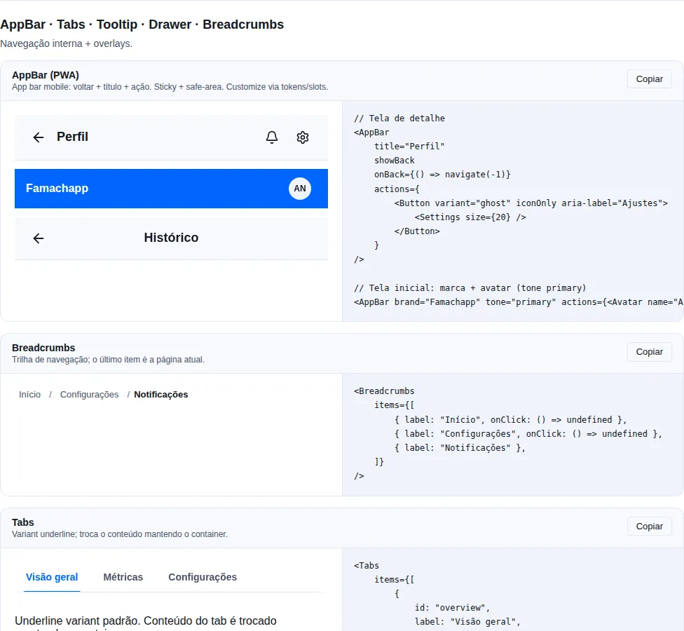
Section navigation of the gallery — run it locally to interact.
When to use: a persistent side panel that complements the background screen — filters, an item's details, secondary navigation. It hugs an edge instead of centering.
Side drawer. placement: left/right/top/bottom. Auto-switches to a bottom-sheet
on mobile via mobilePlacement.
import { useState } from "react";
import { Button, Drawer } from "tempest-react-sdk";

export function GavetaDeFiltros({ apply }: { apply: () => void }) {
    const [open, setOpen] = useState(false);

    return (
        <Drawer
            open={open}
            onClose={() => setOpen(false)}
            placement="right"
            mobilePlacement="bottom"
            title="Filters"
            showHandle
            footer={<Button onClick={apply}>Apply</Button>}
        >
            <p>The profile form goes here.</p>
        </Drawer>
    );
}
| Prop | Type | Default |
|---|---|---|
open |
boolean |
— |
onClose |
() => void |
— |
placement |
"left" \| "right" \| "top" \| "bottom" |
"right" |
mobilePlacement |
"left" \| "right" \| "top" \| "bottom" (mobile override) |
— |
title |
ReactNode |
— |
footer |
ReactNode |
— |
showHandle |
boolean (bottom-sheet style drag indicator) |
false |
hideCloseButton |
boolean |
false |
closeOnBackdrop |
boolean |
true |
closeOnEsc |
boolean |
true |
Drawer sizes to its content, not a size prop
Unlike Modal, Drawer has no size prop — its width/height follows the content (and the placement CSS). For a mobile-first full-width, height-capped panel, prefer BottomSheet or mobilePlacement="bottom".
BottomSheet
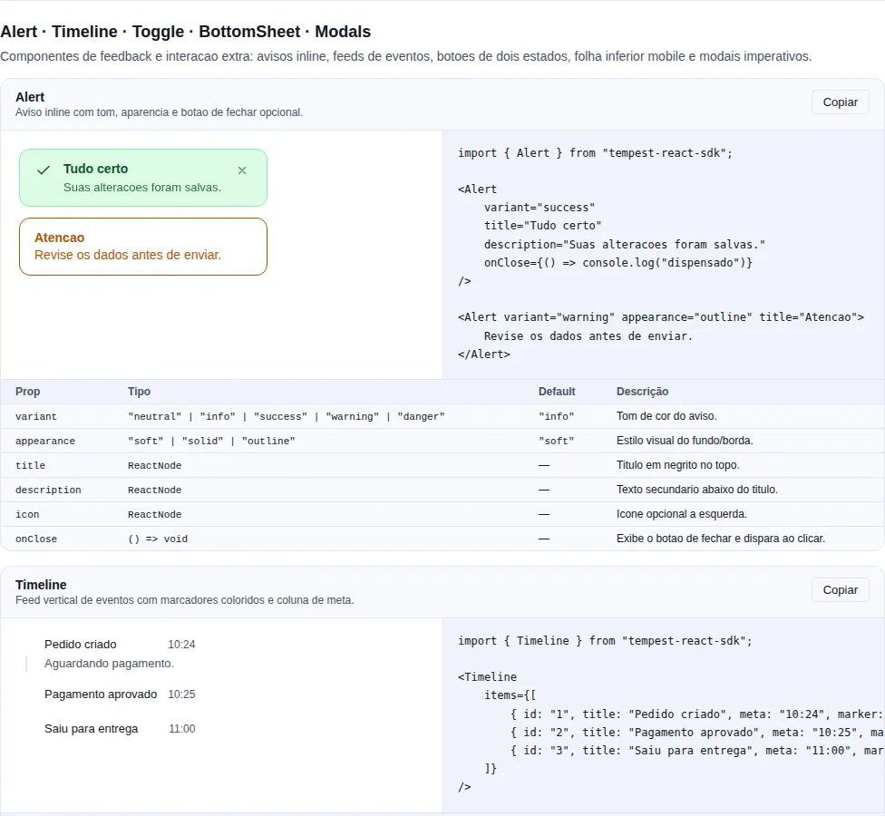
Section feedback-extra of the gallery — run it locally to interact.
When to use: mobile-first actions or choices that rise from the bottom — a share menu, an item's options, a short picker. It's the native iOS/Android pattern.
A modal anchored to the bottom edge — slide-up via animation. Optimized for mobile.
import { useState } from "react";
import { BottomSheet, Button, Stack } from "tempest-react-sdk";
import { Link, Mail, MessageCircle } from "lucide-react";

export function Compartilhar() {
    const [open, setOpen] = useState(false);

    return (
        <BottomSheet open={open} onClose={() => setOpen(false)} title="Share">
            <Stack gap={3}>
                <Button leftIcon={<MessageCircle size={16} />}>WhatsApp</Button>
                <Button leftIcon={<Mail size={16} />}>Email</Button>
                <Button leftIcon={<Link size={16} />}>Copy link</Button>
            </Stack>
        </BottomSheet>
    );
}
| Prop | Type | Default |
|---|---|---|
open |
boolean |
— |
onClose |
() => void |
— |
title |
ReactNode |
— |
showHandle |
boolean |
true |
dismissOnBackdrop |
boolean |
true |
dismissOnEsc |
boolean |
true |
Automatic safe-area
BottomSheet adds padding-bottom respecting env(safe-area-inset-bottom), so controls aren't hidden behind the gesture bar on modern iPhones/Androids.
Difference vs Drawer: BottomSheet is always slide-up + max-height 90dvh + a
drag handle. Use Drawer when you need a variable placement (side/top) or
different behavior between desktop and mobile.
Be careful turning off closeOnBackdrop/dismissOnBackdrop
Disabling backdrop or Esc dismissal traps the user in the overlay until the task is done. Do this only for truly critical forms (data loss) — otherwise always offer a clear exit, or keyboard navigation becomes a trap.
ModalsManager
When to use: when you want to open modals and confirmations imperatively — straight from a handler, without wiring a
<Modal open={...}>controlled by local state everywhere. Ideal for delete confirmations and one-off dialogs.
<ModalsProvider> mounts once near the root and manages a stack of modals;
useModals() exposes the imperative API over the existing Modal and
ConfirmDialog components.
import { ModalsProvider, useModals, Button } from "tempest-react-sdk";

// app root
<ModalsProvider>
  <App />
</ModalsProvider>;

// in any component below the provider
function DeleteButton({ id }: { id: string }) {
  const modals = useModals();
  return (
    <Button
      variant="danger"
      onClick={() =>
        modals.confirm({
          title: "Delete item",
          message: "This action cannot be undone. Continue?",
          confirmLabel: "Delete",
          danger: true,
          onConfirm: async () => {
            await fetch(`/api/items/${id}`, { method: "DELETE" });
          },
        })
      }
    >
      Delete
    </Button>
  );
}
useModals() |
Signature | What it does |
|---|---|---|
open |
(options: OpenModalOptions) => string |
Pushes a content modal; returns the id. |
confirm |
(options: ConfirmModalOptions) => string |
Pushes a ConfirmDialog; returns the id. |
close |
(id: string) => void |
Removes the modal with that id. |
closeAll |
() => void |
Removes every modal from the stack. |
Built on the existing components
open renders a Modal and confirm renders a ConfirmDialog — you inherit
focus trap, scroll lock, Esc and backdrop with zero setup. onConfirm can be
async: the dialog shows loading until the promise resolves and closes
itself when it's done.
Needs <ModalsProvider> above
useModals() throws if called outside a <ModalsProvider>. Mount the provider
once near the app root.
Fullscreen
Every SDK overlay mounts through a portal, and the portal target follows the
fullscreen element whenever there is one — Modal, Drawer, BottomSheet,
ToastProvider, Command, ContextMenu, DropdownMenu, Popover, Tooltip, HoverCard, Combobox,
MultiSelect, NavigationMenu, Menubar and
the generic <Portal>.
This is not convenience, it is correctness. While the page is in fullscreen the
browser paints only the fullscreen element's subtree, and document.body is
outside it. An overlay mounted in body exists in the DOM, has a measured box,
and is neither seen nor clicked — elementFromPoint at its centre returns
whatever sits behind it. Nothing throws and nothing reaches the console.
import { useRef, useState } from "react";
import { Button, Modal } from "tempest-react-sdk";

export function Call() {
    const stage = useRef<HTMLDivElement>(null);
    const [open, setOpen] = useState(false);

    return (
        <div ref={stage}>
            <Button onClick={() => stage.current?.requestFullscreen()}>Fullscreen</Button>
            <Button onClick={() => setOpen(true)}>Audio and video</Button>

            <Modal open={open} onClose={() => setOpen(false)} title="Audio and video">
                The dialog shows up inside the fullscreen element.
            </Modal>
        </div>
    );
}
The target follows, it is not read once
Entering or leaving fullscreen with a dialog already open moves the
dialog: the host is state and listens for fullscreenchange (plus the
webkitfullscreenchange WebKit still emits). The dialog stays mounted and
keeps its state.
container still wins
<Portal container={…}> pins the target and ignores fullscreen. Use it when
you need a specific destination — a layout root, a node outside an
overflow.
General A11y
- Focus trap (
Modal,Drawer,BottomSheet): focus enters the dialog on open,Tab/Shift+Tabcycle only inside it — portalled panels opened from it included — and focus returns to the trigger on close. See Focus stays inside, portalled panels included. - Scroll lock:
body.overflow = "hidden"while open. - Esc closes the top layer (
Modal/Drawer:closeOnEsc={false};BottomSheet:dismissOnEsc={false}) — seeEscapecloses one layer at a time. aria-modal="true"tells screen readers the rest of the page is blocked.- Backdrop: clicks close it (
Modal/Drawer:closeOnBackdrop={false};BottomSheet:dismissOnBackdrop={false}).
Focus stays inside, portalled panels included
Once open, the Modal puts focus on its first focusable element (here, the
header's Close button — labelled "Fechar"). From then on, Tab and
Shift+Tab only move inside the dialog:
import { useState } from "react";
import { Button, Input, Modal, Popover } from "tempest-react-sdk";

export function Filters({ apply }: { apply: () => void }) {
    const [open, setOpen] = useState(false);

    return (
        <>
            <Button onClick={() => setOpen(true)}>Open filters</Button>
            <Modal
                open={open}
                onClose={() => setOpen(false)}
                title="Filters"
                footer={<Button onClick={apply}>Apply</Button>}
            >
                <Popover trigger={<Button variant="secondary">Period</Button>}>
                    <Input aria-label="From" />
                    <Input aria-label="To" />
                </Popover>
            </Modal>
        </>
    );
}
With the Popover open its panel lives at the end of body, outside the dialog —
and it still joins the cycle right after its trigger: Period → From → To →
Apply → Close → Period. A Modal opened from inside another traps focus until
it closes and then hands it back to the button that opened it, inside the one
below. On close, focus returns to Open filters.
Before 0.68.0, Modal, Drawer and BottomSheet declared aria-modal="true"
without trapping focus. Measured in Chrome, with real key presses, on the
gallery's modal section:
| Moment | Before | Now |
|---|---|---|
| Right after opening | focus on the opening button, outside the dialog | the dialog's first focusable |
Tab ×5 |
5 stops on the page behind the backdrop | cycles through the dialog's focusables |
| On close | wherever Tab had left it |
the opening button |
The screen reader heard that the page was blocked while the keyboard kept using
it. Command already trapped focus, but on close it returned it to body: the
search field's autoFocus took focus before the trap noted where it came from.
A dialog with nothing focusable
With hideCloseButton and text-only content, focus goes to the dialog itself
(tabIndex={-1}), and Tab stays on it instead of escaping.
Escape closes one layer at a time
One Escape closes only the most recently opened layer. The next Escape
closes the one below:
import { useState } from "react";
import { Button, DropdownMenu, Modal } from "tempest-react-sdk";

export function EditOrder({ cancel }: { cancel: () => void }) {
    const [open, setOpen] = useState(true);

    return (
        <Modal open={open} onClose={() => setOpen(false)} title="Edit order">
            <DropdownMenu
                trigger={<Button variant="ghost">More actions</Button>}
                items={[{ type: "item", id: "cancel", label: "Cancel order", onSelect: cancel }]}
            />
        </Modal>
    );
}
With the menu open, the first Escape closes the menu and returns focus to the
trigger inside the modal. The second one closes the modal.
Before 0.67.0 every overlay listened for keydown on window and closed on any
Escape, so one key press closed everything that was open. Measured in Chrome,
with a real key press:
| Inside | Inner layer | Before | Now |
|---|---|---|---|
Modal |
DropdownMenu, Combobox, MultiSelect, Popover, ContextMenu, editable DataTable cell |
closed both | closes only the inner one |
Modal |
another Modal |
closed both | closes only the top one |
Drawer |
Popover |
closed both | closes only the Popover |
The rule covers Modal, Drawer, BottomSheet, Lightbox, Popover,
ContextMenu, NavigationMenu, Menubar and Tooltip. Components that handle
Escape on their own element (the Combobox list, the cell editor,
DropdownMenu) consume the key first, and the outer overlay does not react.
closeOnEsc={false} blocks, it does not pass through
A Modal (or Drawer) with Escape turned off stays on top of the stack
and swallows the key. Otherwise Escape would fall through and close the
modal underneath while the top one stays open.
Your own Escape handler works with the stack
If a component of yours handles Escape inside an overlay, call
event.preventDefault(). The stack ignores a consumed key, so the outer
overlay stays open.
Lightbox
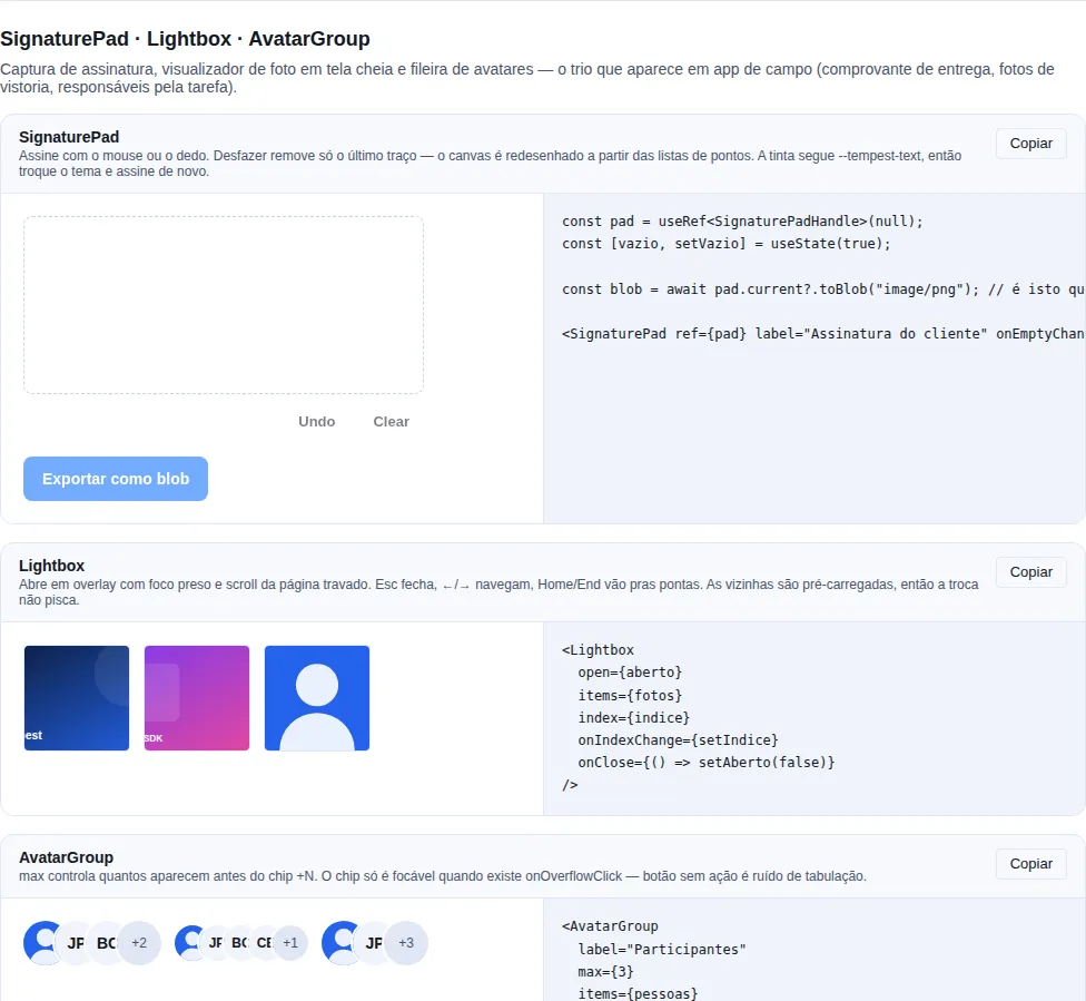
Section capture-media of the gallery — run it locally to interact.
When to use it: view a photo full-screen with navigation — a property gallery, the attachments of a ticket, inspection photos.
A role="dialog" aria-modal overlay with focus trapped inside and the page scroll locked. Only the current image is mounted; the neighbours are preloaded via Image(), so pressing → does not flash an empty frame.
import { Lightbox } from "tempest-react-sdk";
import { useState } from "react";

export function InspectionGallery({ photos }: { photos: { url: string; description: string }[] }) {
  const [open, setOpen] = useState(false);
  const [index, setIndex] = useState(0);

  return (
    <>
      <div className="tempest-grid-auto">
        {photos.map((photo, i) => (
          <button key={photo.url} type="button" onClick={() => { setIndex(i); setOpen(true); }}>
            <img src={photo.url} alt={photo.description} className="tempest-aspect-square" />
          </button>
        ))}
      </div>

      <Lightbox
        open={open}
        items={photos.map((p) => ({ src: p.url, alt: p.description }))}
        index={index}
        onIndexChange={setIndex}
        onClose={() => setOpen(false)}
      />
    </>
  );
}
| Prop | Type | Default | What it does |
|---|---|---|---|
items |
LightboxItem[] |
— | Gallery images. |
open |
boolean |
— | Controls visibility. |
index |
number |
0 |
Index being shown. |
onIndexChange |
(index: number) => void |
— | Passing this makes the index controlled. |
onClose |
() => void |
— | Called on Esc and on the close button. |
showThumbnails |
boolean |
true if > 1 item |
Thumbnail strip. |
showCounter |
boolean |
true |
The 3 / 12 counter. |
loop |
boolean |
true |
Wraps around at the ends. |
LightboxItem = { src, alt, caption?, thumbnail? } — alt is required: a gallery of unlabeled images is unusable with a screen reader.
Keyboard: Esc closes · ←/→ navigate · Home/End jump to the ends.
loop is true on purpose
In a photo viewer, hitting a dead end at the last image reads as a bug more often than as a boundary. Pass loop={false} when order carries meaning (a step-by-step, say) — then the nav buttons disable at the ends.
Recap
| Component | Anchoring | Purpose | Dismiss props |
|---|---|---|---|
Modal |
centered | central flows (create/edit) | closeOnBackdrop/closeOnEsc |
Drawer |
edge (variable) | persistent side panels | closeOnBackdrop/closeOnEsc |
BottomSheet |
bottom edge | mobile-first actions (share) | dismissOnBackdrop/dismissOnEsc |
ModalsManager |
stack (imperative) | open modals/confirmations from code | useModals().close/closeAll |
For a pre-built destructive confirmation, use ConfirmDialog (actions), built on top of Modal. To open modals imperatively (no local state), use <ModalsProvider> + useModals().
Related: actions (ConfirmDialog, buttons in the footer) · inputs (forms inside the overlay) · navigation (Drawer as secondary nav).