Data
Data components present collections — many entities of the same type — in a
readable, navigable way. The choice depends on how many items there are and
how the user moves through them: compare fields side by side (Table), scroll
thousands of rows without choking (VirtualList), expand/collapse content
sections (Accordion), or follow a sequence of events over time (Timeline).
Reach for this page when you need to list/compare records. For a single
record use a Card; for data entry, inputs.
Table<T>
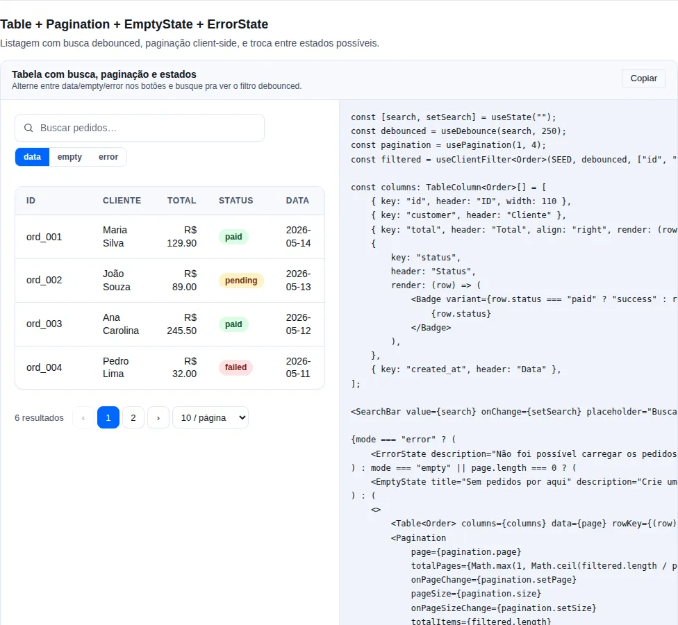
Section table of the gallery — run it locally to interact.
When to use: compare structured records field by field in columns — orders, users, transactions. Typed by
T, with per-column responsive priority and optional stack on mobile.
import { Badge, Button, Table, formatCurrency, formatDate, type TableColumn } from "tempest-react-sdk";

interface Order {
    id: string;
    customer: string;
    total: number;
    created_at: string;
    status: "paid" | "pending" | "failed";
}

const VARIANT = { paid: "success", pending: "warning", failed: "danger" } as const;

export function Orders({
    orders,
    edit,
    navigate,
}: {
    orders: Order[];
    edit: (id: string) => void;
    navigate: (to: string) => void;
}) {
    const columns: TableColumn<Order>[] = [
        { key: "id", header: "ID", align: "right", priority: "always" },
        { key: "customer", header: "Customer", priority: "always" },
        {
            key: "total",
            header: "Total",
            align: "right",
            render: (row) => formatCurrency(row.total),
            priority: "always",
        },
        {
            key: "created_at",
            header: "Date",
            render: (row) => formatDate(row.created_at),
            priority: "tablet",
        },
        {
            key: "status",
            header: "Status",
            render: (row) => <Badge variant={VARIANT[row.status]}>{row.status}</Badge>,
            priority: "desktop",
        },
        {
            key: "actions",
            header: "",
            render: (row) => (
                <Button size="sm" onClick={() => edit(row.id)}>
                    Edit
                </Button>
            ),
            priority: "desktop",
        },
    ];

    return (
        <Table
            columns={columns}
            data={orders}
            rowKey={(row) => row.id}
            onRowClick={(row) => navigate(`/orders/${row.id}`)}
            stackOnMobile
            emptyMessage="No orders found."
        />
    );
}
| Prop | Type | Default |
|---|---|---|
columns |
TableColumn<T>[] |
— |
data |
T[] |
— |
rowKey |
(row: T, index: number) => string \| number |
— |
onRowClick |
(row: T) => void |
— |
emptyMessage |
ReactNode (shown when data is empty) |
"Nenhum registro encontrado." |
stackOnMobile |
boolean (rows become label/value cards < md) |
false |
TableColumn<T>:
| Field | Type | Notes |
|---|---|---|
key |
string |
Identifier + default key (reads row[key]) |
header |
ReactNode |
Column header; becomes data-label in stack mode |
render |
(row: T, index: number) => ReactNode |
Default = row[key] |
align |
"left" \| "right" \| "center" |
Default "left" |
priority |
"always" \| "tablet" \| "desktop" |
tablet: hidden < md. desktop: hidden < lg. |
width |
string \| number |
CSS width (120px, 20%, auto) |
className |
string |
Extra class applied to that column's cells |
There is no loading prop
Table does not render skeleton rows on its own. For a loading state, render your own skeleton conditionally before the table, or pass placeholder rows in data. emptyMessage only covers the "valid query, zero results" case.
Default emptyMessage is Portuguese
emptyMessage defaults to "Nenhum registro encontrado.". Pass an explicit English string in EN-locale apps.
Responsive:
priority="tablet"→ columns hidden at viewport< md(768px).priority="desktop"→ hidden at< lg(1024px).stackOnMobile→ at< sm(640px), each row becomes a label/value card.
VirtualList
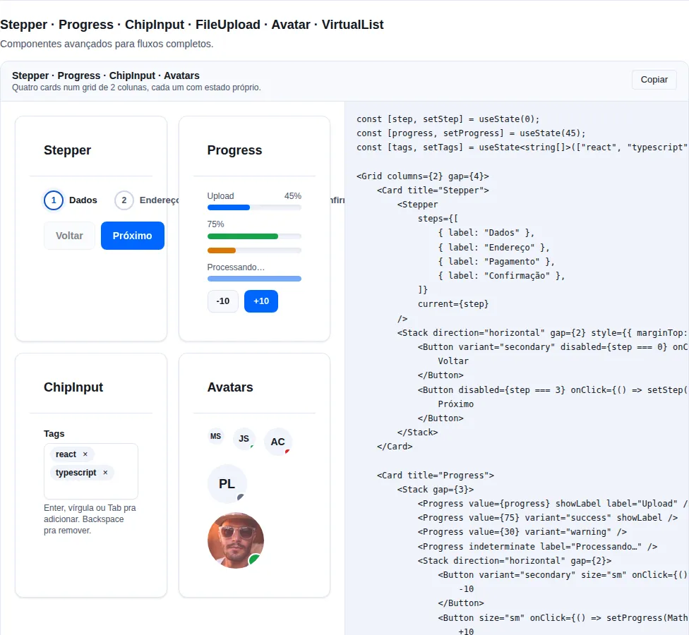
Section advanced of the gallery — run it locally to interact.
When to use: scroll very long lists (500+ items) of fixed-height rows without flooding the DOM — chats, logs, infinite feeds.
Renders only the visible window + a small overscan buffer. Each row needs a fixed height (itemHeight); the container needs a height (height).
import { VirtualList } from "tempest-react-sdk";

interface Message {
    id: string;
    body: string;
}

export function Historico({ messages }: { messages: Message[] }) {
    return (
        <VirtualList
            items={messages}
            itemHeight={64}
            height={480}
            overscan={5}
            getKey={(message) => message.id}
            renderItem={(message) => <p>{message.body}</p>}
        />
    );
}
| Prop | Type | Default |
|---|---|---|
items |
T[] |
— |
itemHeight |
number (fixed height per row, px) |
— |
height |
number \| string (container height) |
— |
renderItem |
(item: T, index: number) => ReactNode |
— |
overscan |
number (items above/below the viewport) |
4 |
getKey |
(item: T, index: number) => string \| number |
index |
Fixed height is required
VirtualList assumes a constant itemHeight to compute the window. For variable-height rows use @tanstack/react-virtual or react-window — they solve the general case at the cost of more setup.
Native search (Ctrl+F) only finds the visible window
Items outside the viewport are not in the DOM, so the browser's Ctrl+F won't find them. Below ~500 items, prefer normal rendering: the perf gain is negligible and you keep native search.
VirtualTable<T>
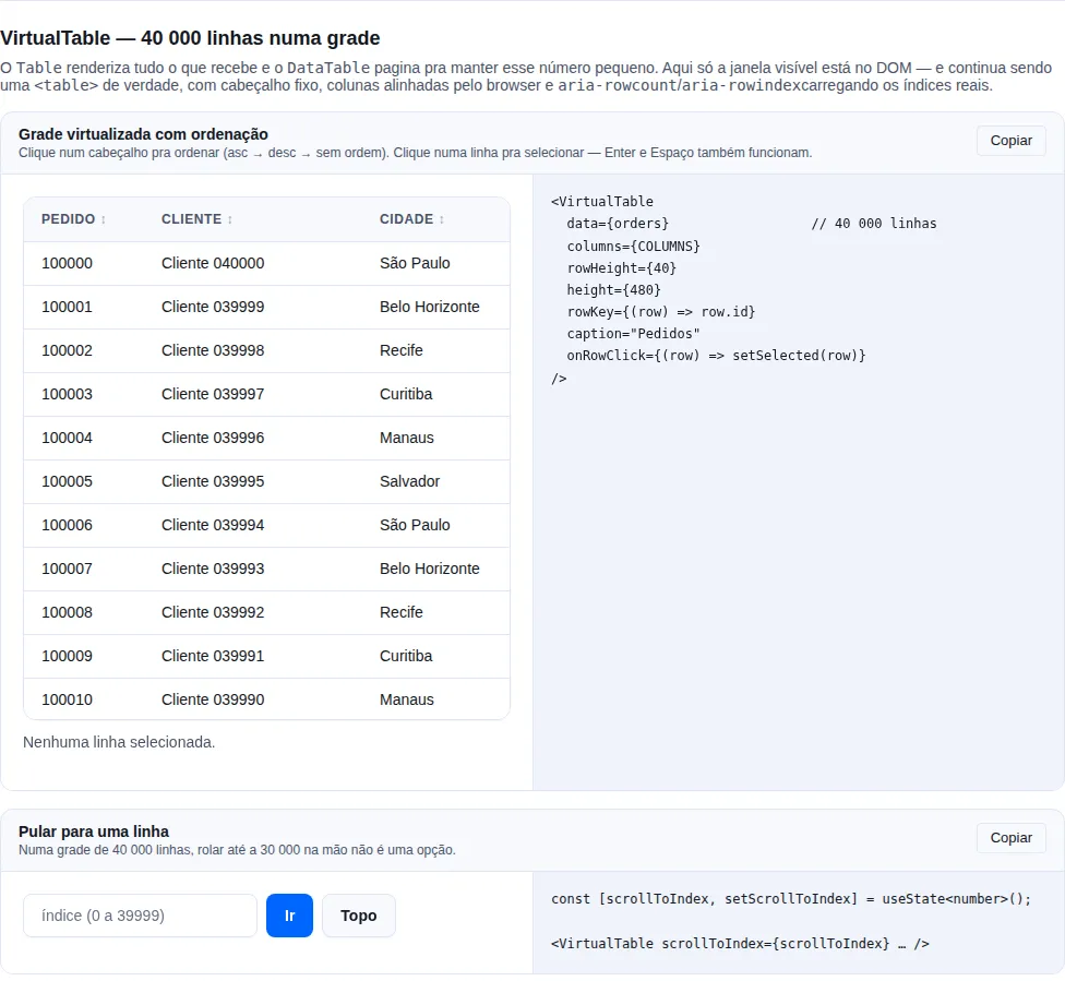
Section virtual-table of the gallery — run it locally to interact.
When to use: a table of thousands of rows in one scrollable grid — a statement, an audit log, a raw export.
Tablerenders everything it is given andDataTablepaginates to keep that count small; neither answers "show me all 40 000 rows at once".
It renders only the visible window, like VirtualList, while staying a real <table>: the browser aligns the columns, the header sticks, and assistive technology still sees a grid.
import { VirtualTable } from "tempest-react-sdk";

interface Row {
    id: number;
    name: string;
    total: string;
}

export function Grande({ rows, open }: { rows: Row[]; open: (id: number) => void }) {
    return (
        <VirtualTable
            data={rows}
            columns={[
                { key: "id", header: "#", width: 80, sortable: true },
                { key: "name", header: "Name", width: 240, sortable: true },
                { key: "total", header: "Total", width: 120, align: "right", sortable: true },
            ]}
            rowHeight={40}
            height={480}
            rowKey={(row) => row.id}
            onRowClick={(row) => open(row.id)}
        />
    );
}
| Prop | Type | Default |
|---|---|---|
data |
T[] |
— |
columns |
VirtualTableColumn<T>[] |
— |
rowHeight |
number (px, uniform) |
— |
height |
number \| string (viewport height) |
— |
overscan |
number |
4 |
rowKey |
(row: T, index: number) => string \| number |
index |
initialSort |
{ key: keyof T; direction: "asc" \| "desc" } |
— |
onRowClick |
(row: T, index: number) => void |
— |
scrollToIndex |
number |
— |
caption |
ReactNode (accessible name, visually hidden) |
— |
emptyMessage |
ReactNode |
"Nenhum registro encontrado." |
Column: { key, header, render?, sortable?, align?, width? }.
Why it stays a <table>
The window is produced by two spacer rows — one above the visible slice, one below — instead of absolutely positioning rows. position: absolute would collapse table layout: every column width would have to be computed by hand, and the element would stop being a table for assistive technology. With spacer rows the browser keeps doing column layout and screen readers keep announcing a grid.
Real indices, not window indices
Because only a slice is in the DOM, aria-rowcount on the table and aria-rowindex on each row carry the real numbers. Without them a screen reader announces "row 3 of 20" while the user is on row 5003 of 40 000 — the detail almost every virtualized table gets wrong.
rowHeight must be uniform, and match what the CSS produces
It is what maps scroll offset to row index. If the CSS renders a different height than declared, the window comes out shifted. For variable heights use @tanstack/react-virtual.
Set width on every column
Rows enter and leave the DOM as you scroll, so letting the browser size columns from whatever is rendered right now makes them jump mid-scroll. The component uses table-layout: fixed precisely so that works.
VirtualTable or DataTable?
| You need… | Use |
|---|---|
| Search + pagination, tens to hundreds of rows | DataTable |
| A scrollable grid of thousands of rows | VirtualTable |
| Full control of the markup, few rows | Table |
Both sort with the same comparator (compareValues), so "sorted" means the same thing in each — numbers numerically, dates by timestamp, strings via localeCompare with numeric: true.
DataTable<T> — inline editing
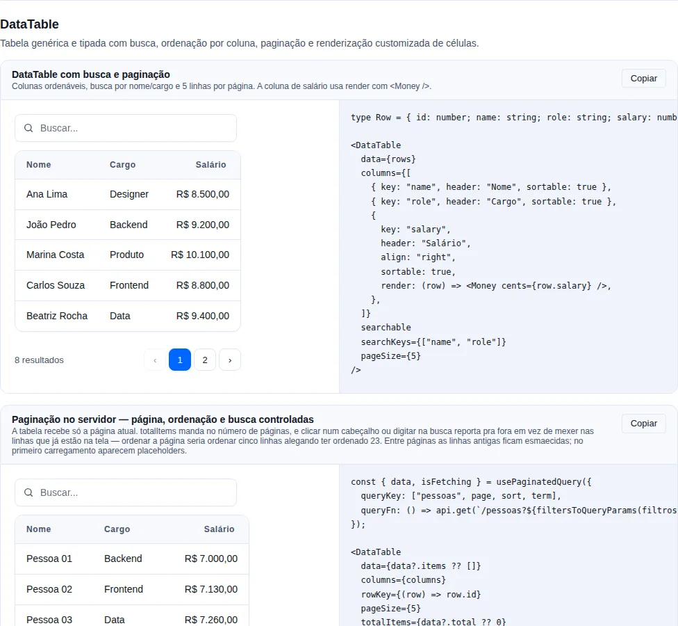
Section data-table of the gallery — run it locally to interact.
When to use: an admin screen. You already list the records with
DataTable; now somebody needs to fix a name without opening a modal per row.
Mark the column editable and give the table an onCellChange. Without both, nothing
changes — editing is strictly opt-in, and a DataTable with no editable column renders
exactly what it rendered before.
import { DataTable, type DataTableColumn } from "tempest-react-sdk";
import { api } from "@/lib/api";

interface Employee {
  id: number;
  name: string;
  email: string;
  salary: number;
}

const columns: DataTableColumn<Employee>[] = [
  {
    key: "name",
    header: "Name",
    editable: true,
    validate: (value) => (String(value).trim().length < 3 ? "At least 3 letters." : null),
  },
  {
    key: "salary",
    header: "Salary",
    align: "right",
    editable: true,
    editorType: "number",
    validate: (value) => (Number(value) <= 0 ? "Must be positive." : null),
  },
  { key: "email", header: "E-mail" },
];

export function Team({ people }: { people: Employee[] }) {
  return (
    <DataTable
      data={people}
      columns={columns}
      rowKey={(row) => row.id}
      onCellChange={({ row, key, value }) =>
        api.patch(`/api/employees/${row.id}`, { body: { [key]: value } })
      }
    />
  );
}
Piece by piece:
editable: trueturns the cell into a button carrying the value. Clicking it (or pressingEnter) opens an<input>.editorTypeis the input'stype("text"by default;"number","date","email","tel","url").validatereturns a message to reject, ornullto accept.onCellChangepersists. Returning a promise is what switches the optimistic behaviour on.
Keyboard
| Key | What it does |
|---|---|
Enter |
Commit and close; focus returns to the cell's button |
Escape |
Discard the draft and close |
Tab |
Commit and open the next editable cell (row by row) |
Shift+Tab |
Commit and open the previous one |
| click away | Commit — losing what was typed is the bug users report as "the table ate my edit" |
Tab is intercepted on purpose: the natural order would walk into the next row's
button, and in a table being edited, moving cell to cell is what people expect.
Optimistic, with a visible rollback
An accepted edit shows immediately and onCellChange runs in the background
(aria-busy on the button meanwhile). If the promise rejects, the cell returns to the
old value and shows the reason in a role="alert" tied to it via
aria-describedby.
onCellChange={async ({ row, key, value }) => {
  const res = await fetch(`/api/employees/${row.id}`, { /* … */ });
  if (!res.ok) throw new Error("That e-mail is already taken.");
}}
The message of the Error you throw is what shows in the cell. With no message, the
default text is used (editLabels.saveFailed).
A silent revert is worse than no optimistic update
The user watched the edit appear and has no reason to doubt it. If the server refused and the cell just goes back to the old value saying nothing, they leave believing it saved. That is why the error stays in the cell instead of becoming a toast that disappears.
Accessibility
- Closed, the cell is a
<button>whose name comes from its own contents: an invisibleEditar {column}:in front of whatever the column rendered. Anaria-labelbuilt from the raw value would read "850000" on a cell showingR$ 8.500,00— that fails WCAG 2.5.3 (Label in Name) and leaves voice control unable to address the cell by what it says. A<td>with anonClickwould be invisible to a keyboard and role-less to a screen reader. - Open, the
<input>has thearia-label{column}, linha {n}. - A validation error sets
aria-invalidand links the message viaaria-describedby. - A successful save is announced through
useAnnounce("{column} salvo"), because it is the only event here with no on-screen representation. The failure is not announced twice: the cell'srole="alert"already does it. - On a coarse pointer (touch), the button's hit area grows to cover the whole
<td>— 44px without spilling into the neighbouring row, which a symmetric hit-slop would do.
Editing props
| Prop | Type | Where |
|---|---|---|
editable |
boolean |
column |
editorType |
"text" \| "number" \| "date" \| "email" \| "tel" \| "url" |
column |
formatEdit |
(row: T) => string |
column — the text the editor opens with |
parse |
(raw: string, row: T) => unknown |
column — string → stored value |
validate |
(value: unknown, row: T) => string \| null |
column |
onCellChange |
(change: DataTableCellChange<T>) => void \| Promise<void> |
table |
editLabels |
Partial<DataTableEditLabels> |
table — the PT-BR copy |
DataTableCellChange<T> carries { row, key, value, previous, rowIndex }, where
rowIndex is the index in the full dataset, not in the page.
A column with render keeps working
A column rendering <Money cents={row.salary} /> receives the row with the
optimistic value already applied, so the new number shows correctly formatted while
the save is still in flight.
DataTable<T> — server-side pagination
When to use: the ordinary admin listing. The backend paginates, filters and sorts; the browser gets one page at a time and cannot answer "how many rows are there" or "which one is first alphabetically" on its own.
By default DataTable takes the whole dataset and does everything in memory.
Pass totalItems and it switches modes: data becomes the current page, the page
count comes from that number, and sorting and searching are delegated to you.
import { useState } from "react";
import {
  DataTable,
  usePaginatedQuery,
  type DataTableColumn,
  type DataTableSort,
} from "tempest-react-sdk";

type Person = { id: number; name: string; role: string };

const COLUMNS: DataTableColumn<Person>[] = [
  { key: "name", header: "Name", sortable: true },
  { key: "role", header: "Role", sortable: true },
];

export function People() {
  const [sort, setSort] = useState<DataTableSort<Person> | null>(null);
  const [term, setTerm] = useState("");

  const { items, total, pageNumber, setPage, isFetching } = usePaginatedQuery<Person>({
    queryKey: ["people", sort, term],
    queryFn: ({ page, size }) =>
      fetch(`/api/people?page=${page}&size=${size}&q=${term}`).then((r) => r.json()),
    pageSize: 20,
  });

  return (
    <DataTable
      data={items}
      columns={COLUMNS}
      rowKey={(row) => row.id}
      pageSize={20}
      totalItems={total}
      page={pageNumber}
      onPageChange={setPage}
      onSortChange={(next) => {
        setSort(next);
        setPage(1);
      }}
      searchable
      onSearchChange={(next) => {
        setTerm(next);
        setPage(1);
      }}
      loading={isFetching}
    />
  );
}
usePaginatedQuery is already the other half
It owns the page and returns items, total, pageNumber and setPage — exactly the four props server mode asks for. No useState for the page; the state that remains is the sort and the term, because those belong to the query key.
| Prop | Type | What it does |
|---|---|---|
totalItems |
number |
Turns on server mode and drives the page count. |
page |
number |
Controlled page, 1-based. |
onPageChange |
(page: number) => void |
Next page requested by the pager. |
manualSort |
boolean |
Delegates sorting. Implied by totalItems. |
onSortChange |
(sort: DataTableSort<T> \| null) => void |
asc → desc → null. |
manualSearch |
boolean |
Delegates searching. Implied by totalItems. |
onSearchChange |
(term: string) => void |
The typed term; debouncing is yours. |
loading |
boolean |
A request is in flight. |
pageSize |
number |
Rows per page; required with onPageSizeChange. |
onPageSizeChange |
(size: number) => void |
Turns on the items-per-page selector (below). |
pageSizeOptions |
number[] |
Sizes offered. Default [10, 25, 50, 100]. |
The compiler now rejects the invalid combination
The props are a union of the shapes that work, so three mistakes that used to compile are now build errors at your call site:
| What you wrote | Why it does not compile |
|---|---|
totalItems without page/onPageChange |
The pager would move the internal page while data keeps showing page one |
page without onPageChange |
A controlled page with nobody to change it |
manualSort without onSortChange |
The header arrow turns and nothing else happens |
manualSearch without onSearchChange |
The search box filters nothing and tells nobody |
Through v0.44.0 each prop was optional on its own, so this only ever showed up
as a console.warn in dev, in the browser, with the component mounted — your
CI's tsc never saw it. The runtime warnings remain, for the callers types
cannot reach (plain JavaScript, or props arriving through an any-typed
spread).
The halves are exported when you need them: DataTableBaseProps,
DataTablePagingProps, DataTableSortProps and DataTableSearchProps.
Partial of a union does not work — to vary only the shared half in a test
helper, use Partial<DataTableBaseProps<T>>.
One case the type does not catch: implicit server-mode search
totalItems already implies manualSearch. So searchable with no
onSearchChange on a server-mode table is the same inert box — without anybody
writing manualSearch, and therefore with nothing for the search axis to see.
Closing that would mean the search axis reading the paging axis, crossing two three-member unions into nine and turning any mismatch into a wall of candidate shapes. That case stays a runtime dev warning — the only one of the four where runtime genuinely is the cheaper check.
Search and sort must come along — filtering the page lies
searchable on its own filters data in memory, and in server mode data is
only the current page. The user types, everything not on page 3 disappears, and
the table looks like it is saying "no such thing". That is why totalItems
already implies manualSearch and manualSort: sorting five rows while
claiming to have sorted 23 is the same kind of lie.
manualSort and manualSearch are useful without server pagination too
A full list in memory but ordered by the backend (by relevance, by a computed
field) is a legitimate case: pass manualSort without totalItems.
Loading and empty are different screens
With rows on screen, loading dims them and marks aria-busy — the old rows
stay, so pagination does not jump under the cursor between pages. With no rows
yet, it draws placeholders at the real height instead of emptyMessage, because
"I am fetching" and "there is nothing" are not the same sentence.
An incomplete combination warns in dev
totalItems without a controlled page, page without onPageChange,
delegated sorting without onSortChange — each renders a screen that looks like
it works and does not (the header sorts and nothing moves). None of them is a
type error, so the warning goes to the console in development.
The sort warning requires a sortable column. totalItems implies
manualSort, so until v0.65.0 every server-mode table printed it — including
the ones with no clickable column at all, where the state the sentence describes
does not exist. A warning nobody can act on teaches the reader to skim past the
two real ones beside it, and the way out it suggested was
onSortChange={() => {}}: a callback that does nothing, that the type-checker
accepts, and that would hide the warning the day a sortable column appeared.
Client mode did not change a line
Without totalItems, manualSort, manualSearch or loading, the markup and
the behaviour are exactly what they were — including the page clamp when the
dataset shrinks, which server mode deliberately turns off (the page is yours,
and a clamp against a totalItems that has not caught up would send the user to
a page they never asked for, mid-fetch).
Items per page
When to use: an admin listing where the reader picks the density — 10 to check a record, 100 to sweep crash reports.
The DataTable footer is the SDK's own Pagination, which already has the
selector. Pass onPageSizeChange and it appears; without that prop, nothing
changes.
import { useState } from "react";
import { DataTable, usePaginatedQuery, type DataTableColumn } from "tempest-react-sdk";

type AppError = { id: number; message: string; occurrences: number };

const COLUMNS: DataTableColumn<AppError>[] = [
  { key: "message", header: "Message" },
  { key: "occurrences", header: "Occurrences", align: "right" },
];

export function ErrorConsole() {
  const [size, setSize] = useState(25);

  const { items, total, pageNumber, setPage, isFetching } = usePaginatedQuery<AppError>({
    queryKey: ["errors"],
    queryFn: ({ page, size }) => fetch(`/api/errors?page=${page}&size=${size}`).then((r) => r.json()),
    pageSize: size,
  });

  return (
    <DataTable
      data={items}
      columns={COLUMNS}
      rowKey={(row) => row.id}
      totalItems={total}
      page={pageNumber}
      onPageChange={setPage}
      pageSize={size}
      pageSizeOptions={[10, 25, 50, 100]}
      onPageSizeChange={setSize}
      loading={isFetching}
    />
  );
}
pageSizecomes back to the table. The selector only reports; you own the size, and it is what counts the pages (totalItems / pageSize). That is whyonPageSizeChangewithoutpageSizedoes not compile.- The page goes back to 1 by itself. After
onPageSizeChange, the table callsonPageChange(1)— unless you are already on page 1. Page 7 at 10 per page is rows 61–70; at 100 per page it does not exist. You do not needsetPage(1)in the callback (writing it is harmless). - The footer stays even with a single page. Picking 100 for 40 rows leaves one page; without the selector on screen there would be no way back to 10.
- The current size is always in the list.
pageSize={20}with the default list is merged in, in order — before, a<select>with no matching option read "10 / página" over a table showing 20 rows.
The type rejects a selector that does nothing
| You wrote | Why it does not compile |
|---|---|
pageSizeOptions without onPageSizeChange |
The selector changes and nobody hears it |
onPageSizeChange without pageSize |
The choice never comes back: the table keeps counting pages of 10 |
The type for this half is DataTablePageSizeProps. For callers the type cannot
reach (plain JavaScript), the second case also warns in the dev console.
Below 640px the selector hides
That is the Pagination default (compactOnMobile): on a phone the footer is
‹ / › plus the summary, and the size picked on desktop keeps applying. It is
a space trade-off, not a bug — see Pagination.
BarList
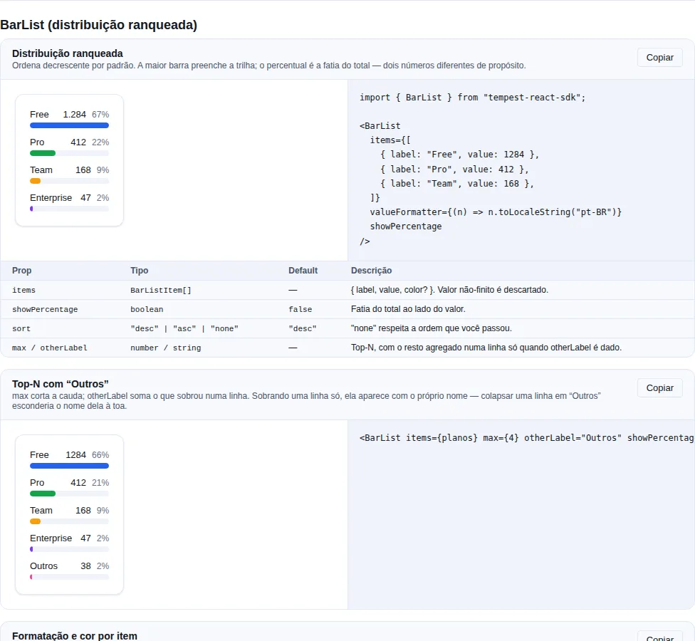
Section bar-list of the gallery — run it locally to interact.
When to use: a ranked distribution — users per plan, errors per endpoint, sales per category. The most common chart on a panel, and the one usually written four times in the same dashboard, each with its own CSS and its own
.sort().
Label, proportional bar, value and (optionally) the share of the total. No recharts —
it is a div with a percentage width, like Sparkline.
import { BarList } from "tempest-react-sdk";

<BarList
  items={[
    { label: "Free", value: 128 },
    { label: "Pro", value: 32 },
    { label: "Team", value: 16 },
  ]}
  valueFormatter={(n) => `${n} active`}
  showPercentage
  max={5}
  otherLabel="Others"
/>;
| Prop | Type | Default | What it does |
|---|---|---|---|
items |
BarListItem[] |
— | { label, value, color? }. Non-finite values are dropped. |
valueFormatter |
(value: number) => string |
— | How the number reads. |
showPercentage |
boolean |
false |
Shows the share of the total next to the value. |
sort |
"desc" \| "asc" \| "none" |
"desc" |
Ordering — "none" keeps the given order. |
max |
number |
— | Keeps at most N rows. |
otherLabel |
string |
— | Aggregates what max cut into a single row. |
Width and percentage are different numbers, on purpose
Width is relative to the largest row, so the biggest bar fills the track. The percentage is the share of the total. Scaling width by the total leaves every bar short in a list of many small values — the chart stops being readable exactly when it has the most rows.
It is a list, not a picture
<ul>/<li> with the value written as text, and the bar aria-hidden
behind it. A screen reader reads "Free, 128, 62%" because that text is there, not
because an aria-label narrates a drawing.
The label never sits on top of the bar
Text over a tinted fill has to be re-verified against that fill — and the
--tempest-chart-* ramp is a brand ramp (3:1), which fails as text. The SDK
has been caught by this twice, and both times it only showed up in a real
browser, because axe under jsdom disables color-contrast with no paint. This
layout avoids the whole class of problem.
A negative value draws no bar but stays in the list
A bar of negative width does not exist: the width becomes 0 and the percentage becomes 0, but the number is still shown. Dropping the row would be worse than showing an odd one. For the same reason the total counts positive values only, or the shares would not add up.
A zero total shows zero, not NaN%
The percentage goes through percentOf, so a freshly created panel shows 0%
instead of the NaN% that (part / total) * 100 would produce.
otherLabel only aggregates when more than one row was cut
Collapsing a single row into "Others" would hide its name for nothing — in that case it appears under its own name.
The palette honours --tempest-chart-count
Each row's colour comes from useChartColors, the same resolver every chart in
the SDK uses, so a theme declaring fewer than eight series cycles within its
own palette. A 6-colour brand theme repeats its 1st and 2nd on rows 7 and 8
instead of falling back to the SDK's default blue and teal.
Through v0.44.0 the colour was read as var(--tempest-chart-N) with
N = index % 8. CSS cannot use --tempest-chart-count as a modulus, so the 8
was hardcoded and a brand lost its last two rows. palette.ts imports nothing,
so this pulls no chart library into the slice.
A per-item color still wins over everything.
The arithmetic is exported: buildBarListRows
buildBarListRows({ items, sort, max, otherLabel }) returns the rows already
ordered, truncated and measured (percentage, width, index) without
rendering anything. Use it when you want the same maths behind a different
drawing — a legend, a table, an export. Only items is required; sort
defaults to "desc".
const rows = buildBarListRows({ items: sales, max: 5, otherLabel: "Other" });
ListTile
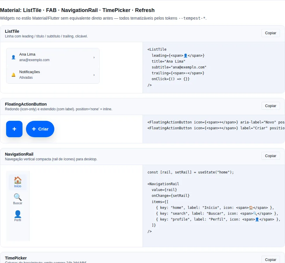
Section material of the gallery — run it locally to interact.
When to use: the canonical Material list row — an item with a leading slot (icon/avatar), a title with an optional subtitle, and a trailing slot (icon, switch, meta). Ideal for settings lists, contacts, or menus.
Renders as a static <div> by default; given an onClick it becomes a full-width, keyboard-accessible <button>.
import { useState } from "react";
import { ListTile, Switch } from "tempest-react-sdk";
import { Bell } from "lucide-react";

function NotificationsRow() {
  const [enabled, setEnabled] = useState(true);

  return (
    <ListTile
      leading={<Bell size={20} />}
      title="Notifications"
      subtitle="Receive push alerts"
      trailing={
        <Switch checked={enabled} onChange={(e) => setEnabled(e.target.checked)} />
      }
    />
  );
}
| Prop | Type | Default |
|---|---|---|
title |
ReactNode |
— |
leading |
ReactNode (left slot) |
— |
subtitle |
ReactNode (secondary line) |
— |
trailing |
ReactNode (right slot) |
— |
onClick |
() => void (turns the tile a button) |
— |
selected |
boolean (highlights the active row) |
false |
disabled |
boolean (dimmed, non-interactive) |
false |
Button only when onClick is set
Without onClick, ListTile is a purely visual <div>. With onClick, it becomes a <button> with aria-pressed (when selected) and honors disabled — don't wrap it in another clickable element.
Accordion
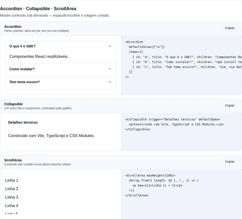
Section disclosure of the gallery — run it locally to interact.
When to use: condense sectionable content the user expands on demand — FAQs, long stepped forms, settings panels.
Single mode (default) or multiple. Controlled via value + onChange, or uncontrolled via defaultValue.
import { useState } from "react";
import { Accordion } from "tempest-react-sdk";

const FAQ = [
    { id: "1", title: "How do I cancel my subscription?", children: <p>In the dashboard, under Account → Subscription.</p> },
    { id: "2", title: "Which payment methods?", children: <p>Card, Pix and bank slip.</p> },
];

export function Perguntas() {
    const [openIds, setOpenIds] = useState<string[]>([]);

    return (
        <>
            <Accordion items={FAQ} />
            <Accordion
                multiple
                value={openIds}
                onChange={(value) => setOpenIds(value as string[])}
                items={FAQ}
            />
        </>
    );
}
| Prop | Type | Default |
|---|---|---|
items |
AccordionItem[] |
— |
multiple |
boolean (allow several open) |
false |
value |
string[] (open ids, controlled) |
— |
defaultValue |
string[] (initially open ids) |
[] |
onChange |
(openIds: string[]) => void |
— |
AccordionItem = { id, title, children, disabled? }.
Accessibility is built in
Headers are <button aria-expanded> and content gets aria-hidden when closed. ↑↓ arrows switch the focused item; Home/End jump to the first/last.
Timeline
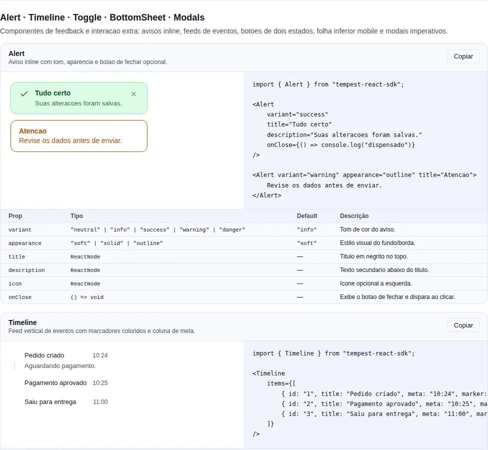
Section feedback-extra of the gallery — run it locally to interact.
When to use: show a sequence of events over time — order tracking, audit log, activity feed. Each entry has an optional colored marker, title, description and meta.
A vertical feed with colored markers. Renders as a semantic <ol> (each item is an <li>).
import { Timeline } from "tempest-react-sdk";

export function Rastreio() {
    return (
        <Timeline
            items={[
                { id: "1", title: "Order created", meta: "10:24", marker: "primary" },
                { id: "2", title: "Payment approved", meta: "10:25", marker: "success" },
                {
                    id: "3",
                    title: "Out for delivery",
                    description: "Driver: John",
                    meta: "11:00",
                    marker: "warning",
                },
                { id: "4", title: "Delivered", meta: "12:30", marker: "success" },
            ]}
        />
    );
}
| Prop | Type | Default |
|---|---|---|
items |
TimelineItem[] |
— |
connector |
boolean (line between markers) |
true |
TimelineItem = { id, title, description?, meta?, icon?, marker?: "primary" \| "success" \| "warning" \| "danger" \| "neutral" }.
TreeView
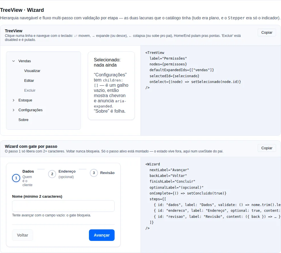
Section hierarchy-flow of the gallery — run it locally to interact.
When to use it: hierarchical data — a category tree, permissions per module, folders, an org chart. When the data is a flat list,
TableorListTilefit better.
Implements role="tree" with roving tabindex: exactly one row is tabbable and the arrow keys move focus inside the widget. That is what stops a 500-node tree from adding 500 stops to the page's tab order.
import { TreeView, type TreeNode } from "tempest-react-sdk";

const permissions: TreeNode[] = [
  {
    id: "sales",
    label: "Sales",
    children: [
      { id: "sales.read", label: "View" },
      { id: "sales.write", label: "Edit" },
      { id: "sales.delete", label: "Delete", disabled: true },
    ],
  },
  { id: "settings", label: "Settings", children: [] },
  { id: "about", label: "About" },
];

export function RolePermissions() {
  const [selected, setSelected] = useState<string | null>(null);

  return (
    <TreeView
      label="Permissions"
      nodes={permissions}
      defaultExpandedIds={["sales"]}
      selectedId={selected}
      onSelect={(node) => setSelected(node.id)}
    />
  );
}
| Prop | Type | Default | What it does |
|---|---|---|---|
nodes |
TreeNode[] |
— | Root nodes. |
expandedIds |
string[] |
— | Controlled expansion. |
defaultExpandedIds |
string[] |
[] |
Initial expansion (uncontrolled). |
onExpandedChange |
(ids: string[]) => void |
— | Called on every expand/collapse. |
selectedId |
string \| null |
— | Controlled selection. |
defaultSelectedId |
string \| null |
null |
Initial selection. |
onSelect |
(node: TreeNode) => void |
— | Called on select (click, Enter or Space). |
toggleOnSelect |
boolean |
true |
Selecting a branch also expands/collapses it. |
label |
string |
— | Accessible name for the tree. |
TreeNode = { id, label, children?, icon?, disabled? }.
Keyboard: ↓/↑ move · → expands (or descends into the first child) · ← collapses (or walks to the parent) · Home/End first/last visible row · Enter/Space select.
children: [] is an empty branch, not a leaf
The distinction matters: an empty folder should still show the chevron and announce aria-expanded. A leaf is a missing children.
toggleOnSelect={false} when the branch is a valid choice
The default (true) mimics a file explorer: clicking the folder opens the folder. Pass false when the branch itself is selectable — a category that is also a destination, say.
The chevron is not a button
It is decoration (aria-hidden): the row already carries aria-expanded, so a second focusable control there would only add screen-reader noise while duplicating an action the keyboard map has. Clicking it works (with the event stopped, so it toggles without selecting).
Sparkline
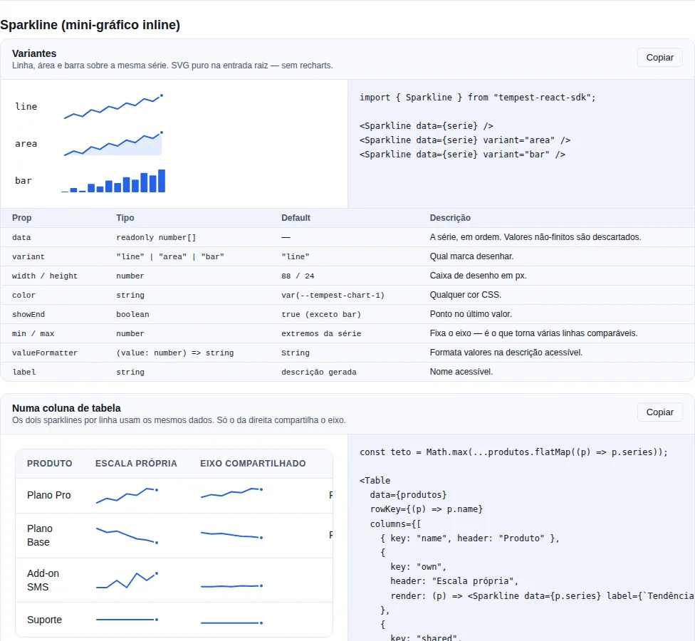
Section sparkline of the gallery — run it locally to interact.
When to use it: show the shape of a series next to the number it explains — a table cell, a metric card, a list row. It is not a chart replacement: if the reader needs to read values off an axis, use
LineChart.
A sparkline is plain SVG on the root entry, no recharts. A trend column in a table should not oblige an app to install a whole charting library.
import { formatCurrency, Sparkline, Table } from "tempest-react-sdk";

const products = [
  { name: "Pro plan", revenue: 48200, series: [12, 18, 15, 24, 22, 31, 29] },
  { name: "Base plan", revenue: 19400, series: [22, 19, 20, 17, 14, 13, 11] },
];

export function TrendByProduct() {
  return (
    <Table
      data={products}
      columns={[
        { key: "name", header: "Product" },
        {
          key: "series",
          header: "7 days",
          render: (row) => (
            <Sparkline data={row.series} label={`${row.name} trend`} />
          ),
        },
        { key: "revenue", header: "Revenue", render: (r) => formatCurrency(r.revenue) },
      ]}
      rowKey={(row) => row.name}
    />
  );
}
Variants
import { Sparkline } from "tempest-react-sdk";

const serie = [4, 6, 5, 9, 12, 10, 14];

export function Variantes() {
    return (
        <>
            <Sparkline data={serie} />
            <Sparkline data={serie} variant="area" />
            <Sparkline data={serie} variant="bar" />
        </>
    );
}
| Prop | Type | Default | What it does |
|---|---|---|---|
data |
readonly number[] |
— | The series, in order. Non-finite entries are dropped. |
variant |
"line" \| "area" \| "bar" |
"line" |
Which mark to draw. |
width |
number |
88 |
Drawing width in px. |
height |
number |
24 |
Drawing height in px. |
color |
string |
var(--tempest-chart-1) |
Any CSS colour. |
showEnd |
boolean |
true (except in "bar") |
Marks the last point with a dot. |
min / max |
number |
the series extremes | Pins the value axis — this is what makes several rows comparable. |
valueFormatter |
(value: number) => string |
String |
How to render a value in the accessible description. |
label |
string |
generated description | Accessible name. |
Comparing rows requires a shared axis
By default each sparkline normalises against its own extremes. In a table column that is a trap: a row going from 2 to 4 and one going from 200 to 400 draw exactly the same shape.
import { Sparkline } from "tempest-react-sdk";

interface Produto {
    id: string;
    serie: number[];
}

export function MesmaEscala({ produtos }: { produtos: Produto[] }) {
    const teto = Math.max(...produtos.flatMap((produto) => produto.serie));

    return (
        <>
            {produtos.map((produto) => (
                <Sparkline key={produto.id} data={produto.serie} min={0} max={teto} />
            ))}
        </>
    );
}
Without min/max the shape is relative — never comparable
Pass both when sparklines are stacked. It is the most common mistake with this component, and it raises no warning at all: the charts look fine and lie.
Accessibility
The component carries role="img" and an aria-label that describes the series in words: point count, direction, extremes and both ends.
"7 pontos, subindo. Início 12, fim 29. Mínimo 12, máximo 31."
A sparkline has no axis and no legend to fall back on — without that sentence it is an unnamed image, and a screen reader reaches it and reads nothing. Pass label when the surrounding text already says what is plotted.
The shape is context, never the only path to the value
Always place the sparkline next to the number it annotates. It answers "is it going up?", not "by how much?".
A series with holes does not blank the chart
A NaN inside a d attribute silently voids the whole path — the chart vanishes with no error. Non-finite values are filtered out before projection.
A flat series is centred
A series with no variation is drawn in the middle of the box, not pinned to an edge. That is the honest reading of "it did not move", and it avoids dividing by a zero-height domain.
Recap
| Component | Use for | Typical volume |
|---|---|---|
Table<T> |
Compare records in columns | tens to hundreds |
VirtualList |
Scroll long fixed-height lists | 500+ items |
VirtualTable<T> |
Scrollable grid of rows in columns | thousands of rows |
ListTile |
A list row (icon + title + action) | any |
Accordion |
On-demand expandable sections (FAQ, steps) | a few sections |
Timeline |
A sequence of events over time | any |
TreeView |
Navigable hierarchy (categories, permissions) | tens to hundreds |
Sparkline |
The shape of a series next to the number it explains | 5 to ~100 points |
Key accessibility points:
Tableuses<th scope="col">(already included);onRowClickappliesrole="button"+tabIndex={0}.TableandVirtualListtake a tab stop of their own while they scroll (role="group"/role="list"+tabIndex={0}), and drop it once the content fits. Without it the container holds nothing focusable and a keyboard user can see the scrollbar with no way to move it. Name it withscrollLabel(Table) orlabel(VirtualList) when the page holds several.VirtualList: items outside the viewport are not rendered —Ctrl+Fonly finds the visible window.VirtualTable: stays a real<table>(spacer rows instead of absolute positioning), witharia-rowcount/aria-rowindexcarrying real indices rather than window indices; sortable headers exposearia-sort.Accordion: ↑↓ switch the focused item, Home/End jump to the first/last.Timeline: semantic order via<ol>; each item is an<li>.Sparkline:role="img"with a sentence describing direction, both ends and the extremes — with no axis or legend, it is the only reading available without sight.TreeView:role="tree"+ roving tabindex (a single tab stop);aria-levelreports depth and disabled nodes are skipped while navigating.
Related: identity (Card flush to host the Table) · feedback (Badge inside cells) · actions (row buttons).