Status & feedback
Signaling state, success, error, activity. Spinners, skeletons, alerts, KPIs.
What this category is
Components that communicate state to the user — what happened, what's happening, and what isn't there. They group by intent:
- Messages (success/error/warning):
Alert(inline),Banner(top of page),Toast(transient) — three scopes of the same concept. - Status labels:
Badge(fixed status),Tag(removable chip),Stat(KPI). - Activity/loading:
Spinner,Progress,Skeleton,NProgressBar(fixed top bar). - Empty/error screen states:
EmptyState,ErrorState.
When to use: whenever the user needs to know the outcome of an action or the
state of some data. The golden rule: never leave an async action without
feedback — show Spinner/Skeleton during, Toast/Alert on completion.
Alert vs Banner vs Toast — pick by scope
Alert is inline and stays until the user resolves the context. Banner is
persistent at the top and applies to the whole page/app. Toast is
transient and dismisses itself. Use Toast for quick confirmations, Alert
for errors tied to a field/section, Banner for global notices
(maintenance, expiration).
Alert
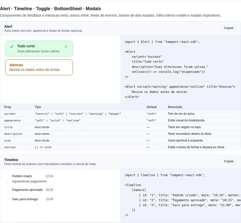
Section feedback-extra of the gallery — run it locally to interact.
When to use: a message tied to a specific context on the screen (form error, result of an operation in a section). Visible until the condition changes.
An inline banner. Different from Banner (top-of-page) and Toast (transient).
import { useState } from "react";
import { Alert } from "tempest-react-sdk";
import { AlertCircle } from "lucide-react";

export function Avisos() {
    const [open, setOpen] = useState(true);

    return (
        <>
            <Alert variant="success" appearance="soft" title="Saved">
                Your changes were applied successfully.
            </Alert>

            {open && (
                <Alert
                    variant="danger"
                    appearance="outline"
                    icon={<AlertCircle size={16} />}
                    onClose={() => setOpen(false)}
                >
                    Could not process the payment.
                </Alert>
            )}
        </>
    );
}
| Prop | Type | Default |
|---|---|---|
variant |
"neutral" \| "info" \| "success" \| "warning" \| "danger" |
"info" |
appearance |
"soft" \| "solid" \| "outline" |
"soft" |
title |
ReactNode |
— |
icon |
ReactNode |
— |
description |
ReactNode |
— |
onClose |
() => void (renders the close button) |
— |
closeLabel |
string |
— |
A11y: role="status" for info/success, role="alert" for warning/danger.
Banner
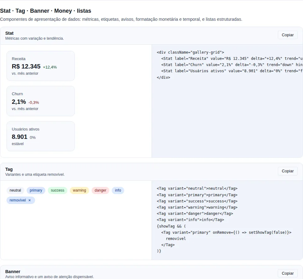
Section data-display of the gallery — run it locally to interact.
Persistent, top-of-page. Use it for environment indicators, maintenance, expiration.
import { useState } from "react";
import { Banner, Button } from "tempest-react-sdk";

export function AvisoDeAssinatura() {
    const [open, setOpen] = useState(true);
    if (!open) return null;

    return (
        <Banner
            variant="warning"
            dismissible
            onDismiss={() => setOpen(false)}
            action={<Button size="sm">Renew</Button>}
        >
            Your subscription expires in 3 days.
        </Banner>
    );
}
Same variants as Alert.
Badge
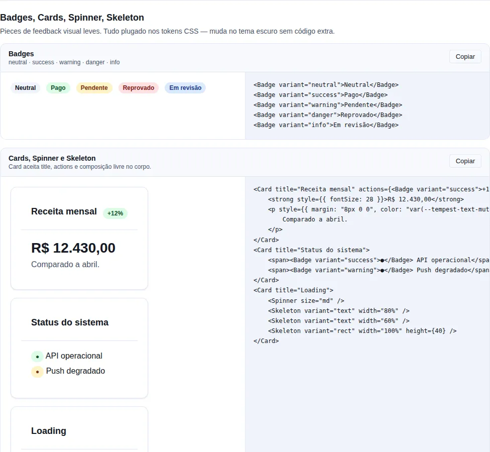
Section feedback of the gallery — run it locally to interact.
When to use: a short, read-only status label next to an item (order status,
count). For a chip the user removes, use Tag.
Status pill — not removable.
import { Badge } from "tempest-react-sdk";

export function Selos() {
    return (
        <>
            <Badge>Default</Badge>
            <Badge variant="success">Paid</Badge>
            <Badge variant="danger" appearance="solid">
                Overdue
            </Badge>
            <Badge variant="warning" appearance="outline" shape="square">
                Pending
            </Badge>
            <Badge variant="info" dot>
                3
            </Badge>
        </>
    );
}
| Prop | Type | Default |
|---|---|---|
variant |
"neutral" \| "primary" \| "success" \| "warning" \| "danger" \| "info" |
"neutral" |
appearance |
"soft" \| "solid" \| "outline" |
"soft" |
shape |
"pill" \| "square" |
"pill" |
size |
"sm" \| "md" \| "lg" |
"md" |
dot |
boolean (status indicator + number) |
false |
Tag
A removable chip. Use it for filter tokens, applied filters, selected entities.
import { Tag } from "tempest-react-sdk";

export function Filtros({ removeFilter }: { removeFilter: (key: string) => void }) {
    return (
        <>
            <Tag onRemove={() => removeFilter("sp")} variant="primary">
                São Paulo
            </Tag>
            <Tag size="sm">In stock</Tag>
        </>
    );
}
| Prop | Type | Default |
|---|---|---|
variant |
"neutral" \| "primary" \| "success" \| "warning" \| "danger" \| "info" |
"neutral" |
size |
"sm" \| "md" \| "lg" |
"md" |
onRemove |
() => void |
— |
removeLabel |
string (a11y) |
"Remover" |
Stat
When to use: highlight a single metric with its delta (revenue, sessions,
NPS) on dashboards. For several KPIs side by side, combine with Grid.
A KPI card for dashboards.
import { Stat } from "tempest-react-sdk";
import { TrendingUp } from "lucide-react";

export function Metricas() {
    return (
        <>
            <Stat
                label="Revenue"
                value="R$ 12.345"
                delta="+12,4%"
                hint="vs. previous month"
                icon={<TrendingUp size={16} />}
            />
            <Stat label="Sessions" value="1.2k" delta="-3%" hint="last 7 days" />
            <Stat label="NPS" value="78" delta="0" trend="flat" />
        </>
    );
}
| Prop | Type | Default |
|---|---|---|
label |
ReactNode |
— |
value |
ReactNode |
— |
delta |
ReactNode |
— |
trend |
"up" \| "down" \| "flat" |
inferred from +/- in the delta string |
hint |
ReactNode |
— |
icon |
ReactNode |
— |
Progress
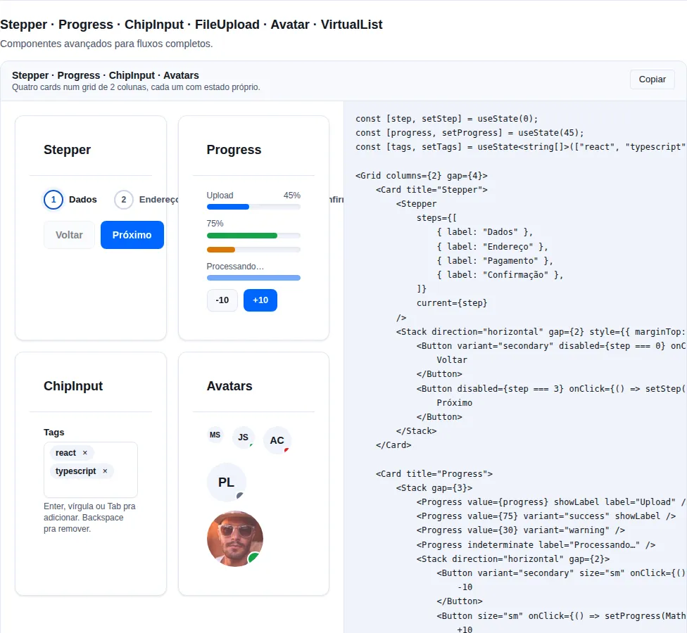
Section advanced of the gallery — run it locally to interact.
Progress bar.
import { Progress } from "tempest-react-sdk";

export function Barras({ uploadProgress }: { uploadProgress: number }) {
    return (
        <>
            <Progress value={uploadProgress} max={100} variant="primary" />
            <Progress value={100} variant="success" />
            <Progress indeterminate variant="primary" />
        </>
    );
}
| Prop | Type | Default |
|---|---|---|
value |
number |
— |
max |
number |
100 |
variant |
"primary" \| "success" \| "danger" |
"primary" |
indeterminate |
boolean |
false |
NProgress
When to use: a fixed top loading bar for transitions with no exact position —
route navigation, background requests. For deterministic upload progress, prefer
Progress.
An imperative controller (nprogress) + the visual bar (<NProgressBar>). Mount
the bar once near the app root and drive the controller from anywhere (router
transitions, fetch interceptors).
import { Button, NProgressBar, nprogress } from "tempest-react-sdk";

async function loadPage(): Promise<void> {
    nprogress.start();
    try {
        await fetch("/api/data");
    } finally {
        nprogress.done();
    }
}

export function Raiz() {
    return (
        <>
            <NProgressBar color="var(--tempest-primary)" height={3} />
            <Button onClick={loadPage}>Load</Button>
        </>
    );
}
nprogress |
Signature | What it does |
|---|---|---|
start |
() => void |
Shows the bar and starts trickling toward ~0.9. |
done |
() => void |
Completes to 1 and hides the bar shortly after. |
set |
(n: number) => void |
Sets progress explicitly (clamped 0..1). |
inc |
(amount?: number) => void |
Increments progress by amount. |
Prop (NProgressBar) |
Type | Default |
|---|---|---|
color |
string |
var(--tempest-primary) |
height |
number |
3 |
className |
string |
— |
Great with router navigation
Call nprogress.start() when a transition begins and nprogress.done() when
the route mounts. nprogress is a module-level singleton — no provider or
props drilling needed.
A11y: the bar uses role="progressbar" with aria-valuenow reflecting the
percentage.
Spinner
A generic loader.
import { Spinner } from "tempest-react-sdk";

export function Carregando() {
    return (
        <>
            <Spinner />
            <Spinner size="lg" />
            <Spinner size="lg" caption="Loading…" />
            <Spinner overlay caption="Loading…" />
        </>
    );
}
| Prop | Type | Default | Description |
|---|---|---|---|
size |
"xs" \| "sm" \| "md" \| "lg" \| "xl" |
"md" |
Indicator size. |
label |
string |
"Carregando" |
Accessible label (screen readers). |
caption |
ReactNode |
— | Visible text under the spinner. |
overlay |
boolean |
false |
Centers inside a full-area container (position: absolute). |
Back-compat
<Spinner /> with no caption/overlay stays a single <span role="status"> — existing usage is unchanged.
overlay positions against the nearest positioned ancestor
overlay applies position: absolute; inset: 0, so it covers the first
ancestor whose position is not static. If nothing above it is positioned,
the spinner escapes to the topmost positioned container — in practice, the
whole page. Give position: relative to the block that should be covered.
Skeleton
When to use: loading content whose shape is already known (cards, table
rows, avatar). It reduces layout shift. For shapeless loading (a button
processing), use Spinner.
A placeholder with shimmer while data loads.
Skeleton mirrors the final layout
Give the skeleton the same dimensions/proportions as the real content — that is what eliminates layout shift when the data arrives. Skeletons that are too generic (a single block) confuse more than they help.
import { Skeleton, Stack } from "tempest-react-sdk";

export function Esqueleto({ loading }: { loading: boolean }) {
    if (loading) {
        return (
            <Stack gap={2}>
                <Skeleton variant="text" width="60%" />
                <Skeleton variant="text" width="40%" />
                <Skeleton variant="rect" height={120} />
                <Skeleton variant="circle" width={40} height={40} />
            </Stack>
        );
    }
    return <p>Loaded content</p>;
}
| Prop | Type | Default |
|---|---|---|
variant |
"rect" \| "text" \| "circle" |
"rect" |
width |
number \| string |
"100%" |
height |
number \| string |
— |
The skeleton has to have the shape of the real content
The value of Skeleton is not the animation, it is the reserved space: if
the ghost lines are close to the width and height of what lands there, the
text does not jump when the data arrives. A generic 200px block that becomes a
340px card trades a spinner for a layout shift — the very problem the skeleton
existed to solve.
RefreshIndicator
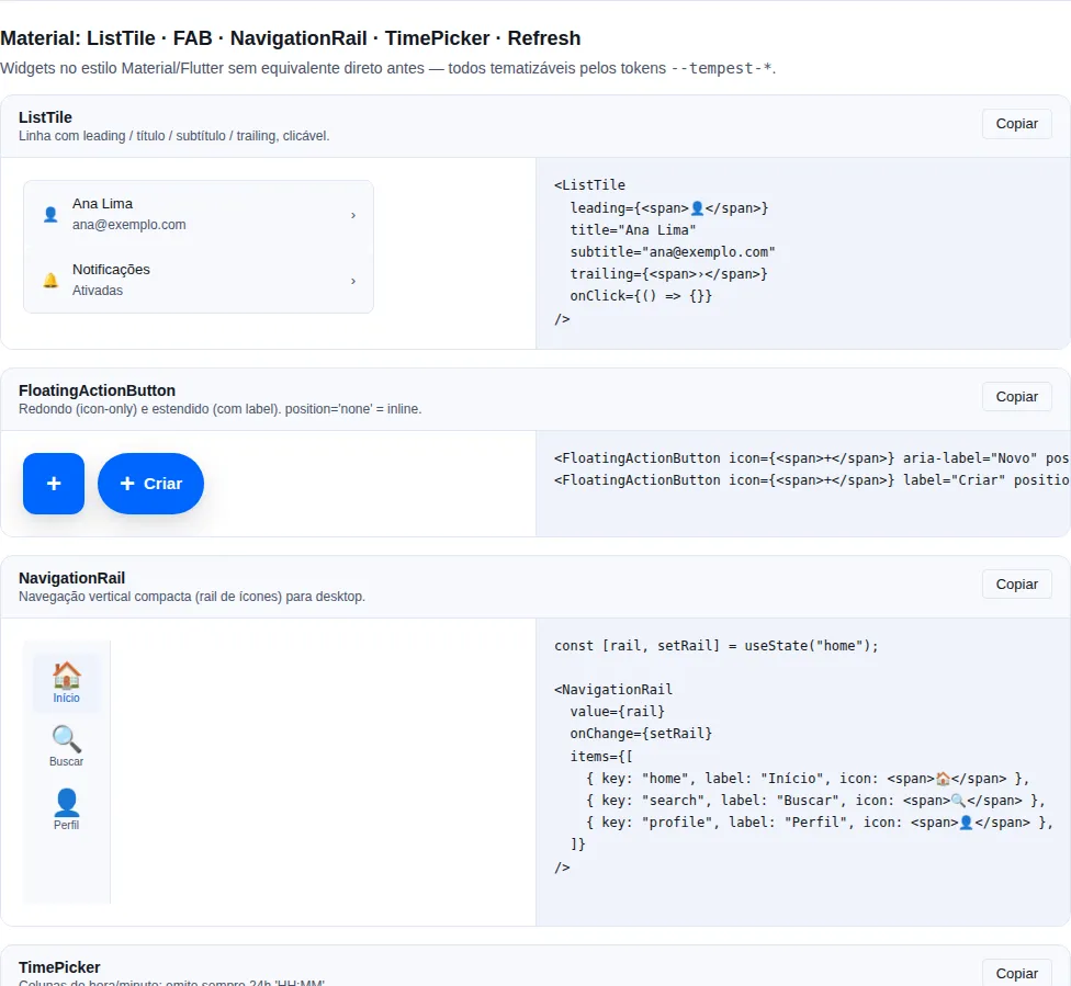
Section material of the gallery — run it locally to interact.
When to use: give the user a pull-to-refresh gesture on scrollable
mobile lists/screens (touch) — feeds, inboxes, dashboards. It wraps the
scrollable content and fires onRefresh when the user pulls past the threshold
and releases.
It is a touch gesture — there's no mouse equivalent. The SDK Spinner shows
while pulling and during the refresh.
import { RefreshIndicator } from "tempest-react-sdk";

interface FeedItem {
    id: string;
    title: string;
}

export function Feed({ items, refetch }: { items: FeedItem[]; refetch: () => Promise<void> }) {
    return (
        <RefreshIndicator onRefresh={refetch}>
            <ul>
                {items.map((item) => (
                    <li key={item.id}>{item.title}</li>
                ))}
            </ul>
        </RefreshIndicator>
    );
}
| Prop | Type | Default |
|---|---|---|
onRefresh |
() => void \| Promise<void> |
— |
children |
ReactNode (scrollable area) |
— |
threshold |
number (px before firing) |
80 |
disabled |
boolean |
false |
Touch-only gesture
RefreshIndicator listens for touch drags that start with the container
scrolled to the top — it doesn't respond to the mouse. On desktop, offer an
explicit "Refresh" button as a fallback.
Toast
When to use: a transient confirmation of an action that already finished
("Saved", "Item removed") — it needs no attention and dismisses itself. For
errors the user must resolve, prefer Alert/Banner (which stay).
Transient notifications. Set up via ToastProvider + use via useToast().
Toast is not for critical errors
Toasts disappear in a few seconds — if the user must act on the message
(fix a field, retry), it has to persist. Use Toast only for dismissible
feedback; actionable errors go in Alert/ErrorState.
import { ToastProvider, useToast } from "tempest-react-sdk";

function Salvar() {
    const toast = useToast();

    return (
        <button
            onClick={() => {
                toast.success("Saved");
                toast.error("Could not process the payment.", { duration: 8000 });
                toast.show({
                    title: "Sync",
                    description: "In progress…",
                    variant: "info",
                });
            }}
        >
            Save
        </button>
    );
}

export function App() {
    return (
        <ToastProvider position="top-right" defaultDuration={4000}>
            <Salvar />
        </ToastProvider>
    );
}
ToastApi |
Signature |
|---|---|
show |
(options: ToastOptions) => string (returns id) |
success |
(description, options?) => string |
error |
(description, options?) => string |
warning |
(description, options?) => string |
info |
(description, options?) => string |
dismiss |
(id: string) => void |
ToastProvider.position: "top-right" (default), "top-left", "top-center",
"bottom-right", "bottom-left", "bottom-center".
Safe-area aware.
Icon and alignment
ToastOptions.icon takes any ReactNode — usually an app asset — and renders it
in its own column to the left of the text. An <img> or <svg> inside it is
capped at 32px without being distorted, at any depth. A node that renders
nothing (null, false, [], an empty fragment) counts as no icon.
import { ToastProvider, useToast } from "tempest-react-sdk";

function Achievement() {
    const toast = useToast();

    return (
        <button
            onClick={() =>
                toast.show({
                    icon: <img src={"/assets/invict.svg"} alt="" />,
                    title: "Undefeated title unlocked!",
                    variant: "success",
                    duration: 4000,
                    align: "center",
                })
            }
        >
            Unlock
        </button>
    );
}

export function App() {
    return (
        <ToastProvider>
            <Achievement />
        </ToastProvider>
    );
}
| Option | Type | Default | What it does |
|---|---|---|---|
icon |
ReactNode |
— | Slot to the left of the text, for an icon. inert; decorative (aria-hidden) without iconLabel. |
iconLabel |
string |
— | Accessible name for the icon: the slot becomes role="img" and is announced with the toast. |
align |
"start" \| "center" |
"start" |
Alignment of the title and description. |
The icon is decorative by default because it almost always repeats the title
("Undefeated title unlocked!" beside the medal). Otherwise an unlabelled image
inside the aria-live region would be read as "image" or by its file name. When
the icon carries information the text does not, pass iconLabel — no need to
touch the asset's alt.
The slot is for an icon, not a control: the wrapper is inert, so a button
or link placed there gets neither focus nor clicks. An action on the notification
lives outside the toast — if the user must act, use Alert.
Why the text is not centred by default
A toast reads as a sentence beside a close button, and it is usually stacked
with others. Left-aligned, the text shares one edge with the icon and with the
neighbouring toasts, and a two-line description stays scannable — centred,
every line starts somewhere else. align: "center" is for the short,
celebratory one-line toast, like the one in the example.
variant, duration and the queue do not change with an icon: the coloured
border still marks the variant, and a toast without an icon keeps exactly the
previous layout.
useToast only exists under a <ToastProvider>
Outside one the hook throws useToast must be used inside a
<ToastProvider>. The provider belongs at the app root, above the router — if
it sits inside a route, any toast fired from outside that route takes the
screen down instead of showing up.
EmptyState
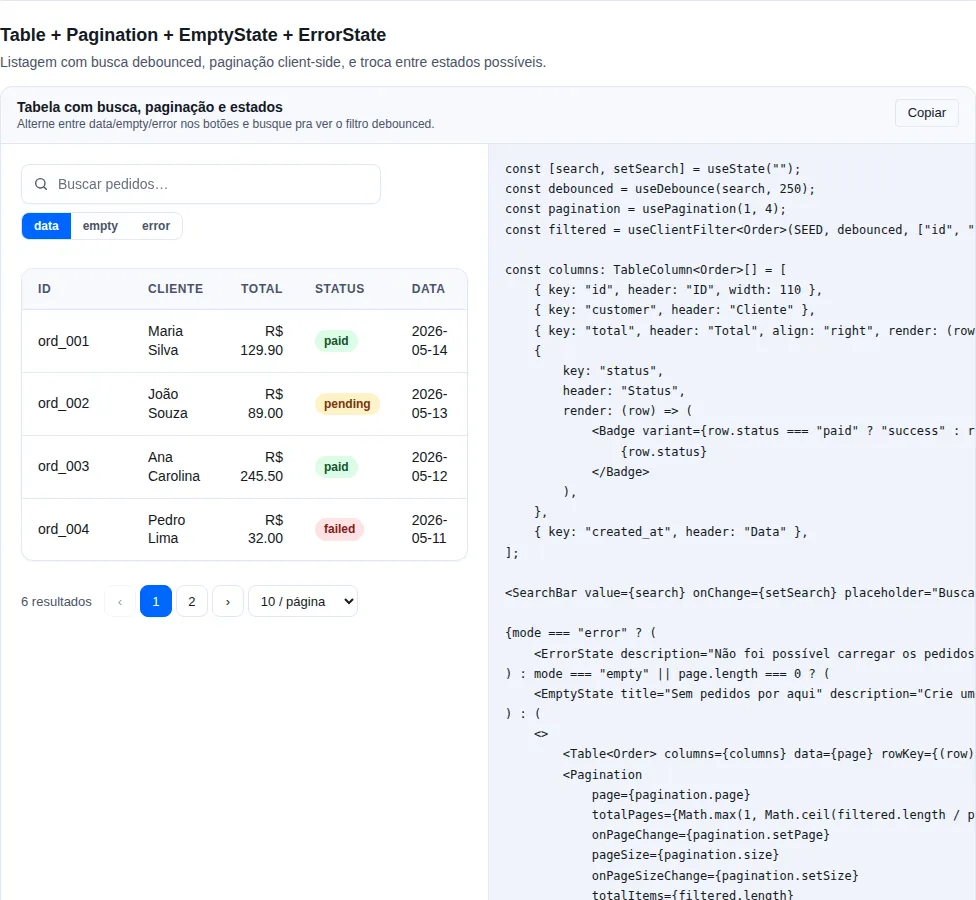
Section table of the gallery — run it locally to interact.
When to use: a list/collection returned zero items successfully (no
orders yet, search with no results). Always offer a way out (create the first
item, clear filters). Don't confuse it with an error — for a failure use
ErrorState.
A centered "nothing here".
import { Button, EmptyState } from "tempest-react-sdk";
import { Inbox, Plus } from "lucide-react";

export function SemPedidos() {
    return (
        <EmptyState
            icon={<Inbox size={32} />}
            title="No orders yet"
            description="When your customers place orders, they show up here."
            action={<Button leftIcon={<Plus size={16} />}>New order</Button>}
        />
    );
}
An empty state is not an error state
EmptyState is for "the query worked and there is nothing" — the suggested
action creates the first record. ErrorState is for "the query failed", and
the action is try again. Swapping one for the other makes the user create
a duplicate order when what actually broke was the network.
ErrorState
When to use: an operation failed (a request errored, an exception) and
the user can retry. Unlike EmptyState, which represents success with no data.
A failure with a retry button.
import { ErrorState } from "tempest-react-sdk";

export function FalhaAoCarregar({
    error,
    refetch,
}: {
    error: unknown;
    refetch: () => void;
}) {
    return (
        <ErrorState
            title="Could not load"
            description={String(error)}
            onRetry={refetch}
        />
    );
}
OfflineIndicator
When to use: warn that the app is offline and confirm when the connection returns. Driven by useOnline — renders nothing while online, so mount it at the root without an if.
import { OfflineIndicator } from "tempest-react-sdk";

export function Raiz() {
    return <OfflineIndicator position="top" />;
}
position: "top" | "bottom" (default). Pass children to replace the body, or onlineFlashMs={0} to skip the confirmation flash. See PWA & Offline-First.
SyncStatusBadge
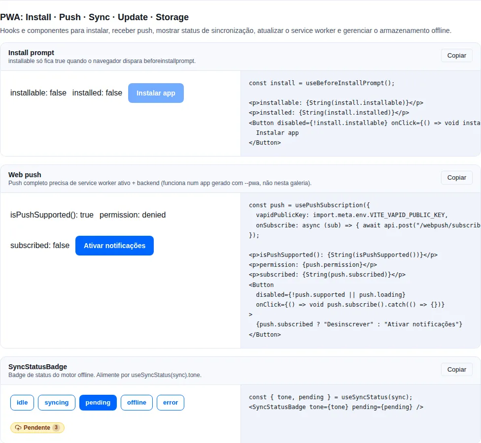
Section pwa of the gallery — run it locally to interact.
When to use: show the offline engine state (synced / syncing / pending / offline / error). Two modes: pass sync to connect straight to the engine (zero wiring), or pass an explicit tone (presentational, testable without IndexedDB).
import { SyncStatusBadge, useSyncStatus, type OfflineSync } from "tempest-react-sdk";

interface Nota {
    id: string;
    body: string;
}

export function Status({ notesSync }: { notesSync: OfflineSync<Nota> }) {
    const { tone, pending } = useSyncStatus(notesSync);

    return (
        <>
            <SyncStatusBadge sync={notesSync} />
            <SyncStatusBadge tone={tone} pending={pending} />
        </>
    );
}
tone: "idle" | "syncing" | "pending" | "offline" | "error". iconOnly hides the label; labels overrides the per-tone text.
UpdatePrompt
When to use: announce a new app version (service worker) and let the user reload. Pairs with useServiceWorkerUpdate.
import { UpdatePrompt, useServiceWorkerUpdate } from "tempest-react-sdk";

export function AvisoDeAtualizacao() {
    const { updateAvailable, applyUpdate } = useServiceWorkerUpdate({ url: "/sw.js" });

    return <UpdatePrompt open={updateAvailable} onUpdate={applyUpdate} />;
}
Renders nothing when open={false}. onDismiss (optional) shows the dismiss button; position "top"/"bottom".
General A11y
Alert/Bannerwith thewarning/dangervariant userole="alert"(announced immediately).- The
Toastcontainer isaria-live="polite"+aria-atomic="false"— only the new toast is announced, not the whole stack. An icon withouticonLabelisaria-hidden. Spinner/Progress.indeterminateaddaria-busy="true".Skeletonis decorative — it doesn't announce (aria-hidden).Stat.valuewith tabular-nums aligns numeric values in columns.
Recap
- Never leave an async action without feedback:
Spinner/Skeletonduring,Toast/Alerton completion. - Messages by scope:
Alert(inline/contextual),Banner(global/top),Toast(transient). EmptyState= success with no data;ErrorState= failure with retry. Don't swap one for the other.Toastonly for dismissible feedback; actionable errors stay inAlert/ErrorState.
Related pages:
- Data entry —
erroron form fields, complementary to a sectionAlert. - Data —
Table/DataTablethat pair withSkeleton(loading) andEmptyState/ErrorState. - Overlays —
ConfirmDialogfor destructive actions that need confirmation before theToast. - Layout —
Gridto lay out multipleStats;Centerfor a full-screenSpinner.