Advanced: navigation & content
Navigation with dropdowns, a menu bar and a carousel. Three ways to take someone elsewhere, or to show more than fits on screen.
NavigationMenu
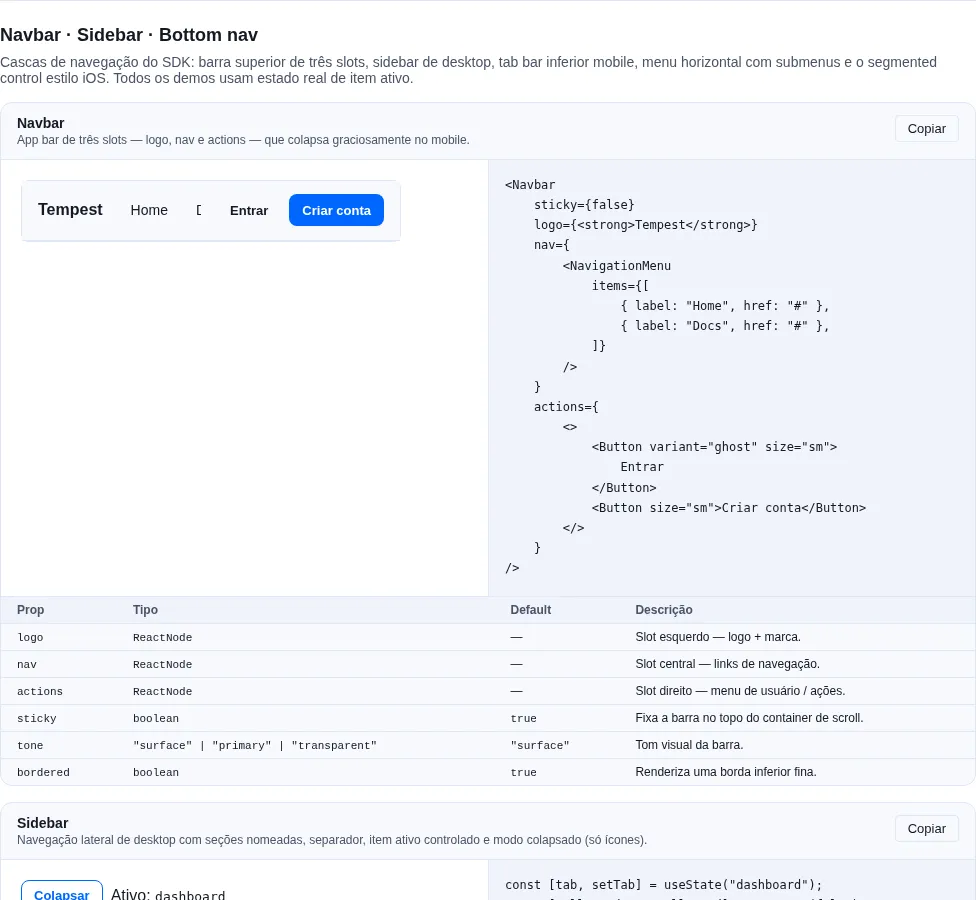
Section nav-extra of the gallery — run it locally to interact.
Horizontal navigation menu with hover/click/focus dropdown submenus. Top-level items render in <nav><ul>; items with children open a role="menu" panel. Only one panel is open at a time.
import { NavigationMenu } from "tempest-react-sdk";

<NavigationMenu
  items={[
    { label: "Home", href: "/" },
    {
      label: "Products",
      children: [
        { label: "Analytics", href: "/analytics" },
        { label: "Billing", onSelect: () => openBilling() },
      ],
    },
  ]}
/>;
| Prop | Type | Default | Description |
|---|---|---|---|
items |
NavigationMenuItem[] |
— | Top-level navigation entries |
portal |
boolean |
true |
Panel in document.body |
The panel opens in a portal — because of Navbar
Navbar's nav slot scrolls horizontally (overflow-x: auto), and by the
CSS rules that forces overflow-y to auto: an in-flow panel was clipped
entirely, measured in Chrome at 1440 px. In a portal it escapes, stays right
after its trigger in the tab order and flips at the screen edge.
portal={false} brings back the in-flow panel. The same holds for Menubar.
NavigationMenuItem = { label: ReactNode; href?: string; onSelect?: () => void; children?: NavigationMenuItem[] }.
Closing
Closes on outside click, Escape, or selecting a leaf entry.
Menubar
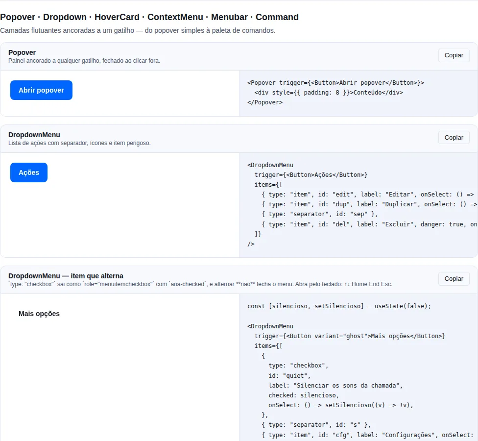
Section overlays of the gallery — run it locally to interact.
Application menubar (File / Edit-style). role="menubar"; each menu is a button that opens a dropdown. Arrow Left/Right move between menus (wrapping).
import { Menubar } from "tempest-react-sdk";

<Menubar
  menus={[
    {
      label: "File",
      items: [
        { label: "New", shortcut: "⌘N", onSelect: () => create() },
        { separator: true },
        { label: "Quit", onSelect: () => quit() },
      ],
    },
  ]}
/>;
| Prop | Type | Default | Description |
|---|---|---|---|
menus |
MenubarMenu[] |
— | Top-level menus rendered left-to-right |
portal |
boolean |
true |
Panel in document.body |
MenubarMenu = { label: ReactNode; items: MenubarItem[] }. MenubarItem = { label: ReactNode; onSelect?: () => void; disabled?: boolean; shortcut?: string } or { separator: true }.
Carousel
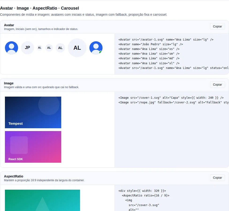
Section display-media of the gallery — run it locally to interact.
Horizontal content slider showing one slide at a time. The track translates by the active index. Prev/next arrows (disabled at the ends unless loop) and dot indicators. Controlled (index) or uncontrolled (defaultIndex).
import { Carousel } from "tempest-react-sdk";

<Carousel loop showArrows showDots>
  <img src="/1.jpg" alt="" />
  <img src="/2.jpg" alt="" />
  <img src="/3.jpg" alt="" />
</Carousel>;
| Prop | Type | Default | Description |
|---|---|---|---|
children |
ReactNode[] |
— | Slides — one rendered at a time |
loop |
boolean |
false |
Wrap around at the ends instead of stopping |
showArrows |
boolean |
true |
Show prev/next arrow buttons |
showDots |
boolean |
true |
Show dot indicators |
index |
number |
— | Controlled active index |
defaultIndex |
number |
0 |
Initial index for uncontrolled use |
onIndexChange |
(index: number) => void |
— | Called whenever the active index changes |
Keyboard
Arrow Left/Right on the focused region navigate between slides.
Recap
- Navigation & content:
NavigationMenuandMenubarfor navigation with dropdowns,Carouselfor sliders. - All share the same controlled/uncontrolled patterns, expose keyboard A11y, and import from
tempest-react-sdk.