Gallery — visual + functional catalogue
An interactive demo of every SDK component and feature. Runs as a Vite + React
app in examples/gallery.
What is the gallery?
The gallery is a real Vite + React app that consumes the SDK exactly the way
a production app would — via an npm install pointing at file:../... It stands
in for Storybook: each section mounts components with varied props, exercises
hooks live (SSE, toast, pagination) and acts as a visual test bench whenever you
touch styles or layout. If a component looks right in the gallery, it looks right
in consumer apps.
How to run
# repo root
npm install
npm run build           # generates the SDK's dist/

cd examples/gallery
npm install
npm run dev             # http://127.0.0.1:5173
tempest-react-sdk is consumed via file:../.. — any rebuild from the root
shows up in the gallery after a reload.
Run the root npm run dev in parallel
The gallery serves the SDK's dist/. To see SDK changes instantly, keep an
npm run dev (vite build --watch) running at the root in one tab and the
gallery's npm run dev in another — each rebuild reloads the page.
Validate UI at both breakpoints
The gallery is where you check responsiveness: resize to ≤ 430px (mobile) and ≥ 1024px (desktop) before calling a visual change done. Stack/Grid/Modal/ Drawer/Table all have responsive behavior here.
Captures in the documentation pages
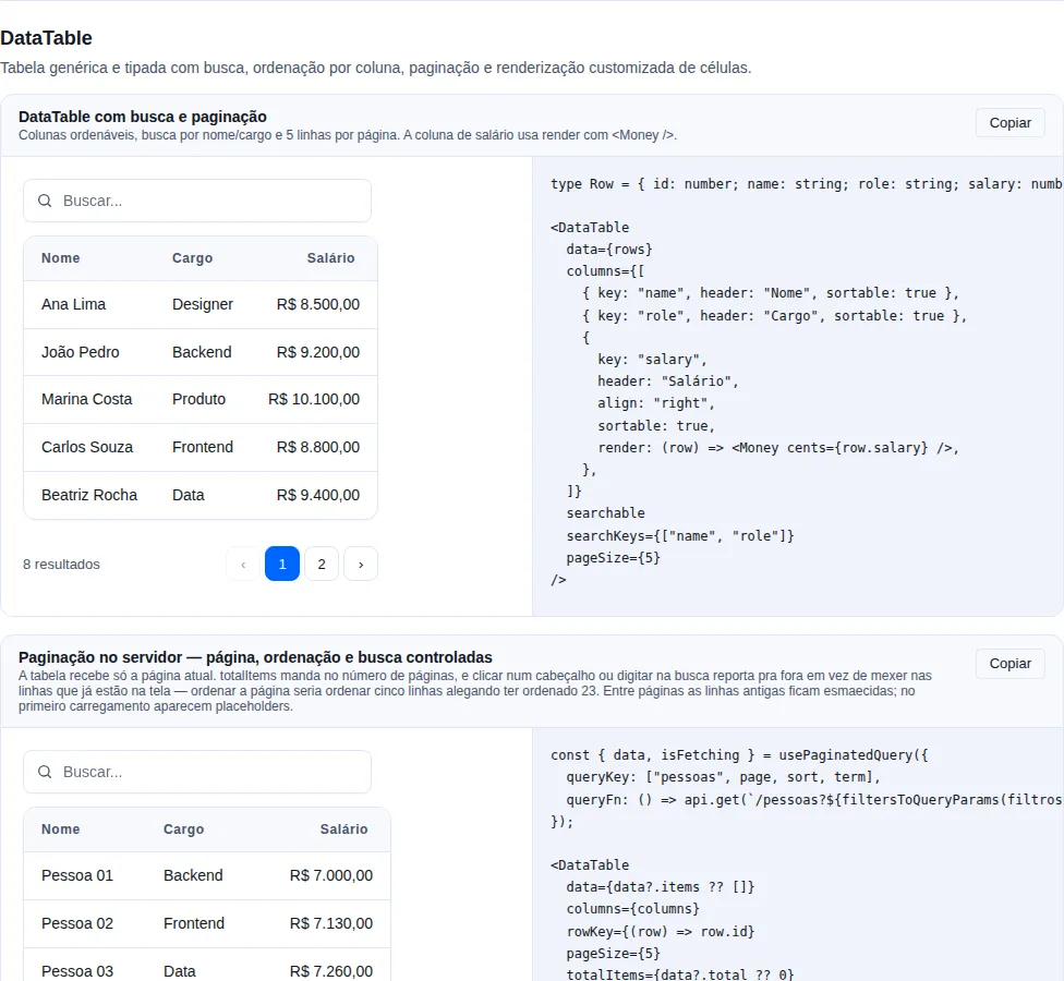
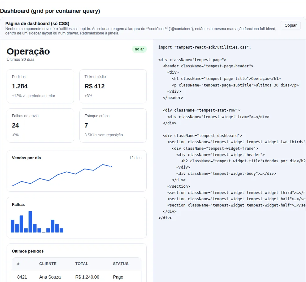
Every gallery section has a versioned capture under docs/assets/gallery/, and
that is what shows up on the component pages. Two commands keep it current:
npm run e2e:build          # build the SDK and the gallery (prerequisite)
npm run docs:shots         # capture one image per section
npm run docs:gallery       # place the images into the .md pages
docs:shots serves the gallery's production build, walks every
section.gallery-section[id] and writes docs/assets/gallery/<id>.webp. The
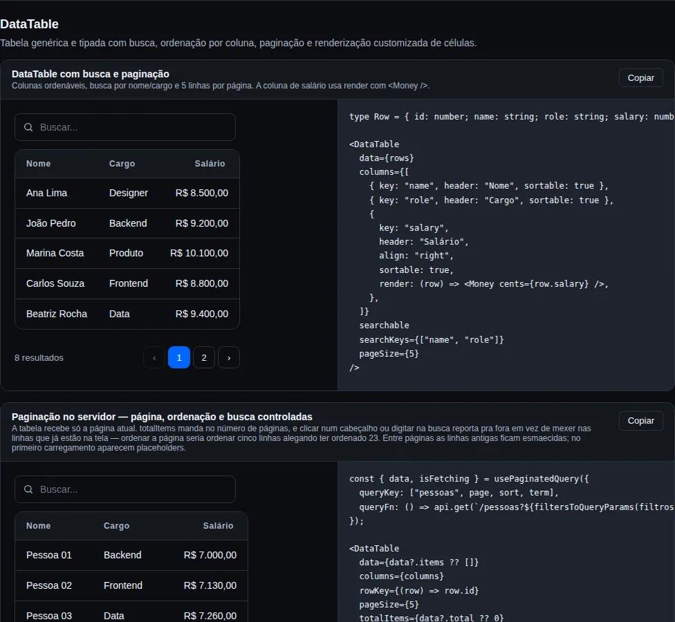
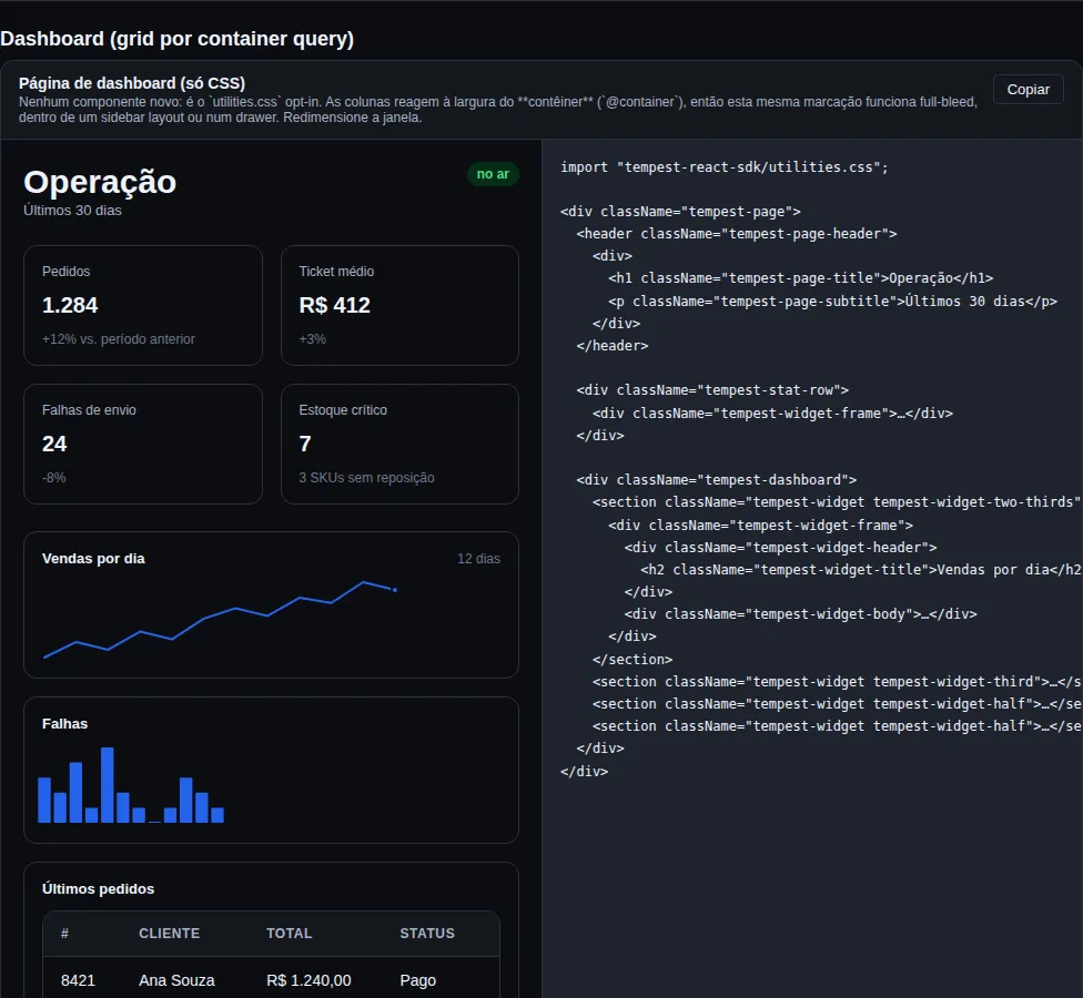
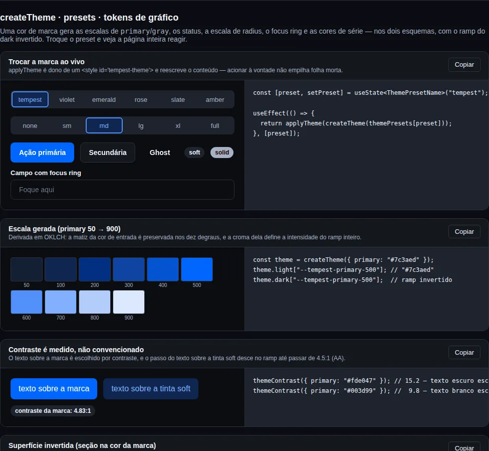
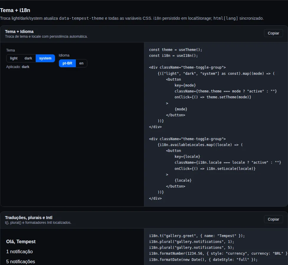
sections where the theme is the point also get an <id>.dark.webp.
Re-running does not dirty the diff
A file is only written when its bytes change. On an untouched gallery a
second run leaves git status clean — a diff shows up only when the
component actually changed.
Why versioned WebP instead of a build artifact
The image has to render on the MkDocs site and in the .md as GitHub
renders it. An artifact produced only at publish time satisfies the first
and leaves the second with a broken image. WebP halves the bytes against PNG
and is encoded by Playwright's own Chromium, with no new dependency.
docs:gallery inserts a marked block (<!-- gallery:<id> -->) under the first
component of each section across docs/components/, in both languages. Pass
--check to fail without writing — that is what the docs guard uses.
Sections
Each section is a file under examples/gallery/src/sections/ and every example is wrapped by the <Example> helper (demo + code + copy button).
| # | Section | Anchor | Group |
|---|---|---|---|
| 1 | Buttons | #buttons |
Componentes |
| 2 | Layout (AppShell · Page · Container) | #layout |
Componentes |
| 3 | Navbar · Sidebar · Bottom nav | #nav-extra |
Componentes |
| 4 | Inputs avançados (Date · Pin · Slider) | #inputs-extra |
Componentes |
| 5 | Alert · Timeline · BottomSheet | #feedback-extra |
Componentes |
| 6 | Headless & render-props | #headless |
Componentes |
| 7 | Form fields | #form-fields |
Componentes |
| 8 | Checkbox · Radio · Switch | #form-primitives |
Componentes |
| 9 | Toggle · Rating · Range · Combobox | #inputs-advanced |
Componentes |
| 10 | Badges · Cards · Skeleton | #feedback |
Componentes |
| 11 | Stat · Tag · Money · Banner | #data-display |
Componentes |
| 12 | Avatar · Image · Carousel | #display-media |
Componentes |
| 13 | Modal & Toast | #modal |
Componentes |
| 14 | Popover · Dropdown · HoverCard | #overlays |
Componentes |
| 15 | Accordion · Collapsible · Scroll | #disclosure |
Componentes |
| 16 | AppBar · Tabs · Tooltip · Drawer | #navigation |
Componentes |
| 17 | Stepper · Progress · VirtualList | #advanced |
Componentes |
| 18 | TreeView · Wizard | #hierarchy-flow |
Componentes |
| 19 | SignaturePad · Lightbox · AvatarGroup | #capture-media |
Componentes |
| 20 | ImageCropper (recorte) | #image-cropper |
Componentes |
| 21 | Table & Pagination | #table |
Componentes |
| 22 | DataTable | #data-table |
Componentes |
| 23 | VirtualTable (40k linhas) | #virtual-table |
Componentes |
| 24 | Scheduler (agenda) | #scheduler |
Componentes |
| 25 | BarList (distribuição ranqueada) | #bar-list |
Componentes |
| 26 | Sparkline (mini-gráfico inline) | #sparkline |
Componentes |
| 27 | QRCode | #qrcode |
Componentes |
| 28 | Chat | #chat |
Componentes |
| 29 | AIChat | #aichat |
Componentes |
| 30 | Mesh WebRTC (createPeerMesh) | #peer-mesh |
Componentes |
| 31 | Cadeia de voz (microfone) | #voice-chain |
Componentes |
| 32 | VideoPlayer | #video-player |
Componentes |
| 33 | Áudio (gravação) | #audio-capture |
Componentes |
| 34 | Captura de dispositivo | #device-capture |
Componentes |
| 35 | Dashboard (CSS) | #dashboard-layout |
Componentes |
| 36 | FilterBar & FilterPanel | #filterbar |
Componentes |
| 37 | Markdown | #markdown |
Componentes |
| 38 | Masonry | #masonry |
Componentes |
| 39 | Reveal | #reveal |
Componentes |
| 40 | Tour | #tour |
Componentes |
| 41 | Transfer | #transfer |
Componentes |
| 42 | CodeBlock | #codeblock |
Componentes |
| 43 | Material (ListTile · FAB · Rail) | #material |
Componentes |
| 44 | Forms (zod) | #forms |
Componentes |
| 45 | BR Forms (CPF/CNPJ/CEP) | #br-forms |
Componentes |
| 46 | Hooks — estado | #hooks-state |
Hooks |
| 47 | Hooks — DOM & timing | #hooks-dom |
Hooks |
| 48 | Network · Clipboard · Share | #meta |
Hooks |
| 49 | Formatters | #utils |
Hooks |
| 50 | HTTP client | #recipe-http |
Receitas |
| 51 | Upload resumível (tus) | #recipe-resumable-upload |
Receitas |
| 52 | Passkeys (WebAuthn) | #recipe-passkeys |
Receitas |
| 53 | Data fetching (TanStack Query) | #recipe-query |
Receitas |
| 54 | Tempo real (WebSocket) | #recipe-realtime |
Receitas |
| 55 | Geolocalização (mapas & trajetória) | #geo |
Receitas |
| 56 | Mapa do Brasil (UF + cidades) | #brazil-map |
Receitas |
| 57 | Pagamentos BR (Pix · boleto · NFe) | #br-payments |
Receitas |
| 58 | Auth & Access Control | #recipe-auth |
Receitas |
| 59 | SSE · Push · Audio | #integrations |
Receitas |
| 60 | NotificationCenter (inbox) | #notification-center |
Receitas |
| 61 | PWA: Install · Push | #pwa |
Receitas |
| 62 | Store (Zustand) | #foundation |
Fundação |
| 63 | Escalas contínuas (heatmap) | #dataviz-scales |
Fundação |
| 64 | createTheme · presets · tokens de gráfico | #theme-factory |
Fundação |
| 65 | Ícones por slug (/icons) | #icons |
Fundação |
| 66 | utilities.css (camada opt-in) | #utilities-css |
Fundação |
| 67 | Tema + i18n | #theme-i18n |
Fundação |
Variant matrix
Button
| Prop | Values |
|---|---|
variant |
primary · secondary · danger · ghost |
size |
sm · md · lg |
| Flags | loading, fullWidth, disabled |
| Slots | leftIcon, rightIcon |
Badge
variant |
Typical use |
|---|---|
neutral |
Generic tag |
success |
Paid, active, online |
warning |
Pending, degraded |
danger |
Failure, blocked |
info |
In review, beta |
Modal
| Prop | Values |
|---|---|
size |
sm · md · lg · xl |
| Flags | closeOnBackdrop, closeOnEsc, hideCloseButton |
| Slots | title, children (body), footer |
Toast (via useToast)
| Method | Variant |
|---|---|
toast.success(text) |
success |
toast.error(text) |
error |
toast.warning(text) |
warning |
toast.info(text) |
info |
toast.show({ title, description, variant, duration }) |
custom |
Table
Column (TableColumn<T>) |
Description |
|---|---|
key |
unique identifier |
header |
header label |
render(row, i) |
custom cell; default row[key] |
align |
left · right · center |
width |
string or number |
Spinner / Skeleton
Spinner size |
Skeleton variant |
|---|---|
sm · md · lg |
rect · text · circle |
Theme modes
| Mode | Behavior |
|---|---|
light |
forces light, ignores OS |
dark |
forces dark, ignores OS |
system |
listens to prefers-color-scheme, updates in real time |
Screenshots
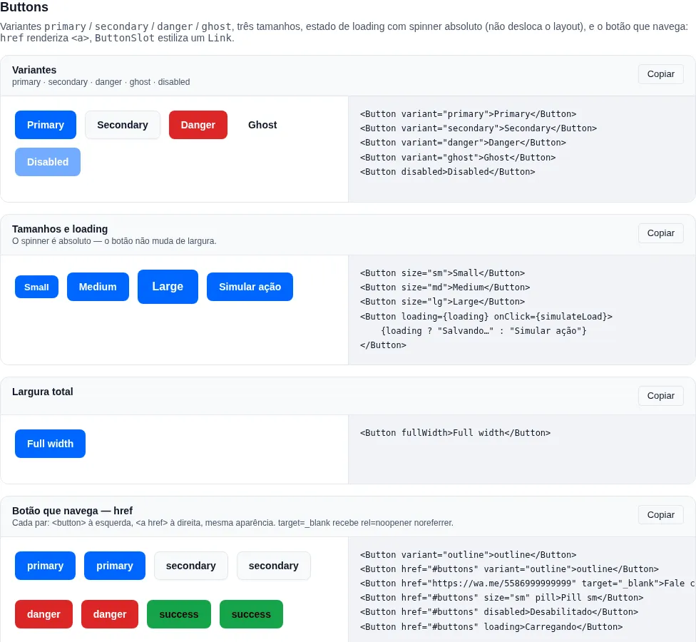
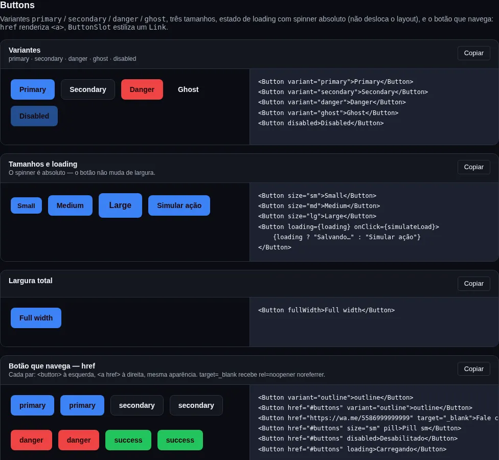
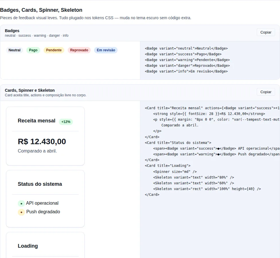
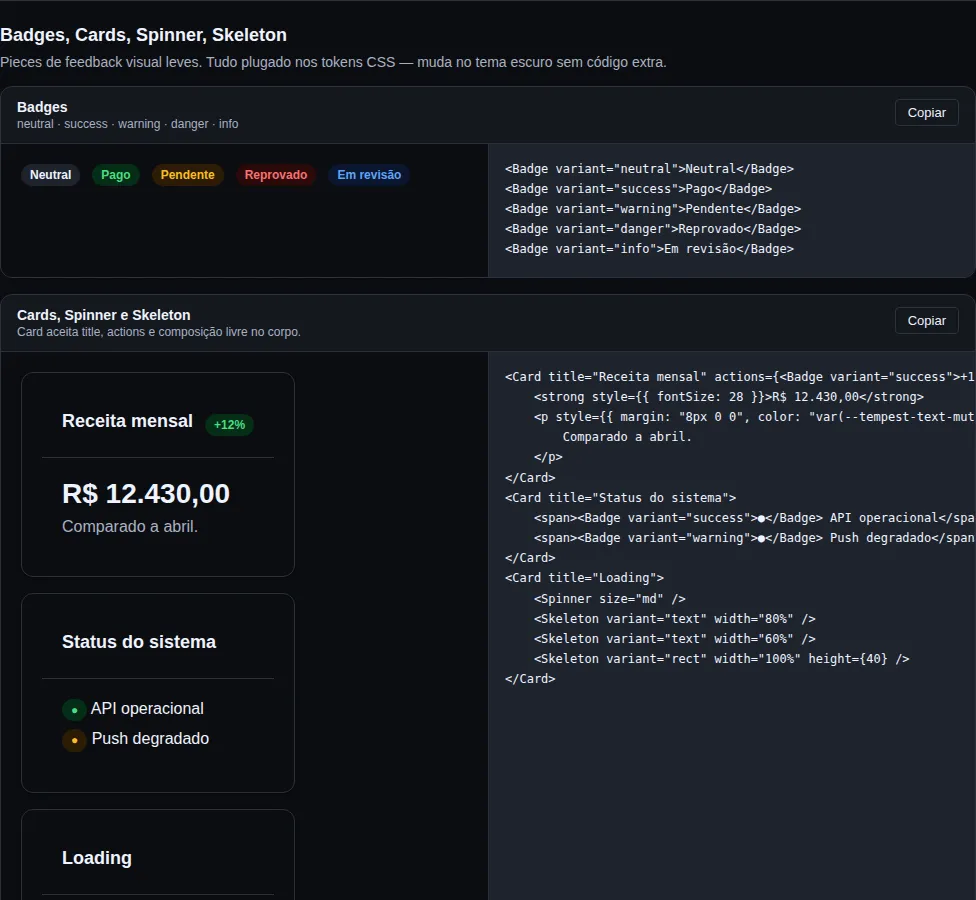
Every example sits next to its source code (with a "Copy" button), so the gallery doubles as a copy-paste reference. Captures of the running app:
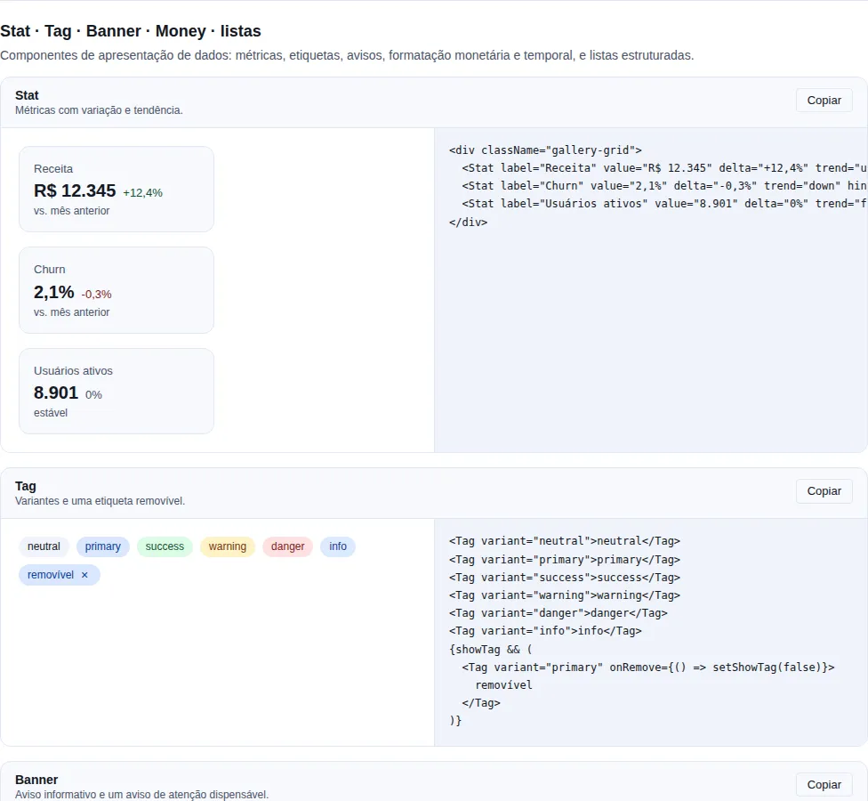
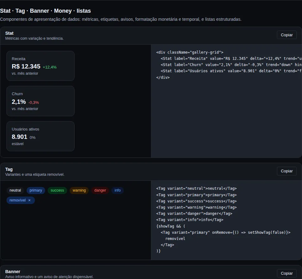
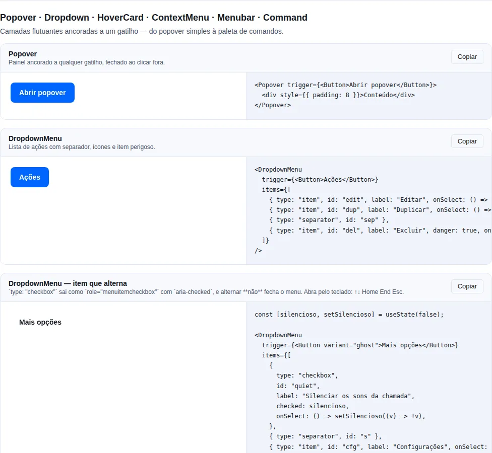
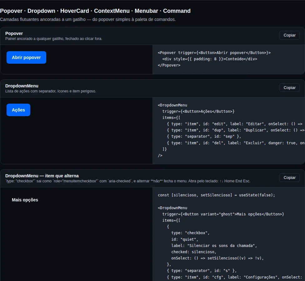
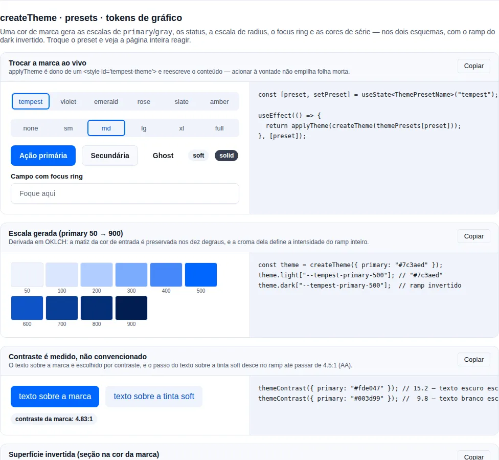
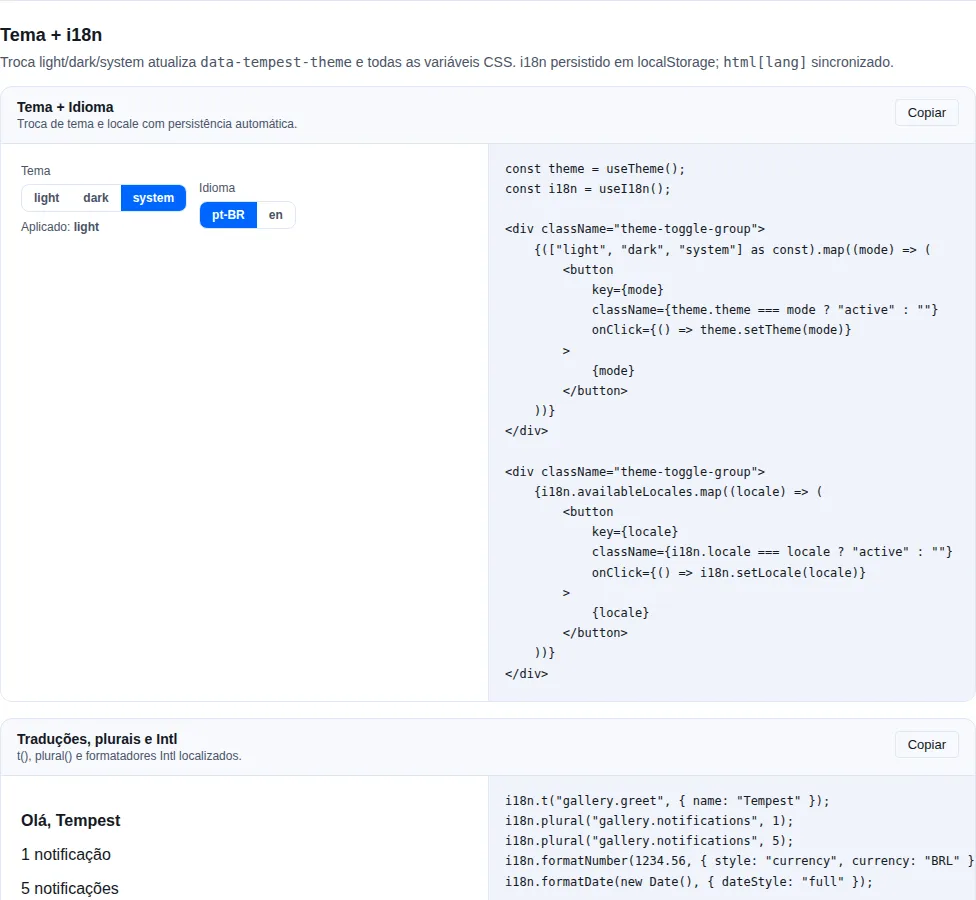
Every section has its own capture next to the component it documents; the pairs below are the ones where the theme is the point. All 77 images are regenerated by npm run docs:shots.
Buttons
Badges · Cards · Skeleton
Stat · Tag · Money · Banner
Popover · Dropdown · HoverCard
DataTable
Dashboard (CSS)
CodeBlock
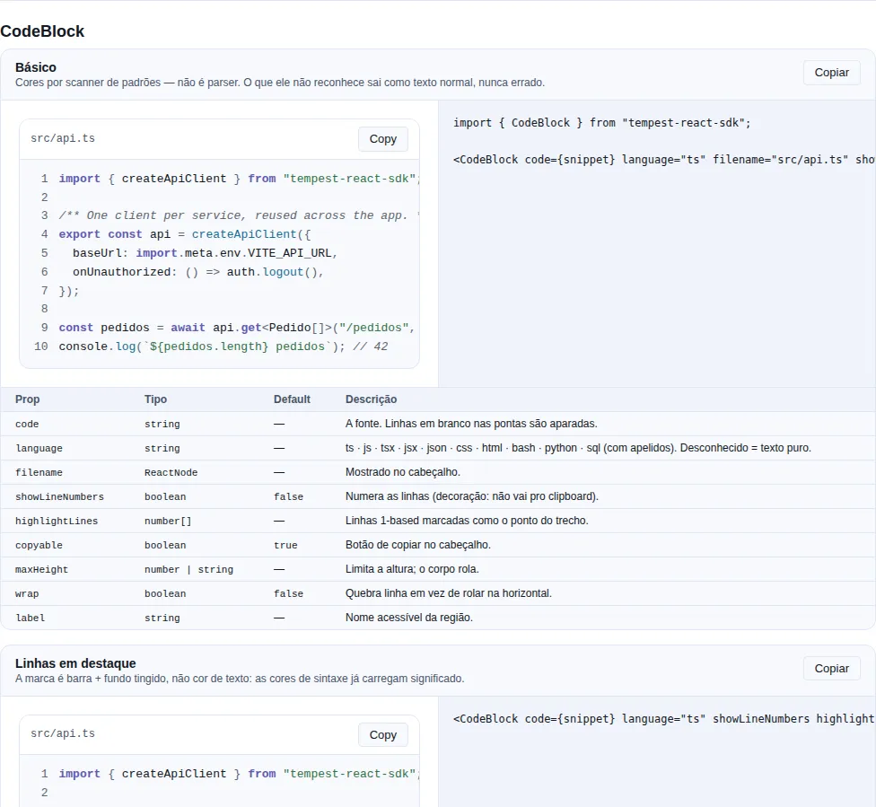
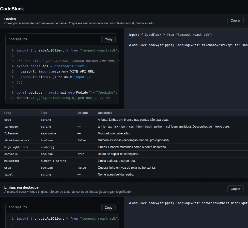
Store (Zustand)
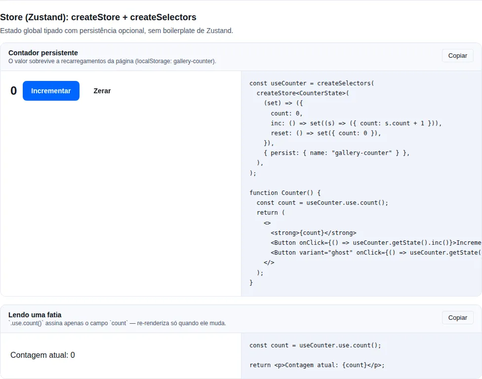
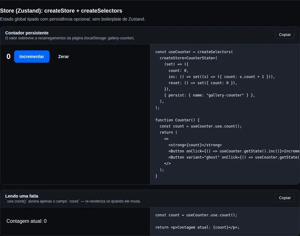
createTheme · presets · tokens de gráfico
Tema + i18n
Recap
- The gallery is a real Vite + React app that consumes the SDK via
file:../..— it plays the role of Storybook. - Run it with
npm run buildat the root, thennpm run devinexamples/gallery(port5173). - 67 sections cover components, overlays, media/images, advanced inputs, DataTable, store, theme/i18n, live integrations, PWA and utils — each example with copy-paste code next to it. The table above is generated from the registry, so it cannot go stale.
- Every section has a versioned capture under
docs/assets/gallery/, refreshed bynpm run docs:shotsand placed into the pages bynpm run docs:gallery. - Use it to validate UI at the mobile and desktop breakpoints before closing out a visual change.