Advanced: data
A stateful table, a step wizard, markdown, a masonry wall, a guided tour, list-to-list transfer, a filter bar and the kanban. Each one solves a whole screen.
DataTable<T>
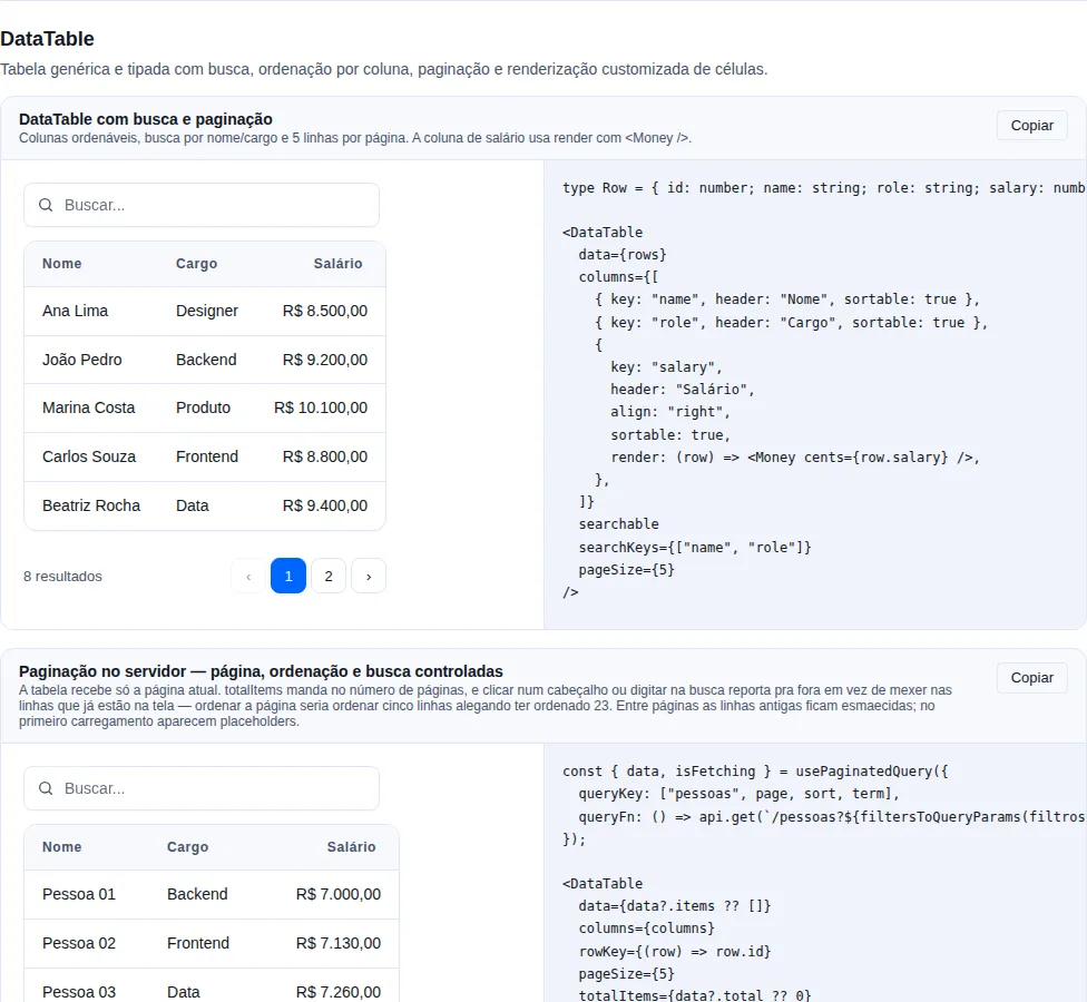
Section data-table of the gallery — run it locally to interact.
A stateful data table built on top of the headless Table. Adds client-side search, click-to-sort columns, and pagination, delegating all markup to the underlying Table.
import { DataTable, type DataTableColumn } from "tempest-react-sdk";

interface User {
  id: number;
  name: string;
  email: string;
  role: string;
}

const columns: DataTableColumn<User>[] = [
  { key: "name", header: "Name", sortable: true },
  { key: "email", header: "Email" },
  { key: "role", header: "Role", sortable: true, align: "right" },
];

<DataTable
  data={users}
  columns={columns}
  searchable
  pageSize={10}
  initialSort={{ key: "name", direction: "asc" }}
  rowKey={(row) => row.id}
  emptyMessage="No users found"
/>;
| Prop | Type | Default | Description |
|---|---|---|---|
data |
T[] |
— | Full dataset; sort/filter/pagination happen client-side |
columns |
DataTableColumn<T>[] |
— | Column definitions |
pageSize |
number |
10 |
Rows per page |
searchable |
boolean |
false |
Render a search input above the table |
searchKeys |
(keyof T)[] |
— | Keys to search; default = string/number columns |
initialSort |
DataTableSort<T> |
— | Initial sort applied before any header interaction |
rowKey |
(row: T, index) => string \| number |
index | Stable key extractor for rows |
emptyMessage |
ReactNode |
— | Content shown when no rows match |
DataTableColumn<T> = { key: keyof T; header: ReactNode; render?: (row: T) => ReactNode; sortable?: boolean; align?: TableAlign; priority?: TablePriority; width?: string | number }. DataTableSort<T> = { key: keyof T; direction: "asc" | "desc" }.
Behavior
Clicking a sortable header cycles asc → desc → unsorted. Search matches a case-insensitive substring across searchKeys (or every string/number column when omitted). Pagination is hidden when the result fits on a single page.
Wizard
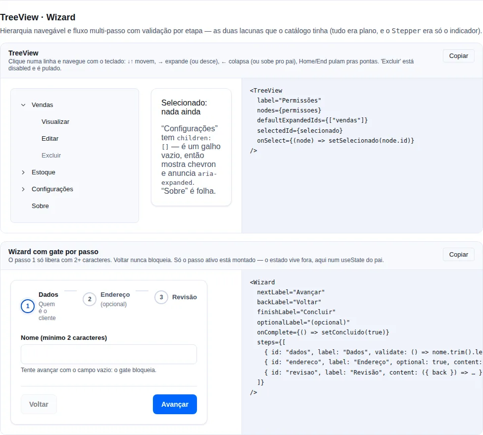
Section hierarchy-flow of the gallery — run it locally to interact.
Multi-step flow: an indicator, one body at a time, and navigation that respects per-step validation. Stepper draws the indicator; Wizard owns the part every app was rewriting — the active index, the async gate before advancing, disabled/pending buttons and the completion call.
import { Button, FormField, Input, Wizard, useZodForm } from "tempest-react-sdk";
import { FormProvider } from "react-hook-form";
import { z } from "zod";

const schema = z.object({
  name: z.string().min(2, "Enter a name"),
  email: z.string().email("Invalid email"),
  zip: z.string().min(5, "Incomplete ZIP"),
});

export function SteppedSignup() {
  const form = useZodForm(schema, { defaultValues: { name: "", email: "", zip: "" } });

  return (
    <FormProvider {...form}>
      <Wizard
        onComplete={form.handleSubmit((values) => console.log(values))}
        steps={[
          {
            id: "details",
            label: "Details",
            description: "Who the customer is",
            validate: () => form.trigger(["name", "email"]),
            content: (
              <>
                <FormField name="name" label="Name" required><Input /></FormField>
                <FormField name="email" label="Email" required><Input type="email" /></FormField>
              </>
            ),
          },
          {
            id: "address",
            label: "Address",
            validate: () => form.trigger(["zip"]),
            content: <FormField name="zip" label="ZIP" required><Input /></FormField>,
          },
          {
            id: "review",
            label: "Review",
            content: ({ back }) => (
              <>
                <pre>{JSON.stringify(form.getValues(), null, 2)}</pre>
                <Button variant="ghost" onClick={back}>Fix something</Button>
              </>
            ),
          },
        ]}
      />
    </FormProvider>
  );
}
| Prop | Type | Default | Description |
|---|---|---|---|
steps |
WizardStep[] |
— | The flow's steps. |
activeIndex |
number |
— | Controlled index. |
defaultActiveIndex |
number |
0 |
Initial index (uncontrolled). |
onStepChange |
(index, step) => void |
— | Called on every step change. |
onComplete |
() => void \| Promise<void> |
— | Called when the last step passes validation. |
nextLabel |
string |
"Next" |
Advance button label. |
backLabel |
string |
"Back" |
Back button label. |
finishLabel |
string |
"Finish" |
Label on the last step. |
optionalLabel |
string |
"(optional)" |
Suffix for an optional step in the indicator — override to localize. |
clickableSteps |
boolean |
false |
Allows jumping by clicking the indicator. |
renderActions |
(controls: WizardControls) => ReactNode |
— | Replaces the default button row. |
WizardStep = { id, label, description?, content, validate?, optional? } — content accepts a ReactNode or a function receiving the controls.
WizardControls = { activeIndex, step, validating, isFirst, isLast, next, back, goTo }.
Only the active step is mounted
Uncommitted input in a step you leave is lost unless the state lives outside (react-hook-form's FormProvider, a store, a parent useState) — which is where it belongs anyway, since the last step usually submits everything at once.
An async validate comes with a pending state
While the promise runs, the advance button is in loading and Back is disabled. A validate that throws counts as "not allowed": a gate wired to a network check should not strand the user on a half-advanced flow when the request fails.
clickableSteps is false on purpose
A wizard exists because order matters. With clickableSteps, jumping back is free (going back never blocks), but jumping forward validates every step crossed — the first gate that fails stops the jump right there.
Markdown
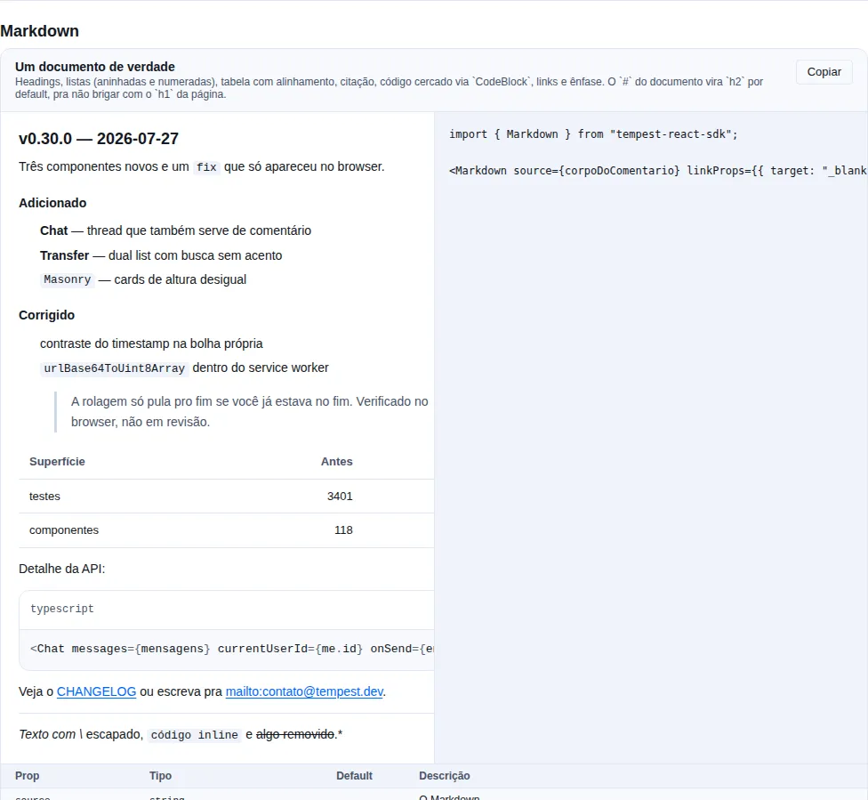
Section markdown of the gallery — run it locally to interact.
When to use: rendering text that came from people — a comment, a ticket description, release notes, a message body.
A Markdown subset: headings, paragraphs, lists (nested and ordered), blockquote, fenced code (through CodeBlock), thematic break, GFM pipe tables with alignment, and the usual inline set (**strong**, *em*, `code`, ~~del~~, links, images, autolinks, hard breaks).
import { Markdown } from "tempest-react-sdk";

<Markdown source={comment.body} linkProps={{ target: "_blank", rel: "noreferrer" }} />;
| Prop | Type | Default | What it does |
|---|---|---|---|
source |
string |
— | The Markdown. |
headingOffset |
number |
2 |
Level the document's # becomes. |
highlightCode |
boolean |
true |
Fenced code through CodeBlock (copy, line numbers). |
showLineNumbers |
boolean |
false |
Line numbers in fenced code. |
linkProps |
AnchorHTMLAttributes |
— | Extra props on every link. |
The safety is structural, not a promise about escaping
dangerouslySetInnerHTML does not exist in this component. The parser produces a node tree and the renderer turns it into React elements — and a React child can only be text. So <script>alert(1)</script> in a comment renders as the characters somebody typed, and so does <img src=x onerror=...>.
This is not "sanitized HTML": it is text. Which is why there is no sanitizer here and no allowed-tags list — there is no path for markup to enter.
URLs go through a scheme allowlist, not a blocklist
Links accept http, https, mailto, tel, sms and relative. Images accept the same plus raster data:image/ (png/jpeg/gif/webp/avif) — data:image/svg+xml is deliberately out: an SVG is a document, it carries <script> and event handlers.
[click](javascript:alert(1)) renders "click" as text: the link goes, the words stay. A blocklist would have to enumerate javascript:, JaVaScRiPt:, java\tscript:, \u0001javascript: — and would miss the one nobody thought of. An allowlist carries no such debt.
Hostile text does not freeze the tab
Parsing is linear in the length of the text: no regex in the parser has two quantifiers competing for the same run. Before 0.77.0, "# a" + " ".repeat(4000) + "b" — 4 KB in a comment — cost 4.7 s of main thread on every render, and the cost grew cubically. Today a heading line with 50 KB of spaces parses in under 1 ms (measured with performance.now() on Node 24; the time ceiling is pinned by a test in markdown-parse.test.ts).
Since 0.78.0 the same holds for list items: - or 1. followed by 80 KB of spaces and a line separator (U+2028/U+2029) made the list regexes race for the run — 3.6 s per line, twice per line. Today it parses under the same ceiling.
Quotes and lists nest up to 32 levels. Past that the content becomes a paragraph: the words stay, only the nesting is dropped. Without the cap, "- ".repeat(20000) overflowed the stack (RangeError) and took down the React tree of whoever merely opened the conversation.
It is a subset, and that is the chosen ceiling
No embedded HTML, footnotes, definition lists, reference links ([a][b]) or task lists. If your case needs full CommonMark with plugins, reach for react-markdown + remark directly — that is 40 KB and a plugin chain the whole SDK does not pay for. The scope here is what a user comment uses.
# becomes h2 by default
A comment rendered inside a page whose h1 is the page title must not emit a second h1. headingOffset shifts the whole scale, and the component never goes past h6, so the document outline stays valid.
A wide table scrolls in its own box, and the box is reachable
The tab stop appears only while the overflow is real — a scroll area with nothing focusable inside is unreachable by keyboard, and adding the stop unconditionally would pollute the tab order with one entry per table.
Masonry
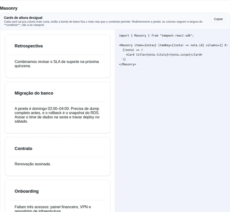
Section masonry of the gallery — run it locally to interact.
When to use: cards of uneven height with no order between them — a notes wall, a photo gallery, dashboard cards.
Measures the cards and deals each one into the shortest column, so the bottom edge is as even as the content allows.
import { Masonry, Card } from "tempest-react-sdk";

<Masonry items={notes} itemKey={(note) => note.id} columns={{ 0: 1, 640: 2, 1024: 3 }}>
  {(note) => <Card title={note.title}>{note.body}</Card>}
</Masonry>;
| Prop | Type | Default | What it does |
|---|---|---|---|
items |
T[] |
— | What to lay out. |
children |
(item: T, index: number) => ReactNode |
— | Renders one card. |
columns |
number \| Record<number, number> |
{ 0: 1, 640: 2, 1024: 3 } |
A fixed number, or a width → columns map. |
itemKey |
(item: T, index: number) => string \| number |
index | Stable key per item. |
gap |
string |
--tempest-space-4 |
Space between cards. |
Why this is not one line of CSS
CSS columns breaks a card across the column boundary, and grid-auto-flow: dense keeps every row at the height of its tallest cell — which is exactly the ragged bottom edge people reach for masonry to avoid. Both are one line of CSS and neither does this job.
Reading order goes down the column, not across the row
Card 2 sits below card 1, not beside it. Which is why this layout is for independent items: a list where item 2 must follow item 1 wants a grid, not this. If order matters to your content, do not use masonry — not here, not in plain CSS.
The breakpoint map is about the container, not the viewport
A masonry inside a drawer or a two-column page is narrower than the window, and a media query would give it three columns at 300px wide. A ResizeObserver is what makes { 0: 1, 640: 2 } mean "of this container", which is the only useful reading.
Shortest column, not round-robin
index % columns is the obvious approach and produces ragged columns the moment items differ in height — which is the only reason to use masonry at all.
An image that loads later is re-measured
Every card is observed individually: a height measured at mount is wrong in exactly the case of an image still downloading. The first paint weights every card as 1 (so it is never blank) and the measured pass re-deals.
Tour
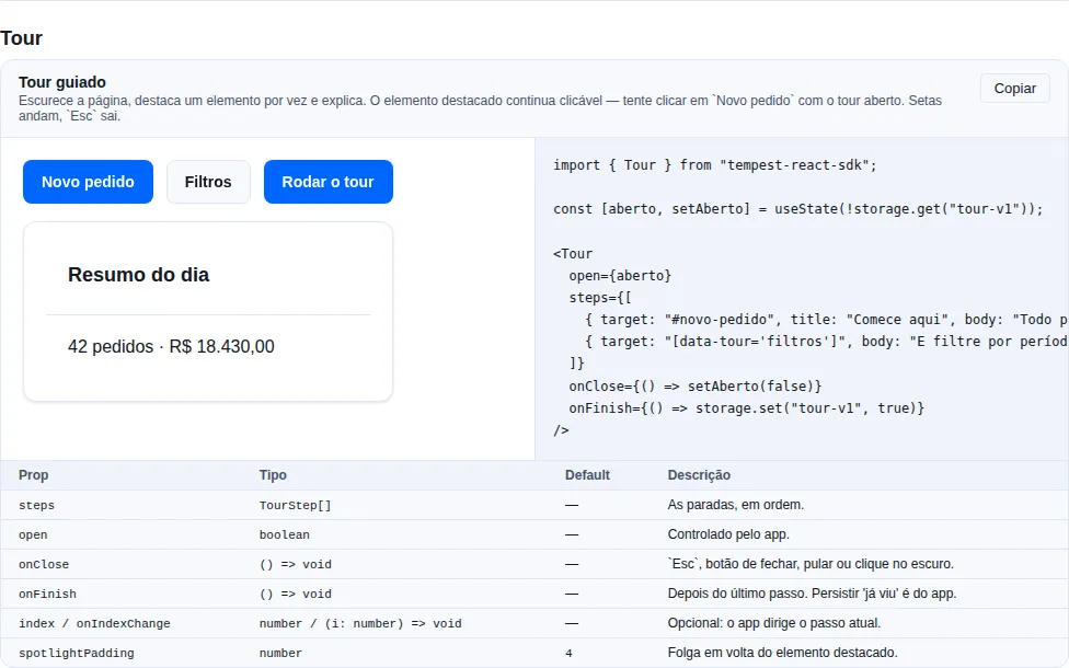
Section tour of the gallery — run it locally to interact.
When to use: introducing a screen — first-run onboarding, a feature that moved, a flow nobody finds on their own.
Dims the page, highlights one element at a time and explains it. The highlighted element stays clickable.
import { Tour } from "tempest-react-sdk";
import { useState } from "react";

export function Orders() {
  const [open, setOpen] = useState(!storage.get("tour-orders-v1"));

  return (
    <>
      {/* … the screen … */}
      <Tour
        open={open}
        steps={[
          { target: "#new-order", title: "Start here", body: "Every order begins with this button." },
          { target: "[data-tour='filters']", body: "And filter by period here.", placement: "right" },
        ]}
        onClose={() => setOpen(false)}
        onFinish={() => storage.set("tour-orders-v1", true)}
      />
    </>
  );
}
| Prop | Type | Default | What it does |
|---|---|---|---|
steps |
TourStep[] |
— | The stops, in order. |
open |
boolean |
— | Controlled by the app. |
onClose |
() => void |
— | Esc, the close button, "skip", or a click on the dim. |
onFinish |
() => void |
— | After the last step, before onClose. |
index / onIndexChange |
number / (i) => void |
internal | The app drives the current step, if it wants to. |
spotlightPadding |
number |
4 |
Space kept clear around the highlighted element. |
locale |
"pt-BR" \| "en" |
"pt-BR" |
Labels. |
TourStep = { target?, title?, body, placement? } · placement ∈ "top" | "bottom" | "left" | "right" | "center".
The highlighted element stays clickable — and that is what makes a coachmark useful
The dim is four rectangles around the target, not one overlay with a box-shadow hole. Because a shadow is not hit-testable: a hole made that way would block nothing — the rest of the page would stay clickable and the target would not. Four rectangles are the other way round, which is what "press this button" needs.
The target is a selector, not a ref
So a tour can be declared as data — in a config file, from the backend, next to the copy — without every screen threading refs up to whoever renders the tour.
A step whose target is missing shows centred, it does not vanish
That is the real case: a feature hidden by permission, a button that only exists with data. Dropping the step would hide its message silently, and skipping to the next could skip the whole tour.
Keyboard: arrows walk, Esc leaves, focus goes to the card
The card is role="dialog" + aria-modal, named by its title and described by its body, with a focus trap (useFocusTrap) and a visible "Step 2 of 5". Esc is handled on the card, not on window: a tour opened over a modal does not close both.
The card flips when it does not fit — and centres when nothing fits
It tries the preferred side, then the opposite one (which keeps the reading relationship with the target; jumping to a side would move the card across the screen for no visible reason), then the others. A card half off-screen is worse than a card in the middle — and that happens for real when the target is taller than the viewport.
Persisting 'already seen' is the app's business
The component takes open and emits onClose/onFinish. Writing the flag is one line in the app (storage.set) and would be a wrong default here — the key is versioned, scoped per user, and sometimes lives on the backend.
Transfer
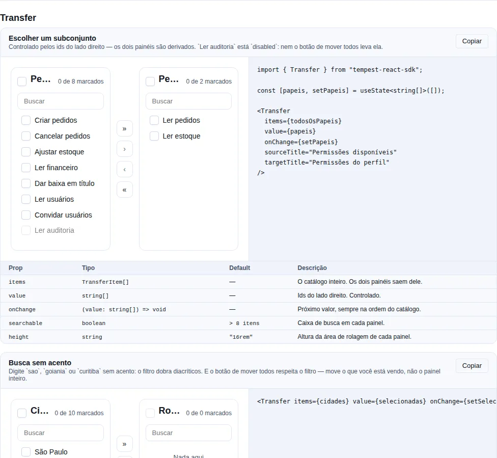
Section transfer of the gallery — run it locally to interact.
When to use: picking a subset of a catalogue — a profile's permissions, cities on a route, members of a group, columns of a report.
Two panes, four move controls, a search box on each side. Controlled by the ids on the right; both panes are derived.
import { Transfer, type TransferItem } from "tempest-react-sdk";
import { useState } from "react";

const PERMISSIONS: TransferItem[] = [
  { id: "orders.read", label: "Read orders" },
  { id: "orders.create", label: "Create orders" },
  { id: "audit.read", label: "Read audit log", disabled: true },
];

export function ProfilePermissions() {
  const [permissions, setPermissions] = useState<string[]>([]);

  return (
    <Transfer
      items={PERMISSIONS}
      value={permissions}
      onChange={setPermissions}
      sourceTitle="Available"
      targetTitle="On the profile"
    />
  );
}
| Prop | Type | Default | What it does |
|---|---|---|---|
items |
TransferItem[] |
— | The whole catalogue. Both panes come from it. |
value |
string[] |
— | Ids on the right. Controlled. |
onChange |
(value: string[]) => void |
— | Next value, always in catalogue order. |
sourceTitle / targetTitle |
ReactNode |
"Disponíveis" / "Selecionados" |
Each pane's heading. |
searchable |
boolean |
true past 8 items |
A search box on each pane. |
renderItem |
(item, side) => ReactNode |
item.label |
Custom row body. |
height |
string |
"16rem" |
Height of each pane's scroll area. |
locale |
"pt-BR" \| "en" |
"pt-BR" |
Labels and announcements. |
disabled |
boolean |
false |
Blocks every move. |
TransferItem = { id, label, searchText?, disabled?, data? }
Only the right-hand ids are state — the panes are derived
Storing two lists looks simpler and drifts the first time the catalogue changes underneath: a permission removed on the server lingers in whichever pane held it, and an id present on both sides is a bug nobody can see. With a single value, items is in charge: anything that left the catalogue simply disappears from both panes.
The move-all button respects the filter
Filtering by sao and clicking "move all" moves what you are looking at, not the whole pane. Moving the rows the filter hid is the kind of surprise that makes people stop trusting the button — and it was a real bug, caught by a test before the merge.
Search folds accents, both ways
sao finds "São Paulo" and so does são. For a PT-BR audience that is not a refinement: a plain includes would miss half the searches.
A disabled row does not move by any path
The check lives in applyMove, not in each of the four buttons — it is a mandatory permission, a locked seat. Which is why » moves "everything movable", not "everything".
Checks are cleared after a move
Otherwise the next click on the opposite button sends it all back, and the component looks like it is undoing itself.
The controls sit in the middle by grid order, but come last in the DOM
A keyboard reaching the buttons before it has seen what they move would have to go back; a screen reader would read "move checked to the right" with no idea what is checked. Each pane is a region named by its heading, and each move is announced in a role="status".
FilterBar
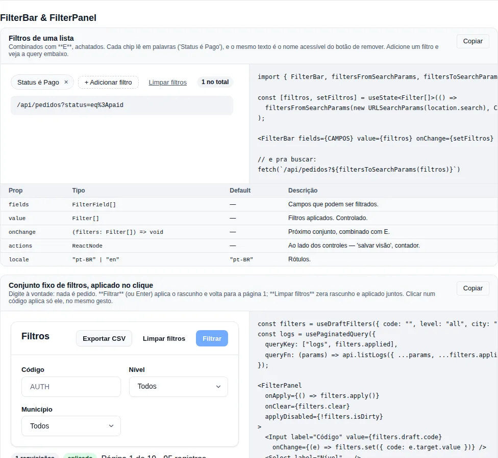
Section filterbar of the gallery — run it locally to interact.
When to use: filtering an admin list — orders by status and period, users by role, invoices by due date.
Chips for the applied filters, plus a small editor to add another. Filters are combined with AND, flat.
import {
  FilterBar,
  filtersFromSearchParams,
  filtersToSearchParams,
  type Filter,
  type FilterField,
} from "tempest-react-sdk";

const FIELDS: FilterField[] = [
  { name: "title", label: "Title", type: "text" },
  { name: "total", label: "Total", type: "number" },
  { name: "createdAt", label: "Created", type: "date" },
  {
    name: "status",
    label: "Status",
    type: "select",
    options: [
      { value: "paid", label: "Paid" },
      { value: "sent", label: "Sent" },
    ],
  },
];

export function Orders() {
  // The set comes from the URL, so a shared link opens with the same filters.
  const [filters, setFilters] = useState<Filter[]>(() =>
    filtersFromSearchParams(new URLSearchParams(location.search), FIELDS),
  );

  const { data } = useQuery({
    queryKey: ["orders", filters],
    queryFn: () => api.get(`/orders?${filtersToSearchParams(filters)}`),
  });

  return <FilterBar fields={FIELDS} value={filters} onChange={setFilters} />;
}
| Prop | Type | Default | What it does |
|---|---|---|---|
fields |
FilterField[] |
— | Fields that can be filtered. |
value |
Filter[] |
— | Applied filters. Controlled. |
onChange |
(filters: Filter[]) => void |
— | Next set, combined with AND. |
actions |
ReactNode |
— | Next to the controls — "save this view", a counter. |
locale |
"pt-BR" \| "en" |
"pt-BR" |
Labels and descriptions. |
FilterField = { name, label, type, options?, operators?, placeholder? } · type ∈ "text" | "number" | "date" | "select" | "boolean"
Filter = { field, operator, value? } · operator ∈ eq · ne · contains · gt · gte · lt · lte · between · in · empty · notEmpty
Exported helpers: applyFilters, filtersToQueryParams, filtersToSearchParams, filtersFromSearchParams, describeFilter, operatorsFor.
Applying the filters
FilterBar produces Filter[]; evaluating them is yours. The SDK ships both ends, and you pick one by list size, not by taste.
Whole list in memory — applyFilters runs the eleven operators:
import { FilterBar, applyFilters, type Filter } from "tempest-react-sdk";

export function Orders({ orders }: { orders: Order[] }) {
  const [filters, setFilters] = useState<Filter[]>([]);
  const visible = useMemo(() => applyFilters(orders, filters), [orders, filters]);

  return (
    <>
      <FilterBar fields={FIELDS} value={filters} onChange={setFilters} />
      <DataTable data={visible} columns={COLUMNS} />
    </>
  );
}
Server-paginated listing — filtersToQueryParams, which speaks the tempest-fastapi-sdk dialect:
import { useQuery } from "@tanstack/react-query";
import { createApiClient, filtersToQueryParams, type Filter } from "tempest-react-sdk";

const api = createApiClient({ baseURL: "/api" });

export function usePedidos(filtros: Filter[], pagina: number) {
    const params = filtersToQueryParams(filtros);
    params.set("page", String(pagina));
    params.set("page_size", "20");

    return useQuery({
        queryKey: ["pedidos", filtros, pagina],
        queryFn: () => api.get(`/pedidos?${params}`),
    });
}
| Operator | Param sent |
|---|---|
eq |
field (or field__iexact on the name column) |
ne |
field__ne |
contains |
field__icontains |
gt gte lt lte |
field__gt … field__lte |
between |
field__between twice, low value first |
in |
field__in, once per value |
empty / notEmpty |
field__isnull=true / =false |
The dialect is the default, not a law
The table above is the tempest-fastapi-sdk dialect. A different backend passes
options rather than reimplementing the encoder:
// The searchable column is `razao_social`, and `ne` is spelled the Django way.
const params = filtersToQueryParams(filters, {
  substringColumns: ["razao_social"],
  operatorSuffix: { ne: "__exclude" },
});
substringColumns— the columns whoseeqis emitted ascolumn__iexact. Default["name"], which is whatbuild_filter_conditionspecial-cases. Pass[]when your backend treats no column that way and aneqshould stay bare.operatorSuffix— merged over the default, so an override names only the operators that differ.
Through v0.44.0 both were closed module constants. A project whose column was
called nome or titulo could not get the treatment, and one without the
special case got an __iexact nobody asked for.
The backend must declare every key, or the filter fails silently
BasePaginationFilterSchema.get_conditions() only forwards fields the subclass declares. A status__ne the schema never mentions is dropped by FastAPI before the repository sees it — no error, no filtering, and the full list comes back looking like "the filter didn't take". Declare status__ne: str | None = None on the filter schema for every operator the screen offers.
applyFilters and the backend disagree on two points, deliberately
ne matches rows with no value. In SQL, column <> 'x' is NULL for a NULL column and the row drops out. On the client, "is not paid" also shows the orders with no status at all — which is what the chip promises.
empty matches blank text. __isnull on the server only matches NULL; a column storing "" instead of NULL answers differently on each side.
If one screen alternates between both modes, pick one per field and stay there.
eq is case-sensitive; contains is not
That is the alignment with the server: eq becomes WHERE column = value, and a case-insensitive client would quietly disagree with it. contains becomes icontains and is insensitive on both sides — and since it is the default operator for text fields, the friendly behaviour is what you get without asking.
Dates compare by day, and between is inclusive at both ends
A row stamped 2026-03-05T13:00:00Z matches eq 2026-03-05, and an inverted between (later date first) is normalised instead of matching nothing — someone who picked the end date first meant the range, not an empty list.
Flat AND, not a tree with OR — and that is the chosen ceiling
Nested groups ((a OR b) AND c) are a different component: they need a tree UI with a per-node operator and a different serialization. Trying to be both produces a builder that is clumsy at the 95% case — "status is paid, created after March, title contains nota". If you need nested OR, what you want is a real query builder, and it does not fit behind this API.
The filter set fits in the URL — and comes back from it
filtersToSearchParams writes status=eq:paid&total=between:10|90; filtersFromSearchParams reads it back, and there is a round-trip test. A filter set that cannot survive a reload is one people re-enter every time they open a link somebody sent them.
Whatever does not parse is dropped, not guessed at
A hand-edited URL is the normal way this input arrives. An operator the field does not offer (total=contains:1), an unknown field, a between with one end — all discarded. Rendering a chip the backend cannot evaluate would show a list that does not match what the chip claims.
The chip reads in words, and it is the same text a screen reader hears
"Status is Paid" — with the option's label, not its key (paid). The remove button uses the same sentence in its aria-label ("Remove filter: Status is Paid"), because a chip that says one thing to a sighted user and another to a screen reader is two different truths.
The input follows the field, not the operator
A date field gets a date picker even under between (two of them). Typing a date into a text box is the fastest way to produce a filter the backend cannot parse.
An incomplete filter only disables Apply
It is not an error to shout about — it is a half-filled form. Changing the operator clears the value, because a value carried across operators produces filters nobody meant to write.
FilterPanel
When to use it: the screen already knows its filters — city, state, status, a search box — and what is missing is the frame: the card, the grid that reflows, the title and the clear button.
FilterBar above is a builder: the user picks field, operator and value. FilterPanel is the other case, the most common one in an admin panel — the set is fixed, and the fields are your own Input/Select. It holds no state and has no opinion on the fields: it is layout.
import {
  FilterPanel,
  Input,
  Select,
  useDraftFilters,
  usePaginatedQuery,
  type OffsetPage,
} from "tempest-react-sdk";

interface Activity {
  id: number;
  title: string;
}

interface ActivityFilter {
  search: string;
  state: string;
}

const EMPTY: ActivityFilter = { search: "", state: "" };

const STATES = [
  { value: "", label: "All" },
  { value: "PI", label: "Piauí" },
  { value: "PE", label: "Pernambuco" },
];

async function listActivities(
  params: Record<string, unknown>,
): Promise<OffsetPage<Activity>> {
  const response = await fetch(`/api/activities?${new URLSearchParams(params as Record<string, string>)}`);
  return (await response.json()) as OffsetPage<Activity>;
}

export function Activities() {
  const filters = useDraftFilters(EMPTY);
  const activities = usePaginatedQuery<Activity>({
    queryKey: ["activities", filters.applied],
    queryFn: (params) => listActivities({ ...params, ...filters.applied }),
  });

  return (
    <>
      <FilterPanel
        locale="en"
        onApply={() => filters.apply()}
        onClear={filters.clear}
        applyDisabled={!filters.isDirty}
      >
        <Input
          label="Search"
          value={filters.draft.search}
          onChange={(e) => filters.set({ search: e.target.value })}
        />
        <Select
          label="State"
          options={STATES}
          value={filters.draft.state}
          onChange={(e) => filters.set({ state: e.target.value })}
        />
      </FilterPanel>
      <p>{activities.total} activities</p>
    </>
  );
}
What happens there:
- The fields edit the draft (
filters.draft) — typing asks the server for nothing. - Apply filters, or Enter in any field, calls
onApply: the draft becomesfilters.applied, which is in thequeryKey, and one request goes out. - Clear filters calls
onClear, which resets the draft and the applied value together. - With
applyDisabled={!filters.isDirty}, the button only lights up when there is something new to apply.
| Prop | Type | Default | What it does |
|---|---|---|---|
children |
ReactNode |
— | The fields. Each child is one grid cell. |
title |
ReactNode |
"Filtros" |
Heading. A string renders as an h3 and names the search region. |
actions |
ReactNode |
— | Actions that are not fields — "Export CSV", "Refresh every 30s". |
onClear |
() => void |
— | Shows Clear filters. Without it, there is no button. |
onApply |
() => void |
— | Puts the fields in a <form>: the Apply button and Enter apply. |
applyDisabled |
boolean |
false |
Disables Apply (and, with it, Enter). |
minFieldWidth |
string |
"12rem" |
Narrowest a field gets before the grid drops a column. |
columns |
ResponsiveValue<number \| string> |
— | Fixed columns per viewport, as in Grid. Replaces minFieldWidth. |
locale |
"pt-BR" \| "en" |
"pt-BR" |
Default title and labels. |
labels |
Partial<FilterPanelLabels> |
— | Override any label — { apply: "Search" }. |
The grid follows the panel's width, not the screen's
The default is repeat(auto-fill, minmax(min(100%, 12rem), 1fr)). Measured in Chromium: the same set inside a 360 px column of a 1280 px screen, built with Grid columns={{ mobile: 1, tablet: 2, desktop: 4 }}, became four 57.5 px fields — Grid switches columns on the viewport. With the default, the count comes from the room the panel has, and min(100%, …) keeps a floor wider than the phone from overflowing it.
Cells align to the top
A field with an error message is taller. With the grid's default stretch, its row-mates' boxes grew with it (62 → 82 px); the input itself did not stretch, but the cell lied about its own height.
The header wraps
Three actions next to the title measured 527 px in a 308 px header at 390 px wide, and the whole page scrolled sideways. Card's header now wraps — this applies to every Card with actions — and the actions wrap among themselves. Apply is always last.
Why children, not fields={[…]}
An array of nodes needs a key on every field just to please React, and buys nothing: each child is already a grid cell.
Kanban
When to use it: a board of columns whose cards move between stages — backlog, sales pipeline, work orders by status.
Reorders within a column and moves across columns, by pointer or keyboard. The drag machine is useSortable — the board reimplements none of it.
import { applyKanbanMove, Kanban, type KanbanColumn } from "tempest-react-sdk";
import { useState } from "react";

export function BacklogBoard() {
  const [columns, setColumns] = useState<KanbanColumn[]>([
    { id: "todo", title: "To do", cards: [{ id: "1", content: "Fix login" }] },
    { id: "doing", title: "Doing", cards: [] },
    { id: "done", title: "Done", cards: [], locked: true },
  ]);

  return (
    <Kanban
      label="Backlog"
      columns={columns}
      onMove={(move) => setColumns((current) => applyKanbanMove(current, move))}
    />
  );
}
| Prop | Type | Default | What it does |
|---|---|---|---|
columns |
KanbanColumn[] |
— | Columns with their cards, in display order. |
onMove |
(move: KanbanMove) => void |
— | Called once per committed move. You apply it. |
renderCard |
(card, column) => ReactNode |
the card content | Customizes the card body. |
label |
string |
"Quadro" |
Accessible name of the board. |
emptyLabel |
ReactNode |
"Nenhum card" |
Text for an empty column. |
cardRoleDescription |
string |
keyboard hint | Announced per card — override to localize. |
disabled |
boolean |
false |
Blocks all dragging. |
KanbanColumn = { id, title, cards, locked? } · KanbanCard = { id, content } · KanbanMove = { cardId, fromColumn, toColumn, toIndex }.
applyKanbanMove(columns, move) is the reducer that applies a move returning new arrays — exported because every consumer needs the same one, and it is where the off-by-one lives.
A locked column refuses drops but still lets cards leave
That is a "Done" column which takes no new work, but whose cards can still be pulled back.
A keyboard move can only target a position that holds a card
The move walks the index space of existing cards, so dropping into an empty column works by pointer but not by keyboard. That is a limitation of the current implementation, not a design choice: until column-switch keys land, the way around is to move into a column that already has a card and then reorder.
ARIA: one listbox per column, not one per board
Each column that has cards is a listbox named by its title, containing only options. A single board-wide listbox does not survive the markup a board needs — listbox requires option/group children and the column header in between breaks that ownership. An empty column is not marked as a listbox (zero options fails aria-required-children), and the header is a div, not a <header>: outside a sectioning element every <header> becomes a banner landmark — with three columns, three duplicate banners.
Recap
- Data:
DataTable<T>wraps the headlessTablewith client-side search, sort, and pagination. - Filters:
FilterBarfor free-form querying (field + operator + value);FilterPanelfor the fixed set a screen knows, withuseDraftFilterskeeping the draft apart from what is applied. - All share the same controlled/uncontrolled patterns, expose keyboard A11y, and import from
tempest-react-sdk.