Navigation
Top bars, side navs, bottom nav, tabs, breadcrumbs, pagination, segmented control.
What this category is
Components that help the user orient and move through the app. They split by scope:
- Primary navigation (between app sections):
Navbar(top),Sidebar(desktop side),BottomNavigation(mobile bottom) — typically the three slots of anAppShell. - Local navigation (within a screen):
Tabs,SegmentedControl,Stepper. - Orientation and traversal:
Breadcrumbs(where am I) andPagination(next/previous in lists).
When to use: pick by scope — don't use Tabs to navigate between top-level
routes (that's Navbar/Sidebar), nor Navbar to switch views of the same
screen (that's Tabs/SegmentedControl).
Responsive Sidebar + BottomNavigation pattern
The idiomatic combo: Sidebar inside <Show above="md"> on desktop and
BottomNavigation inside <Hide above="md"> on mobile, both sharing the
same value/onChange. AppShell already does this swap automatically when
you pass both slots.
Navbar
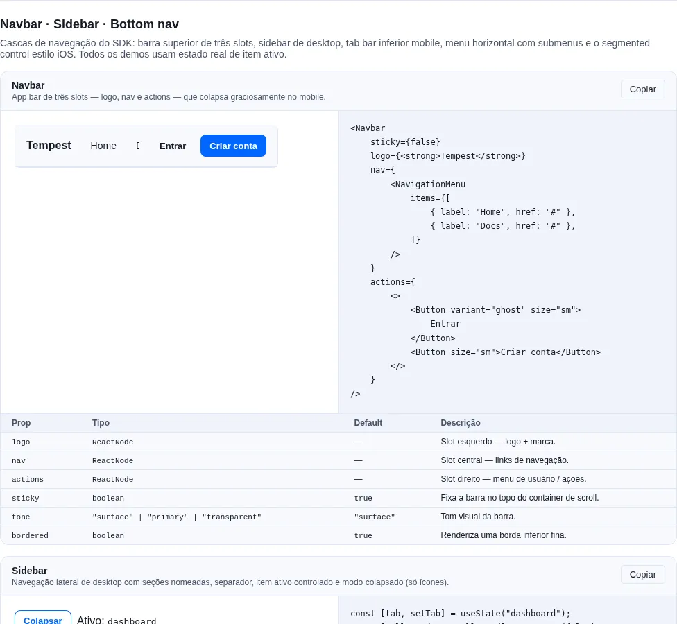
Section nav-extra of the gallery — run it locally to interact.
When to use: a persistent top bar with brand + global actions (search, avatar, notifications). It's the highest-level navigation.
Top app bar. Three slots (logo / nav / actions). Sticky by default.
import { Avatar, Button, Navbar } from "tempest-react-sdk";
import { NavLink } from "react-router";
import { Search } from "lucide-react";

const user = { photo: "/avatars/ana.jpg" };

export function TopBar() {
    return (
        <Navbar
            logo={<img src="/logo.svg" alt="App" />}
            nav={
                <>
                    <NavLink to="/orders">Orders</NavLink>
                    <NavLink to="/products">Products</NavLink>
                </>
            }
            actions={
                <>
                    <Button variant="ghost" iconOnly aria-label="Search">
                        <Search size={16} />
                    </Button>
                    <Avatar src={user.photo} />
                </>
            }
        />
    );
}
| Prop | Type | Default |
|---|---|---|
logo |
ReactNode |
— |
nav |
ReactNode |
— |
actions |
ReactNode |
— |
sticky |
boolean |
true |
tone |
"surface" \| "primary" \| "inverse" \| "transparent" |
"surface" |
bordered |
boolean |
true |
Safe-area: applies padding-top: max(space-3, env(safe-area-inset-top))
automatically.
A bar in the brand color
tone="primary" paints the bar's background with --tempest-primary and its
text with --tempest-primary-foreground — and nothing else. The components
inside it keep the page's tokens. Measured in Chromium over the SDK's blue
(#0066ff, light theme): a Button variant="link" disappears (1:1), the
primary Button has the bar's own color (edge 1:1), muted text sits at
1.59:1 and the focus ring at 1.41:1.
When the bar holds a button, a link or a field, use tone="inverse": it gets
data-tempest-tone="inverse" and every color token inverts inside it, as in a
Section tone="inverse".
import "tempest-react-sdk/styles/inverse.css";
import { AppBar, Button, Navbar } from "tempest-react-sdk";

export function Bars() {
    return (
        <>
            <Navbar
                tone="inverse"
                logo={<strong>Tempest</strong>}
                nav={
                    <Button variant="link" href="/docs">
                        Docs
                    </Button>
                }
                actions={<Button>Create account</Button>}
            />
            <AppBar title="Order" showBack tone="inverse" actions={<Button>Save</Button>} />
        </>
    );
}
Measured in Chromium. The inverse rows give the same number on the light and
the dark page; the primary row is the light page's (in dark the 500 becomes
#3b82f6: text 5.25, link 1, muted 1.72, ring 1.45):
| brand | fill | text and icon | link and ghost |
muted |
primary button label | focus ring |
|---|---|---|---|---|---|---|
SDK (#0066ff), primary |
#0066ff |
4.83 | 1 · 3.67 | 1.59 | 4.83 (button = bar) | 1.41 |
SDK (#0066ff), inverse |
#042e75 |
12.71 | 12.71 · 12.71 | 9.60 | 12.71 | 6.95 |
#facc15, inverse |
#facc15 |
11.59 | 11.59 · 11.59 | 8.82 | 11.59 | 6.40 |
Why a new tone, and not primary inverting
The inverse surface's fill is not always the brand's 500: the generator
walks the ramp to the step that carries all three text levels. For
#0066ff that step is the 800 (#042e75) — white on the 500 measures
4.83:1 and leaves no room for muted. Making primary invert would repaint
every bar that already uses it. And adding the attribute alone is not
enough: inside the surface, --tempest-primary is the action color
(white on the SDK's blue), and the measured bar turned #ffffff. So
primary stays as in 0.74.0 — before/after captures byte-identical — and
inverse is the explicit request.
Without the inverse surface loaded
tone="inverse" depends on the opt-in: tempest-react-sdk/styles/inverse.css
(the SDK's blue) or createTheme({ primary, inverse: createInverseSurface })
(your brand). With neither, the bar falls back to the page's tokens
(--tempest-bg and --tempest-text): legible — text at 17.75:1 in light and
17.51:1 in dark — just not in the brand color.
AppBar
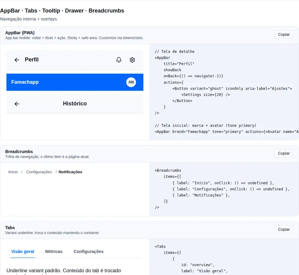
Section navigation of the gallery — run it locally to interact.
When to use: the mobile-first PWA app bar — the "back + title + action"
pattern every detail screen repeats. Use AppBar for mobile/PWA apps; use
Navbar when you want the desktop horizontal nav (three slots).
Grid layout: a leading slot (back button + brand) · the title (<h1>) ·
actions on the right. Sticky + safe-area by default. The back button is
accessible and, without onBack, falls back to window.history.back() — with a
router, pass onBack={() => navigate(-1)}.
import { AppBar, Avatar, Button } from "tempest-react-sdk";
import { Settings } from "lucide-react";

const user = { photo: "/avatars/ana.jpg" };

export function Barras({
    navigate,
    openSettings,
}: {
    navigate: (delta: number) => void;
    openSettings: () => void;
}) {
    return (
        <>
            <AppBar
                title="Profile"
                showBack
                onBack={() => navigate(-1)}
                actions={
                    <Button variant="ghost" iconOnly aria-label="Settings" onClick={openSettings}>
                        <Settings size={16} />
                    </Button>
                }
            />

            <AppBar brand="Famachapp" actions={<Avatar src={user.photo} />} />

            <AppBar title="History" showBack centered />
        </>
    );
}
| Prop | Type | Default |
|---|---|---|
title |
ReactNode |
— |
leading |
ReactNode (replaces back + brand) |
— |
showBack |
boolean |
false |
onBack |
() => void |
history.back() |
backLabel |
string (button aria-label) |
"Go back" |
backIcon |
ReactNode |
← arrow |
brand |
ReactNode |
— |
actions |
ReactNode |
— |
centered |
boolean |
false |
sticky |
boolean |
true |
tone |
"surface" \| "primary" \| "inverse" \| "transparent" |
"surface" |
bordered |
boolean |
true |
safeArea |
boolean |
true |
With a button or a field in actions over the brand color, use tone="inverse" —
see A bar in the brand color.
Visual customization
The SDK ships only the layout + behaviour. Color, height and typography come
from the --tempest-* tokens (override them on :root). For a custom
icon/menu on the right, pass any node to actions; to replace the whole left
side (e.g. an avatar instead of the back button), use leading.
Bar scrolling away?
It is almost never the AppBar — it is one line of your app's global CSS:
/* ❌ the horizontal clamp that kills sticky */
body {
    overflow-x: hidden;
}

/* ✅ same clamp, no scroll container */
html,
body {
    overflow-x: clip;
}
overflow-x: hidden on the body forces the computed overflow-y to auto — a CSS rule, not a browser bug — which makes the body a scroll container. Every sticky element then pins to the body's scrollport instead of the viewport, and that scrollport travels with the document. Measured in Chromium at 390px on a long page: the bar sat at top: -900px after scrolling 900px. Off screen.
On desktop the symptom barely shows, because screens usually fit without scrolling. On Chrome Android the collapsing URL bar turns every screen into a scrolling screen — and then it is gone every time.
clip has to be on both elements: with it on only html, or only body, the document still pans sideways.
In development the AppBar itself warns in the console when it detects this CSS. 💡
Sidebar
Desktop side nav. items: SidebarEntry[] (items, sections and separators),
header/footer slots, a collapsed mode (icons only).
import { useState } from "react";
import { Button, Sidebar } from "tempest-react-sdk";
import { Cog, Home, Package } from "lucide-react";

export function Lateral() {
    const [tab, setTab] = useState("home");
    const [collapsed, setCollapsed] = useState(false);

    return (
        <Sidebar
            header={<strong>{collapsed ? "T" : "Tempest"}</strong>}
            items={[
                { key: "home", label: "Home", icon: <Home size={16} /> },
                { key: "orders", label: "Orders", icon: <Package size={16} />, badge: 3 },
                { key: "settings", label: "Settings", icon: <Cog size={16} /> },
            ]}
            value={tab}
            onChange={setTab}
            footer={<Button onClick={() => setCollapsed(!collapsed)}>Collapse</Button>}
            collapsed={collapsed}
            width={240}
            collapsedWidth={64}
        />
    );
}
| Prop | Type | Default |
|---|---|---|
header |
ReactNode |
— |
items |
SidebarEntry[] |
— |
value |
string |
— |
onChange |
(key: string) => void |
— |
match |
"key" \| "route" |
"key" |
footer |
ReactNode |
— |
collapsed |
boolean |
false |
width |
number \| string (px or CSS) |
240 |
collapsedWidth |
number \| string |
64 |
type SidebarItem = {
    key: string;
    label: ReactNode;
    icon?: ReactNode;
    badge?: ReactNode;
    disabled?: boolean;
    href?: string;
};

type SidebarEntry =
    | ({ type?: "item" } & SidebarItem)
    | { type: "section"; key: string; label: ReactNode }
    | { type: "separator"; key: string };
type is optional on the item branch, so a SidebarItem[] is still a valid
SidebarEntry[] — no existing call site changes a line.
Grouping into sections
A flat list works up to about 8 items. Past that it is a wall: 16 screens with no headings leave "Diagnostics" visually glued to "Campaigns", and the admin loses the anchor that told them which part of the panel they are in.
A section opens a group, and the items after it belong to it until the next section or separator:
import { useState } from "react";
import { Sidebar } from "tempest-react-sdk";
import { Activity, BarChart3, FileText, Settings, Users } from "lucide-react";

function AdminNav() {
  const [tab, setTab] = useState("overview");

  return (
    <Sidebar
      items={[
        { type: "section", key: "monitoring", label: "Monitoring" },
        { key: "overview", label: "Overview", icon: <BarChart3 /> },
        { key: "activity", label: "Activity", icon: <Activity /> },
        { key: "reports", label: "Reports", icon: <FileText /> },

        { type: "section", key: "users", label: "User management" },
        { key: "users", label: "Users", icon: <Users /> },

        { type: "separator", key: "before-admin" },
        { key: "settings", label: "Settings", icon: <Settings /> },
      ]}
      value={tab}
      onChange={setTab}
    />
  );
}
What comes out in the HTML:
<nav aria-label="Navegação lateral">
  <div role="group" aria-labelledby="…-monitoring">
    <div id="…-monitoring" role="presentation">Monitoring</div>
    <!-- Overview, Activity, Reports -->
  </div>
  <div role="group" aria-labelledby="…-users">…</div>
  <hr />
  <div><!-- Settings, loose --></div>
</nav>
Why role="group" and not a styled item
Using disabled: true as a heading renders <button disabled>: it passes
visually with some CSS, but a screen reader announces "button
unavailable" instead of a heading, and the entry stays in the navigation
tree. With role="group" + aria-labelledby the announcement is "Monitoring,
group, 3 items" — without inventing a button that does not exist.
Items before the first section stay loose
That is the behaviour you already had. An app that uses no sections sees no
role="group" in the HTML — the list comes out exactly as before.
In collapsed mode the label leaves the view, not the tree
64px does not fit "User management", so the label becomes
clip-path: inset(50%) and the group gains a divider on top. The
aria-labelledby still points at it, so a screen reader does not lose the
structure when the admin collapses the column.
An item that is a link
href renders an <a> instead of a <button>, and onChange still fires on
click:
import { useState } from "react";
import { Sidebar } from "tempest-react-sdk";

export function ComLink() {
    const [tab, setTab] = useState("overview");

    return (
        <Sidebar
            items={[{ key: "overview", label: "Overview", href: "/overview" }]}
            value={tab}
            onChange={setTab}
        />
    );
}
With that, middle-click opens a new tab, ctrl-click works, "copy link address"
shows up in the context menu, and a screen reader announces a link rather than a
button. A disabled item ignores href and stays a <button disabled>: an
anchor has no disabled state, and dropping the href to fake one leaves a link
that announces itself as actionable and is not.
Active item from the route
When each item's key (or href) is a URL, the pathname almost never equals
one of them: /dashboard/tips/42 has to highlight /dashboard/tips. Pass the
route as value with match="route" and the component resolves it:
import { useLocation } from "react-router";
import { Sidebar } from "tempest-react-sdk";

export function PanelNav() {
    const { pathname } = useLocation();

    return (
        <Sidebar
            match="route"
            value={pathname}
            items={[
                { key: "overview", label: "Overview", href: "/dashboard" },
                { key: "tips", label: "Tips", href: "/dashboard/tips" },
                { key: "users", label: "Users", href: "/users" },
                { key: "admins", label: "Admins", href: "/users-admin" },
            ]}
        />
    );
}
The active item is the one with the longest path covering the route, on a
segment boundary. It compares against the item's href, or its key when it
has no href; sections and separators take no part.
| Route | Active | Why |
|---|---|---|
/dashboard/tips/42 |
Tips | longest wins — /dashboard covers it too |
/dashboard/tip |
Overview | /dashboard/tip is not a segment of /dashboard/tips |
/users-admin/3 |
Admins | /users does not cover /users-admin |
/users/?tab=2#top |
Users | trailing slash, query and hash are ignored |
/reports |
none | nothing covers the route |
Why not find + startsWith
The items.find((i) => pathname.startsWith(i.href)) every panel writes first
gets 8 of the 11 cases measured in #357 wrong: the array order
decides the winner (/dashboard stays lit on every screen) and
/dashboard/tip lights /dashboard/tips. react-router's NavLink does not
solve it either: each link decides on its own, so on /dashboard/tips/42
two items get aria-current="page".
The root / lights only on /
Same rule as NavLink. A root that prefixed everything would light "Home" on
every screen the menu does not list.
The component reads no router — value comes in as a string — so it keeps
working with no <Router> mounted (window.location.pathname works).
activeNavKey — the same resolution, outside Sidebar
BottomNavigation, NavigationRail or the menu inside a Drawer take value as
a key. For them, the pure function returns the active key:
import { useLocation } from "react-router";
import { activeNavKey, BottomNavigation } from "tempest-react-sdk";

const items = [
    { key: "/dashboard", label: "Panel" },
    { key: "/dashboard/tips", label: "Tips" },
];

export function MobileNav() {
    const { pathname } = useLocation();

    return (
        <BottomNavigation
            items={items}
            value={activeNavKey(pathname, items.map((item) => item.key))}
            onChange={() => {}}
        />
    );
}
activeNavKey(pathname, keys) returns the key exactly as given in keys, or
"" when nothing covers the route — never undefined, never a throw. The
comparison is case-sensitive, as URL paths are. With a router basename, pass the
pathname from useLocation() (which already has it stripped) and keys without
the basename.
Mobile: hide it with <Show above="md"> and expose it via <Drawer> in the
hamburger menu.
NavigationRail
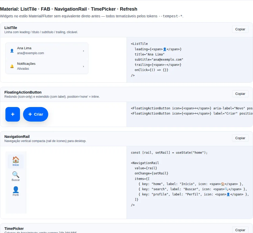
Section material of the gallery — run it locally to interact.
When to use: a compact, vertical navigation column for desktop/tablet — a
narrower alternative to Sidebar when you only need icons stacked over short
labels. Each item stacks an icon over its label; the active one gets
aria-current="page".
items: NavigationRailItem[], header/footer slots, and label control via
labelVisibility.
import { useState } from "react";
import { NavigationRail, FloatingActionButton } from "tempest-react-sdk";
import { Home, Inbox, Settings, Plus } from "lucide-react";

function AppRail() {
  const [tab, setTab] = useState("home");

  return (
    <NavigationRail
      header={<FloatingActionButton icon={<Plus />} aria-label="New" position="none" />}
      items={[
        { key: "home", label: "Home", icon: <Home /> },
        { key: "inbox", label: "Inbox", icon: <Inbox />, badge: 3 },
        { key: "settings", label: "Settings", icon: <Settings /> },
      ]}
      value={tab}
      onChange={setTab}
      labelVisibility="all"
    />
  );
}
| Prop | Type | Default |
|---|---|---|
items |
NavigationRailItem[] |
— |
value |
string (selected key) |
— |
onChange |
(key: string) => void |
— |
header |
ReactNode (top — e.g. a FAB) |
— |
footer |
ReactNode (bottom) |
— |
labelVisibility |
"all" \| "selected" \| "none" |
"all" |
Type NavigationRailItem = { key, label, icon?, badge?, disabled? }.
labelVisibility controls the density
Use "selected" to show only the active item's label (a narrower rail) or
"none" for an icon-only rail. On small screens prefer BottomNavigation.
BottomNavigation
A bottom-fixed tab bar for mobile. 3-5 items.
import { useState } from "react";
import { BottomNavigation, Show } from "tempest-react-sdk";
import { Home, Search, ShoppingCart, User } from "lucide-react";

export function BarraInferior({ cartCount }: { cartCount: number }) {
    const [tab, setTab] = useState("home");

    return (
        <Show below="md">
            <BottomNavigation
                items={[
                    { key: "home", label: "Home", icon: <Home size={20} /> },
                    { key: "search", label: "Search", icon: <Search size={20} /> },
                    {
                        key: "cart",
                        label: "Cart",
                        icon: <ShoppingCart size={20} />,
                        badge: cartCount,
                    },
                    { key: "profile", label: "Profile", icon: <User size={20} /> },
                ]}
                value={tab}
                onChange={setTab}
            />
        </Show>
    );
}
| Prop | Type | Default |
|---|---|---|
items |
BottomNavigationItem[] (3–5) |
— |
value |
string |
— |
onChange |
(key: string) => void |
— |
showLabels |
boolean |
true |
Type BottomNavigationItem = { key, label, icon?, badge?, disabled? }.
Safe-area: applies padding-bottom: env(safe-area-inset-bottom)
automatically.
Tabs
When to use: switch between content panels within a single screen (overview / details / logs). Don't use it to navigate between routes.
Controlled/uncontrolled tabs. Fade-edge mask on horizontal overflow. Visual
variants via variant ("underline" default or "pill").
import { useState } from "react";
import { Tabs } from "tempest-react-sdk";

export function Abas() {
    const [tab, setTab] = useState("overview");

    return (
        <Tabs
            activeId={tab}
            onChange={setTab}
            items={[
                { id: "overview", label: "Overview", content: <p>Overview</p> },
                { id: "details", label: "Details", content: <p>Details</p> },
                { id: "logs", label: "Logs", content: <p>Logs</p> },
            ]}
        />
    );
}
| Prop | Type | Default |
|---|---|---|
items |
TabItem[] |
— |
activeId |
string (controlled) |
— |
defaultId |
string (uncontrolled) |
— |
defaultValue |
string (uncontrolled) |
— |
onChange |
(key: string) => void |
— |
Stepper
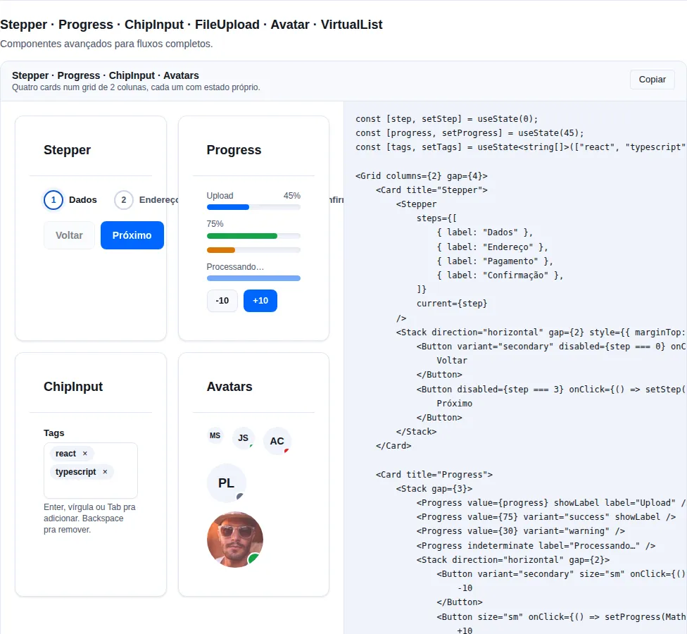
Section advanced of the gallery — run it locally to interact.
When to use: show progress through a linear multi-step flow (checkout,
onboarding, wizard). It's a progress indicator, not a selector — drive current
from your flow logic.
A linear wizard with numbered steps. orientation accepts "horizontal"
(default) or "vertical".
import { useState } from "react";
import { Stepper } from "tempest-react-sdk";

export function Passos() {
    const [step] = useState(1);

    return (
        <Stepper
            current={step}
            steps={[
                { label: "Details" },
                { label: "Payment" },
                { label: "Review" },
            ]}
        />
    );
}
Breadcrumbs
When to use: signal position in a deep hierarchy (Home › Orders › #12345) and allow jumping back to previous levels. Skippable in 1-2 level apps.
Hierarchical navigation.
import { Breadcrumbs } from "tempest-react-sdk";

export function Trilha() {
    return (
        <Breadcrumbs
            items={[
                { label: "Home", href: "/" },
                { label: "Orders", href: "/orders" },
                { label: "#12345" },
            ]}
        />
    );
}
A11y: the last item is marked with aria-current="page".
Pagination
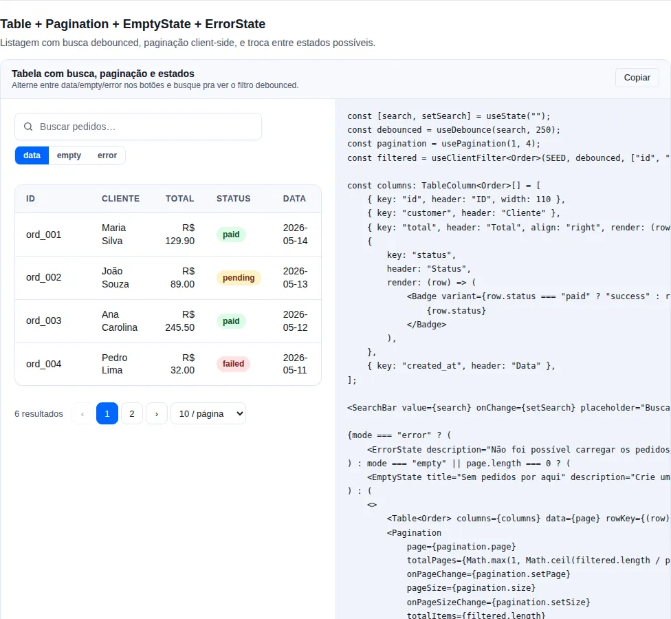
Section table of the gallery — run it locally to interact.
When to use: walk large lists in discrete pages (search results, tables).
For continuous feeds prefer infinite scroll (VirtualList + usePoll/Query).
Numeric with siblings + an optional page-size selector.
page is 1-indexed, and you count the pages
totalPages is the number of pages — the component does not derive it from pageSize. totalItems is optional and only feeds the summary line ("1–20 of 137"). Remember to reset page to 1 when the filter changes, or you can end up on a page that no longer exists.
import { useState } from "react";
import { Pagination } from "tempest-react-sdk";

export function Paginacao({ totalItems }: { totalItems: number }) {
    const [page, setPage] = useState(1);
    const [size, setSize] = useState(20);

    return (
        <Pagination
            page={page}
            pageSize={size}
            totalPages={Math.max(1, Math.ceil(totalItems / size))}
            totalItems={totalItems}
            onPageChange={setPage}
            onPageSizeChange={setSize}
            siblingCount={1}
        />
    );
}
| Prop | Type | Default |
|---|---|---|
page |
number (1-indexed) |
— |
pageSize |
number |
— |
totalPages |
number |
— |
totalItems |
number (count, optional) |
— |
onPageChange |
(page: number) => void |
— |
onPageSizeChange |
(size: number) => void |
— |
pageSizeOptions |
number[] — the current pageSize is always merged in |
[10, 25, 50, 100] |
siblingCount |
number (neighbors) |
3 |
compactOnMobile |
boolean |
true |
Below 640px: sequential by default, random access if you ask
The default hides the numbers and leaves ‹ / › plus the summary. That is reasonable in a desktop-first app; in a mobile-first one it costs exactly what pagination is for — reaching page 7 becomes six taps on "next" instead of one tap on 7.
<Pagination page={page} totalPages={pages} onPageChange={setPage} compactOnMobile={false} />
With false the numbers stay at every width: the row scrolls horizontally on its own instead of widening the page, and the current page is brought into view whenever it changes.
Why a boolean and not a variant
Simply dropping the display: none would push a nine-button row past a 360px viewport and give the whole document a horizontal scrollbar. The opt-out has to carry its own layout — so it does, and there is no third option to choose between.
SegmentedControl
When to use: toggle between 2-5 mutually exclusive views of the same screen
(list/grid/map). It's more compact than Tabs and has no built-in content
panels — you swap the view manually via value.
An iOS-style pill bar (2-5 options).
import { useState } from "react";
import { SegmentedControl } from "tempest-react-sdk";
import { LayoutGrid, List, Map } from "lucide-react";

export function Visao() {
    const [view, setView] = useState("list");

    return (
        <SegmentedControl
            value={view}
            onChange={setView}
            options={[
                { value: "list", label: "List", icon: <List size={14} /> },
                { value: "grid", label: "Grid", icon: <LayoutGrid size={14} /> },
                { value: "map", label: "Map", icon: <Map size={14} /> },
            ]}
            size="md"
            fullWidth
        />
    );
}
| Prop | Type | Default |
|---|---|---|
options |
SegmentedControlOption[] |
— |
value |
string |
— |
onChange |
(value: string) => void |
— |
size |
"sm" \| "md" \| "lg" |
"md" |
fullWidth |
boolean |
false |
A11y: role="radiogroup" + role="radio" with aria-checked.
General A11y
- Navbar: uses
<nav>(already included); mark active items witharia-current="page". - Sidebar/BottomNavigation: keyboard accessible — Tab cycles between items.
- Tabs: ←→ arrows switch tabs when focused.
- Breadcrumbs: the separator (
/) is decorative (aria-hidden).
Mark the active item with aria-current
Navbar/Sidebar/BottomNavigation need the current-route item to carry
aria-current="page" — without it, screen readers don't announce where the
user is. Breadcrumbs already does this on the last item automatically.
Recap
- Pick by scope:
Navbar/Sidebar/NavigationRail/BottomNavigationto navigate between sections;Tabs/SegmentedControl/Stepperto move within a screen. - The trio
Navbar+Sidebar+BottomNavigationare theAppShellslots — let it orchestrate the desktop/mobile swap. Paginationfor paged lists;Breadcrumbsfor deep hierarchies.- Always mark the active item with
aria-current="page"in primary navigation.
Related pages: