Utility & headless
Small, focused components: some render bits of UI (Money, RelativeTime, CopyButton), others are headless — they drive behavior/logic without dictating the visuals (Portal, ClickOutside, For). All imported from tempest-react-sdk.
Display
CopyButton
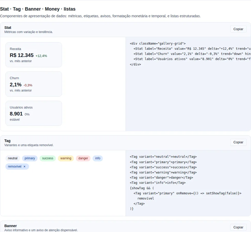
Section data-display of the gallery — run it locally to interact.
Button that copies a string to the clipboard and shows a transient "copied" state.
import { CopyButton } from "tempest-react-sdk";

<CopyButton value="npm i tempest-react-sdk" />;

<CopyButton value={token} timeout={3000} onCopied={() => toast("Token copied")}>
  Copy token
</CopyButton>;
| Prop | Type | Default | Notes |
|---|---|---|---|
value |
string |
— | Text written to the clipboard. |
timeout |
number (ms) |
2000 |
How long the "copied" state stays active. |
children |
ReactNode |
"Copy"/"Copied" |
Fixed label in both states; without children the text toggles. |
onCopied |
() => void |
— | Called after a successful write. |
Extends ButtonHTMLAttributes. Clipboard failures are silenced; the timer is cleared on unmount.
RelativeTime
Renders a date as a relative string ("5 min ago") inside a semantic <time> element with a machine-readable dateTime.
import { RelativeTime } from "tempest-react-sdk";

<RelativeTime date={post.createdAt} />; // pt-BR
<RelativeTime date={post.createdAt} locale="en" />;
| Prop | Type | Default | Notes |
|---|---|---|---|
date |
Date \| string \| number |
— | Instant to render. |
locale |
"pt" \| "en" |
"pt" |
"pt" maps to "pt-BR". |
Extends HTMLAttributes<HTMLTimeElement>.
Money
Renders a monetary amount given in cents as a localized currency string inside a <span>.
import { Money } from "tempest-react-sdk";

<Money cents={1990} />; // "R$ 19,90"
<Money cents={500} currency="USD" locale="en-US" />; // "$5.00"
| Prop | Type | Default | Notes |
|---|---|---|---|
cents |
number |
— | Amount in the smallest unit (cents). |
currency |
string |
"BRL" |
ISO 4217 code. |
locale |
string |
"pt-BR" |
BCP 47 locale used for formatting. |
Extends HTMLAttributes<HTMLSpanElement>. Internally divides cents by 100 and uses Intl.NumberFormat.
TruncateText
Clamps text to a fixed number of lines via CSS line-clamp, with an ellipsis on overflow.
import { TruncateText } from "tempest-react-sdk";

<TruncateText lines={2}>{longDescription}</TruncateText>;
| Prop | Type | Default | Notes |
|---|---|---|---|
lines |
number |
1 |
Lines before clamping (--tempest-clamp-lines). |
children |
ReactNode |
— | Content to clamp. |
Extends HTMLAttributes<HTMLDivElement>.
VisuallyHidden
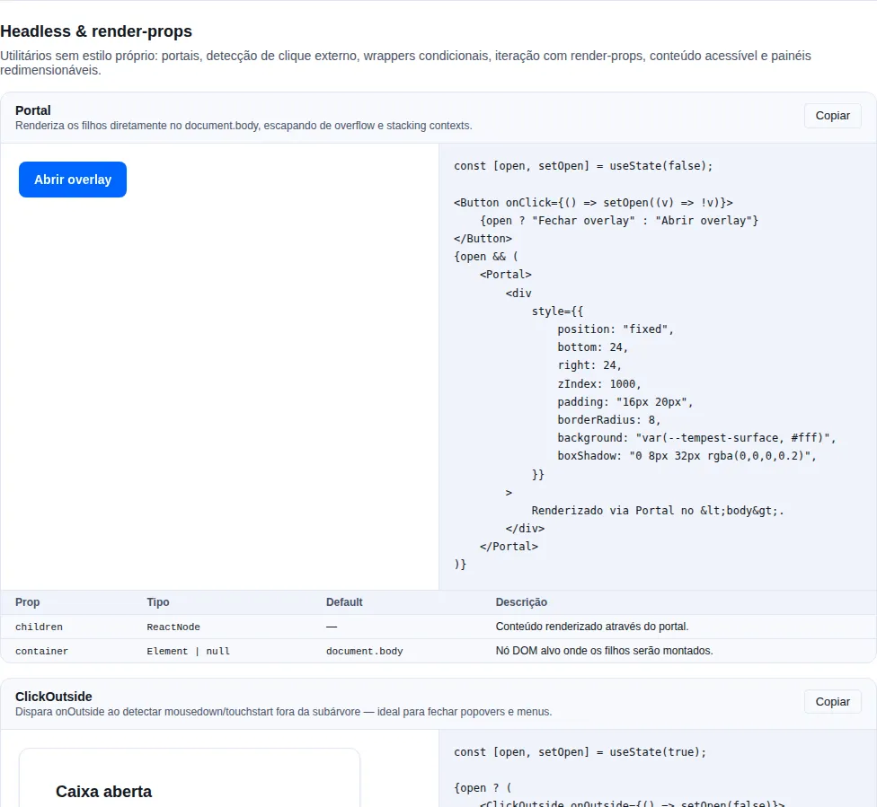
Section headless of the gallery — run it locally to interact.
Content hidden visually but available to screen readers — the sr-only pattern.
import { VisuallyHidden } from "tempest-react-sdk";

<button>
  <Icon />
  <VisuallyHidden>Close</VisuallyHidden>
</button>;
| Prop | Type | Default | Notes |
|---|---|---|---|
as |
keyof JSX.IntrinsicElements |
"span" |
Intrinsic element to render. |
Extends HTMLAttributes<HTMLElement>.
Motion
Reveal
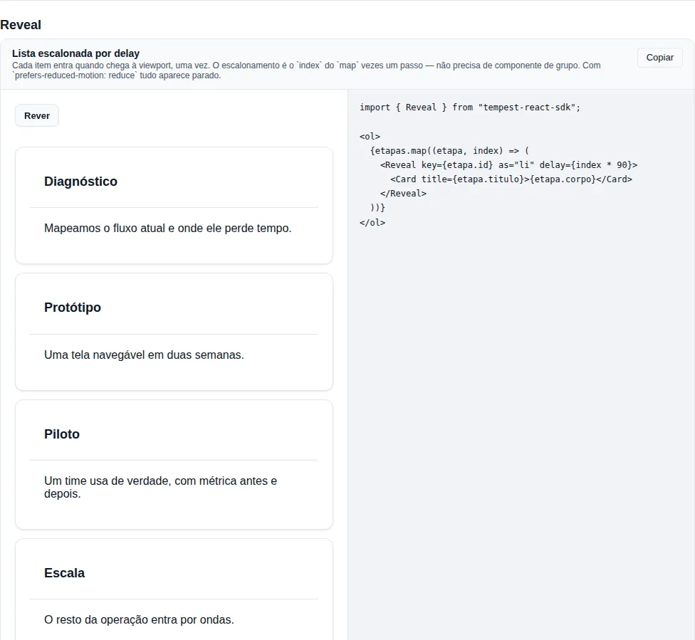
Section reveal of the gallery — run it locally to interact.
Content that enters when it reaches the viewport — a fade or slide on scroll, the pattern of every landing page. It reveals once and stops observing.
import { Card, Reveal } from "tempest-react-sdk";

const steps = [
  { id: "1", title: "Discovery" },
  { id: "2", title: "Prototype" },
  { id: "3", title: "Pilot" },
];

export function Steps() {
  return (
    <ol>
      {steps.map((step, index) => (
        <Reveal key={step.id} as="li" variant="up" delay={index * 90}>
          <Card title={step.title} />
        </Reveal>
      ))}
    </ol>
  );
}
Staggering is the map index times a step: there is no RevealGroup, because the index is already in your hand and a group would only hide that arithmetic behind cloneElement.
| Prop | Type | Default | Notes |
|---|---|---|---|
variant |
"fade" \| "up" \| "down" \| "left" \| "right" \| "scale" |
"up" |
Where the content comes from. up rises from below; left travels right to left. |
delay |
number (ms) |
0 |
Wait before entering (--tempest-reveal-delay). |
duration |
number (ms) |
--tempest-duration-slower |
Length of the entrance (--tempest-reveal-duration). |
as |
keyof JSX.IntrinsicElements |
"div" |
Element to render — "li" inside <ul>/<ol> keeps the list semantics. |
once |
boolean |
true |
false hides again once the element is fully out of view, and animates next time. |
threshold |
number |
0.15 |
Fraction of the element — or of the viewport, when it is taller — that must be visible. |
rootMargin |
string |
"0px" |
Root margin, as in IntersectionObserver. |
Extends HTMLAttributes<HTMLElement>. The current state is written to data-state ("static", "hidden" or "shown") and the variant to data-variant.
The three traps of a hand-rolled Reveal are handled by the component:
prefers-reduced-motion: reduce→ the content is visible and still, with no transform and no transition (WCAG 2.3.3). It is CSS, so it also holds when the preference changes with the page open.- No
IntersectionObserver→ the element stays atdata-state="static", which is visible content. It is never hidden waiting for an observation that cannot come. - Element taller than the viewport → a block three screens tall never reaches 50% visibility, so a raw
threshold={0.5}would never reveal it.Revealreads the geometry on the first observation and rescales the threshold by the highest reachable ratio: the block reveals once it fills half the viewport.
Markup without JavaScript stays visible
The hidden state is applied only on a client that can observe. Rendered without JS — or before hydration — the element comes out as data-state="static". The transition lives on the "shown" state only, so the switch to "hidden" on mount is instant, with no fade-out.
Customize without a new prop through the custom properties --tempest-reveal-distance (default 1.5rem), --tempest-reveal-scale (0.95) and --tempest-reveal-easing.
Headless / logical
No CSS of their own: they encapsulate behavior and let you supply the markup.
Portal
Renders its children into a different part of the DOM tree via a React portal — ideal for overlays that must escape overflow/stacking contexts.
import { Portal } from "tempest-react-sdk";

<Portal>
  <div className="toast">Saved!</div>
</Portal>;

<Portal container={drawerRoot}>{menu}</Portal>;
| Prop | Type | Default | Notes |
|---|---|---|---|
children |
ReactNode |
— | Content rendered through the portal. |
container |
Element \| null |
document.body |
Target DOM node. |
SSR-safe
Renders null on the server and on the first client render; mounts the portal only after hydration.
ClickOutside
Wraps its children in a <div> and fires onOutside when a mousedown/touchstart happens outside the subtree. Handy for dismissing popovers and menus.
import { ClickOutside } from "tempest-react-sdk";

<ClickOutside onOutside={() => setOpen(false)}>
  <Menu />
</ClickOutside>;
| Prop | Type | Default | Notes |
|---|---|---|---|
onOutside |
(event: MouseEvent \| TouchEvent) => void |
— | Called on outside interaction. |
children |
ReactNode |
— | Content inside the boundary. |
Extends HTMLAttributes<HTMLDivElement> (props flow to the wrapper <div>).
ConditionalWrapper
Wraps its children with wrapper only when condition is true — avoids duplicating the subtree just to add an optional wrapper (link, tooltip, boundary).
import { ConditionalWrapper } from "tempest-react-sdk";

<ConditionalWrapper condition={Boolean(href)} wrapper={(children) => <a href={href}>{children}</a>}>
  <CardBody />
</ConditionalWrapper>;
| Prop | Type | Default | Notes |
|---|---|---|---|
condition |
boolean |
— | When true, applies the wrapper. |
wrapper |
(children: ReactNode) => ReactNode |
— | Wrapping function. |
children |
ReactNode |
— | Content that may be wrapped. |
For
Typed, JSX-friendly list renderer with a fallback for the empty collection. The item type is inferred from each.
import { For } from "tempest-react-sdk";

<For each={users} fallback={<p>No users</p>}>
  {(user, index) => (
    <li key={user.id}>
      {index + 1}. {user.name}
    </li>
  )}
</For>;
| Prop | Type | Default | Notes |
|---|---|---|---|
each |
readonly T[] |
— | Collection to iterate. |
children |
(item: T, index: number) => ReactNode |
— | Render per item. |
fallback |
ReactNode |
null |
Rendered when each is empty. |
ErrorText
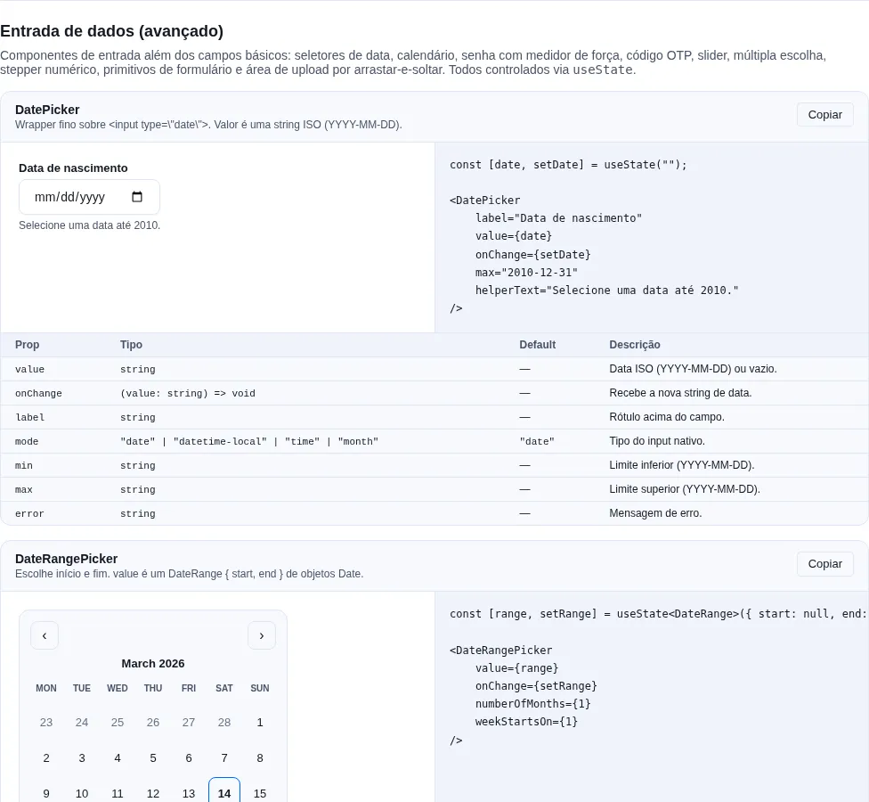
Section inputs-extra of the gallery — run it locally to interact.
A form-field error message as <p role="alert">. Renders null when there are no children — place it unconditionally below a field and it only appears when an error is present.
import { ErrorText } from "tempest-react-sdk";

<input aria-invalid={Boolean(error)} />
<ErrorText>{error}</ErrorText>;
| Prop | Type | Default | Notes |
|---|---|---|---|
children |
ReactNode |
— | Message; null/""/false → renders nothing. |
Extends HTMLAttributes<HTMLParagraphElement>. Styled with the --tempest-danger token.
Media / content
Image
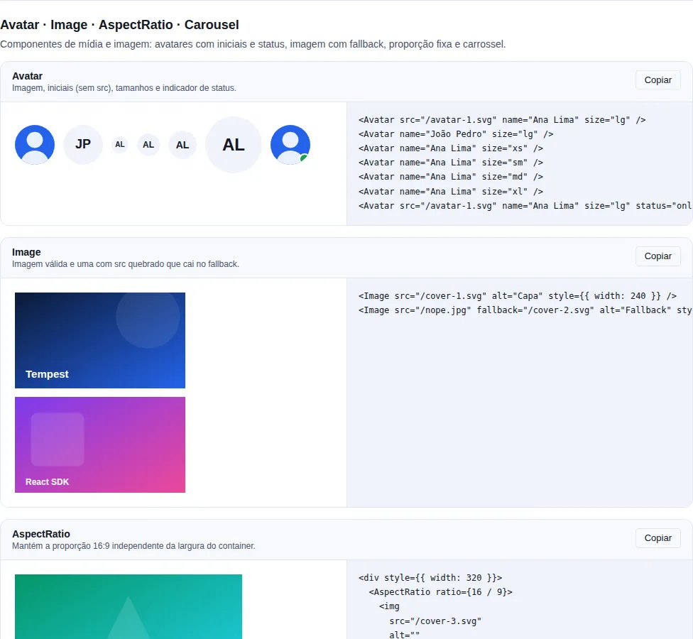
Section display-media of the gallery — run it locally to interact.
<img> with native lazy loading and a one-shot fallback.
import { Image } from "tempest-react-sdk";

<Image src={user.avatarUrl} fallback="/avatar-placeholder.png" alt={user.name} />;
| Prop | Type | Default | Notes |
|---|---|---|---|
src |
string |
— | Primary source. |
fallback |
string |
— | Source swapped in once if the primary fails. |
alt |
string |
— | Alternative text (required). |
lazy |
boolean |
true |
true → loading="lazy"; false → eager. |
Extends ImgHTMLAttributes (without src). The fallback is guarded so it cannot loop the onError handler.
DataList
Generic, typed list rendering a <ul> with one <li> per item, with an empty slot.
import { DataList } from "tempest-react-sdk";

<DataList
  items={notifications}
  keyExtractor={(n) => n.id}
  renderItem={(n) => <NotificationRow notification={n} />}
  empty={<p>Nothing new</p>}
/>;
| Prop | Type | Default | Notes |
|---|---|---|---|
items |
readonly T[] |
— | Collection to render. |
renderItem |
(item: T, index: number) => ReactNode |
— | Contents of each <li>. |
keyExtractor |
(item: T, index: number) => string \| number |
index | Stable key per item. |
empty |
ReactNode |
— | Rendered when items is empty. |
Extends HTMLAttributes<HTMLUListElement>.
DescriptionList
Semantic <dl> of term/description pairs, with token-based key/value styling.
import { DescriptionList } from "tempest-react-sdk";

<DescriptionList
  items={[
    { term: "Order", description: "#1042" },
    { term: "Status", description: <Badge variant="success">Paid</Badge> },
    { term: "Total", description: <Money cents={1990} /> },
  ]}
/>;
| Prop | Type | Default | Notes |
|---|---|---|---|
items |
DescriptionListItem[] |
— | <dt>/<dd> pairs. |
DescriptionListItem = { term: ReactNode; description: ReactNode }. Extends HTMLAttributes<HTMLDListElement>.
CodeBlock
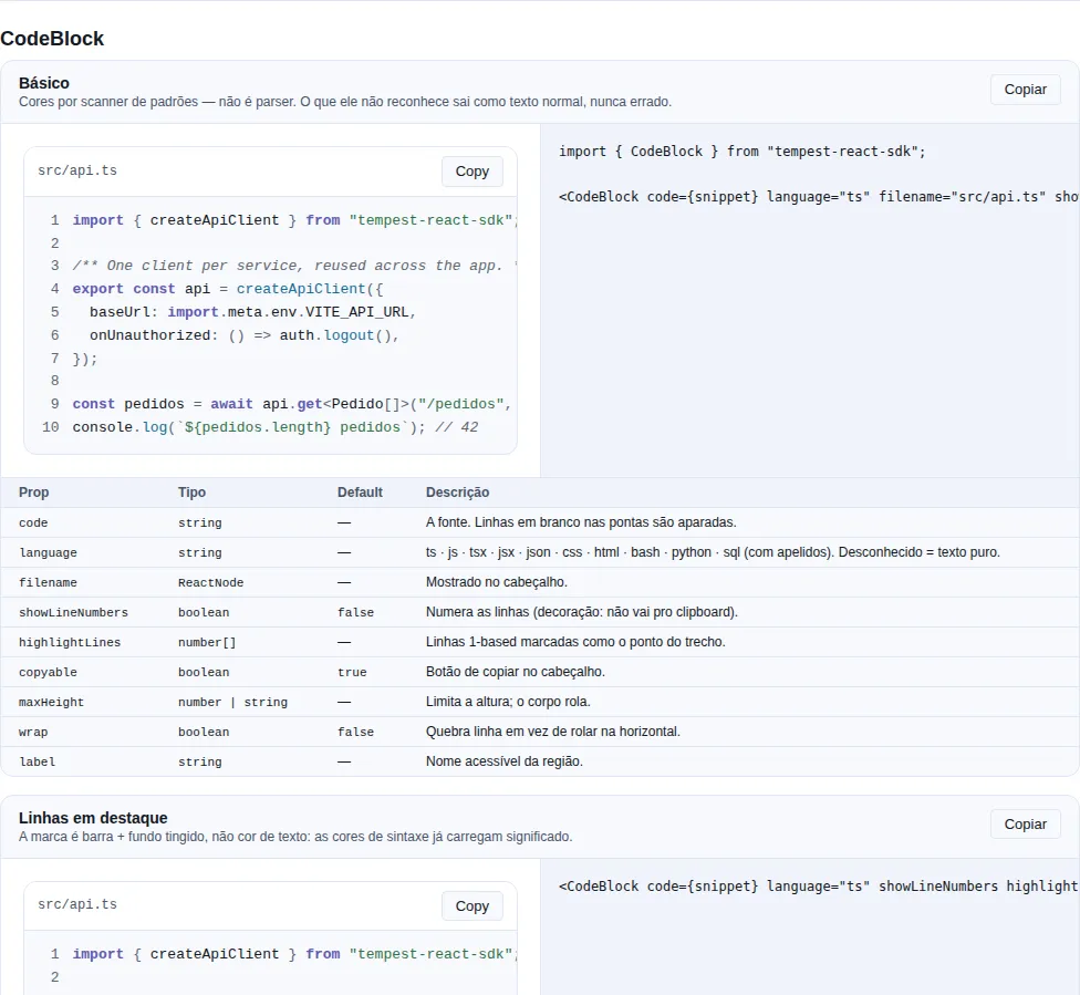
Section codeblock of the gallery — run it locally to interact.
A read-only code sample: syntax colours, optional line numbers, copy button.
import { CodeBlock } from "tempest-react-sdk";

<CodeBlock code={snippet} language="ts" filename="src/api.ts" showLineNumbers />
<CodeBlock code={log} language="bash" maxHeight={280} />
| Prop | Type | Default | Notes |
|---|---|---|---|
code |
string |
— | The source. Blank lines at either end are trimmed. |
language |
string |
— | Grammar or alias. Unknown values render as plain text. |
filename |
ReactNode |
— | Shown in the header. |
showLineNumbers |
boolean |
false |
Number the lines. |
highlightLines |
number[] |
— | 1-based lines marked as the point of the snippet. |
copyable |
boolean |
true |
Copy button in the header. |
maxHeight |
number \| string |
— | Cap the height; the body scrolls. |
wrap |
boolean |
false |
Wrap long lines instead of scrolling sideways. |
label |
string |
— | Accessible name for the region. |
Grammars: typescript · javascript · tsx · jsx · json · css · html · bash · python · sql, with aliases (ts, js, sh, py, scss, xml, shell, zsh, jsonc…).
It is a scanner, not a parser — and that is a chosen ceiling
The highlighter recognises comments, strings, numbers, keywords and punctuation by pattern. It knows nothing about scope, types or grammar. A real parser per language is a dependency the size of the rest of the SDK, and the payoff — being right about the rare corners of a documentation snippet — is small. Where it is unsure it emits plain, which renders as ordinary text rather than as something wrong. An unknown language produces an uncoloured block, which is a normal outcome and never an error.
The <pre> is always focusable
A code block scrolls and holds nothing focusable inside. Without a tab stop, a keyboard user can see the scrollbar and has no way to move it — focus never lands anywhere the arrow keys would scroll. It is the one scroll container in the SDK where the stop is unconditional rather than measured: a code sample is meant to be reached, read and selected on its own. The others (Table, VirtualList, ScrollArea) only take the stop while they actually overflow.
Line numbers are decoration — and stay out of the clipboard
They are aria-hidden (a screen reader announcing "one const two import" adds nothing) and user-select: none. Selecting the block with the mouse and copying gives you the source, without the numbers. Verified in a browser: selecting the whole <code> yields exactly the original.
Syntax colours have their own tokens, not the chart ramp
--tempest-code-*. The chart ramp is validated at the mark floor (3:1); this is text and needs 4.5:1. Measured as text the ramp fails in both modes — a keyword came out at 3.47:1 on the dark surface and a string at 2.03:1 on the light one. Each code token was solved in OKLCH against both grounds it can land on: the block surface, and a highlighted line once the wash composites over it. See style tokens.
QRCode
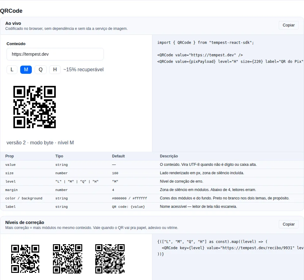
Section qrcode of the gallery — run it locally to interact.
A QR symbol encoded in the browser and drawn as SVG. No dependency and no image-service round trip — a remote generator would hand the payload (a payment link, a session token, an invite) to a third party.
import { QRCode } from "tempest-react-sdk";

<QRCode value="https://tempest.dev" />
<QRCode value={pixPayload} level="H" size={220} label="QR do Pix — R$ 42,00" />
| Prop | Type | Default | Notes |
|---|---|---|---|
value |
string |
— | The payload. UTF-8 when it is not digits or upper case. |
size |
number |
160 |
Rendered side in px, quiet zone included. |
level |
"L" \| "M" \| "Q" \| "H" |
"M" |
Error correction: ~7% · ~15% · ~25% · ~30% recoverable. |
margin |
number |
4 |
Quiet zone in modules. |
color |
string |
#000000 |
Module colour. |
background |
string |
#ffffff |
Background colour. |
label |
string |
QR code: {value} |
Accessible name. |
Black on white in both themes — on purpose
This is the one part of the SDK that ignores the theme tokens. Scanners expect dark-on-light, and the ones that cope with an inverted symbol do it slowly and unreliably. Wiring the modules to --tempest-text would flip them light in dark mode and leave a light symbol on the white ground, which scans as nothing at all. A QR that matches your dark page and scans on the third try is worse than one that looks pasted on. Only touch color/background with a scanner in hand.
The mode changes the symbol size, and the size changes how easily it scans
The encoder picks the densest mode the payload allows: numeric packs 3 digits into 10 bits, alphanumeric 2 characters into 11, byte spends 8 bits per byte. A phone number as plain digits fits in a visibly coarser symbol than the same number as bytes — and a bigger module is an easier module to scan. If you control the payload format, upper case and no accents buys you symbol size.
A quiet zone below 4 modules is where scanners start to miss
The default margin follows the standard. Shrinking it to save screen space is the optimisation that costs the most read rate.
The correction level is not quality — it is damage tolerance
L is enough for an on-screen QR that nobody creases. Q/H earn their size when the symbol goes to paper, a sticker, a shop window or a badge: they recover ~25%/~30% of the codewords, so a tear, a fold or a smudge still reads. The cost is a larger symbol for the same content.
A screen reader cannot scan
That is why the default aria-label names the payload (QR code: https://…) rather than just saying "QR code". When the payload is opaque — a Pix BR Code, say — pass a label describing what it does, and offer the same data as text or a copy button beside it.
When the payload is too large
A payload that does not fit even a version-40 symbol throws QRCapacityError instead of drawing a truncated symbol that scans wrong. That is a programming error rather than a state to render — validate first if the content comes from a user, or wrap it in an ErrorBoundary.
import { encodeQR, QRCapacityError } from "tempest-react-sdk";

try {
  encodeQR(payload, { level: "H" });
} catch (error) {
  if (error instanceof QRCapacityError) {
    // error.length (bytes) and error.level
  }
}
encodeQR(value, { level, minVersion }) returns the raw matrix (modules, size, version, mode, mask) for anyone drawing it themselves — canvas, PDF, thermal label. matrixToPath(matrix, margin) builds the same d the component uses.
Recap
- Display:
CopyButton(clipboard + transient state),RelativeTime(relative<time>),Money(cents → currency),TruncateText(line-clamp),VisuallyHidden(sr-only). - Motion:
Reveal(enter on scroll, staggered bydelay; visible withoutIntersectionObserverand still underprefers-reduced-motion). - Headless/logical:
Portal(SSR-safe),ClickOutside,ConditionalWrapper,For(typed list with fallback),ErrorText(field errorrole="alert"). - Media/content:
Image(lazy + fallback),DataList(generic<ul>),DescriptionList(<dl>term/value),CodeBlock(code sample with highlighting),QRCode(QR symbol as SVG, encoded in the browser). - "Display" and "content" components use
--tempest-*tokens; the headless ones ship no CSS — you supply the markup.