Actions
Action components are where the user triggers something: click, pick from a list, confirm. They carry intent — a click changes data, navigates, or starts a flow. That's why this category groups both the direct trigger (Button) and the elements around an action: contextual hint (Tooltip), a set of secondary actions (DropdownMenu), an anchored panel (Popover), and the safeguard before something destructive (ConfirmDialog).
Reach for this page when you need the user to do something. For data entry (text, selection, dates) see inputs; to present collections, see data.
Button
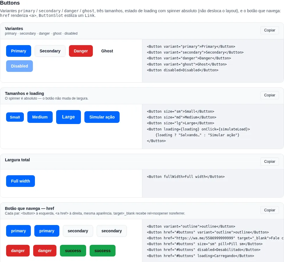
Section buttons of the gallery — run it locally to interact.
When to use: the primary or secondary action of any screen — submit a form, open a modal, navigate. The default action trigger.
Primary button with variants, sizes, and a loading state.
import { Button } from "tempest-react-sdk";
import { Plus, Trash } from "lucide-react";

<Button>Save</Button>;
<Button variant="danger" leftIcon={<Trash size={16} />}>
  Delete
</Button>;
<Button variant="outline" loading>
  Loading…
</Button>;
<Button variant="link" rightIcon={<ArrowRight size={14} />}>
  See more
</Button>;
<Button iconOnly aria-label="Add">
  <Plus size={16} />
</Button>;
<Button fullWidth pill>
  CTA
</Button>;
| Prop | Type | Default |
|---|---|---|
variant |
"primary" \| "secondary" \| "success" \| "danger" \| "soft" \| "outline" \| "ghost" \| "link" |
"primary" |
size |
"xs" \| "sm" \| "md" \| "lg" \| "xl" |
"md" |
loading |
boolean |
false |
fullWidth |
boolean |
false |
iconOnly |
boolean (square, requires aria-label) |
false |
pill |
boolean (pill border-radius) |
false |
leftIcon |
ReactNode |
— |
rightIcon |
ReactNode |
— |
href |
string — renders <a> instead of <button> |
— |
iconOnly needs an accessible label
iconOnly removes the visible text, so screen readers have nothing to announce. Always pass aria-label describing the action (aria-label="Delete"). Without it the button is a mute icon to assistive tech.
loading blocks double-clicks
loading disables the button and sets aria-busy="true" — it's the standard for async submits. Turn it on the moment you fire the request to avoid duplicate requests from repeated clicks.
The label stays the accessible name while loading: it is removed from paint only (the spinner replaces it on screen, at the same width), so a screen reader announces "Save, button, unavailable" — not a nameless "button". The spinner is decorative (aria-hidden) and adds nothing to the name; the state comes from aria-busy and disabled. This holds for <button>, href and ButtonSlot.
A button that navigates: href
A call to action that takes the user somewhere — "Contact us" on WhatsApp, mailto:, "See plans", "Download" — is a link, not a button. With onClick={() => location.assign(url)} it loses the middle click, Ctrl+click, "open in new tab", the URL preview and the crawler; with <a><Button /></a> it is invalid HTML with two tab stops. With href, Button renders an <a> with the same look across every variant and size:
import { Button } from "tempest-react-sdk";
import { MessageCircle } from "lucide-react";

export function Ctas() {
  return (
    <>
      <Button href="/plans" variant="outline">
        See plans
      </Button>
      <Button
        href="https://wa.me/5586999999999"
        target="_blank"
        leftIcon={<MessageCircle size={16} />}
      >
        Contact us
      </Button>
    </>
  );
}
targetandrelare forwarded.- The
refis typed per mode:HTMLButtonElementwithouthref,HTMLAnchorElementwith it.typeexists only in the<button>mode —<Button href="/x" type="submit">does not compile.
target=_blank gets noopener noreferrer on its own
Without noopener, the opened tab receives window.opener and can redirect yours. It is a mechanical rule with one right answer, so it lives in the component: the tokens you pass in rel stay, and the missing ones are added without duplicates.
Disabled link
<a> has no disabled. With disabled or loading, the link gets aria-disabled="true", role="link" and tabIndex={-1}, loses its href, and has its click and middle click cancelled — it does not navigate and is announced as unavailable.
Why InstallButton does not take href
Its click opens the install prompt or reveals the instruction — an action, not a navigation. It inherits the props of the <button> mode.
ButtonSlot
When to use: give the
Buttonlook to another element — typically react-router'sLink, to change routes without reloading the page.
ButtonSlot renders no element of its own: it applies the button's classes, props and ref to its single child (the asChild/Slot pattern). It takes the same look props as Button (variant, size, loading, disabled, fullWidth, iconOnly, pill, leftIcon, rightIcon), and Button never imports the router.
import { ButtonSlot } from "tempest-react-sdk";
import { Link, NavLink } from "react-router";

export function Menu() {
  return (
    <>
      <ButtonSlot variant="soft">
        <Link to="/account">My account</Link>
      </ButtonSlot>
      <ButtonSlot variant="ghost">
        <NavLink to="/" className={({ isActive }) => (isActive ? "active" : "")}>
          Home
        </NavLink>
      </ButtonSlot>
    </>
  );
}
How the props combine:
- Classes are added. A function
className(NavLink's) stays a function. ButtonSlot's props win over the child's, because they carry the disabled semantics.- Both handlers run:
ButtonSlot's first; if it callspreventDefault(), the child's does not run. - Both
refs — the child's andButtonSlot's — receive the same node. - A child with
target="_blank"also getsnoopener noreferrer.
Disabled around a Link
With disabled or loading, the child gets aria-disabled="true" and tabIndex={-1}, and the click and middle click are cancelled — the Link skips its navigation because the event arrives prevented. A plain <a href> also loses its href; a Link's href is computed by the Link and stays in the DOM.
Why a component and not an asChild prop
The prop merge and ref composition cost ~0.6 kB brotli. An asChild prop is a runtime branch no bundler can remove, so every app using Button would pay for it. As a separate export, ButtonSlot drops out of the bundle of anyone who does not import it: the { Button } slice measures 1.21 kB with href, against 1.71 kB with asChild inside Button.
FloatingActionButton
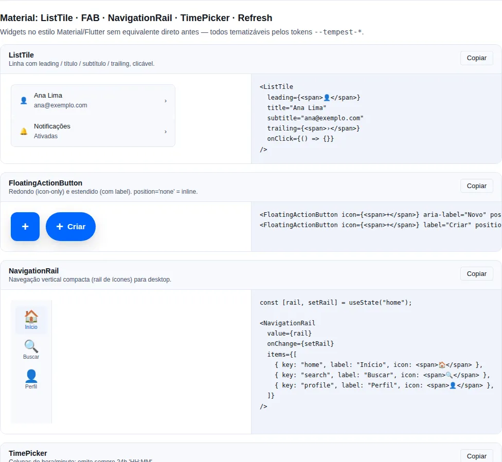
Section material of the gallery — run it locally to interact.
When to use: the primary, persistent action of a screen (create, compose, add) that should always be reachable, floating over the content. Round when icon-only, or extended (pill) when given a
label.
By default it is fixed to the bottom-right corner; pass position="none" to place it inline (e.g. inside a NavigationRail). Spreads all native <button> props (onClick, disabled, etc.).
import { FloatingActionButton } from "tempest-react-sdk";
import { Plus } from "lucide-react";

<FloatingActionButton icon={<Plus />} aria-label="New" position="none" onClick={create} />;
<FloatingActionButton icon={<Plus />} label="New order" onClick={create} />;
| Prop | Type | Default |
|---|---|---|
icon |
ReactNode |
— |
label |
ReactNode (present → extended FAB) |
— |
position |
"bottom-right" \| "bottom-left" \| "none" |
"bottom-right" |
size |
"sm" \| "md" \| "lg" |
"md" |
variant |
"primary" \| "surface" |
"primary" |
| ... | All HTMLButtonElement attributes |
— |
An icon-only FAB needs aria-label
Without a visible label, the round FAB has no accessible name. Always pass aria-label describing the action (aria-label="New"); when a label is present, it already serves as the name.
Tooltip
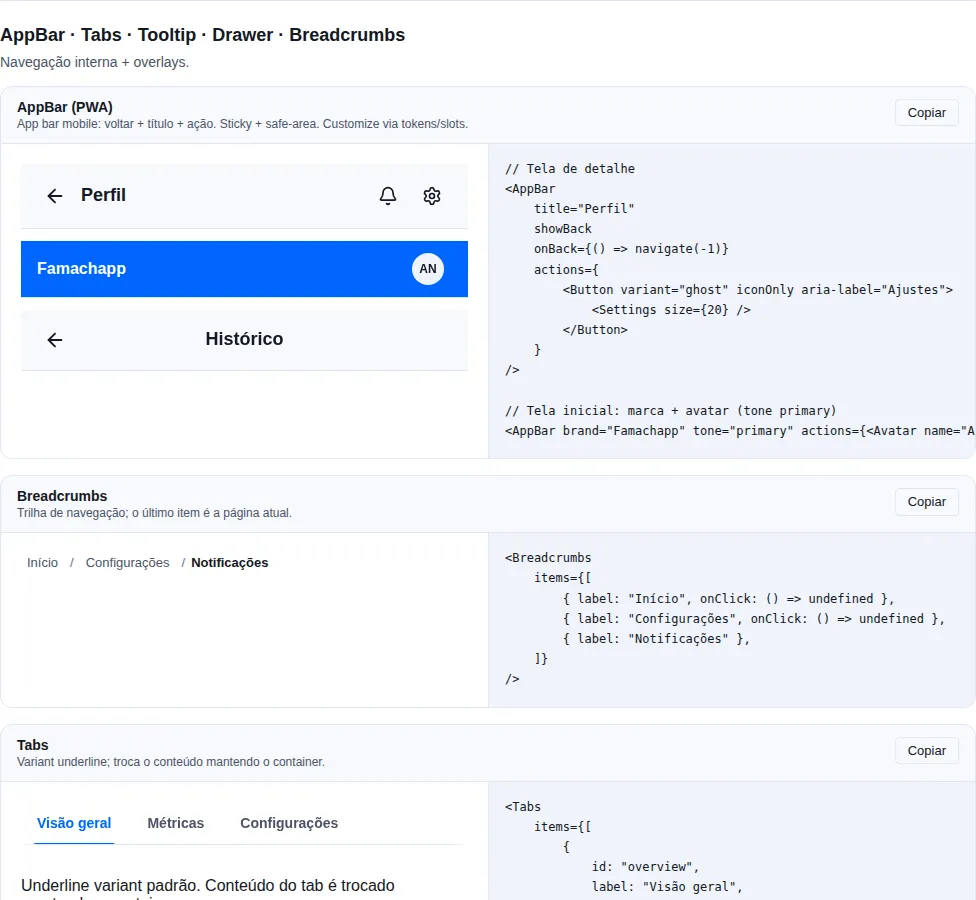
Section navigation of the gallery — run it locally to interact.
When to use: give extra context to a control whose meaning isn't obvious — typically
iconOnlybuttons. Never for critical information.
A hover tooltip in a portal: it escapes an overflow ancestor (a DataTable cell, say) and flips to the opposite side at the screen edge. Shows on hover and on keyboard focus.
import { Button, Tooltip } from "tempest-react-sdk";
import { Trash } from "lucide-react";

export function ExcluirComDica() {
    return (
        <Tooltip content="Delete permanently" placement="bottom" openDelay={300}>
            <Button variant="danger" iconOnly aria-label="Delete">
                <Trash size={16} />
            </Button>
        </Tooltip>
    );
}
| Prop | Type | Default |
|---|---|---|
content |
ReactNode |
— |
placement |
"top" \| "right" \| "bottom" \| "left" |
"top" |
openDelay |
number (ms before showing) |
150 |
disabled |
boolean (turn off, trigger unchanged) |
false |
portal |
boolean (renders in document.body) |
true |
Escape hides the tooltip without moving the pointer or the focus, as WCAG 2.2
SC 1.4.13 asks. Inside a Modal, the first Escape hides the tooltip and the
second one closes the modal.
Don't hide essential information in a tooltip
Touch users have no hover — they'll never see the content. A tooltip is reinforcement, not the only source of information needed to complete the task.
DropdownMenu
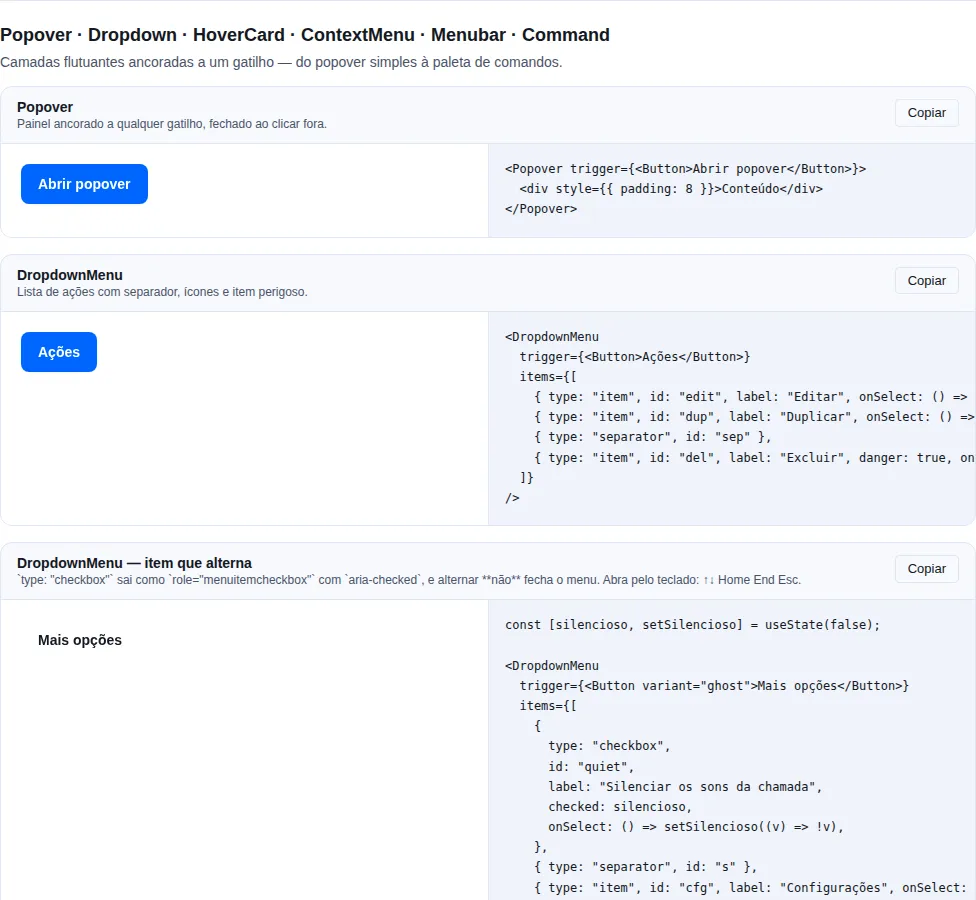
Section overlays of the gallery — run it locally to interact.
When to use: group secondary actions behind a single trigger ("More actions", a profile menu) when they don't fit the main bar.
A dropdown menu of actions. Keyboard nav (↑↓ Home End Esc). Each entry needs a stable id (used as the React key).
import { Button, DropdownMenu } from "tempest-react-sdk";

export function MaisAcoes({
    navigate,
    logout,
}: {
    navigate: (to: string) => void;
    logout: () => void;
}) {
    return (
        <DropdownMenu
            trigger={<Button variant="ghost">More actions</Button>}
            items={[
                { type: "label", id: "h", label: "Account" },
                {
                    type: "item",
                    id: "edit",
                    label: "Edit profile",
                    onSelect: () => navigate("/profile"),
                },
                { type: "separator", id: "s1" },
                { type: "item", id: "logout", label: "Sign out", onSelect: logout, danger: true },
            ]}
        />
    );
}
| Entry type | Fields |
|---|---|
"item" |
id, label, icon?, onSelect, disabled?, danger? |
"checkbox" |
id, label, icon?, checked, onSelect, disabled? |
"label" |
id, label |
"separator" |
id |
Component props: trigger (ReactElement), items (DropdownMenuEntry[]), placement ("bottom-start" \| "bottom-end" \| "top-start" \| "top-end", default "bottom-start"), portal (boolean, default true — see In a table row).
In a table row
The per-row action menu is the most common case of an admin panel, and it is
exactly where an in-flow menu breaks: the DataTable wrapper scrolls
horizontally (overflow-x: auto), and by the CSS rules that forces
overflow-y to auto too. That is why the menu renders in a portal by
default, anchored to its trigger.
import { Button, DataTable, DropdownMenu } from "tempest-react-sdk";

interface User {
    id: string;
    name: string;
}

export function UsersTable({
    users,
    open,
    remove,
}: {
    users: User[];
    open: (id: string) => void;
    remove: (id: string) => void;
}) {
    return (
        <DataTable<User>
            data={users}
            rowKey={(user) => user.id}
            columns={[
                { key: "name", header: "Name" },
                {
                    key: "id",
                    header: "",
                    render: (user) => (
                        <DropdownMenu
                            placement="bottom-end"
                            trigger={
                                <Button variant="ghost" iconOnly aria-label="Actions">
                                    ⋮
                                </Button>
                            }
                            items={[
                                {
                                    type: "item",
                                    id: "view",
                                    label: "View profile",
                                    onSelect: () => open(user.id),
                                },
                                {
                                    type: "item",
                                    id: "delete",
                                    label: "Delete",
                                    danger: true,
                                    onSelect: () => remove(user.id),
                                },
                            ]}
                        />
                    ),
                },
            ]}
        />
    );
}
What the portal fixes, measured in Chrome at 1440 px with the three-entry menu on the last row:
| In flow (before 0.67.0) | In a portal | |
|---|---|---|
| Visible entries | 1 of 3 | 3 of 3 |
| No room below | opened below the fold | flips above the trigger |
| Table scrolls with the menu open | — | the menu follows the trigger |
Inside a Modal |
— | paints on top of the modal |
Why the portalled menu sits above Modal
In a portal the menu lives in document.body, next to the modal — it no
longer inherits the modal's stacking. It uses --tempest-z-popover (1150),
above --tempest-z-modal (1100). With --tempest-z-dropdown (1000),
measured, a menu opened inside a modal sat behind it.
portal={false} brings back the in-flow menu
Use it when the container must own the menu's clipping or stacking on
purpose. The same portal exists on Popover and Tooltip.
An entry that toggles
type: "checkbox" renders role="menuitemcheckbox" with aria-checked — which
is how a screen reader announces "checked" instead of leaving the state
invisible.
import { useState } from "react";
import { Button, DropdownMenu } from "tempest-react-sdk";

export function CallMenu({ toggleTheme }: { toggleTheme: () => void }) {
    const [quiet, setQuiet] = useState(false);

    return (
        <DropdownMenu
            trigger={<Button variant="ghost">More options</Button>}
            items={[
                {
                    type: "checkbox",
                    id: "quiet",
                    label: "Mute call sounds",
                    checked: quiet,
                    onSelect: () => setQuiet((value) => !value),
                },
                { type: "separator", id: "s" },
                { type: "item", id: "theme", label: "Toggle theme", onSelect: toggleTheme },
            ]}
        />
    );
}
A plain item closes, a checkbox does not
Selecting an "item" fires onSelect and closes the menu. A "checkbox"
toggles and leaves the menu open, because adjusting two preferences in a
row is the ordinary case and closing after the first would make the second a
second trip.
Keyboard
role="menu" is a promise about the keyboard, and the component keeps it — the
pattern is the APG Menu Button:
| Key | On the trigger | In the open menu |
|---|---|---|
Enter / Space |
opens, focuses the first entry | activates the focused entry |
↓ |
opens, focuses the first entry | next, wrapping |
↑ |
opens, focuses the last entry | previous, wrapping |
Home / End |
— | first / last |
Esc |
— | closes and returns focus to the trigger |
Tab |
follows the page | closes and follows the page from the trigger |
Managed focus — Tab does not walk the menu
Entries carry tabIndex={-1} and only the active one is 0. Without that,
Tab would step through entry by entry and do the job the arrow key should
— which is worse than inaccessible, because the widget looks like it works
while contradicting what role="menu" announced. Disabled entries, label
and separator are never a stop.
Popover
When to use: a floating panel with arbitrary content (filters, a mini-form, a preview) anchored to a trigger — when you need more than a list of actions.
A generic floating panel (anchor + outside-click + Esc dismiss). Works controlled (open + onOpenChange) or uncontrolled (defaultOpen).
import { useState } from "react";
import { Button, Checkbox, Popover, Stack } from "tempest-react-sdk";

export function Filtros() {
    const [open, setOpen] = useState(false);

    return (
        <Popover
            open={open}
            onOpenChange={setOpen}
            placement="bottom"
            trigger={<Button>Filters</Button>}
        >
            <Stack gap={3}>
                <Checkbox label="Active only" />
                <Checkbox label="Paid" />
                <Button onClick={() => setOpen(false)}>Apply</Button>
            </Stack>
        </Popover>
    );
}
| Prop | Type | Default |
|---|---|---|
trigger |
ReactElement (cloned with handlers) |
— |
open |
boolean |
— (controlled) |
onOpenChange |
(open: boolean) => void |
— |
defaultOpen |
boolean (uncontrolled usage) |
false |
placement |
"top" \| "bottom" \| "left" \| "right" |
"bottom" |
closeOnEsc |
boolean |
true |
closeOnOutsideClick |
boolean |
true |
portal |
boolean (renders in document.body) |
true |
Flips at the screen edge
In a portal (the default), the panel moves to the opposite side when the requested placement does not fit the viewport, and is kept inside it with an 8 px margin. Scrolling the page or a container with the panel open carries it along with the trigger.
Tab enters the panel, even in a portal
In a portal the panel lives at the end of body, and the browser would reach
it last. Popover restores the in-flow order: Tab from the open trigger
enters the panel's first field, Tab on its last field moves on to what
follows the trigger, and Shift+Tab walks back the same way.
ConfirmDialog
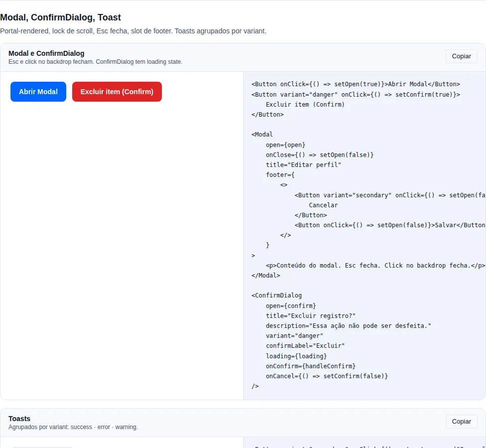
Section modal of the gallery — run it locally to interact.
When to use: the last barrier before an irreversible or costly action (delete, overwrite, cancel). Always with
variant="danger"when destructive.
A pre-built destructive prompt on top of Modal (text + 2 buttons).
import { useState } from "react";
import { ConfirmDialog } from "tempest-react-sdk";

export function ExcluirUsuario({
    user,
    deleteUser,
}: {
    user: { id: string; name: string };
    deleteUser: (id: string) => Promise<void>;
}) {
    const [open, setOpen] = useState(false);
    const [deleting, setDeleting] = useState(false);

    return (
        <ConfirmDialog
            open={open}
            title="Delete user"
            description={`This cannot be undone. Delete ${user.name}?`}
            confirmLabel="Yes, delete"
            cancelLabel="Cancel"
            variant="danger"
            loading={deleting}
            onConfirm={async () => {
                setDeleting(true);
                await deleteUser(user.id);
                setDeleting(false);
                setOpen(false);
            }}
            onCancel={() => setOpen(false)}
        />
    );
}
| Prop | Type | Default |
|---|---|---|
open |
boolean |
— |
title |
ReactNode |
— |
description |
ReactNode |
— |
confirmLabel |
string |
"Confirmar" |
cancelLabel |
string |
"Cancelar" |
variant |
"primary" \| "danger" |
"primary" |
loading |
boolean (shows spinner + disables both) |
false |
onConfirm |
() => void \| Promise<void> |
— |
onCancel |
() => void |
— |
Control loading during the request
onConfirm accepts a promise, but ConfirmDialog doesn't manage the loading state itself — pass loading={deleting} driven by your own state to lock both buttons while the async action runs.
Default labels are Portuguese
confirmLabel/cancelLabel default to "Confirmar"/"Cancelar". Pass explicit English strings in EN-locale apps.
InstallButton
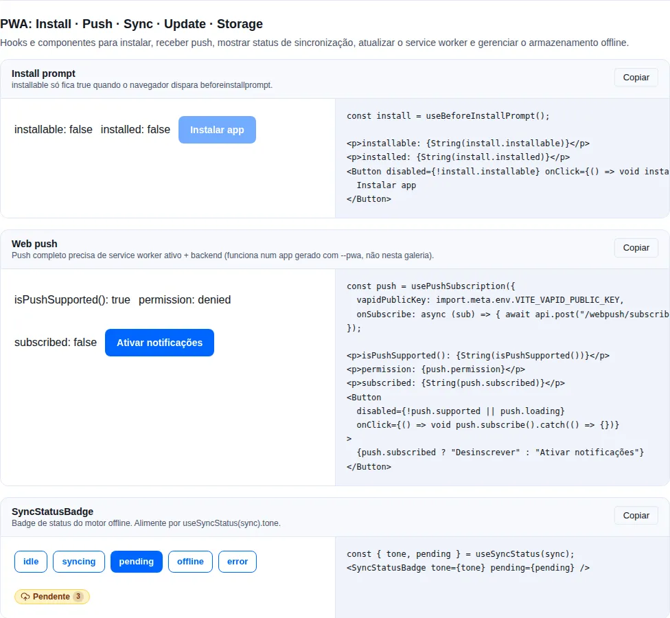
Section pwa of the gallery — run it locally to interact.
PWA install button wired to useInstallPrompt. Where the browser fires beforeinstallprompt, the click installs. Where it does not — iOS Safari, and the Android Chromium forks (Mi Browser, UC, Opera Mini, Huawei) — the click reveals that platform's instruction instead of the button disappearing. Inherits every Button prop.
import { InstallButton } from "tempest-react-sdk";
import { Download } from "lucide-react";

<InstallButton variant="primary" leftIcon={<Download size={18} />} />;
| Prop | Type | Default |
|---|---|---|
label |
ReactNode |
"Instalar app" |
hintLabel |
ReactNode |
"Como instalar" |
onResult |
(o: "accepted" \| "dismissed" \| "unsupported") => void |
— |
renderHint |
(input: InstallHintInput) => ReactNode |
defaultInstallHint |
manualFallbackDelayMs |
number |
3000 |
wrapperClassName |
string |
— |
| … | all Button props (variant, size, leftIcon) |
— |
Until v0.65.0 both disappeared exactly where the user needs them
InstallButton and InstallBanner were built on useBeforeInstallPrompt, so they rendered null in every browser that never fires the event. iOS Safari is precisely that case — and it is where the install path hides behind the Share sheet, which nobody finds unless told. In practice every app kept a local copy of these two components just to add the ios and manual paths.
null now means only that there is nothing to offer: already installed, running standalone, or inside the decline window.
renderHint swaps the copy without rewriting the component
The default is PT-BR and names the real menu entries — on Android it also offers the intent:// link that reopens the page in Chrome, which is the only path that reaches a real install on a fork with no install entry at all.
import { InstallButton, defaultInstallHint } from "tempest-react-sdk";

<InstallButton
    renderHint={(input) =>
        input.method === "ios" ? <MyIOSSteps /> : defaultInstallHint(input)
    }
/>;
InstallHintInput carries method ("native" | "ios" | "manual" | "none") and openInChromeIntent.
InstallBanner
Dismissible bottom banner inviting the user to install the PWA, on the same useInstallPrompt. Where the browser cannot be prompted, the button becomes "Como instalar" and reveals the platform's instruction inside the banner. storageKey remembers the dismissal across reloads.
import { InstallBanner } from "tempest-react-sdk";

export function Instalar() {
    return (
        <InstallBanner
            title="Install the app"
            description="Offline access and a home-screen shortcut."
            storageKey="meu-app:install-dismissed"
        />
    );
}
| Prop | Type | Default |
|---|---|---|
title |
ReactNode |
"Instale o app" |
description |
ReactNode |
— |
installLabel |
string |
"Instalar" |
dismissLabel |
string |
"Dispensar" |
icon |
ReactNode |
— |
hintLabel |
string |
"Como instalar" |
storageKey |
string |
— (session) |
declineCooldownMs |
number |
— (permanent) |
renderHint |
(input: InstallHintInput) => ReactNode |
defaultInstallHint |
manualFallbackDelayMs |
number |
3000 |
onResult |
(o) => void |
— |
declineCooldownMs changes what is stored — and respects what was already there
Without it, a dismissal written to storageKey is permanent, which is what the component always did (it stores "1"). With it, a timestamp is stored and the banner returns after the window.
A key already holding "1" still counts as a permanent dismissal even with declineCooldownMs configured: it was written under the old contract, and reviving a banner the user switched off is worse than leaving it off.
Recap
| Component | Use for | Trigger |
|---|---|---|
Button |
Fire the primary/secondary action | click |
FloatingActionButton |
Floating, persistent primary action | click |
InstallButton |
Install the PWA, or teach how where no prompt exists | click |
InstallBanner |
Dismissible invite to install the PWA | click |
Tooltip |
Non-critical context on a control | hover/focus |
DropdownMenu |
A list of secondary actions (closes on pick) | click |
Popover |
A floating panel with arbitrary content | click |
ConfirmDialog |
Confirm a destructive action before running it | — |
Key accessibility points:
- Destructive actions should use
variant="danger". Button.loadingis the standard for async submits — it blocks double-clicks.- Tooltips should not contain critical information (touch users don't see hover).
iconOnlyrequiresaria-label.
Related: overlay (ConfirmDialog is built on Modal) · inputs (data entry) · feedback (toasts/alerts after the action).