Charts (recharts)
Charts turn numbers into shape: a trend that climbs, a slice that dominates, an
axis where one series crosses another. The SDK wraps
recharts in five themed components — AreaChart,
BarChart, LineChart, PieChart, and RadarChart — that take plain tabular
data (an array of objects) and handle axes, grid, legend, tooltip, and colors
for you.
You don't assemble <XAxis>/<YAxis>/<Tooltip> by hand: you pass data, say
which key is the axis (index) and which keys become series (categories), and
the component does the rest.
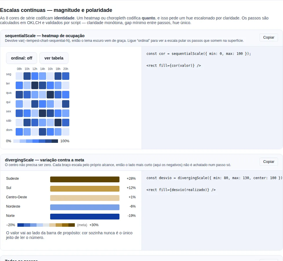
Section dataviz-scales of the gallery — run it locally to interact.
Why a separate subpath
The charts don't come from the main barrel. You import them from
tempest-react-sdk/charts:
import { BarChart, LineChart, AreaChart } from "tempest-react-sdk/charts";
Why isolate the charts in a subpath?
recharts is a heavy dependency (D3 under the hood). Most Tempest apps
draw no charts at all — and it would be unfair to charge that weight to
everyone. So the charts live in a dedicated subpath and recharts is
externalized out of the SDK bundle. Apps that never import from
tempest-react-sdk/charts pay nothing: the app bundler's tree-shaking
strips it all.
Only want the shape of the series? You don't need a chart
An inline mini-chart — a trend in a table cell, next to a KPI — is
Sparkline, which lives on the root
entry and is plain SVG. No recharts involved. Use the charts on this page
when the reader needs to read values off an axis.
This is the same caller injects the heavy dependency pattern the SDK already
uses in its telemetry adapters (Sentry/PostHog) and feature-flags adapters
(GrowthBook/LaunchDarkly): the SDK describes the integration, but the real
library is the app's responsibility. The difference here is that recharts is an
optional peer dependency — you install it once and all five components reuse
it.
Install
npm i recharts
Without recharts, the charts won't render
Because recharts is an optional peer dep, npm install
tempest-react-sdk does not pull it in. If you import from
tempest-react-sdk/charts without having run npm i recharts, the build
breaks with Cannot find module 'recharts'. Install it in the app that
actually uses charts.
The cartesian family: Area, Bar, Line
AreaChart, BarChart, and LineChart share the same props interface,
CartesianChartProps. Learn one and you know all three — you only swap the
component name.
The mental model is always the same:
data— your rows (array of objects).index— the key that becomes the X axis (labels: months, days, names…).categories— the keys that become series (one area/bar/line each).
BarChart
import { BarChart } from "tempest-react-sdk/charts";

const revenue = [
  { month: "Jan", income: 12000, cost: 8000 },
  { month: "Feb", income: 15000, cost: 9000 },
  { month: "Mar", income: 18000, cost: 9500 },
  { month: "Apr", income: 21000, cost: 11000 },
];

export function MonthlyRevenue() {
  return (
    <BarChart
      data={revenue}
      index="month"
      categories={["income", "cost"]}
      valueFormatter={(v) => `$${v.toLocaleString("en-US")}`}
      height={320}
    />
  );
}
Two series (income, cost), grouped side by side per month. The
valueFormatter formats the numbers in the tooltip and on the Y axis.
LineChart
Same data shape, same index and categories — only the component changes:
import { LineChart } from "tempest-react-sdk/charts";

const visits = [
  { day: "Mon", organic: 320, paid: 120 },
  { day: "Tue", organic: 410, paid: 150 },
  { day: "Wed", organic: 380, paid: 90 },
  { day: "Thu", organic: 520, paid: 200 },
  { day: "Fri", organic: 610, paid: 240 },
];

export function WeeklyVisits() {
  return (
    <LineChart
      data={visits}
      index="day"
      categories={["organic", "paid"]}
      valueFormatter={(v) => v.toLocaleString("en-US")}
    />
  );
}
stack does not stack lines
CartesianChartProps carries the stack prop for uniformity, but
LineChart ignores it — stacked lines rarely make sense. Use stack on
AreaChart or BarChart, where it actually stacks the series on a shared
stackId.
AreaChart (with stack)
import { AreaChart } from "tempest-react-sdk/charts";

const traffic = [
  { hour: "08h", desktop: 120, mobile: 80, tablet: 20 },
  { hour: "12h", desktop: 200, mobile: 160, tablet: 30 },
  { hour: "18h", desktop: 90, mobile: 240, tablet: 25 },
  { hour: "22h", desktop: 60, mobile: 300, tablet: 40 },
];

export function TrafficByDevice() {
  return (
    <AreaChart
      data={traffic}
      index="hour"
      categories={["desktop", "mobile", "tablet"]}
      stack
      valueFormatter={(v) => `${v} sessions`}
    />
  );
}
With stack, the three areas stack and the top shows the total per hour.
CartesianChartProps — reference
| Prop | Type | Default | What it does |
|---|---|---|---|
data |
ChartData |
— | Rows to plot (array of objects key → string \| number). |
index |
string |
— | Row key used for the X axis (cartesian) or angle axis (radar). |
categories |
string[] |
— | Row keys to plot, one series each. |
colors |
string[] |
--tempest-chart-* tokens |
Series colors, cycled per category. |
height |
number |
300 |
Chart height in pixels. |
width |
number |
— | Fixed width in px. When set, bypasses the ResponsiveContainer. |
stack |
boolean |
false |
Stacks the series on a shared stackId (ignored by LineChart). |
showLegend |
boolean |
true |
Renders the legend. |
showGrid |
boolean |
true |
Renders the cartesian grid. |
showTooltip |
boolean |
true |
Renders the tooltip. |
valueFormatter |
(value: number) => string |
— | Formats numeric values in the tooltip and on the Y axis. |
className |
string |
— | Extra class name applied to the chart wrapper. |
ChartData = Array<Record<string, string | number>> — each row maps a column key
to a label (string) or value (number).
One series, or many
categories is an array, so you decide how many series you want. Just one
(categories={["income"]}) draws a simple chart; several draw comparative
series, each picking the next color in the palette.
PieChart
PieChart has a different data shape: one row per slice. Instead of
categories, you say which key holds the value (category) and which holds
the label (index).
import { PieChart } from "tempest-react-sdk/charts";

const plans = [
  { plan: "Free", users: 4200 },
  { plan: "Pro", users: 1800 },
  { plan: "Business", users: 600 },
  { plan: "Enterprise", users: 120 },
];

export function PlanDistribution() {
  return (
    <PieChart
      data={plans}
      category="users"
      index="plan"
      donut
      valueFormatter={(v) => `${v.toLocaleString("en-US")} users`}
    />
  );
}
Each row becomes a slice colored by the next palette color. With donut, the
center is hollow (60% inner radius) — great for putting a total in the middle.
PieChartProps — reference
| Prop | Type | Default | What it does |
|---|---|---|---|
data |
ChartData |
— | Rows to plot, one slice each. |
category |
string |
— | Row key holding the slice's numeric value. |
index |
string |
— | Row key holding the slice's name/label. |
colors |
string[] |
--tempest-chart-* tokens |
Slice colors, cycled per slice. |
height |
number |
300 |
Chart height in pixels. |
width |
number |
— | Fixed width in px. When set, bypasses the ResponsiveContainer. |
donut |
boolean |
false |
Renders as a donut (non-zero inner radius) instead of a full pie. |
showLegend |
boolean |
true |
Renders the legend. |
showTooltip |
boolean |
true |
Renders the tooltip. |
valueFormatter |
(value: number) => string |
— | Formats numeric values in the tooltip. |
className |
string |
— | Extra class name applied to the wrapper. |
PieChart has no showGrid or stack
A pie has no cartesian grid and no stacking — those cartesian-family props simply don't exist here.
RadarChart
RadarChart reuses CartesianChartProps (same signature as Area/Bar/Line), but
plots polygons on a radial axis: index becomes the angle axis (the
vertices) and each categories entry becomes one polygon.
import { RadarChart } from "tempest-react-sdk/charts";

const skills = [
  { attribute: "Speed", team_a: 80, team_b: 65 },
  { attribute: "Defense", team_a: 70, team_b: 90 },
  { attribute: "Attack", team_a: 95, team_b: 75 },
  { attribute: "Stamina", team_a: 60, team_b: 85 },
  { attribute: "Technique", team_a: 88, team_b: 80 },
];

export function TeamComparison() {
  return (
    <RadarChart
      data={skills}
      index="attribute"
      categories={["team_a", "team_b"]}
      valueFormatter={(v) => `${v} pts`}
    />
  );
}
Two overlaid polygons compare team_a and team_b on each attribute — perfect
for comparing multi-dimensional profiles.
RadarChart ignores showGrid and stack
The radar always draws its own PolarGrid (there's no showGrid), and it
doesn't stack series (stack is ignored). showLegend/showTooltip/
colors/valueFormatter work as usual.
Colors and theming
You do not have to do anything: series colors come from the theme tokens
--tempest-chart-1 … --tempest-chart-8 by default. Rebranding with
createTheme({ chart: [...] }) moves the charts along, and flipping to dark swaps
in the lightened palette — with no prop on the chart at all.
/* what the SDK already defines (colors.css) */
:root {
  --tempest-chart-1: #2563eb; /* blue   */
  --tempest-chart-2: #16a34a; /* green  */
  --tempest-chart-3: #f59e0b; /* amber  */
  --tempest-chart-4: #7c3aed; /* violet */
  --tempest-chart-5: #ec4899; /* pink   */
  --tempest-chart-6: #06b6d4; /* cyan   */
  --tempest-chart-7: #ea580c;
  --tempest-chart-8: #0f766e;
}
A 6-color palette must not become 8
If you define only chart-1..6, the reader would keep walking into the SDK's
built-in --tempest-chart-7/-8 and a 7-series chart would come out with a
mixed palette — 6 brand colors plus 2 leftovers. That is what
--tempest-chart-count is for: createTheme writes how many colors the theme
owns and resolveChartColors stops there. Setting tokens by hand, declare it:
:root {
  --tempest-chart-1: #0f766e;
  --tempest-chart-2: #f97316;
  --tempest-chart-count: 2;
}
Override them in your own CSS, or generate them with the theme factory:
import { applyTheme, createTheme } from "tempest-react-sdk";

applyTheme(createTheme({
  primary: "#0f766e",
  chart: ["#0f766e", "#f97316", "#9333ea"],
}));
colors={["var(--my-token)"]} does not work
Recharts applies color as an SVG presentation attribute (fill="…"), and
no browser substitutes var() there — a custom property is only resolved in a
CSS declaration. A var() passed through colors renders as an invalid
color (invisible series).
That is why the SDK reads the tokens via getComputedStyle and hands
literal colors to recharts. If you need one of your own tokens in JS, take the
same route:
import { readThemeToken } from "tempest-react-sdk";

const brand = readThemeToken("--my-brand"); // "#0f766e"
For one specific chart, colors still wins over everything — it is the escape
hatch, cycled by series (or slice) index:
import { BarChart, DEFAULT_CHART_COLORS } from "tempest-react-sdk/charts";

export function SalesWithBrandColors() {
  return (
    <BarChart
      data={sales}
      index="month"
      categories={["store_a", "store_b", "store_c"]}
      colors={["#0f766e", "#f97316", "#9333ea"]}
    />
  );
}

// Tweak just the first color and keep the rest of the fallback:
const myPalette = ["#e11d48", ...DEFAULT_CHART_COLORS.slice(1)];
DEFAULT_CHART_COLORS is the fallback, used when the tokens are not
readable: no styles.css imported, outside a browser (tests, a build script), or
a page that dropped the tokens.
Resolving tokens yourself
import { resolveChartColors, useChartColors } from "tempest-react-sdk/charts";

// inside a component — re-resolves when the theme flips
const colors = useChartColors();

// outside React (canvas, image export, custom tooltip)
const palette = resolveChartColors();
useChartColors observes the data-tempest-theme attribute and re-resolves on a
theme switch; passing an explicit array short-circuits the hook (no observer is
created). Need the grid/axis color? resolveChartChrome("grid" | "axis").
Theming one section
Both accept an element: useChartColors(undefined, sectionRef.current)
resolves the tokens of that subtree, so a section carrying its own theme
paints its charts with its own palette.
Continuous scales: magnitude and polarity
The 8 series colors encode identity — which series is which. A heatmap or a choropleth encodes how much, and that is a different job: it needs one hue stepped by lightness, not eight hues.
import { sequentialScale, divergingScale, scaleSteps } from "tempest-react-sdk";

const color = sequentialScale({ min: 0, max: 250 });
<rect fill={color(value)} />;

// Polarity: variance against a target
const variance = divergingScale({ min: 80, max: 130, center: 100 });
<rect fill={variance(actual)} />;
| Export | What it does |
|---|---|
sequentialScale |
{ min, max, ordinal? } → (value) => color |
divergingScale |
{ min, max, center? } → (value) => color |
scaleSteps |
Every step in order, for building the legend |
SEQUENTIAL_STEP_COUNT |
7 |
DIVERGING_STEP_COUNT |
9 (1–4 cool · 5 neutral · 6–9 warm) |
ORDINAL_START_STEP |
3 — first step that clears 2:1 on the surface |
They ship on the root entry, not behind /charts
They are pure token math with no recharts dependency. The things that need
them most — a /br choropleth, a hand-rolled heatmap — have no reason to install
recharts. Measured cost: 365 B brotli importing from the root. /charts
re-exports them only for discoverability.
They return a token, not a hex
The result is var(--tempest-chart-sequential-4). A heatmap painted once follows
the theme — including dark mode, whose steps are selected for the dark surface
rather than flipped from the light ones.
Sequential lets zero recede; ordinal must not
On a sequential scale the lightest step disappears into the surface on
purpose: that is what "almost nothing" should look like on a heatmap. On an
ordinal one — funnel stages, tiers, bands — every step is a mark someone has
to see, and an invisible step is lost data. Pass ordinal: true and the scale
starts at step 3.
sequentialScale({ min: 0, max: 4, ordinal: true }); // uses 3..7
Each diverging arm scales against its own range
On an asymmetric domain (−5 to +80) the negatives still use the whole cool arm. Scaling both arms by the wider one — the easy mistake — would collapse every negative into the step next to the midpoint and hide the sign entirely.
The diverging midpoint is grey, never a hue
A coloured midpoint reads as a third category instead of "no deviation", which is the one thing a diverging scale exists to show. That is why token 5 is neutral in both modes.
A continuous scale needs a legend
Without a ramp labelled at its ends, nobody can turn a colour back into a number.
That is what scaleSteps is for:
<div style={{ display: "flex" }}>
  {scaleSteps("sequential").map((color) => (
    <span key={color} style={{ background: color, width: 20, height: 10 }} />
  ))}
</div>
<span>0</span> … <span>250</span>
How the ramps were built
They were not picked by eye. The steps are computed in OKLCH with evenly spaced lightness, so an equal step of data looks like an equal step of colour — which does not happen when you space in RGB. Chroma follows a dome: the ends stay believable and the middle carries the hue.
Each ramp was validated by script in both modes: monotone lightness, adjacent gaps
≥ 0.06, a single hue, and the end nearest the surface clearing 2:1 in the ordinal
slice. createTheme rebuilds both scales from the brand hue (using the theme's
danger as the warm pole, so "warm" and "bad" do not disagree on screen), so
rebranding moves the heatmap too instead of leaving it in the SDK's blue.
Responsive by default, fixed when needed
By default, each chart stretches to its parent's width via a recharts
ResponsiveContainer — you only control the height. That's what you want in
almost any dashboard: the width follows the column.
// Fluid width (fills the container), fixed 300px height (default).
<LineChart data={data} index="day" categories={["value"]} />
But there are cases where you need a fixed, deterministic width: snapshot
tests, server-side rendering (SSR), exporting an exact-size PNG. Then you pass
width:
// Fixed 600px width — no ResponsiveContainer.
<LineChart data={data} index="day" categories={["value"]} width={600} height={300} />
width turns off the ResponsiveContainer
When you set width, the chart renders at that exact width and is not
wrapped in a ResponsiveContainer. This is intentional: the
ResponsiveContainer measures the parent on the client and doesn't work well
in SSR/jsdom, where there's no computed layout. For a normal page in the
browser, omit width and let it fill the parent.
Recap
- Import the charts from
tempest-react-sdk/charts— a dedicated subpath.rechartsis an optional peer dep: runnpm i rechartsin the app that uses charts. Apps that don't import from there pay no weight (same "caller injects the heavy dep" pattern as the telemetry/flags adapters). AreaChart,BarChart, andLineChartshareCartesianChartProps:data+index(X axis) +categories(series).stackstacks in Area/Bar;LineChartignores it.PieChartusescategory(value) +index(label), one row per slice, with optionaldonut.RadarChartreusesCartesianChartProps(index= angle axis); ignoresshowGrid/stack.DEFAULT_CHART_COLORSis the default palette (6 colors); override it via thecolorsprop, cycled per series/slice.- Without
width, the chart is responsive (stretches to the parent viaResponsiveContainer, you controlheight). Withwidth, it renders at a fixed size without aResponsiveContainer— handy for tests/SSR.