Data entry
Controls for collecting user data. They all forward refs to the native DOM
element (compatible with react-hook-form).
What this category is
This page gathers the SDK's full set of form controls — from the plain
Input to specialized fields like PinInput (OTP), PasswordInput (with a
strength meter), RangeSlider (dual-thumb range) and Dropzone (drag-and-drop
file area). They all share the same
label/error/size API (see Conventions below) and forward their ref, so they
plug straight into react-hook-form with no extra wrappers.
When to use: whenever you need to collect a value from the user. Pick the
control by data type — short text (Input), long text (Textarea), one option
out of a few (Radio/Select), one option out of many with search
(Combobox), a boolean (Switch/Checkbox), a verification code (PinInput),
a number with increment (StepperInput), etc.
Start with the Conventions
Every field accepts label, helperText, error, required and size
the same way. Learn those 5 props once and you know how to use any field on
this page.
Conventions
label(string or node) — label above the field.helperText— auxiliary text below; replaced byerrorwhen it is set.error(string) — error message; addsaria-invalid="true"+ a red border.required— adds*to the label and propagatesrequiredto the input.size: "sm" | "md" | "lg"— height/padding/font scale via density tokens.
Input
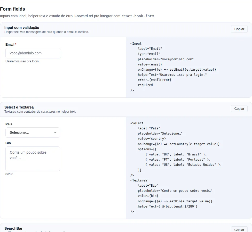
Section form-fields of the gallery — run it locally to interact.
Single-line text.
import { Input } from "tempest-react-sdk";
import { Search } from "lucide-react";

<Input label="Email" type="email" placeholder="user@example.com" required />;
<Input label="Search" leftIcon={<Search size={16} />} placeholder="keyword" />;
<Input label="Password" type="password" error="Minimum 8 characters" />;
| Prop | Type | Default |
|---|---|---|
label |
string |
— |
helperText |
string |
— |
error |
string |
— |
leftIcon |
ReactNode |
— |
rightIcon |
ReactNode |
— |
size |
"sm" \| "md" \| "lg" |
"md" |
wrapperClassName |
string |
— |
| ... | All HTMLInputElement attributes except size |
— |
Textarea
Multi-line. Same API as Input (without leftIcon/rightIcon).
import { Textarea } from "tempest-react-sdk";

export function Mensagem() {
    return <Textarea label="Message" rows={4} helperText="Up to 500 characters" />;
}
Select
Native <select>. Accepts options (a list) or <option> children. Three variants: field (default — label, control, helper text and error slot), chip (the control alone, for a settings row) and bare (the mechanism without the look, for an app with its own visual identity).
import { Select } from "tempest-react-sdk";

export function Estado() {
    return (
        <Select
            label="UF"
            options={[
                { value: "SP", label: "São Paulo" },
                { value: "RJ", label: "Rio de Janeiro" },
            ]}
        />
    );
}
| Prop | Type | Default |
|---|---|---|
options |
SelectOption[] |
— |
label |
string |
— |
helperText |
string |
— |
error |
string |
— |
variant |
"field" \| "chip" \| "bare" |
"field" |
caretIcon |
ReactNode |
SDK chevron |
wrapperClassName |
string |
— |
The chip variant — settings rows
In a settings row — icon and label on the left, a compact control on the right — the full field stacks two labelled fields inside one list item. variant="chip" renders the control alone, sized to its content:
import { ListTile, Select } from "tempest-react-sdk";

export function LanguageRow({ lang, setLang }: { lang: string; setLang: (v: string) => void }) {
    return (
        <ListTile
            leading={<span>🌐</span>}
            title="Idioma"
            trailing={
                <Select
                    variant="chip"
                    aria-label="Idioma"
                    value={lang}
                    onChange={(e) => setLang(e.target.value)}
                    options={[
                        { value: "pt", label: "Português" },
                        { value: "en", label: "English" },
                    ]}
                />
            }
        />
    );
}
aria-label is required on chip — and the type enforces it
The variant removes the only visible label the component had. The row's text (the ListTile's title) names the row, not the <select> — there is no accessibility relationship between them — so without aria-label a screen reader announces a combobox with no name. SelectChipProps declares "aria-label": string as required, so forgetting it is a compile error rather than an audit finding.
This is why hand-rolling a <select> is not worth it
The way out apps took was a native <select> with appearance: none, just to keep the chip shape. That duplicates this component's markup and loses with it the token-driven focus ring, the disabled styling and the caret — all already solved here.
The field variant is unchanged: label, helperText and error exist only there.
Options from a map — toOptions, withAllOption, withEmptyOption
The pt-BR label of an API enum is nearly always a value → label map. toOptions turns that map into the list Select, MultiSelect and Combobox take, and two helpers prepend the entries a <select> cannot represent on its own:
import { useState } from "react";
import { ALL_OPTION_VALUE, Select, toOptions, withAllOption, withEmptyOption } from "tempest-react-sdk";

const STATUS = { active: "Ativo", paused: "Pausado", archived: "Arquivado" };
const HUMOR = new Map([
    [5, "Ótimo"],
    [3, "Ok"],
    [1, "Ruim"],
]);

export function Filters() {
    const [status, setStatus] = useState(ALL_OPTION_VALUE);
    const [humor, setHumor] = useState("");
    const filter = status === ALL_OPTION_VALUE ? {} : { status };

    return (
        <>
            <Select
                label="Status"
                value={status}
                onChange={(e) => setStatus(e.target.value)}
                options={withAllOption(toOptions(STATUS))}
            />
            <Select
                label="Humor"
                value={humor}
                onChange={(e) => setHumor(e.target.value)}
                options={withEmptyOption(toOptions(HUMOR))}
            />
            <pre>{JSON.stringify(filter)}</pre>
        </>
    );
}
withAllOption(options, label = "Todos")— the"all"("no filter") entry. It has to be a real option, not theplaceholder: a placeholder reads as "nothing chosen", and nobody can tell whether the column is filtered. Compare againstALL_OPTION_VALUE, not the string.withEmptyOption(options, label = "— Não definido —")— the""entry of a nullable field.- Neither mutates the list it receives.
Without an empty entry, saving the form writes a value nobody chose
Measured in jsdom (which implements HTML's selectedness algorithm): a controlled <select> with value="" and no empty option reads back as the first option (select.value === "a"). Opening an edit form and saving it writes that value. Select's placeholder does not solve it: its entry is disabled hidden, so once something is picked the field can never go back to empty. A nullable field uses withEmptyOption.
An object reorders numeric keys — use a Map for a scale
toOptions always keeps a Map's order, and an object's except for integer keys, which JavaScript enumerates first and ascending (OrdinaryOwnPropertyKeys). Measured in Node 24: Object.keys({ 5: "Ótimo", 3: "Ok", 1: "Ruim" }) is ["1", "3", "5"]. A mood scale is not ascending by accident — pass a Map.
Every key becomes a string value, because a string is what event.target.value hands back: an option built from the number 0 comes back as "0", and === would never match. That is why the list fits SelectOption[], MultiSelectOption[] and ComboboxOption[].
The bare variant — the mechanism without the look
The hard parts of a custom select are appearance: none and a caret positioned over the control; the look (border, background, radius, shadow, height) is the easy part, and precisely the one an app with its own identity does not want. variant="bare" ships only the mechanism:
import { Select, toOptions, withAllOption } from "tempest-react-sdk";

const STATUS = { active: "Ativo", paused: "Pausado" };

export function FilterBar() {
    return (
        <div style={{ display: "flex", gap: 12 }}>
            <Select
                variant="bare"
                aria-label="Status"
                wrapperClassName="brand-filter"
                options={withAllOption(toOptions(STATUS))}
            />
        </div>
    );
}
.brand-filter {
    flex: 0 0 40%;
    height: 44px;
    padding: 0 4%;
    border-radius: 22px;
    background-color: #6d28d9;
    color: #fff;
}
- Renders a single shell element:
wrapper > select + caret. The shell takeswrapperClassNameand is the flex item — there is no otherdivbetween it and the bar, soflex: 0 0 40%still applies. - Paints no border, background, radius, shadow or height. The
<select>stretches to the shell's height. - The
<select>inheritsbackground-colorandcolorfrom the shell. The background is not cosmetic: the native menu paints each<option>from the<select>'s background, so a transparent control would hand the popup back to the system white. - The focus ring (
--tempest-focus-ring-*) is drawn on the shell, through:focus-within, and follows its radius. - Like
chip, there is no visible label:aria-labeloraria-labelledbyis required by the type.
The app's CSS does not capture the caret
Measured in Chrome: a screen rule .fieldset svg { width: 18.4px; height: 100% } (specificity 0-1-1) stretched the caret from 14 to 18.39 px. The caret slot now pins the svg with a 0-2-1 selector and margin: 0, so an app's element rule does not reach it.
The caret — caretIcon and the density tokens
The caret is positioned and sized by two density tokens, read by both Select and Combobox:
| Density | --tempest-control-caret-offset |
--tempest-control-caret-size |
md height |
|---|---|---|---|
compact |
10px | 12px | 34px |
comfortable |
12px | 14px | 40px |
touch |
12px | 16px | 44px |
spacious |
14px | 16px | 44px |
Before, the caret sat 12 px from the edge at every density (measured in Chrome, while the control went from 34 to 44 px tall and its radius from 4 to 12 px). The lane the control's padding reserves for the caret is computed from the same tokens, so moving the caret moves the text's end with it. On comfortable the pixels are the old ones: 12 px offset and a 36 px lane on field, 10 px and 30 px on chip.
Moving the caret away from the edge is a token, at whatever scope you want:
.my-form {
    --tempest-control-caret-offset: 18px;
}
And swapping the icon is a prop — the svg you pass is stretched to --tempest-control-caret-size, so the token, not the icon's width, decides its size at every density:
import { ChevronsUpDown } from "lucide-react";
import { Select } from "tempest-react-sdk";

export function SortBy() {
    return (
        <Select
            label="Sort by"
            caretIcon={<ChevronsUpDown />}
            options={[
                { value: "recent", label: "Most recent" },
                { value: "name", label: "Name" },
            ]}
        />
    );
}
Combobox
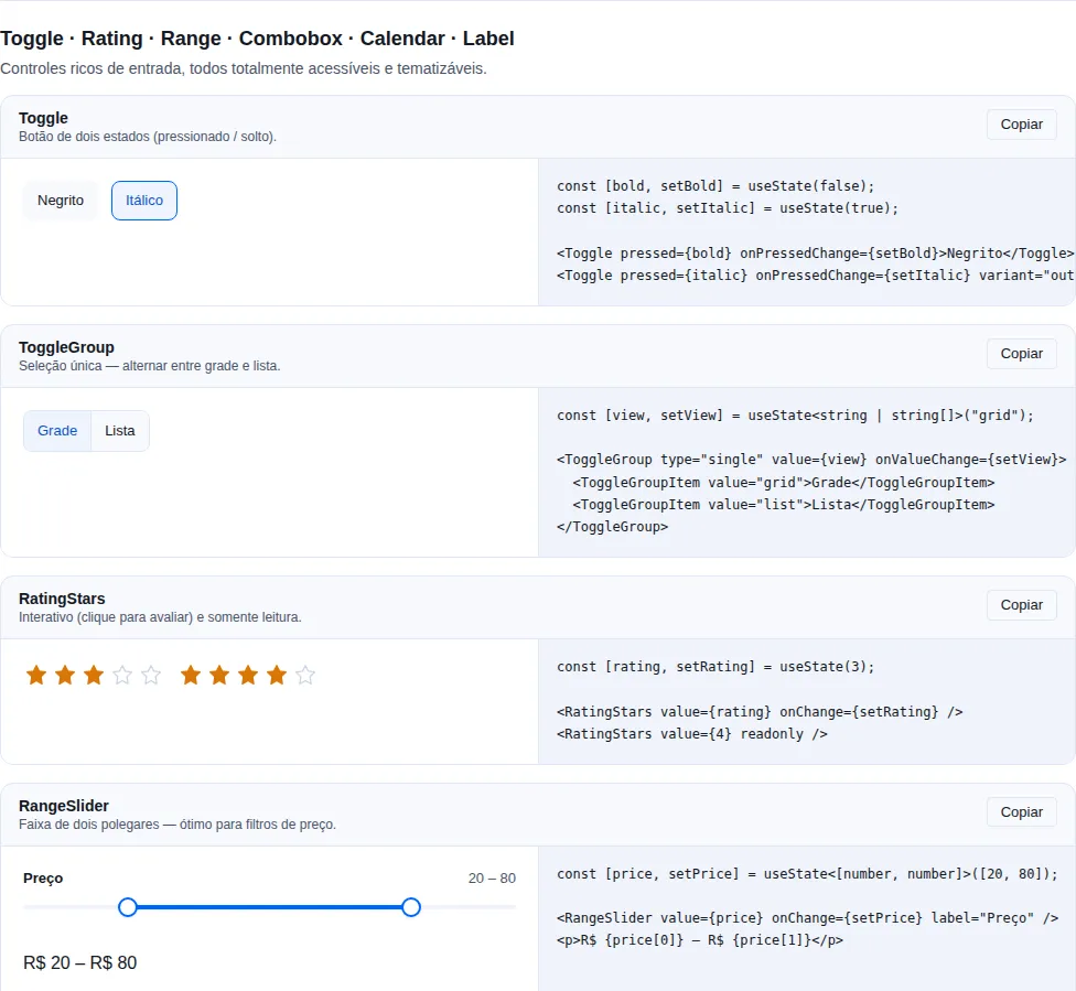
Section inputs-advanced of the gallery — run it locally to interact.
When to use: one option out of many (dozens+), where the user needs to type
to filter. For a few options use Select.
Select with search + filter. Keyboard nav (↑↓ Enter Esc).
import { useState } from "react";
import { Combobox } from "tempest-react-sdk";

const CIDADES = [
    { value: "sp", label: "São Paulo" },
    { value: "rj", label: "Rio de Janeiro" },
    { value: "bh", label: "Belo Horizonte" },
];

export function Cidade() {
    const [city, setCity] = useState("sp");

    return (
        <Combobox
            label="City"
            options={CIDADES}
            value={city}
            onChange={setCity}
            filter={(option, query) =>
                String(option.label).toLowerCase().includes(query.toLowerCase())
            }
        />
    );
}
The list opens in a portal
The list renders in document.body, at the field's width, and flips above it
when there is no room below. That is why a Combobox in the last row of a
DataTable — whose wrapper scrolls and clips what crosses its edge — shows the
whole list. portal={false} brings back the in-flow list.
MultiSelect
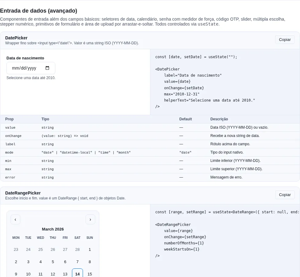
Section inputs-extra of the gallery — run it locally to interact.
When to use: several options out of many, with search and removable chips.
For a single option use Combobox; for a few boolean options use Checkbox.
Filterable multi-select with removable chips. Keyboard nav (↑↓ moves, Enter toggles, Esc closes, Backspace on an empty query removes the last chip).
import { MultiSelect, type MultiSelectOption } from "tempest-react-sdk";
import { useState } from "react";

function Example() {
  const [sel, setSel] = useState<string[]>([]);
  const options: MultiSelectOption[] = [
    { value: "sp", label: "São Paulo" },
    { value: "rj", label: "Rio de Janeiro" },
  ];

  return <MultiSelect label="States" options={options} value={sel} onChange={setSel} />;
}
| Prop | Type | Default |
|---|---|---|
options |
MultiSelectOption[] |
— (required) |
value |
string[] |
— (required, controlled) |
onChange |
(value: string[]) => void |
— (required) |
label |
string |
— |
placeholder |
string |
"Selecione" |
helperText |
string |
— |
error |
string |
— |
disabled |
boolean |
false |
maxItems |
number |
— |
filter |
(option, query) => boolean |
— |
emptyMessage |
string |
"Nenhuma opção encontrada" |
portal |
boolean (list in document.body) |
true |
className |
string |
— |
MultiSelectOption is { value: string; label: string; disabled?: boolean }.
Checkbox
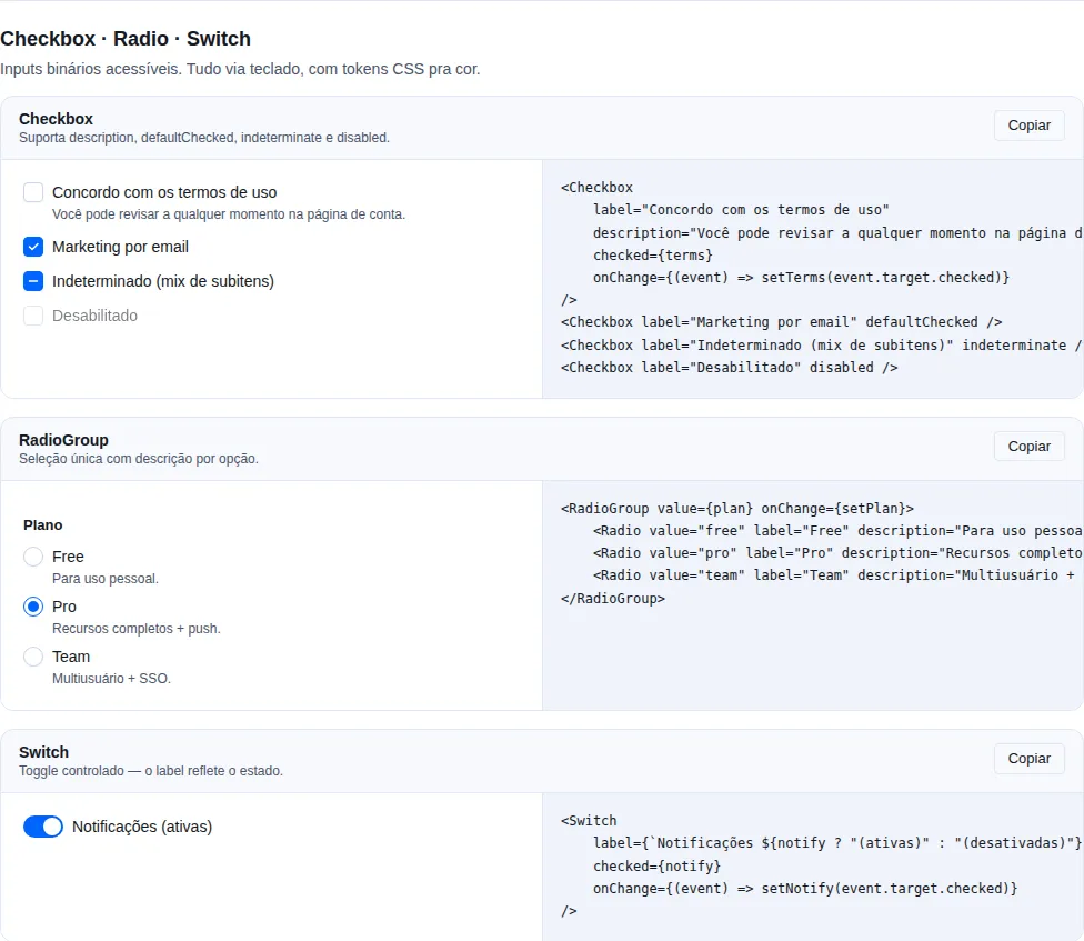
Section form-primitives of the gallery — run it locally to interact.
A single checkbox. Supports indeterminate.
import { Checkbox } from "tempest-react-sdk";

export function Selecao({
    someSelected,
    allSelected,
}: {
    someSelected: boolean;
    allSelected: boolean;
}) {
    return (
        <>
            <Checkbox label="I accept the terms" />
            <Checkbox label="Select all" indeterminate={someSelected && !allSelected} />
        </>
    );
}
Radio / RadioGroup
Standalone radio OR grouped with a single value.
import { useState } from "react";
import { Radio, RadioGroup } from "tempest-react-sdk";

export function Plano() {
    const [plan, setPlan] = useState("free");

    return (
        <fieldset>
            <legend>Plan</legend>
            <RadioGroup value={plan} onChange={setPlan}>
                <Radio value="free" label="Free" />
                <Radio value="pro" label="Pro" />
                <Radio value="team" label="Team" />
            </RadioGroup>
        </fieldset>
    );
}
RadioGroup has no label — the group heading is yours
The component is the state container (value, onChange, name) and
renders no heading at all. A radio group with no label is announced by its
options alone, and the screen reader never says what they are options
for. Wrap it in a <fieldset> with a <legend>, as in the example — HTML
already solves this, and no prop needs to exist for it.
Switch
When to use: turn a preference on/off with immediate effect (e.g.
notifications). For an opt-in that only takes effect on form submit (e.g.
accepting terms), prefer Checkbox.
On/off toggle.
import { useState } from "react";
import { Switch } from "tempest-react-sdk";

export function Emails() {
    const [subscribed, setSubscribed] = useState(false);

    return (
        <Switch
            label="Receive emails"
            checked={subscribed}
            onChange={(event) => setSubscribed(event.target.checked)}
        />
    );
}
Switch vs Checkbox — not interchangeable
A Switch signals an action that happens now; a Checkbox signals a
state that will be applied later (on submit). Swapping one for the other
confuses the user about when the change takes effect.
ChipInput
A list of chips with add-on-Enter + automatic dedup.
import { useState } from "react";
import { ChipInput } from "tempest-react-sdk";

export function Tags() {
    const [tags, setTags] = useState<string[]>([]);

    return (
        <ChipInput label="Tags" value={tags} onChange={setTags} placeholder="type and press Enter" />
    );
}
SearchBar
A search input with a clear button + optional debounce via useDebounce.
import { useState } from "react";
import { SearchBar } from "tempest-react-sdk";

export function Busca() {
    const [q, setQ] = useState("");

    return <SearchBar value={q} onChange={setQ} placeholder="What are you looking for?" />;
}
DatePicker
<input type="date"> (or time, datetime-local, month) with label/error.
import { useState } from "react";
import { DatePicker } from "tempest-react-sdk";

export function Datas() {
    const [date, setDate] = useState("2026-01-15");
    const [start, setStart] = useState("2026-01-15T09:00");

    return (
        <>
            <DatePicker
                label="Date"
                value={date}
                onChange={setDate}
                mode="date"
                min="2025-01-01"
            />
            <DatePicker
                label="Start"
                mode="datetime-local"
                value={start}
                onChange={setStart}
            />
        </>
    );
}
DateRangePicker
When to use: selecting a date range (start + end) on a calendar. For a
single date use Calendar.
Range calendar: the first click sets start, the next sets end (auto-ordered
if it is earlier), a third click starts over; the hovered day previews the range.
Pure Date math, no dependencies.
import { DateRangePicker, type DateRange } from "tempest-react-sdk";
import { useState } from "react";

function Example() {
  const [range, setRange] = useState<DateRange>({ start: null, end: null });

  return <DateRangePicker value={range} onChange={setRange} numberOfMonths={2} />;
}
| Prop | Type | Default |
|---|---|---|
value |
DateRange |
— (required, controlled) |
onChange |
(range: DateRange) => void |
— (required) |
numberOfMonths |
number |
2 |
defaultMonth |
Date |
— |
minDate |
Date |
— |
maxDate |
Date |
— |
weekStartsOn |
0 \| 1 |
0 |
className |
string |
— |
DateRange is { start: Date | null; end: Date | null }.
TimePicker
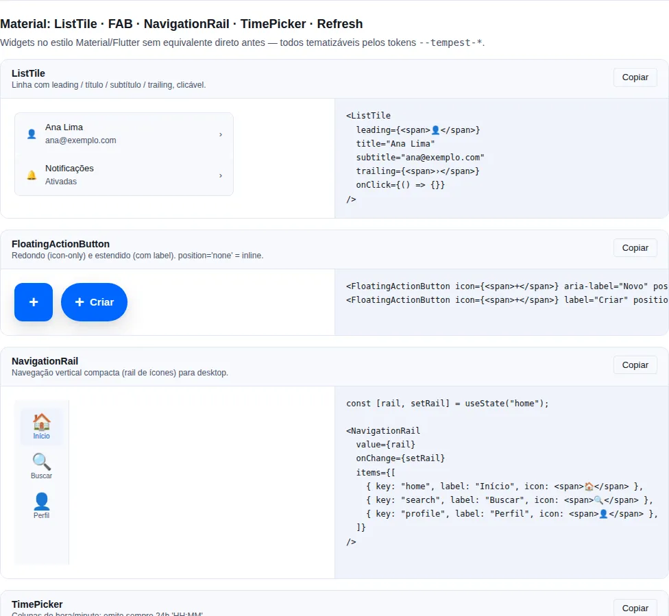
Section material of the gallery — run it locally to interact.
When to use: pick a time in scrollable columns (Material "spinner" style) —
scheduling, reminders, service windows. For a plain native field, use
DatePicker with mode="time".
Always emits a 24h "HH:MM" string via onChange, even with use12Hours
enabled. minuteStep controls the granularity of the minute column.
import { useState } from "react";
import { TimePicker } from "tempest-react-sdk";

function ScheduleField() {
  const [t, setT] = useState("09:30");

  return (
    <TimePicker
      label="Time"
      value={t}
      onChange={setT}
      minuteStep={15}
      helperText="Select hour and minute"
    />
  );
}
| Prop | Type | Default |
|---|---|---|
value |
string (24h "HH:MM") |
— |
onChange |
(value: string) => void |
— |
minuteStep |
number (granularity) |
5 |
use12Hours |
boolean (1–12 columns + AM/PM) |
false |
label |
string |
— |
helperText |
string |
— |
disabled |
boolean |
false |
Output is always 24h
Even with use12Hours (1–12 columns + AM/PM), onChange keeps emitting a 24h
"HH:MM" — the 12h display is visual only. Store and send the 24h value
directly.
FileUpload
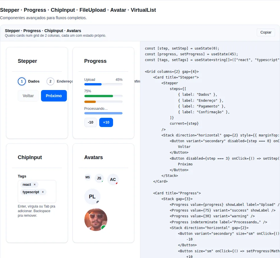
Section advanced of the gallery — run it locally to interact.
Drag-and-drop + click-to-upload + file list.
import { useState } from "react";
import { FileUpload } from "tempest-react-sdk";

export function Anexos() {
    const [files, setFiles] = useState<File[]>([]);

    return (
        <FileUpload
            label="Attach"
            accept="image/*"
            multiple
            value={files}
            onChange={setFiles}
            maxSize={5 * 1024 * 1024}
        />
    );
}
Slider
When to use: picking a single value on a continuous range (volume,
brightness, etc.). For a two-value range use RangeSlider.
Single-thumb slider over a native <input type="range">.
import { Slider } from "tempest-react-sdk";
import { useState } from "react";

function Example() {
  const [vol, setVol] = useState(30);

  return <Slider value={vol} onChange={setVol} label="Volume" formatValue={(v) => v + "%"} />;
}
| Prop | Type | Default |
|---|---|---|
value |
number |
— (required, controlled) |
onChange |
(value: number) => void |
— (required) |
min |
number |
0 |
max |
number |
100 |
step |
number |
1 |
label |
string |
— |
helperText |
string |
— |
disabled |
boolean |
false |
formatValue |
(value: number) => string |
— |
aria-label |
string |
— |
className |
string |
— |
Compact slider: an accessible name without the visible label
Passing label renders a block above the track (label + value). Where that
block does not fit — a one-line footer, a table cell, a toolbar — use
aria-label on its own:
<Slider value={gain} onChange={setGain} aria-label={`${name}'s volume`} />
Without it every slider on the page announces itself as "Slider" and a
screen reader cannot tell them apart. Precedence is
aria-label → label → "Slider", so passing only label behaves exactly
as before. Wrapping the field in an outer <label> does not help: an
explicit aria-label on the input wins the accessible-name precedence order.
Dropzone
When to use: a lean drag-and-drop area when you only need to capture the
files (onDrop) and render the list/preview yourself. For a ready-made field
with a label, file list and form styling, use FileUpload.
A drag-and-drop area with a hidden file input — clickable and keyboard
focusable. It filters by maxSize before calling onDrop; rejected files go to
onReject.
import { useState } from "react";
import { Dropzone } from "tempest-react-sdk";

function Uploader() {
  const [files, setFiles] = useState<File[]>([]);
  return (
    <>
      <Dropzone
        accept="image/*"
        multiple
        maxSize={5 * 1024 * 1024}
        onDrop={(accepted) => setFiles(accepted)}
        onReject={(rejected) => alert(`${rejected.length} file(s) over 5 MB`)}
      >
        Drag images here or click to select
      </Dropzone>
      <ul>
        {files.map((file) => (
          <li key={file.name}>{file.name}</li>
        ))}
      </ul>
    </>
  );
}
| Prop | Type | Default |
|---|---|---|
onDrop |
(files: File[]) => void |
— |
accept |
string |
— |
multiple |
boolean |
true |
maxSize |
number (bytes) |
— |
onReject |
(files: File[]) => void |
— |
disabled |
boolean |
false |
children |
ReactNode |
default prompt |
className |
string |
— |
A11y: role="button" + tabIndex (Enter/Space open the picker);
aria-disabled when disabled.
RangeSlider
Dual-thumb slider with a low ≤ high clamp.
import { useState } from "react";
import { RangeSlider } from "tempest-react-sdk";

export function PriceRange() {
    const [range, setRange] = useState<[number, number]>([100, 800]);

    return (
        <RangeSlider
            label="Price range"
            min={0}
            max={1000}
            step={10}
            value={range}
            onChange={setRange}
            formatValue={([lo, hi]) => `R$ ${lo} – R$ ${hi}`}
        />
    );
}
It takes aria-label for the same reason Slider does. Each thumb keeps its own
name — "Price range (mínimo)" and "Price range (máximo)" — because someone
moving between the two needs to know which end they are on.
RatingStars
A radio group of stars.
import { useState } from "react";
import { RatingStars } from "tempest-react-sdk";

export function Avaliacao() {
    const [rating, setRating] = useState(4);

    return (
        <>
            <RatingStars value={rating} onChange={setRating} max={5} size="md" />
            <RatingStars value={4.5} readonly size="lg" />
        </>
    );
}
PinInput
When to use: short verification codes (OTP, 2FA, SMS/email confirmation).
For passwords use PasswordInput.
OTP / one-time-code with N cells. Paste, auto-advance, backspace flowback, arrow nav.
Pasting the whole code works
The user can paste 123456 into any cell and PinInput distributes the
digits automatically — set type="numeric" so the mobile keyboard opens in
numeric mode.
import { PinInput } from "tempest-react-sdk";

export function Codigos({ verify }: { verify: (code: string) => void }) {
    return (
        <>
            <PinInput length={6} type="numeric" onComplete={verify} />
            <PinInput length={4} type="alphanumeric" masked autoFocus />
        </>
    );
}
| Prop | Type | Default |
|---|---|---|
length |
number |
6 |
type |
"numeric" \| "alphanumeric" |
"numeric" |
value |
string |
— (controlled) |
defaultValue |
string |
"" |
onChange |
(value: string) => void |
— |
onComplete |
(value: string) => void |
— |
masked |
boolean |
false |
size |
"sm" \| "md" \| "lg" |
"md" |
autoFocus |
boolean |
false |
PasswordInput
A password-type field with a visibility toggle + an optional strength meter (5
levels).
import { PasswordInput } from "tempest-react-sdk";

export function Senha() {
    return <PasswordInput label="Password" autoComplete="new-password" showStrength />;
}
Exposed helper: estimatePasswordStrength(value) returns 0-4 (length, case
mix, digits, symbols).
Use the correct autoComplete
On signup screens use autoComplete="new-password"; on login use
autoComplete="current-password". The wrong value makes the browser's
password manager suggest/save the password incorrectly.
| Prop | Type | Default |
|---|---|---|
showStrength |
boolean |
false |
strength |
0 \| 1 \| 2 \| 3 \| 4 (manual override) |
estimatePasswordStrength(value) |
strengthLabels |
[string,string,string,string,string] |
["Muito fraca","Fraca","Razoável","Forte","Excelente"] |
toggleLabels |
{ show, hide } |
{ show: "Mostrar senha", hide: "Esconder senha" } |
StepperInput
+ / − numeric with a clamp on min/max.
import { useState } from "react";
import { StepperInput } from "tempest-react-sdk";

export function Quantidades() {
    const [qty, setQty] = useState(1);
    const [price, setPrice] = useState(50);

    return (
        <>
            <StepperInput value={qty} onChange={setQty} min={1} max={10} />
            <StepperInput
                value={price}
                onChange={setPrice}
                step={5}
                format={(value) => `R$ ${value}`}
            />
        </>
    );
}
Form / FormSection / FormRow / FormActions / FormField
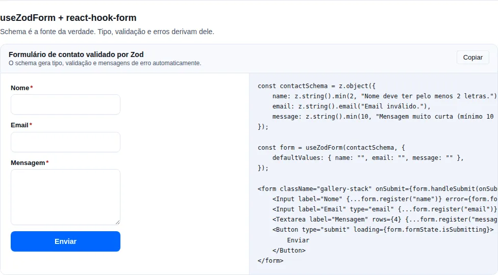
Section forms of the gallery — run it locally to interact.
Layout wrappers for forms (stack/inline/grid) + RHF integration.
import { Button, Form, FormActions, Input } from "tempest-react-sdk";

export function Cadastro() {
    return (
        <Form layout="grid" columns={2} gap={4}>
            <Input label="Name" />
            <Input label="Email" type="email" />
            <FormActions align="end">
                <Button type="submit">Save</Button>
            </FormActions>
        </Form>
    );
}
Full details in ../forms.md.
ImageCropper
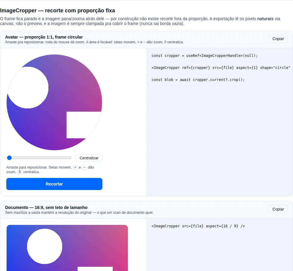
Section image-cropper of the gallery — run it locally to interact.
When to use: the natural partner of
FileUpload— a profile photo, a document photo, a cover image. The app decides the output ratio; the user only chooses what lands inside it.
The frame stays still and the image pans and zooms behind it. That is the model an avatar flow wants: by construction there is no off-ratio crop.
import { useRef, useState } from "react";
import { Button, FileUpload, ImageCropper, type ImageCropperHandle } from "tempest-react-sdk";

export function AvatarField({ onSave }: { onSave: (blob: Blob) => void }) {
  const [files, setFiles] = useState<File[]>([]);
  const cropper = useRef<ImageCropperHandle>(null);

  return (
    <>
      <FileUpload value={files} onChange={setFiles} accept="image/*" label="Photo" />
      {files[0] && (
        <>
          <ImageCropper
            ref={cropper}
            src={files[0]}
            aspect={1}
            shape="circle"
            maxSize={512}
            outputType="image/jpeg"
          />
          <Button
            onClick={async () => {
              const blob = await cropper.current?.crop();
              if (blob) onSave(blob);
            }}
          >
            Save
          </Button>
        </>
      )}
    </>
  );
}
| Prop | Type | Default |
|---|---|---|
src |
File \| Blob \| string |
— |
aspect |
number (width / height) |
1 |
maxZoom |
number |
4 |
maxSize |
number (cap on the exported long edge, px) |
— |
outputType |
string |
"image/png" |
outputQuality |
number (0–1, lossy types) |
0.92 |
shape |
"rect" \| "circle" |
"rect" |
onCropChange |
({ zoom, offset }) => void |
— |
label |
string (accessible name for the crop area) |
"Área de recorte" |
ref |
Ref<ImageCropperHandle> |
— |
The ref exposes { crop, reset }. crop() resolves Promise<Blob | null>.
It exports the original pixels, not the preview
The crop is read from the image's natural size through a canvas. A 4000 px photo cropped in a 320 px preview exports at the source's resolution, not the preview's — the most common defect in a hand-rolled cropper.
Use maxSize to cap it: a 12 MP photo cropped for a 96 px avatar is megabytes of
waste.
An empty edge can never happen
The image is always clamped to cover the frame, on pan and on zoom. That is the other classic defect: dragging or zooming out until the frame shows background, and the transparent (or black) band gets baked into the exported file. Here it is impossible by construction — including when zooming out, where an offset that was legal a moment ago stops being.
Keyboard support of equal weight
The crop area is focusable. Arrows pan (with Shift, 4× the step), +/−
zoom, 0 recentres. The mouse wheel zooms too. A cropper that only works by
dragging excludes anyone navigating by keyboard.
crop() returns null, it does not throw
Before the image has loaded, or if the browser declines to encode, the result is
null. A submit handler needs no try/catch — it needs to check the result.
A File/Blob becomes an object URL, and it is revoked
Changing the photo or unmounting revokes the previous URL. Without that, every re-pick would leak the previous one for the lifetime of the document.
SignaturePad
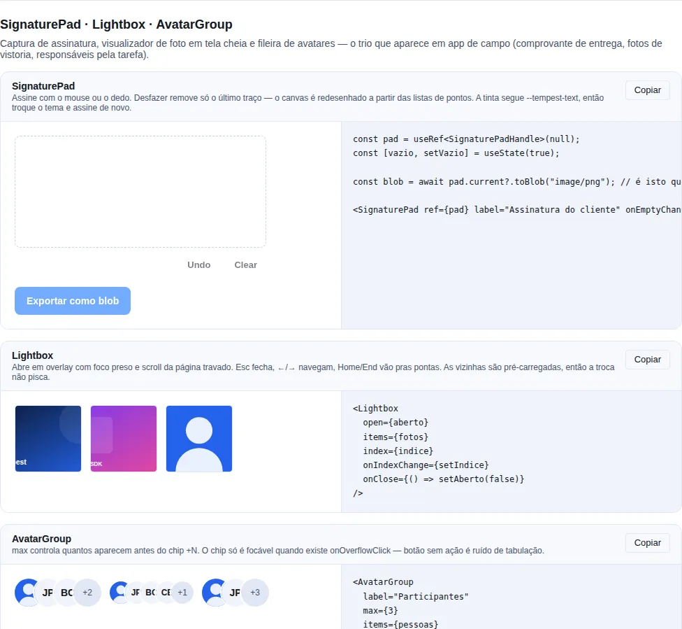
Section capture-media of the gallery — run it locally to interact.
When to use it: capture a handwritten signature — a delivery receipt, a service order, a terms acceptance. In the field, on a phone, with a finger.
A canvas driven by pointer events (mouse, finger and stylus down the same path). Strokes are kept as point lists and the canvas is redrawn from them — that is what makes undo possible at all: a canvas holds pixels, not history, so dropping the last stroke means repainting the rest.
import { Button, SignaturePad, type SignaturePadHandle } from "tempest-react-sdk";
import { useRef, useState } from "react";

export function DeliverySignature({ deliveryId }: { deliveryId: string }) {
  const pad = useRef<SignaturePadHandle>(null);
  const [empty, setEmpty] = useState(true);

  async function submit() {
    const blob = await pad.current?.toBlob("image/png");
    if (!blob) return;
    const form = new FormData();
    form.append("signature", blob, `${deliveryId}.png`);
    await api.post(`/deliveries/${deliveryId}/signature`, form);
  }

  return (
    <>
      <SignaturePad
        label="Customer signature"
        width={360}
        height={180}
        onEmptyChange={setEmpty}
      />
      <Button disabled={empty} onClick={submit}>Confirm delivery</Button>
    </>
  );
}
| Prop | Type | Default | What it does |
|---|---|---|---|
width |
number |
400 |
Surface width in CSS px. |
height |
number |
160 |
Surface height in CSS px. |
penColor |
string |
computed color | Stroke color. The default follows --tempest-text. |
penWidth |
number |
2 |
Stroke width. |
disabled |
boolean |
false |
Blocks drawing and dims the surface. |
label |
string |
"Signature" |
Accessible name of the canvas. |
onBegin |
() => void |
— | Called at the start of each stroke. |
onEnd |
(dataUrl: string) => void |
— | Called at the end of each stroke, with the current image. |
onEmptyChange |
(isEmpty: boolean) => void |
— | Called when emptiness changes — wire it to the submit button. |
showActions |
boolean |
true |
Renders the Undo/Clear buttons. |
Imperative handle (ref): clear(), undo(), isEmpty(), toDataURL(type?, quality?), toBlob(type?, quality?).
Upload toBlob(), not toDataURL()
A data URL is base64: ~33% more bytes, and it ends up as a string inside your JSON. toBlob() hands you binary ready for FormData.
Sharpness on a high-density screen
The canvas backing store is scaled by devicePixelRatio and the context gets the matching setTransform. Without it the line comes out blurry on a phone — the classic 1x canvas defect.
The ink follows the theme
The default reads the canvas' computed color, which the CSS binds to --tempest-text. A signature drawn in dark mode is light; in light mode, dark. Pass penColor only when you need fixed ink (pen blue, say).
A11y
- Always use
label— screen readers announce the field. erroraddsaria-invalid="true"+ describes it viaaria-describedby.requiredpropagates the nativerequiredattribute + a visual*indicator.PinInputcells expose individualaria-label="Digit N".PasswordInput.toggleusesaria-pressedand a localizedaria-label.
Recap
- Pick the control by data type — don't force an
Inputwhere aSelect,SwitchorPinInputcommunicates intent better. - Every field shares
label/helperText/error/required/sizeand forwards itsref→ they plug straight intoreact-hook-form. errorreplaceshelperTextand addsaria-invalidautomatically — don't duplicate the message.
Related pages:
- Form validation —
validateForm,useZodForm, BR masks,useViaCEPand the<FormField>wrapper. - Layout —
Form/FormSection/FormRow/FormActionsto structure the fields. - Actions —
Buttonfor the form submit. - Status & feedback —
Alert/Toastto confirm submit success or error.