Advanced: layout & UX
Styled scrolling, resizable panes, calendar and scheduler. They shape the space around the content, with no external dependency.
ScrollArea
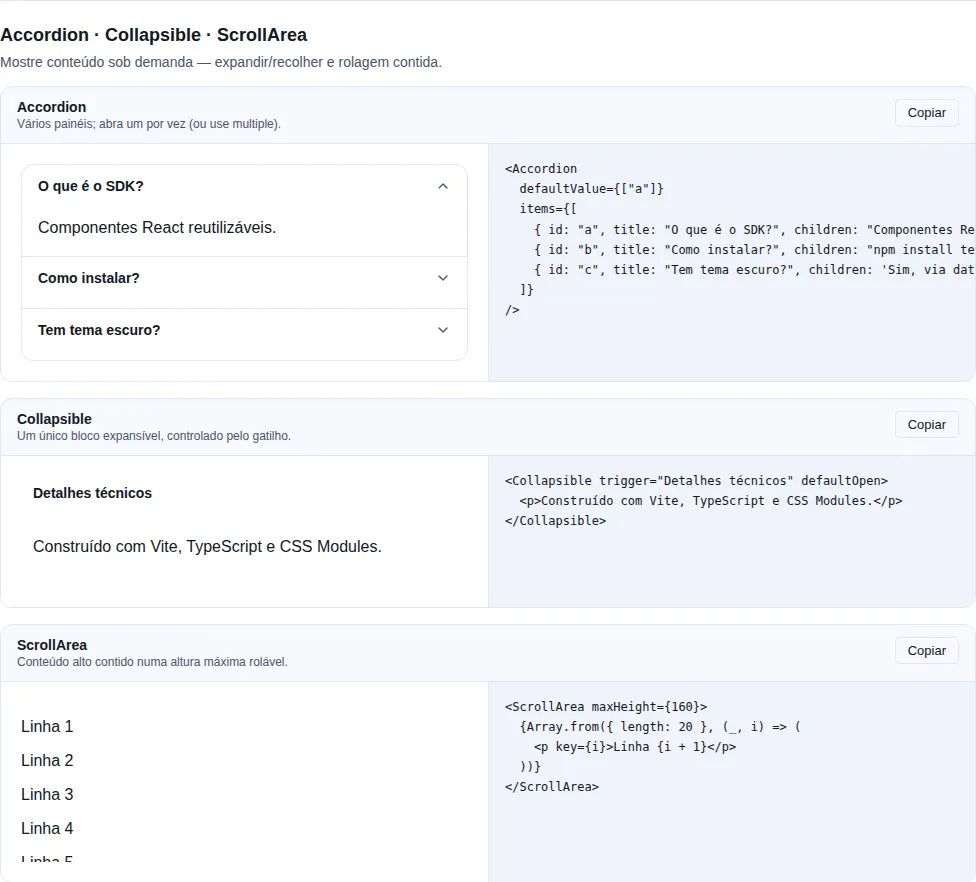
Section disclosure of the gallery — run it locally to interact.
A styled scroll container that overflows on the chosen axis and renders a thin scrollbar (WebKit). Forwards className, style, and ref to the <div>.
import { ScrollArea } from "tempest-react-sdk";

<ScrollArea maxHeight={240} orientation="vertical">
  <ul>
    {items.map((item) => (
      <li key={item.id}>{item.name}</li>
    ))}
  </ul>
</ScrollArea>;
| Prop | Type | Default | Description |
|---|---|---|---|
maxHeight |
number \| string |
— | Caps the height; numbers are pixels |
orientation |
"vertical" \| "horizontal" \| "both" |
"vertical" |
Which axis scrolls |
scrollLabel |
string |
"Área rolável" |
Accessible name for the scroll region |
Remaining <div> props are forwarded.
While it overflows, it becomes a focusable group
An area whose content is plain text holds nothing focusable. Without a tab stop of its own, a keyboard user can see the scrollbar and has no way to move it — focus never lands anywhere the arrow keys would scroll. So the area takes tabIndex={0} + role="group" + aria-label only while the content actually overflows, and loses it again once it fits. An area that does not scroll never adds a tab stop. A caller-supplied role or tabIndex still wins.
Resizable
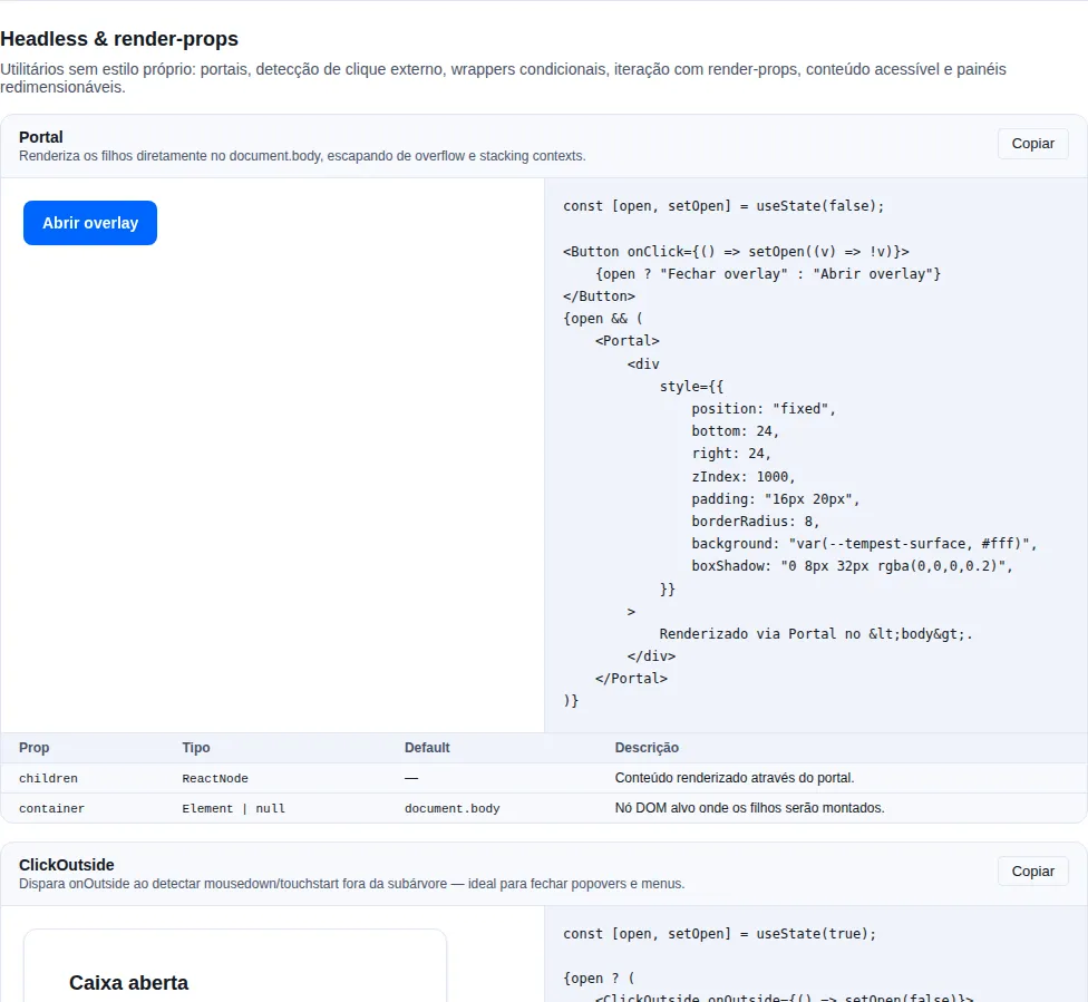
Section headless of the gallery — run it locally to interact.
A two-pane split layout with a draggable divider. The first pane is sized via flex-basis as a percentage; the second fills the rest. Drag with a pointer, or focus the divider and use the arrow keys (2% steps).
import { Resizable } from "tempest-react-sdk";

<Resizable direction="horizontal" defaultSize={40} min={20} max={80}>
  <aside>Side panel</aside>
  <main>Main content</main>
</Resizable>;
| Prop | Type | Default | Description |
|---|---|---|---|
direction |
"horizontal" \| "vertical" |
"horizontal" |
horizontal places the panes side by side |
defaultSize |
number (%) |
50 |
Initial size of the first pane, as a percentage |
min |
number (%) |
10 |
Lower clamp for the first pane |
max |
number (%) |
90 |
Upper clamp for the first pane |
children |
[ReactNode, ReactNode] |
— | Exactly two panes — [paneA, paneB] |
Exactly two children
children is a [ReactNode, ReactNode] tuple. The size is always clamped to [min, max].
Calendar
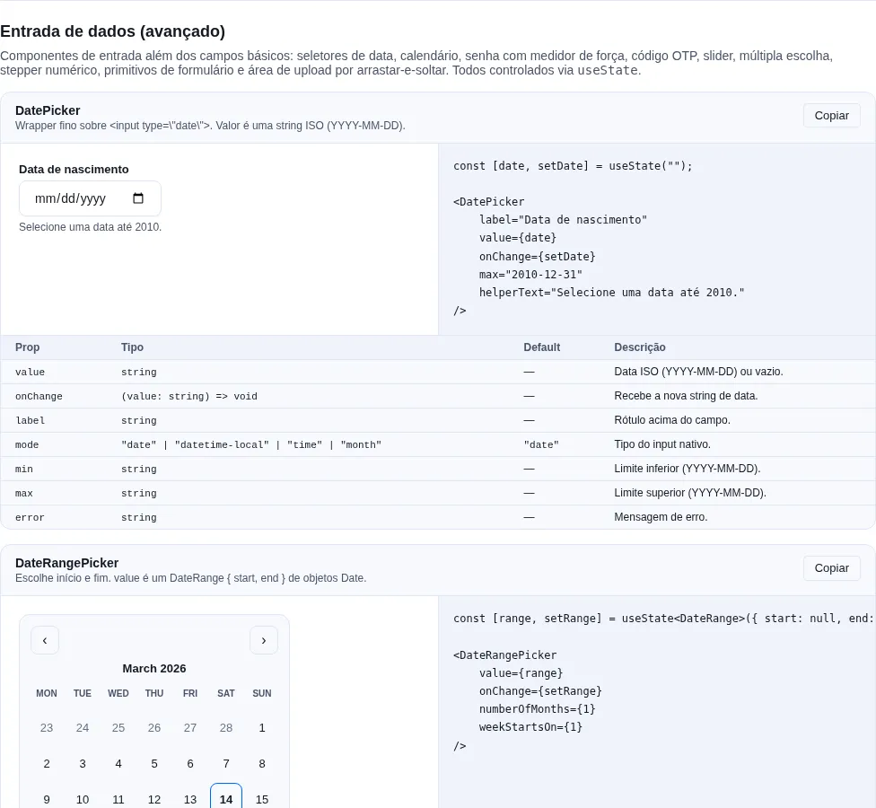
Section inputs-extra of the gallery — run it locally to interact.
A standalone month-grid date picker. Header with month/year + prev/next buttons, a weekday row, and a 6×7 grid of day buttons. Selection and visible month can each be controlled or uncontrolled. Uses plain Date math — no external date libraries.
import { Calendar } from "tempest-react-sdk";
import { useState } from "react";

const [date, setDate] = useState<Date>();

<Calendar value={date} onChange={setDate} weekStartsOn={1} minDate={new Date(2026, 0, 1)} />;
| Prop | Type | Default | Description |
|---|---|---|---|
value |
Date |
— | Controlled selected date |
defaultValue |
Date |
— | Initial selected date for the uncontrolled case |
onChange |
(date: Date) => void |
— | Called with the newly selected date |
month |
Date |
— | Controlled visible month (any day within it) |
onMonthChange |
(month: Date) => void |
— | Called when the visible month changes (prev/next) |
minDate |
Date |
— | Earliest selectable date (inclusive) |
maxDate |
Date |
— | Latest selectable date (inclusive) |
weekStartsOn |
0 \| 1 |
0 |
First column — 0 Sunday, 1 Monday |
Keyboard
Arrow keys move focus by day (←/→) or week (↑/↓); Enter/Space selects the focused day.
Scheduler
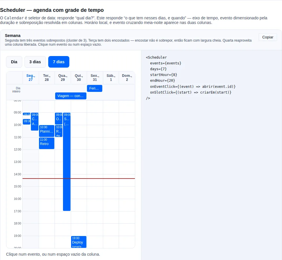
Section scheduler of the gallery — run it locally to interact.
An agenda: events placed on a time grid across consecutive days. The Calendar above is a date picker — it answers "which day?". This answers "what is on those days, and when", which needs a different structure: a vertical time axis, events sized by duration, and overlapping events side by side.
import { Scheduler, type SchedulerEvent } from "tempest-react-sdk";

const events: SchedulerEvent[] = [
  { id: "1", title: "Daily", start: new Date(2026, 6, 27, 9, 0), end: new Date(2026, 6, 27, 9, 15) },
  { id: "2", title: "Client", start: new Date(2026, 6, 27, 9, 0), end: new Date(2026, 6, 27, 10, 30) },
  { id: "3", title: "Holiday", start: new Date(2026, 6, 29), end: new Date(2026, 6, 30), allDay: true },
];

<Scheduler
  events={events}
  days={7}
  startHour={7}
  endHour={21}
  onEventClick={(event) => open(event.id)}
  onSlotClick={(start) => createAt(start)}
/>;
| Prop | Type | Default | Description |
|---|---|---|---|
events |
SchedulerEvent[] |
— | Events; instants read in local time |
anchor |
Date |
today | Any day within the range to show |
days |
number |
7 |
Consecutive days — 1 is a day view |
startHour |
number |
8 |
First visible hour |
endHour |
number |
20 |
Last visible hour |
snapMinutes |
number |
30 |
Granularity of a click on empty space |
onEventClick |
(event: SchedulerEvent) => void |
— | An event was activated |
onSlotClick |
(start: Date) => void |
— | Empty space clicked, already snapped |
renderEvent |
(event: SchedulerEvent) => ReactNode |
— | Event contents |
locale |
string |
"pt-BR" |
Day and hour labels |
showCurrentTime |
boolean |
true |
The current-time line |
now |
Date |
clock | Fixed "now" — use it in tests and demos |
An event is { id, title, start, end, allDay?, data? }.
Overlap is what almost every implementation gets wrong
Overlapping events are grouped into clusters of mutual overlap — a chain where each event overlaps at least one other — and everyone in a cluster shares one column count. That is what makes the widths line up; assigning columns pairwise produces the ragged layout where two events claim half the width each and a third silently covers one of them.
A column is reused the moment it frees: 9–10, 9–10, 10–11 takes two
columns, not three. And touching is not overlapping — 9–10 followed by 10–11
both stay full width.
The layout is pure and lives in scheduler-layout.ts, with its own tests.
Local time, and DST does not duplicate a day
start/end are instants read in the browser's time zone. The day range is built
by incrementing the calendar day, not by adding 24 h of milliseconds: across a
DST boundary a day is 23 or 25 hours long, and millisecond arithmetic would produce
a duplicated or skipped date.
An event crossing midnight appears in both columns
A 23:00–01:00 booking is split into two segments, each clipped to its own day's visible window. Without that it either vanishes or is drawn outside its column.
All-day events get their own lane
An event with allDay renders in a lane above the grid, spanning the days it
covers — a vertical position would mean nothing for it. The lane is not rendered
when there are none.
Clicking empty space creates; clicking an event does not
onSlotClick only fires when the click landed on the column rather than on an
event inside it. The instant arrives snapped to snapMinutes and clamped to the
window.
It is not role=\"grid\"
An ARIA grid requires row children, and here the events are siblings of the
day columns inside one CSS grid: a row wrapper would stop the columns being grid
items and the layout would collapse. Each day is a labelled group instead — a
screen reader tabs the event buttons and the group name supplies the day. Verified
with axe.
Recap
- Layout & UX:
ScrollAreafor styled scrolling,Resizablefor split panes, andCalendarfor date selection with no external dependencies. - All share the same controlled/uncontrolled patterns, expose keyboard A11y, and import from
tempest-react-sdk.