Layout widgets
Layout widgets are the structural building blocks of every tempestroid screen. They arrange children in space — stacking vertically, horizontally, layering on top of each other, scrolling long content, or respecting safe system edges. Combine them freely to build any UI structure you need.
All widgets in this family are supported by both renderers — the Qt simulator (desktop) and Compose on the device — with no API differences.
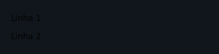
Column
Stacks children vertically (main axis = top to bottom).
from tempestroid import Column, Style, Text

Column(
    style=Style(gap=8.0, padding=16.0),
    children=[
        Text(content="Title", key="title"),
        Text(content="Subtitle", key="sub"),
    ],
)
| Prop | Type | Default | Description |
|---|---|---|---|
children |
list[Widget] |
[] |
Children stacked from top to bottom. |
Keys in lists
Always give a stable key to each child of a Column when the list
may change size — the reconciler uses the key to emit Reorder instead
of recreating the widget.
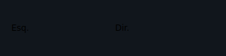
Row
Places children horizontally (main axis = left to right).
from tempestroid import Button, Row, TapEvent

async def on_dec(e: TapEvent) -> None:
    app.set_state(lambda s: setattr(s, "count", s.count - 1))

async def on_inc(e: TapEvent) -> None:
    app.set_state(lambda s: setattr(s, "count", s.count + 1))

Row(
    children=[
        Button(label="-", on_click=on_dec, key="dec"),
        Button(label="+", on_click=on_inc, key="inc"),
    ],
)
| Prop | Type | Default | Description |
|---|---|---|---|
children |
list[Widget] |
[] |
Children placed from left to right. |
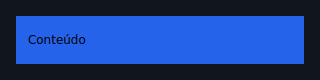
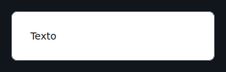
Container
A single-child box used to apply padding, background color, borders, and fixed
sizing via Style.
from tempestroid import Container, Style, Text

Container(
    style=Style(padding=16.0, background="#1E90FF", border_radius=8.0),
    child=Text(content="Hello!"),
)
| Prop | Type | Default | Description |
|---|---|---|---|
child |
Widget \| None |
None |
The single child to wrap. |
Style is the main Container API
Container alone does not define size, color, or spacing — use
style=Style(...) for that. Without a Style, it acts as a transparent
single-child Column.
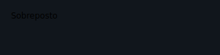
Stack
An overlapping container: children share one box, layered by index (last = topmost).
from tempestroid import Container, Stack, Style, Text

Stack(
    children=[
        Container(
            style=Style(width=200.0, height=200.0, background="#E0E0E0"),
            key="bg",
        ),
        Text(content="Overlaid text", key="label"),
    ],
)
| Prop | Type | Default | Description |
|---|---|---|---|
children |
list[Widget] |
[] |
Children overlaid in z-order. |
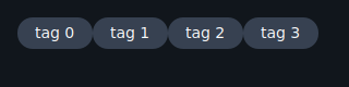
Wrap
A flow-layout container: children wrap to the next line when the current row
fills up (equivalent to flex-wrap: wrap).
from tempestroid import Chip, Wrap

Wrap(
    children=[
        Chip(label="Python", key="py"),
        Chip(label="Android", key="android"),
        Chip(label="Kotlin", key="kt"),
        Chip(label="Compose", key="compose"),
    ],
)
| Prop | Type | Default | Description |
|---|---|---|---|
children |
list[Widget] |
[] |
Children that wrap to the next line when the row is full. |
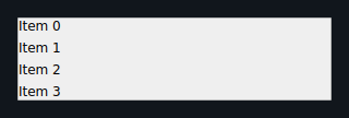
ScrollView
A scrollable container that accommodates children exceeding the visible space.
Scrolls vertically by default; horizontal=True flips the axis.
from tempestroid import ScrollView, Text

ScrollView(
    children=[
        Text(content=f"Item {i}", key=str(i))
        for i in range(50)
    ],
)
| Prop | Type | Default | Description |
|---|---|---|---|
horizontal |
bool |
False |
True enables horizontal scrolling. |
children |
list[Widget] |
[] |
Scrollable content. |
Large lists with many items
For lists of hundreds or thousands of items, prefer LazyColumn /
LazyRow (the lists family), which virtualize the content and only
materialize the visible window.
SafeArea
A single-child box that insets its content away from system intrusions (notch, status bar, gesture navigation bar).
from tempestroid import Column, SafeArea, Text

SafeArea(
    child=Column(
        children=[
            Text(content="Safe content", key="body"),
        ],
    ),
)

| Prop | Type | Default | Description |
|---|---|---|---|
child |
Widget \| None |
None |
Child to be inset from safe edges. |
edges |
list[SafeAreaEdge] |
[] |
Edges to respect. Empty list = all edges. |
Safe area edges
SafeAreaEdge is an enum with values TOP, BOTTOM, LEFT, and
RIGHT. Pass an empty list (default) to guard all edges, or pick only
the ones that make sense for the current screen context.
AspectRatio
A single-child box that constrains its child to a fixed width/height ratio.
from tempestroid import AspectRatio, Image

AspectRatio(
    ratio=16 / 9,
    child=Image(src="https://example.com/banner.jpg", alt="Banner"),
)

| Prop | Type | Default | Description |
|---|---|---|---|
ratio |
float |
(required) | Width ÷ height ratio (e.g. 16/9 ≈ 1.77). |
child |
Widget \| None |
None |
Child to be constrained. |
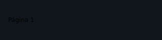
PageView
A paginated horizontal carousel: one full-width page visible at a time, with
programmatic page switching via page and change reporting via
on_page_change.
from tempestroid import Container, PageView, PageChangeEvent, Style, Text

async def on_page(e: PageChangeEvent) -> None:
    app.set_state(lambda s: setattr(s, "page", e.index))

PageView(
    page=app.state.page,
    on_page_change=on_page,
    children=[
        Container(
            style=Style(background="#FF6B6B", padding=32.0),
            child=Text(content="Page 1"),
            key="p0",
        ),
        Container(
            style=Style(background="#4ECDC4", padding=32.0),
            child=Text(content="Page 2"),
            key="p1",
        ),
        Container(
            style=Style(background="#45B7D1", padding=32.0),
            child=Text(content="Page 3"),
            key="p2",
        ),
    ],
)
| Prop | Type | Default | Description |
|---|---|---|---|
children |
list[Widget] |
[] |
Carousel pages; each occupies the full width. |
page |
int |
0 |
Index of the visible page (controlled by the app). |
on_page_change |
handler → PageChangeEvent |
None |
Called when the user swipes to another page. The handler receives a PageChangeEvent with an index field. |
KeyboardAvoidingView
A vertical container that recedes its content when the soft keyboard appears, preventing input fields from being hidden beneath it.
from tempestroid import Input, KeyboardAvoidingView, TextChangeEvent

async def on_change(e: TextChangeEvent) -> None:
    app.set_state(lambda s: setattr(s, "text", e.value))

KeyboardAvoidingView(
    children=[
        Input(
            value=app.state.text,
            placeholder="Type here...",
            on_change=on_change,
            key="field",
        ),
    ],
)
| Prop | Type | Default | Description |
|---|---|---|---|
children |
list[Widget] |
[] |
Children stacked vertically; they recede when the keyboard opens. |
Behaviour in the Qt simulator
In the desktop simulator a physical keyboard does not trigger the
recede behaviour — the widget acts like a plain Column. The recede
effect is only visible on the Android device, where the soft keyboard
can cover part of the screen.
Recap
Column/Row— stack children vertically and horizontally. Always usekeyon dynamic lists.Container— wraps a single child; all visual styling comes fromStyle.Stack— overlays children in layers (z-order = list index).Wrap— automatic line-breaking flow, great for chips and tags.ScrollView— scrolls content that exceeds the visible space; preferLazyColumn/LazyRowfor very long lists.SafeArea— insets content from system safe edges (notch, bars).AspectRatio— enforces a fixed ratio on its child.PageView— full-width page carousel;pageis app-controlled.KeyboardAvoidingView— recedes content when the soft keyboard opens (visible effect on device only).
Next steps: style widgets with Styles, explore input controls on the Inputs page, or see full working apps in the Example gallery.