Storybook (gallery)
You've walked the whole design system: tokens → variants → kit → surface → feedback → navigation → research. This is the capstone: a single app that gathers every H1–H6 component into a navigable gallery — the way to see the system working together, and to prove the theme toggles re-skin everything at once.
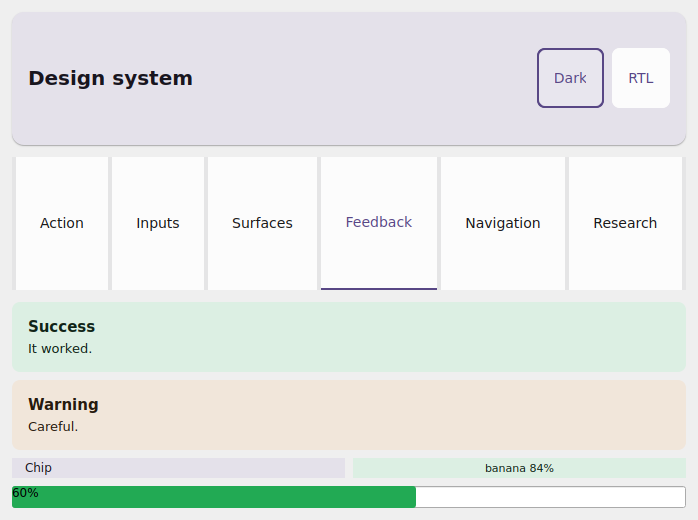
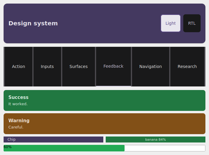
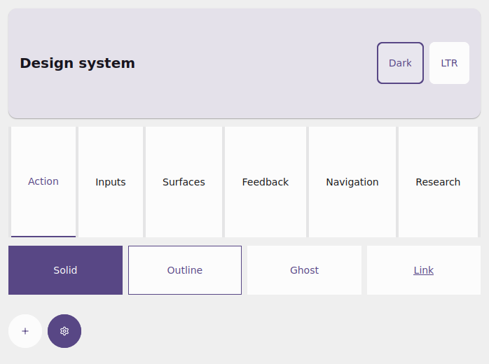
The same examples/storybook app in the Qt simulator: light, dark and
RTL. The same components, re-skinned by the toggles — a single source of truth
for the theme.
What the storybook shows
examples/storybook/app.py is a Storybook-style gallery:
- an
AppBarwith two toggles: light/dark and LTR/RTL; - a
Tabsstrip switching between categories — Action, Inputs, Surfaces, Feedback, Navigation and Research; - a representative specimen of each H1–H6 component inside its category.
Each category maps to a page of this guide:
| Category | Components | Guide |
|---|---|---|
| Action | Button, IconButton (variants/sizes) |
variants |
| Inputs | Input, Checkbox, Switch, Slider |
kit |
| Surfaces | Card, Surface, Divider |
surface |
| Feedback | Alert, Chip, ConfidenceBadge, ProgressBar |
feedback |
| Navigation | NavBar, Divider (under the AppBar/Tabs) |
navigation |
| Research | MetricCard, BarChart, DetectionOverlay |
research |
How to run
Tap the tabs to switch categories; tap Dark/Light and RTL/LTR on
the AppBar to re-skin the whole system live. The full source is in
examples/storybook/app.py.
The magic: one theme, the whole system
Dark mode + RTL are a property of the app, not of each widget
Every styled component accepts a theme=. The app reads app.theme
(light/dark) and app.locale (LTR/RTL) as context and passes them to
every component in the view. The toggles just call app.set_theme(...) /
app.set_locale(...); the coalesced rebuild reconstructs the view with the
new theme/locale, and every component resolves its colors and mirroring
again. That's why one tap re-skins the whole gallery — and it's exactly the
design system's dark/RTL verification surface.
The storybook's view skeleton is literally this — read the context, build the
toggles, dispatch to the active category:
from tempestroid import App, Locale, Theme, ThemeMode, Widget


def view(app: App[object]) -> Widget:  # state: the active category
    theme = app.theme
    dark = theme.is_dark(platform_dark_mode=app.media.platform_dark_mode)
    rtl = app.locale.rtl

    def _toggle_dark() -> None:
        app.set_theme(Theme(mode=ThemeMode.LIGHT if dark else ThemeMode.DARK))

    def _toggle_rtl() -> None:
        app.set_locale(
            Locale(language="pt", region="BR", rtl=False)
            if rtl
            else Locale(language="ar", region="EG", rtl=True)
        )

    ...  # AppBar(actions=[toggle dark, toggle RTL]) + Tabs + the category body
Each specimen receives that same theme — for example, the Action category:
from tempestroid import Button, HStack, IconButton, Variant, Widget


def action(theme) -> Widget:  # theme: Theme
    return HStack(
        gap="sm",
        theme=theme,
        children=[
            Button(label="Solid", variant=Variant.SOLID, theme=theme, key="b1"),
            Button(label="Outline", variant=Variant.OUTLINE, theme=theme, key="b2"),
            Button(label="Ghost", variant=Variant.GHOST, theme=theme, key="b3"),
            IconButton(icon="add", label="Add", theme=theme, key="ib"),
        ],
    )
Use the storybook as a test bench
When you add a component or tweak a token, open the storybook and toggle light/dark + LTR/RTL: if the color resolves and the layout mirrors in every combination, the component is conformant. It's the fastest way to catch a contrast or RTL-mirroring regression before taking it to the device.
Recap
examples/storybook/app.pyis the one-app tour of the whole H1–H6 design system, organized into tabs by category (Action/Inputs/Surfaces/Feedback/ Navigation/Research).- The
AppBarbrings the light/dark and LTR/RTL toggles; each callsapp.set_theme/app.set_locale. - Every component takes
theme=; the app readsapp.theme/app.localeas context, so one tap re-skins the whole system live — the dark/RTL verification surface. - Run it with
uv run python examples/storybook/app.py.
For the full widget catalog and the API reference, see the widgets overview and the public API.