Data display & feedback
You already have action (variants, kit) and the
frame (surface). What's missing is talking to the user:
confirming something worked, warning of an error, showing a metric, indicating
progress. This page closes the design system with the data display + feedback
layer — and introduces the status color_schemes.
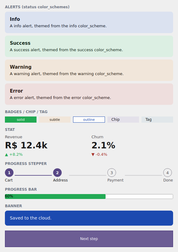
The examples/h4gallery example in the Qt simulator: status alerts, the badge
family, Stat, ProgressStepper, ProgressBar and a Banner.
Where the names live
Everything on this page imports from tempestroid: the widgets (Alert,
Banner, Badge, Chip, Tag, Stat, ProgressStepper, ProgressBar),
the AlertVariant/BadgeVariant enums and Theme/Color.
The status color_schemes
So far you've seen the emphasis roles: primary, secondary, tertiary,
error and neutral. The design system adds three first-class status roles —
full M3 tonal families, with their on_* pairs generated for WCAG-AA contrast:
color_scheme |
Means | Typical use |
|---|---|---|
"success" |
it worked | confirmation, saved, valid |
"warning" |
heads up | reversible warning, near a limit |
"info" |
information | neutral tip, what's new |
They drop into any component that accepts color_scheme — exactly like the
emphasis roles. Together with "error", they are the feedback vocabulary.
Color + container, both AA
Each status role carries the base/on_* pair and a container variant
(light tonal background + dark content) that the SUBTLE variants use. Both
pairs are generated to hit WCAG-AA contrast in light and dark — you pick the
status, the engine guarantees legibility.
Alert and Banner
An Alert is the inline message box; a Banner is the wide strip (top of
screen). Both carry color_scheme (the status) and variant (the AlertVariant
enum) for the visual treatment:
AlertVariant |
Treatment |
|---|---|
SUBTLE |
tonal container background + dark content (the default) |
SOLID |
full role background + on_* content |
LEFT_ACCENT |
accent bar on the left, soft background |
TOP_ACCENT |
accent bar on top, soft background |
from tempestroid import Alert, AlertVariant, Widget


def avisos(theme) -> Widget:  # theme: Theme
    return Alert(
        title="Tudo certo",
        body="Suas alterações foram salvas.",
        color_scheme="success",
        variant=AlertVariant.SUBTLE,
        theme=theme,
    )
from tempestroid import AlertVariant, Banner, Widget


def faixa(theme) -> Widget:  # theme: Theme
    return Banner(
        message="Salvo na nuvem.",
        color_scheme="info",
        variant=AlertVariant.SOLID,
        theme=theme,
    )
Dismissible
Pass a handler in Alert(dismiss=...) to show the close "x"; the Banner
accepts an action (a widget, typically a Button/Chip) at the right
edge.
The Badge / Chip / Tag family
Badge is the compact label (count, status); Chip is the interactive element
(filter, selection); Tag is a Chip preset for labels. Badge carries its own
variant scale (the BadgeVariant enum):
BadgeVariant |
Treatment |
|---|---|
SOLID |
full role background + on_* text (the default) |
SUBTLE |
tonal container background + dark text |
OUTLINE |
border only + text in the role color |
from tempestroid import Badge, BadgeVariant, Chip, HStack, Tag, Widget


def rotulos(theme) -> Widget:  # theme: Theme
    return HStack(
        gap="sm",
        theme=theme,
        children=[
            Badge(label="Novo", color_scheme="success", variant=BadgeVariant.SOLID,
                  theme=theme),
            Badge(label="Beta", color_scheme="warning", variant=BadgeVariant.SUBTLE,
                  theme=theme),
            Badge(label="3", color_scheme="info", variant=BadgeVariant.OUTLINE,
                  theme=theme),
            Chip(label="Filtro", color_scheme="primary", theme=theme),
            Tag(label="Etiqueta", color_scheme="secondary", theme=theme),
        ],
    )
Chip and Tag are interactive
Chip/Tag carry selected + on_click — a tap toggles the selection
state. Badge is display only (no handler).
Stat — the KPI metric
Stat shows a large number with a label and an optional delta (the change,
green up / red down via delta_up):
from tempestroid import HStack, Stat, Widget


def metricas(theme) -> Widget:  # theme: Theme
    return HStack(
        gap="md",
        theme=theme,
        children=[
            Stat(label="Receita", value="R$ 12,4k", delta="+8,2%", delta_up=True,
                 theme=theme),
            Stat(label="Churn", value="2,1%", delta="-0,4%", delta_up=False,
                 theme=theme),
        ],
    )
ProgressStepper and the ProgressBar accent
ProgressStepper draws the steps of a flow (cart → address → payment), with the
current step via current; ProgressBar gained a color_scheme to tint the
filled bar in the theme accent:
from tempestroid import ProgressBar, ProgressStepper, VStack, Widget


def progresso(theme, etapa: int) -> Widget:  # theme: Theme
    return VStack(
        gap="md",
        theme=theme,
        children=[
            ProgressStepper(
                steps=["Carrinho", "Endereço", "Pagamento", "Pronto"],
                current=etapa,
                color_scheme="primary",
                theme=theme,
            ),
            ProgressBar(value=0.6, color_scheme="success"),
        ],
    )
More display & feedback
The same layer holds Avatar, EmptyState, SegmentedControl, Rating and
Spinner — all theme-following and accepting color_scheme. See the full
catalog in the widgets overview and the
public API.
Full example: the feedback gallery
examples/h4gallery/app.py draws the whole layer — the four statuses as
Alerts, the badge family, two Stats, the ProgressStepper (advances when you
tap the "Next step" Chip), a ProgressBar and a Banner:
On the device, the same view/make_state loads in the Compose host: because
the whole layer is composite components (they lower to primitives via
Component.render), they render through the primitive children on both
renderers, over the resolved status colors.
Recap
- The design system promotes three status roles to first-class
color_schemes —success/warning/info(added toerror) — each with base/on_*+ container, all WCAG-AA. Alert(inline) andBanner(strip) carrycolor_scheme+AlertVariant(SUBTLE/SOLID/LEFT_ACCENT/TOP_ACCENT).BadgehasBadgeVariant(SOLID/SUBTLE/OUTLINE);Chip/Tagare interactive (selected+on_click).Statis the metric withdelta/delta_up;ProgressStepperdraws the steps;ProgressBaracceptscolor_scheme.- It's all composite components → it renders through the primitives on both renderers.
You finished the design system: tokens → variants → kit → surface → feedback. For the full widget catalog and the API reference, see the widgets overview and the public API.