Chakra-style variants
With the theme and tokens in place, you don't need to assemble a
Style for every button. The styled components expose a variant API with
Chakra UI ergonomics — three props (variant / size / color_scheme) — and
the engine resolves, from the theme, a complete Material 3 Style, with
interaction states and an accessible touch target. You describe the intent;
the design system computes the pixels.
Where the names live
variant/size/color_scheme are plain props; the enums Variant,
Size, ComponentState and the IconButton widget are re-exported by
tempestroid, alongside Button, Theme and Color. Import everything
from one place — tempest_core is just the engine underneath.
The Button in one line
from tempestroid import Button, Color, Size, Theme, Variant

theme = Theme.from_seed(Color.from_hex("#2563eb"))

save = Button(
    label="Save",
    variant=Variant.SOLID,
    size=Size.MD,
    color_scheme="primary",
    theme=theme,
    on_click=lambda: print("saved!"),
)
With no prop beyond label, you get a solid / md / primary button — the
defaults. Everything else is optional and additive.
Overrides still work
Passed an explicit style=? It's merged on top of the resolved style
(the set fields win). Variants don't take fine control away from you — they
just spare you writing it when you don't need it.
The four variants
The variant prop (enum Variant) picks the visual treatment, mirroring
Material 3:
Variant |
Look |
|---|---|
SOLID |
filled with the role color + legible on_* content (the highest-emphasis action) |
OUTLINE |
transparent fill, role color as content and a same-color border |
GHOST |
transparent fill, role color as content, no border |
LINK |
same as ghost, plus an underline (reads as a text link) |
from tempestroid import Button, Color, Row, Theme, Variant

theme = Theme.from_seed(Color.from_hex("#2563eb"))

Row(
    style=...,
    children=[
        Button(label=v.value, variant=v, color_scheme="primary", theme=theme, key=v.value)
        for v in Variant  # SOLID, OUTLINE, GHOST, LINK
    ],
)
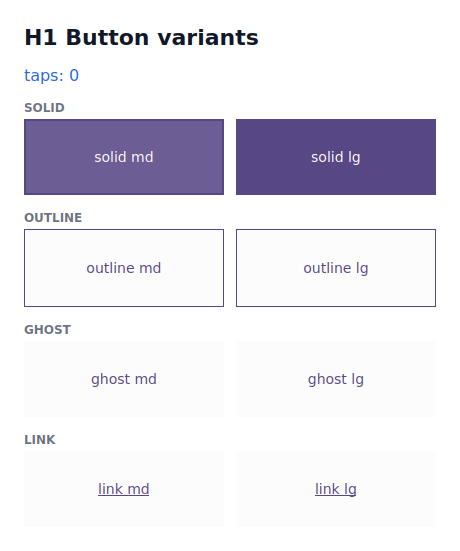
The four variants (examples/h1buttons) at md/lg sizes, rendered in the Qt
simulator.
Sizes and the 48dp touch target
The size prop (enum Size) controls visual density — padding and font
size come from the theme's scales:
Size |
Density |
|---|---|
XS |
most compact |
SM |
compact |
MD |
default |
LG |
larger |
Accessibility built in
No matter how small the size, the touch target never drops below 48dp
(the Material 3 minimum). An XS only shrinks the look; the tappable area
stays accessible. WCAG-AA contrast between the role and its on_* is
guaranteed by the tokens too.
Color scheme
The color_scheme prop picks the Material 3 role family the component paints
with — one of the emphasis roles ("primary", "secondary", "tertiary",
"error", "neutral") or a status role ("success", "warning", "info",
added by the design system — see
data display & feedback) (the
roles table has the summary).
from tempestroid import Button, Color, Theme, Variant

theme = Theme.from_seed(Color.from_hex("#2563eb"))

delete = Button(label="Delete", variant=Variant.SOLID, color_scheme="error", theme=theme)
cancel = Button(label="Cancel", variant=Variant.OUTLINE, color_scheme="neutral", theme=theme)
An invalid scheme fails fast
Passing a color_scheme outside the known families fails when the component
is built — you catch the mistake right away, not at render time.
Interaction states (M3 state layers)
Each component resolves not just the resting style, but the full table of
interaction states — default / hover / pressed / focus / disabled
— as Material 3 state layers (the content color overlaid on the background at
the M3 opacities). The component hands that table to the renderer, which applies
the matching style on real pointer/focus events:
from tempestroid import Button, Color, Theme, Variant

theme = Theme.from_seed(Color.from_hex("#2563eb"))
button = Button(label="Save", variant=Variant.SOLID, color_scheme="primary", theme=theme)

states = button.state_styles()
# {ComponentState.DEFAULT: Style(...), ComponentState.HOVER: Style(...), ...}
print(sorted(s.value for s in states))
# ['default', 'disabled', 'focus', 'hover', 'pressed']
Resolution is pure; event→state lives in the renderer
state_styles() is a pure function in the engine — same inputs, same output
— and it's pinned by the conformance suite. Each renderer only maps the real
event to a state: Qt uses QSS pseudo-states; Compose uses
InteractionSource + the native Material 3 state layers.
Responsive size
size also accepts a per-breakpoint map (Chakra-style), resolved mobile-first
against the theme's breakpoints and the current viewport width:
from tempestroid import Button, Color, Size, Theme

theme = Theme.from_seed(Color.from_hex("#2563eb"))

responsive = Button(
    label="Continue",
    size={"base": Size.SM, "md": Size.LG},  # SM on phones, LG from md up
    color_scheme="primary",
    theme=theme,
)
The "base" key is the starting size (width 0); from each named breakpoint
(sm/md/lg/xl) that breakpoint's size wins once the viewport reaches it.
The app supplies the viewport via media= (a MediaQueryData); the runtime
keeps that context current.
Full example: the variant showcase
The examples/h1buttons/app.py example draws the variant matrix live (and a tap
counter to prove the tap → handler → patch path). Here's its heart — an
end-to-end runnable tempest app:
from __future__ import annotations

from dataclasses import dataclass

from tempestroid import (
    App,
    Button,
    Color,
    Column,
    Row,
    Size,
    Style,
    Text,
    Theme,
    Variant,
    Widget,
)


@dataclass
class State:
    taps: int = 0


def make_state() -> State:
    return State()


def view(app: App[State]) -> Widget:
    theme = Theme.from_seed(Color.from_hex("#2563eb"))

    def bump() -> None:
        app.set_state(lambda s: setattr(s, "taps", s.taps + 1))

    def variant_row(variant: Variant) -> Widget:
        return Row(
            style=Style(gap=12.0),
            key=f"row:{variant.value}",
            children=[
                Button(
                    label=f"{variant.value} {size.value}",
                    on_click=bump,
                    variant=variant,
                    size=size,
                    color_scheme="primary",
                    theme=theme,
                    key=size.value,
                )
                for size in (Size.MD, Size.LG)
            ],
        )

    return Column(
        style=Style(gap=16.0),
        children=[
            Text(content=f"taps: {app.state.taps}", key="taps"),
            variant_row(Variant.SOLID),
            variant_row(Variant.OUTLINE),
            variant_row(Variant.GHOST),
            variant_row(Variant.LINK),
        ],
    )


def main() -> int:
    # Import the Qt renderer lazily — the device loads view/make_state from this
    # same file and has no PySide6.
    from tempestroid.renderers.qt import run_qt

    return run_qt(make_state(), view, title="H1 buttons", size=(420, 520))


if __name__ == "__main__":
    raise SystemExit(main())
Run it in the Qt simulator:
On the device, the same view/make_state is loaded by the Compose host; each
variant maps to its Material 3 affordance (filled / outlined / text), and
Material 3 supplies the native press/hover/focus state layers over the resolved
colors.
Recap
- The variant API is three props:
variant(SOLID/OUTLINE/GHOST/LINK),size(XS/SM/MD/LG) andcolor_scheme(the M3 emphasis families + the status onessuccess/warning/info). - The engine resolves, from the
theme, a complete M3Style— you describe the intent, not the pixels. - The touch target ≥ 48dp and WCAG-AA contrast are guaranteed; a smaller
sizeonly changes visual density. - Each component hands the states table (
state_styles()) as M3 state layers; the renderer applies the state on the real event (Qt QSS / ComposeInteractionSource). sizeaccepts a responsive map ({"base": Size.SM, "md": Size.LG}), resolved mobile-first against the theme's breakpoints.- An explicit
style=is still merged on top — nothing is taken away from you.
Next: the action and entry kit — IconButton, the field family
(Input/Dropdown/Autocomplete), the selection controls and the BR inputs.