Surface & layout
The action and entry kit gave the controls their ergonomics. What's missing is the frame: the cards, surfaces and spacers that organize the screen. tempestroid ships that layer with the same variant API you already know — except the axis here is Material 3 elevation, not button emphasis.
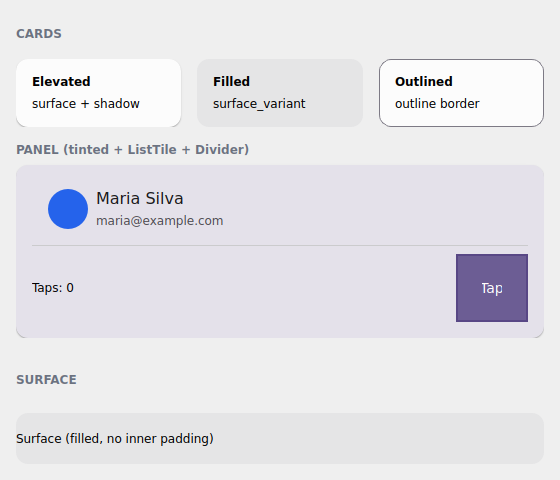
The examples/h3gallery example in the Qt simulator: the three Card variants,
a tinted panel with ListTile + Divider, and a bare Surface.
Where the names live
Everything on this page imports from tempestroid: the widgets (Card,
Surface, HStack, VStack, Spacer, Divider, ListTile), the
CardVariant enum and Theme/Color. tempest_core is just the engine
underneath — you never import it.
Card and the three Material 3 variants
A Card groups content on a surface with rounded corners and inner padding. The
variant prop (the CardVariant enum) picks the M3 treatment — and, just like
Button, the engine resolves the Style from the theme, with no hand-set
colors:
CardVariant |
Treatment |
|---|---|
ELEVATED |
surface + shadow (the elevation becomes a Shadow) — the default |
FILLED |
tonal fill (surface_variant), no shadow |
OUTLINED |
thin border in the outline color, surface background |
from tempestroid import Card, CardVariant, Text, Widget


def cards(theme) -> Widget:  # theme: Theme
    return Card(
        variant=CardVariant.ELEVATED,
        theme=theme,
        children=[
            Text(content="Título"),
            Text(content="Conteúdo do cartão"),
        ],
    )
The spacing steps come from the theme
Card carries padding_step / radius_step / gap_step (defaults "md" /
"md" / "sm") — steps of the theme's 4dp scale, not loose pixels. Switch
to "sm" or "lg" and the card breathes in step with the rest of the app.
Tinting a card with color_scheme
A Card accepts color_scheme to tint the surface in a
color role (the default is
"neutral"). Handy to highlight a panel without leaving the theme:
from tempestroid import Card, CardVariant, Text, Widget


def painel(theme) -> Widget:  # theme: Theme
    return Card(
        variant=CardVariant.ELEVATED,
        color_scheme="primary",  # surface tinted in the accent
        theme=theme,
        children=[Text(content="Painel em destaque")],
    )
Surface — the bare primitive
Card is a convenience over Surface: the Surface applies the same
variant resolution (ELEVATED/FILLED/OUTLINED + color_scheme +
radius_step), but with no inner padding and holding one child (child,
not children). Use it when you want to control the spacing yourself:
from tempestroid import CardVariant, Surface, Text, Widget


def superficie(theme) -> Widget:  # theme: Theme
    return Surface(
        variant=CardVariant.FILLED,
        theme=theme,
        child=Text(content="Superfície preenchida, sem padding interno"),
    )
Card builds on Surface
Think of Card as Surface + padding + a Column of your children. When
the card's built-in padding doesn't fit, drop to Surface and build the
inside yourself.
Stack helpers: HStack, VStack, Spacer
For day-to-day arrangement, the stack helpers are Row/Column with named
theme gaps instead of a pixel number. HStack stacks horizontally, VStack
vertically; the gap takes a step of the spacing scale
("xs"/"sm"/"md"/"lg"/"xl"):
from tempestroid import HStack, Spacer, Text, VStack, Widget


def barra(theme) -> Widget:  # theme: Theme
    return HStack(
        gap="md",
        theme=theme,
        children=[
            Text(content="Início"),
            Spacer(),  # pushes what follows to the opposite edge
            Text(content="Configurações"),
        ],
    )


def coluna(theme) -> Widget:  # theme: Theme
    return VStack(
        gap="sm",
        theme=theme,
        children=[Text(content="Linha 1"), Text(content="Linha 2")],
    )
Spacer is the elastic space: it grows to fill the main axis, so a Spacer
between two children of an HStack throws the second one to the far edge.
Control the proportion with flex (default 1.0).
Themed Divider and ListTile
Divider is a thin rule that follows the theme's outline color (or a
color_scheme you pass); ListTile is the classic list row — title +
subtitle + leading/trailing slots (which take any widget, like an
Avatar):
from tempestroid import Avatar, Divider, ListTile, VStack, Widget


def lista(theme) -> Widget:  # theme: Theme
    return VStack(
        gap="xs",
        theme=theme,
        children=[
            ListTile(
                title="Maria Silva",
                subtitle="maria@example.com",
                leading=Avatar(label="MS"),
                theme=theme,
            ),
            Divider(theme=theme),
            ListTile(title="João Souza", subtitle="joao@example.com", theme=theme),
        ],
    )
Full example: the surface gallery
examples/h3gallery/app.py puts it all together — the three Card variants side
by side, a tinted card with ListTile + Divider + an action row that uses
Spacer to push the button to the edge, and a bare Surface:
On the device, the same view/make_state loads in the Compose host: because
Card, Surface, HStack, VStack, Divider and ListTile are composite
components (they lower to primitives via Component.render), they render
through their primitive children on both renderers — with no dedicated Kotlin
branch.
Surface divergence
The ELEVATED shadow becomes a Shadow resolved from the M3 elevation and
follows both Style translators. The geometry (radius, padding) comes from
the theme steps — identical on both renderers. See the
renderer coverage for the full table.
Recap
Cardgroups content on an M3 surface;variantpicksELEVATED(shadow) /FILLED(tonal) /OUTLINED(border) and the engine resolves theStylefrom the theme.padding_step/radius_step/gap_stepcome from the theme's 4dp scale, not loose pixels;color_schemetints the surface in a color role.Surfaceis the bare primitive theCarduses — same variant resolution, no padding and a singlechild.HStack/VStackareRow/Columnwith a named theme gap;Spacergrows to push its neighbors.Divider/ListTilefollow the theme (rule + the classic list row withleading/trailing).- It's all composite components → it renders through the primitives on both renderers.
Next: data display & feedback — Alert/Banner, the
Badge/Chip/Tag family, Stat, ProgressStepper and the status
color_schemes.