Navigation
You already have action (variants, kit), the
frame (surface) and the conversation
(feedback). What's missing is the navigation shell: the top
bar, the tab strip, the bottom navigation, the search, the page trail. This page
styles that layer — every component resolves the M3 surfaces and the
active-item accent from color_scheme/theme, with no hand-set colors.
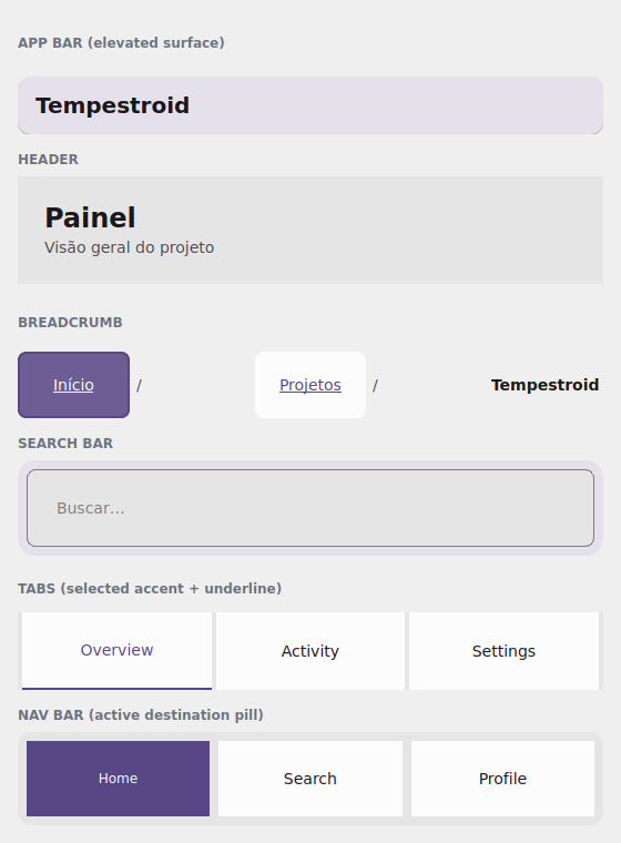
The examples/h5gallery example in the Qt simulator: AppBar, Header,
Breadcrumb, SearchBar, Tabs and NavBar — all theme-tinted.
Where the names live
Everything on this page imports from tempestroid: the navigation
components (AppBar, CollapsingAppBar, NavBar, Drawer, Sidebar,
Breadcrumb, Burger, Footer, Header, Scaffold, SearchBar, Tabs)
and Theme.
The AppBar and the Header
The AppBar is the top bar — an M3 elevated surface with a title, a
leading widget (back/menu button) and a list of actions on the right. The
color_scheme sets the role of the surface and its content:
from tempestroid import AppBar, Button, Variant, Widget


def barra(theme) -> Widget:  # theme: Theme
    return AppBar(
        title="Tempestroid",
        color_scheme="primary",
        actions=[
            Button(label="Sair", variant=Variant.GHOST, theme=theme, key="out"),
        ],
        theme=theme,
    )
The Header is the content heading (not the system bar): a large title +
subtitle, over the page surface.
from tempestroid import Header, Widget


def cabecalho(theme) -> Widget:  # theme: Theme
    return Header(
        title="Painel",
        subtitle="Visão geral do projeto",
        theme=theme,
    )
A bar that collapses on scroll
CollapsingAppBar is the AppBar that shrinks as the screen scrolls: pass
the scroll_offset (from the ScrollEvent) and it interpolates between
expanded_height and collapsed_height. It marries the
collapsible app bar from E6 with the theme tokens.
Tabs — the M3 tab strip
Tabs is the styled tab strip: a list of labels (tabs), the active index
(active) and an on_select(index) handler. The active tab gets the
color_scheme accent plus an underline:
from tempestroid import Tabs, Widget


def abas(theme, ativa: int) -> Widget:  # theme: Theme
    return Tabs(
        tabs=["Visão geral", "Atividade", "Ajustes"],
        active=ativa,
        on_select=lambda i: None,  # swap the index in your state
        color_scheme="primary",
        theme=theme,
    )
Tabs is the strip; the screens are yours
Tabs only draws and emits the selection — it does not swap content by
itself. Keep the index in state, render the active tab's body and update via
app.set_state. For a screen stack with an animated transition, use the
navigation TabView/Navigator.
NavBar — the bottom navigation
NavBar is the destination bar (M3 "bottom navigation" style): labels via
items, the active destination via active, and on_select(index). The active
item gets the accent pill from color_scheme:
from tempestroid import NavBar, Widget


def navegacao(theme, ativo: int) -> Widget:  # theme: Theme
    return NavBar(
        items=["Início", "Buscar", "Perfil"],
        active=ativo,
        on_select=lambda i: None,
        color_scheme="primary",
        theme=theme,
    )
SearchBar and Breadcrumb
The SearchBar is the M3 search field — a field_variant over the surface, with
value, placeholder, on_change(text) and an optional on_clear. The
Breadcrumb is the page trail: a list of labels (items) with a separator and
on_select(index).
from tempestroid import Breadcrumb, SearchBar, VStack, Widget


def busca_e_caminho(theme, consulta: str) -> Widget:  # theme: Theme
    return VStack(
        gap="md",
        theme=theme,
        children=[
            SearchBar(
                value=consulta,
                placeholder="Buscar…",
                on_change=lambda q: None,  # keep it in state
                color_scheme="primary",
                theme=theme,
            ),
            Breadcrumb(
                items=["Início", "Projetos", "Tempestroid"],
                on_select=lambda i: None,
                theme=theme,
            ),
        ],
    )
The rest of the shell
The same layer brings Drawer/Sidebar (the side drawer), Burger (the
menu button), Footer, and Scaffold (the top-bar + body + bottom-bar
skeleton that ties it together). All follow the theme and accept
color_scheme. See the full catalog in the
widgets overview and the
public API.
Full example: the navigation gallery
examples/h5gallery/app.py draws the whole shell — AppBar, Header,
Breadcrumb, SearchBar (type and the state updates), Tabs (a tap swaps the
active tab) and NavBar (a tap swaps the destination), all theme-tinted:
The full source is in
examples/h5gallery/app.py.
On the device, the same view/make_state loads in the Compose host: because
the whole layer is composite components (they lower to primitives via
Component.render), they render through the primitive children on both
renderers, over the resolved theme surfaces and accent.
Recap
- The
AppBaris the top bar (elevated surface +leading/actions); theHeaderis the content heading;CollapsingAppBarshrinks on scroll viascroll_offset. Tabsis the M3 tab strip (tabs/active/on_select), with an accent + underline on the active tab — you keep the index and render the body.NavBaris the bottom navigation (items/active/on_select) with an accent pill on the active destination.SearchBaris the search field (value/on_change/on_clear);Breadcrumbis the page trail (items/on_select).Drawer/Sidebar/Burger/Footer/Scaffoldcomplete the shell — everything follows the theme andcolor_scheme.
Next: the research components — metrics, charts and the
ort-vision-sdk bridge.