Theme and tokens
So far you've styled every widget by hand: Color.from_hex("#2563eb") here, a
12.0 radius there, an Edge.all(16.0) padding somewhere else. It works, but it
scatters brand decisions across the whole app — and when dark mode arrives,
you rewrite every color. The tempestroid design system fixes this: a Theme
carries a set of Material 3 tokens (colors, spacing, shape, typography,
elevation, motion), and components read those tokens instead of raw values.
Where the tokens come from
The design engine (Theme, TokenSet, variants) is implemented in the
tempest-core package, installed alongside tempestroid. But you don't
import it: the whole design-system surface — Theme, ThemeMode,
ColorRole, TokenSet, TokenRef, Variant and friends — is
re-exported by tempestroid, so you import everything from one place,
like any other widget or enum.
A Theme in one line
The entry point is Theme.from_seed(...): give it one brand color and get a
complete Material 3 palette back — light and dark, every color role filled in,
with contrast guaranteed.
from tempestroid import Color, Theme

theme = Theme.from_seed(Color.from_hex("#2563eb"))

# The seed becomes a whole M3 tonal scheme:
print(theme.color("primary").to_hex())     # the light scheme's primary role
print(theme.color("on_primary").to_hex())  # legible content over primary
print(theme.space("md"))                    # 16.0 — default gutter (4dp grid)
print(theme.radius("lg"))                   # 16.0 — large corner radius
print(theme.elevation(2))                   # 3.0 — elevation level 2, in dp
No brand color yet?
Build Theme() with no arguments: you get the Material 3 baseline theme (the
reference purple #6750A4). Everything on this page works the same.
The color roles (color schemes)
Material 3 doesn't paint with raw colors — it paints with semantic roles.
Each role has an on_* pair that is the legible content drawn on top of it
(generated to meet WCAG-AA contrast). tempestroid exposes five role families,
which components pick via color_scheme:
color_scheme |
Base role | Content (on_*) |
Typical use |
|---|---|---|---|
"primary" |
primary |
on_primary |
main action, active state |
"secondary" |
secondary |
on_secondary |
complementary accent |
"tertiary" |
tertiary |
on_tertiary |
contrasting accent |
"error" |
error |
on_error |
error / destructive action |
"neutral" |
on_surface |
surface |
low-emphasis, neutral treatment |
Beyond these emphasis families, the design system promotes three status roles
to first-class color_schemes — "success", "warning" and "info" (added to
"error"), each with its on_* pair and an AA container variant. They appear
in any component that accepts color_scheme; the feedback vocabulary lives in
data display & feedback.
The full scheme also carries the surface roles your app uses for the
page chrome — surface / on_surface, background / on_background,
outline, surface_variant and their on_*. Read any of them by ColorRole
or by string:
from tempestroid import Color, ColorRole, Theme

theme = Theme.from_seed(Color.from_hex("#2563eb"))

surface = theme.color(ColorRole.SURFACE)
on_surface = theme.color(ColorRole.ON_SURFACE)
outline = theme.color("outline")  # a string resolves too
Hand-pick accent seeds
from_seed derives secondary/tertiary by rotating the seed's hue. Want to
pick each accent? Pass secondary_seed / tertiary_seed / error_seed, all
Color.
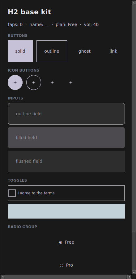
Light and dark with ThemeMode
The theme's mode decides which scheme (light or dark) the roles resolve to. The
same app, just swapping the ThemeMode, becomes:
There are three options:
from tempestroid import Color, Theme, ThemeMode

light = Theme.from_seed(Color.from_hex("#2563eb"), mode=ThemeMode.LIGHT)
dark = Theme.from_seed(Color.from_hex("#2563eb"), mode=ThemeMode.DARK)

print(light.color("background").to_hex())  # light surface
print(dark.color("background").to_hex())    # dark surface
ThemeMode.SYSTEM is the default: the app follows the device setting. To swap
the theme at runtime (a "dark mode" toggle in the app), use App.set_theme(...)
— see the examples/theming/app.py example.
The systematic scales
Beyond colors, the TokenSet carries named Material 3 scales — you ask for
"md" instead of memorizing 16.0:
| Scale | Access | Steps |
|---|---|---|
| Spacing (4dp grid) | theme.space(name) |
none xs sm md lg xl xxl |
| Shape (radius) | theme.radius(name) |
none xs sm md lg xl full |
| Typography | theme.typography(role) |
display_* headline_* title_* body_* label_* |
| Elevation | theme.elevation(level) |
levels 0–5, in dp |
| Motion | theme.tokens.motion |
durations + easing curves |
from tempestroid import Color, Edge, Style, Theme

theme = Theme.from_seed(Color.from_hex("#2563eb"))

# Compose a Style from tokens, not magic numbers:
title = theme.typography("title_large")
card = Style(
    background=theme.color("surface_variant"),
    padding=Edge.all(theme.space("md")),
    radius=theme.radius("lg"),
    font_size=title.font_size,
    font_weight=title.font_weight,
)
radius('full') is the pill
The full step uses the 999.0 sentinel; the renderer reads it as a
fully-rounded shape (pill/circle) and clamps it to the real box size.
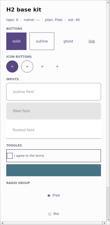
How a component reads the theme
The important part: a component resolves its Style against the theme you
hand it. The styled components (Button, Input, Checkbox, …) take a
theme parameter. Always pass the app's live theme and the component adapts its
look — dark mode included — without you rewriting a single color:
from tempestroid import Button, Color, Theme, Variant

theme = Theme.from_seed(Color.from_hex("#2563eb"))

# The Button resolves background/color/radius from the given theme:
save = Button(
    label="Save",
    variant=Variant.SOLID,
    color_scheme="primary",
    theme=theme,
)
print(save.style.background)  # already the theme's "primary" role color
Swap the theme for a dark one and the same Button resolves dark colors.
That's why the example gallery (examples/h2gallery/app.py) passes
theme=app.theme to every component: the whole app follows one theme.
Tokens are additive — raw Style still works
None of this breaks what you already have. A hand-written
Style(background=Color.from_hex(...)) keeps working. The theme is an
alternative, opt-in source of values. You can even carry a TokenRef
inside a Style (Style(background=TokenRef.color("primary"))) and let the
theme resolve it at build time via theme.resolve_style(...).
Recap
- A
Themecarries a Material 3TokenSet: color schemes + scales for spacing/shape/typography/elevation/motion. Theme.from_seed("#rrggbb")turns a brand color into a complete M3 palette (light + dark), with contrast guaranteed.- Colors are semantic roles (
primary/secondary/tertiary/error/neutral+ theiron_*and the surface roles), not raw colors. ThemeMode(LIGHT/DARK/SYSTEM) decides which scheme resolves; swap it at runtime withApp.set_theme.- Ask for scales by name —
theme.space("md"),theme.radius("lg"),theme.typography("title_large")— instead of magic numbers. - A component resolves against the
themeyou pass: hand ittheme=app.themeand everything follows the app's theme, dark mode included.
Next: the Chakra-style variant API, where
variant/size/color_scheme become the ergonomic way to ask for a
theme-resolved Style.