Input Widgets
Input widgets carry a value and hand control back to your app through a typed
change event. Every widget in this group calls app.set_state(...) inside its
handler, closing the data → UI → data loop. The event payload is always validated
before it reaches your handler — the same way FastAPI validates request bodies.
Both renderers — the Qt simulator (desktop) and Compose on device (Android arm64) — render these inputs natively.
Material 3 styling with variants
Every input also accepts the Chakra-style variant API — field_variant /
size / color_scheme + theme — which resolves a Material 3 Style from
the theme (focus/invalid states included). See the
Action and entry kit.
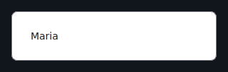
Input
A single-line editable text field. Supports password mode, keyboard hints, error messages, and character limits.
from dataclasses import dataclass
from tempestroid import App, Column, Input, KeyboardType, Text, TextChangeEvent


@dataclass
class State:
    email: str = ""
    password: str = ""


def view(app: App) -> Column:
    state = app.state

    def on_email(event: TextChangeEvent) -> None:
        app.set_state(lambda s: setattr(s, "email", event.value))

    def on_password(event: TextChangeEvent) -> None:
        app.set_state(lambda s: setattr(s, "password", event.value))

    return Column(
        children=[
            Input(
                value=state.email,
                placeholder="you@email.com",
                keyboard=KeyboardType.EMAIL,
                key="email",
                on_change=on_email,
            ),
            Input(
                value=state.password,
                placeholder="Password",
                secure=True,
                on_change=on_password,
                key="pwd",
            ),
            Text(content=f"Email: {state.email}", key="preview"),
        ]
    )


def make_state() -> State:
    return State()
| Prop | Type | Default | Description |
|---|---|---|---|
value |
str |
"" |
Current field content. |
placeholder |
str |
"" |
Hint text shown when empty. |
secure |
bool |
False |
Masks the text (password mode). |
pattern |
str \| None |
None |
Validation regex; TextChangeEvent.valid reflects the result. |
error |
str |
"" |
Error message shown below the field. |
keyboard |
KeyboardType |
KeyboardType.TEXT |
Keyboard type hint for the device (TEXT, NUMBER, EMAIL, PHONE, URL, PASSWORD). |
max_length |
int \| None |
None |
Maximum number of characters allowed. |
on_change |
handler → TextChangeEvent |
None |
Called on every text change. Receives TextChangeEvent(value, valid). |
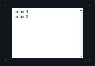
TextArea
A multi-line editable text field — great for comments, bios, and notes.
from dataclasses import dataclass
from tempestroid import App, Column, Text, TextArea, TextChangeEvent


@dataclass
class State:
    bio: str = ""


def view(app: App) -> Column:
    state = app.state

    def on_bio(event: TextChangeEvent) -> None:
        app.set_state(lambda s: setattr(s, "bio", event.value))

    return Column(
        children=[
            TextArea(
                value=state.bio,
                placeholder="Write your bio…",
                rows=4,
                max_length=280,
                on_change=on_bio,
                key="bio",
            ),
            Text(content=f"{len(state.bio)}/280", key="counter"),
        ]
    )


def make_state() -> State:
    return State()
| Prop | Type | Default | Description |
|---|---|---|---|
value |
str |
"" |
Current content. |
placeholder |
str |
"" |
Hint text. |
rows |
int |
3 |
Minimum visible height in lines. |
max_length |
int \| None |
None |
Character limit. |
on_change |
handler → TextChangeEvent |
None |
Called on every change. Receives TextChangeEvent(value, valid). |
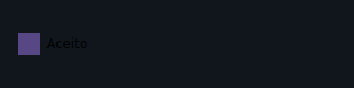
Checkbox
A labelled boolean checkbox.
from dataclasses import dataclass
from tempestroid import App, Checkbox, Column, Text, ToggleEvent


@dataclass
class State:
    accepted: bool = False


def view(app: App) -> Column:
    state = app.state

    def on_toggle(event: ToggleEvent) -> None:
        app.set_state(lambda s: setattr(s, "accepted", event.checked))

    return Column(
        children=[
            Checkbox(
                label="I accept the terms of use",
                checked=state.accepted,
                on_change=on_toggle,
                key="terms",
            ),
            Text(content="Accepted!" if state.accepted else "Pending…", key="status"),
        ]
    )


def make_state() -> State:
    return State()
| Prop | Type | Default | Description |
|---|---|---|---|
label |
str |
"" |
Label displayed next to the checkbox. |
checked |
bool |
False |
Current state. |
on_change |
handler → ToggleEvent |
None |
Called when the user toggles. Receives ToggleEvent(checked). |
Switch
An on/off toggle with a label. Uses the same event logic as Checkbox.
from dataclasses import dataclass
from tempestroid import App, Column, Switch, Text, ToggleEvent


@dataclass
class State:
    notifications: bool = True


def view(app: App) -> Column:
    state = app.state

    def on_switch(event: ToggleEvent) -> None:
        app.set_state(lambda s: setattr(s, "notifications", event.checked))

    return Column(
        children=[
            Switch(
                label="Receive notifications",
                checked=state.notifications,
                on_change=on_switch,
                key="notif",
            ),
            Text(content="On" if state.notifications else "Off", key="label"),
        ]
    )


def make_state() -> State:
    return State()

| Prop | Type | Default | Description |
|---|---|---|---|
label |
str |
"" |
Label displayed next to the switch. |
checked |
bool |
False |
Current state. |
on_change |
handler → ToggleEvent |
None |
Called when the user toggles. Receives ToggleEvent(checked). |
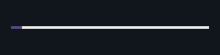
Slider
A draggable single-value control over a numeric range.
from dataclasses import dataclass
from tempestroid import App, Column, Slider, SlideEvent, Text


@dataclass
class State:
    volume: float = 50.0


def view(app: App) -> Column:
    state = app.state

    def on_slide(event: SlideEvent) -> None:
        app.set_state(lambda s: setattr(s, "volume", event.value))

    return Column(
        children=[
            Slider(
                value=state.volume,
                min_value=0.0,
                max_value=100.0,
                step=1.0,
                on_change=on_slide,
                key="vol",
            ),
            Text(content=f"Volume: {int(state.volume)}", key="label"),
        ]
    )


def make_state() -> State:
    return State()
| Prop | Type | Default | Description |
|---|---|---|---|
value |
float |
0.0 |
Current value. |
min_value |
float |
0.0 |
Lower bound. |
max_value |
float |
100.0 |
Upper bound. |
step |
float |
1.0 |
Minimum increment per step. |
on_change |
handler → SlideEvent |
None |
Called on every movement. Receives SlideEvent(value). |
RangeSlider
A dual-handle slider that defines a [low, high] sub-range.
from dataclasses import dataclass
from tempestroid import App, Column, RangeChangeEvent, RangeSlider, Text


@dataclass
class State:
    price_min: float = 20.0
    price_max: float = 80.0


def view(app: App) -> Column:
    state = app.state

    def on_range(event: RangeChangeEvent) -> None:
        app.set_state(lambda s: (
            setattr(s, "price_min", event.low) or
            setattr(s, "price_max", event.high)
        ))

    return Column(
        children=[
            RangeSlider(
                low=state.price_min,
                high=state.price_max,
                min_value=0.0,
                max_value=100.0,
                step=1.0,
                on_change=on_range,
                key="price",
            ),
            Text(
                content=f"${state.price_min:.0f} – ${state.price_max:.0f}",
                key="label",
            ),
        ]
    )


def make_state() -> State:
    return State()
| Prop | Type | Default | Description |
|---|---|---|---|
low |
float |
0.0 |
Value of the lower handle. |
high |
float |
100.0 |
Value of the upper handle. |
min_value |
float |
0.0 |
Minimum bound of the range. |
max_value |
float |
100.0 |
Maximum bound of the range. |
step |
float |
1.0 |
Minimum increment. |
on_change |
handler → RangeChangeEvent |
None |
Called on every movement. Receives RangeChangeEvent(low, high). |
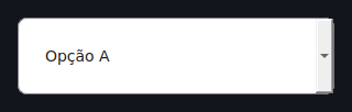
Dropdown
A single-choice dropdown / select control.
from dataclasses import dataclass
from tempestroid import App, Column, Dropdown, SelectEvent, Text


@dataclass
class State:
    country: str | None = None


def view(app: App) -> Column:
    state = app.state

    def on_select(event: SelectEvent) -> None:
        app.set_state(lambda s: setattr(s, "country", event.value))

    return Column(
        children=[
            Dropdown(
                options=["USA", "Brazil", "Germany", "Japan"],
                value=state.country,
                placeholder="Select a country…",
                on_select=on_select,
                key="country",
            ),
            Text(
                content=f"Country: {state.country or '—'}",
                key="label",
            ),
        ]
    )


def make_state() -> State:
    return State()
| Prop | Type | Default | Description |
|---|---|---|---|
options |
list[str] |
[] |
Available options. |
value |
str \| None |
None |
Currently selected option. |
placeholder |
str |
"Select…" |
Text shown when no option is selected. |
on_select |
handler → SelectEvent |
None |
Called when the user picks an option. Receives SelectEvent(value, index). |
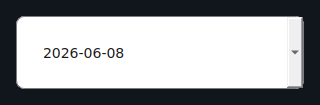
DatePicker
A date selection field. The value is an ISO yyyy-mm-dd string.
from dataclasses import dataclass
from tempestroid import App, Column, DateChangeEvent, DatePicker, Text


@dataclass
class State:
    birthday: str = ""


def view(app: App) -> Column:
    state = app.state

    def on_date(event: DateChangeEvent) -> None:
        app.set_state(lambda s: setattr(s, "birthday", event.value))

    return Column(
        children=[
            DatePicker(
                value=state.birthday,
                label="Date of birth",
                on_change=on_date,
                key="bday",
            ),
            Text(content=f"Birthday: {state.birthday or '—'}", key="label"),
        ]
    )


def make_state() -> State:
    return State()
| Prop | Type | Default | Description |
|---|---|---|---|
value |
str |
"" |
Selected date in ISO format (yyyy-mm-dd). |
label |
str |
"" |
Label displayed above the field. |
on_change |
handler → DateChangeEvent |
None |
Called when a date is selected. Receives DateChangeEvent(value). |
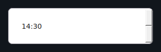
TimePicker
A time selection field in HH:mm format.
from dataclasses import dataclass
from tempestroid import App, Column, Text, TimeChangeEvent, TimePicker


@dataclass
class State:
    meeting_time: str = ""


def view(app: App) -> Column:
    state = app.state

    def on_time(event: TimeChangeEvent) -> None:
        app.set_state(lambda s: setattr(s, "meeting_time", event.value))

    return Column(
        children=[
            TimePicker(
                value=state.meeting_time,
                label="Meeting time",
                on_change=on_time,
                key="time",
            ),
            Text(content=f"Time: {state.meeting_time or '—'}", key="label"),
        ]
    )


def make_state() -> State:
    return State()
| Prop | Type | Default | Description |
|---|---|---|---|
value |
str |
"" |
Selected time in HH:mm format. |
label |
str |
"" |
Label displayed above the field. |
on_change |
handler → TimeChangeEvent |
None |
Called when the time changes. Receives TimeChangeEvent(value). |
FilePicker
A button that opens the platform file picker. On selection it returns the file URI and name.
from dataclasses import dataclass
from tempestroid import App, Column, FilePicker, FileSelectEvent, Text


@dataclass
class State:
    filename: str = ""


def view(app: App) -> Column:
    state = app.state

    def on_pick(event: FileSelectEvent) -> None:
        app.set_state(lambda s: setattr(s, "filename", event.name or event.uri))

    return Column(
        children=[
            FilePicker(
                label="Choose file",
                value=state.filename,
                on_select=on_pick,
                key="fp",
            ),
            Text(content=f"File: {state.filename or '—'}", key="label"),
        ]
    )


def make_state() -> State:
    return State()
| Prop | Type | Default | Description |
|---|---|---|---|
label |
str |
"Choose file" |
Button label. |
value |
str |
"" |
Currently selected file path/name. |
on_select |
handler → FileSelectEvent |
None |
Called after selection. Receives FileSelectEvent(uri, name). |
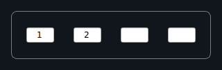
PinInput
A segmented PIN / OTP entry with individual cells. Focus advances automatically to the next cell after each character is typed.
Automatic focus advance
Each cell accepts exactly one character. After a cell is filled, focus moves automatically to the next one — the user does not need to tap each cell individually.
from dataclasses import dataclass
from tempestroid import App, Column, PinInput, SubmitEvent, Text, TextChangeEvent


@dataclass
class State:
    pin: str = ""
    complete: bool = False


def view(app: App) -> Column:
    state = app.state

    def on_change(event: TextChangeEvent) -> None:
        app.set_state(lambda s: setattr(s, "pin", event.value))

    def on_complete(event: SubmitEvent) -> None:
        app.set_state(lambda s: setattr(s, "complete", True))

    return Column(
        children=[
            PinInput(
                length=6,
                value=state.pin,
                secure=False,
                on_change=on_change,
                on_complete=on_complete,
                key="pin",
            ),
            Text(
                content="PIN complete!" if state.complete else f"Entered: {len(state.pin)}/6",
                key="status",
            ),
        ]
    )


def make_state() -> State:
    return State()
| Prop | Type | Default | Description |
|---|---|---|---|
length |
int |
6 |
Number of cells (digits). |
value |
str |
"" |
Current content (concatenation of digits). |
secure |
bool |
False |
Masks digits as dots. |
on_change |
handler → TextChangeEvent |
None |
Called after each cell is filled. Receives TextChangeEvent(value, valid). |
on_complete |
handler → SubmitEvent |
None |
Called when all cells are filled. Receives SubmitEvent. |
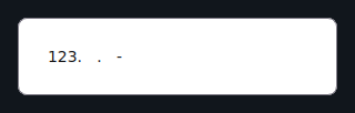
MaskedInput
A text field that enforces an input mask while typing — useful for phone numbers, SSNs, credit cards, etc.
Mask characters
9— accepts any digit (0–9).A— accepts any letter (a–z,A–Z).- All other characters are literals (e.g.
/,-,(,)) and are inserted automatically as the user types.
from dataclasses import dataclass
from tempestroid import App, Column, KeyboardType, MaskedInput, Text, TextChangeEvent


@dataclass
class State:
    phone: str = ""


def view(app: App) -> Column:
    state = app.state

    def on_phone(event: TextChangeEvent) -> None:
        app.set_state(lambda s: setattr(s, "phone", event.value))

    return Column(
        children=[
            MaskedInput(
                mask="(999) 999-9999",
                value=state.phone,
                placeholder="(555) 000-0000",
                keyboard=KeyboardType.NUMBER,
                on_change=on_phone,
                key="phone",
            ),
            Text(content=f"Phone: {state.phone or '—'}", key="label"),
        ]
    )


def make_state() -> State:
    return State()
| Prop | Type | Default | Description |
|---|---|---|---|
mask |
str |
"" |
Mask pattern (9 = digit, A = letter, others = literal). |
value |
str |
"" |
Current content (with the mask applied). |
placeholder |
str |
"" |
Hint text. |
keyboard |
KeyboardType |
KeyboardType.TEXT |
Keyboard type hint for the device. |
on_change |
handler → TextChangeEvent |
None |
Called on every change. Receives TextChangeEvent(value, valid). |
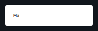
Autocomplete
A text field that displays suggestions from a list of options and lets the user
select one. Fires two distinct events: one per keystroke (on_change) and one
when a suggestion is confirmed (on_select).
from dataclasses import dataclass
from tempestroid import App, Autocomplete, Column, SelectEvent, Text, TextChangeEvent


CITIES = ["New York", "Los Angeles", "Chicago", "Houston", "Phoenix"]


@dataclass
class State:
    query: str = ""
    city: str = ""


def view(app: App) -> Column:
    state = app.state

    def on_change(event: TextChangeEvent) -> None:
        app.set_state(lambda s: setattr(s, "query", event.value))

    def on_select(event: SelectEvent) -> None:
        app.set_state(lambda s: (
            setattr(s, "city", event.value) or
            setattr(s, "query", event.value)
        ))

    return Column(
        children=[
            Autocomplete(
                options=CITIES,
                value=state.query,
                placeholder="Type a city…",
                on_change=on_change,
                on_select=on_select,
                key="city",
            ),
            Text(content=f"Selected: {state.city or '—'}", key="label"),
        ]
    )


def make_state() -> State:
    return State()
| Prop | Type | Default | Description |
|---|---|---|---|
options |
list[str] |
[] |
Full list of suggestions. |
value |
str |
"" |
Current text field content. |
placeholder |
str |
"" |
Hint text. |
on_change |
handler → TextChangeEvent |
None |
Called on every keystroke. Receives TextChangeEvent(value, valid). |
on_select |
handler → SelectEvent |
None |
Called when a suggestion is confirmed. Receives SelectEvent(value, index). |
Form and FormField
Form and FormField work together to validate inputs before allowing
submission. Validation runs in Python — before any patches reach the renderer —
and each FormField displays its own inline error.
Validation in Python
Form.validate() calls every validators list on each FormField and
returns a FormState with per-field errors. The renderer only sees the
already-computed error string — it never makes validation decisions.
from dataclasses import dataclass, field
from tempestroid import (
    App,
    Button,
    Column,
    Form,
    FormField,
    Input,
    KeyboardType,
    SubmitEvent,
    Text,
    TextChangeEvent,
    ValidationEvent,
)


@dataclass
class State:
    name: str = ""
    email: str = ""
    name_error: str = ""
    email_error: str = ""
    submitted: bool = False


def _required(value: str) -> str:
    return "Required field." if not value.strip() else ""


def _valid_email(value: str) -> str:
    return "Invalid e-mail." if "@" not in value else ""


def view(app: App) -> Column:
    state = app.state

    def on_name(event: TextChangeEvent) -> None:
        app.set_state(lambda s: setattr(s, "name", event.value))

    def on_email(event: TextChangeEvent) -> None:
        app.set_state(lambda s: setattr(s, "email", event.value))

    def on_submit(event: SubmitEvent) -> None:
        name_err = _required(state.name)
        email_err = _valid_email(state.email)
        if name_err or email_err:
            app.set_state(lambda s: (
                setattr(s, "name_error", name_err) or
                setattr(s, "email_error", email_err)
            ))
        else:
            app.set_state(lambda s: setattr(s, "submitted", True))

    return Column(
        children=[
            Form(
                fields=[
                    FormField(
                        name="name",
                        label="Full name",
                        error=state.name_error,
                        child=Input(
                            value=state.name,
                            placeholder="Your name",
                            on_change=on_name,
                            key="name-input",
                        ),
                        key="ff-name",
                    ),
                    FormField(
                        name="email",
                        label="E-mail",
                        error=state.email_error,
                        child=Input(
                            value=state.email,
                            placeholder="you@email.com",
                            keyboard=KeyboardType.EMAIL,
                            on_change=on_email,
                            key="email-input",
                        ),
                        key="ff-email",
                    ),
                ],
                on_submit=on_submit,
                key="form",
            ),
            Text(
                content="Form submitted!" if state.submitted else "",
                key="result",
            ),
        ]
    )


def make_state() -> State:
    return State()
Form props
| Prop | Type | Default | Description |
|---|---|---|---|
fields |
list[FormField] |
[] |
List of form fields. |
on_submit |
handler → SubmitEvent |
None |
Called when the user triggers submission. Receives SubmitEvent. |
FormField props
| Prop | Type | Default | Description |
|---|---|---|---|
name |
str |
— (required) | Field identifier (used in FormState). |
label |
str |
"" |
Label displayed above the field. |
error |
str |
"" |
Inline error message; hidden when empty. |
child |
Widget \| None |
None |
The wrapped input widget. |
validators |
handler | [] |
List of validator functions called by Form.validate(). |
on_validate |
handler → ValidationEvent |
None |
Called when the field is validated. Receives ValidationEvent. |
Recap
- Input widgets carry a value and emit a typed change event —
TextChangeEvent,ToggleEvent,SlideEvent,SelectEvent, etc. - The handler receives the validated event and calls
app.set_state(...). secure=TrueonInputandPinInputmasks the text;keyboardhints the correct keyboard on device.MaskedInputuses9for a digit andAfor a letter; other characters are literals inserted automatically.PinInputadvances focus automatically and fireson_completewhen all cells are filled.Form/FormFieldvalidate in Python before patching the renderer — never delegate validation logic to the native side.
Next steps
➡️ See how to compose inputs in real forms in the Examples gallery, understand the typed Events in detail, or explore the Layout widgets to structure your screens.