Composite components
Composite components are ready-to-use, high-level UI building blocks.
Each one extends Component and implements a render() method that returns a
subtree of primitive widgets — Column, Row, Container, Text,
Button, etc. The reconciler and renderers treat them exactly like primitives:
no special cases, no extra code in Qt or Compose.
Two renderers, zero extra code
Because components lower to primitives via render(), they work identically
in the Qt simulator (desktop) and in Compose on the device without
any renderer changes.
Always import from the package level — each component below shows the imports it needs:
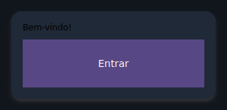
Cards and lists
Card
An elevated surface that groups children vertically inside a rounded, shadowed container.
from tempestroid import Button, Card, Text

Card(
    children=[
        Text(content="Welcome!", key="t"),
        Button(label="Sign in", on_click=on_enter, key="btn"),
    ],
    key="welcome-card",
)
| Prop | Type | Default | Description |
|---|---|---|---|
children |
list[Widget] |
[] |
Widgets stacked vertically inside the card. |
ListTile
A list row with a primary title, an optional subtitle, and leading/trailing widget slots.
from tempestroid import Avatar, Button, ListTile, TapEvent

async def on_delete(e: TapEvent) -> None:
    app.set_state(lambda s: s.remove_item(item_id))

ListTile(
    title="Maria Silva",
    subtitle="maria@example.com",
    leading=Avatar(initials="MS", key="av"),
    trailing=Button(label="✕", on_click=on_delete, key="del"),
    key="tile-1",
)

Tapping the whole row
ListTile is presentational (no row-level on_click). For actions use a
Button in the trailing slot, or wrap the tile in a label-less Button.
| Prop | Type | Default | Description |
|---|---|---|---|
title |
str |
"" |
Primary text. |
subtitle |
str \| None |
None |
Secondary line shown muted below the title. |
leading |
Widget \| None |
None |
Widget before the text block (e.g. Avatar). |
trailing |
Widget \| None |
None |
Widget after the text block (e.g. Button). |
Avatar
A circular badge showing short initials — great for profile icons or placeholders.
| Prop | Type | Default | Description |
|---|---|---|---|
initials |
str |
"" |
Short text shown inside the circle (e.g. "MB"). |
size |
float |
40.0 |
Circle diameter in logical pixels. |
Divider
A thin horizontal rule for separating sections.
from tempestroid import Column, Divider, Text

Column(
    children=[
        Text(content="Section A", key="a"),
        Divider(thickness=1.0, key="div"),
        Text(content="Section B", key="b"),
    ],
)

| Prop | Type | Default | Description |
|---|---|---|---|
thickness |
float |
1.0 |
Line height in logical pixels. |
Bars and navigation
AppBar
Top application bar with a leading widget, a title, and trailing actions.
from tempestroid import AppBar, Button, TapEvent

async def on_menu(e: TapEvent) -> None:
    app.set_state(lambda s: setattr(s, "drawer_open", True))

AppBar(
    title="My App",
    leading=Button(label="☰", on_click=on_menu, key="menu"),
    actions=[Button(label="⚙", on_click=on_settings, key="cfg")],
    key="appbar",
)

| Prop | Type | Default | Description |
|---|---|---|---|
title |
str |
"" |
Title text. |
leading |
Widget \| None |
None |
Widget before the title (e.g. back button or Burger). |
actions |
list[Widget] |
[] |
Trailing action widgets. |
Header
Page header band with a title and an optional subtitle on a distinct background.
from tempestroid import Header

Header(title="Dashboard", subtitle="Daily overview", key="page-header")

| Prop | Type | Default | Description |
|---|---|---|---|
title |
str |
"" |
Primary heading text. |
subtitle |
str \| None |
None |
Muted secondary line below the title. |
Footer
Bottom bar that centers arbitrary children (links, labels, actions).
from tempestroid import Footer, Text

Footer(
    children=[
        Text(content="© 2026 My Company", key="copy"),
    ],
    key="footer",
)

| Prop | Type | Default | Description |
|---|---|---|---|
children |
list[Widget] |
[] |
Widgets displayed in the bottom bar. |
CollapsingAppBar
An app bar that shrinks as the user scrolls the content down. The height is
derived from scroll_offset — the app reads the scroll event from the list
and feeds the value back as state; no renderer logic is involved.
from tempestroid import CollapsingAppBar, LazyColumn, ScrollEvent

async def on_scroll(e: ScrollEvent) -> None:
    app.set_state(lambda s: setattr(s, "offset", e.offset))

def view(app):
    return Column(children=[
        CollapsingAppBar(
            title="News",
            scroll_offset=app.state.offset,
            expanded_height=200.0,
            collapsed_height=56.0,
            key="cbar",
        ),
        LazyColumn(
            item_count=100,
            item_builder=build_item,
            on_scroll=on_scroll,
            key="list",
        ),
    ])
| Prop | Type | Default | Description |
|---|---|---|---|
title |
str |
"" |
Title text. |
expanded_height |
float |
200.0 |
Bar height when scroll_offset == 0. |
collapsed_height |
float |
56.0 |
Minimum height after full collapse. |
scroll_offset |
float |
0.0 |
Current scroll offset in logical pixels (comes from app state). |
background |
Color \| None |
None |
Background color (default: SURFACE token). |
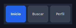
NavBar
Horizontal navigation/tab bar with the active item highlighted. Each item is a
button; tapping calls on_select(index).
from tempestroid import NavBar

NavBar(
    items=["Home", "Explore", "Profile"],
    active=app.state.tab,
    on_select=lambda i: app.set_state(lambda s: setattr(s, "tab", i)),
    key="navbar",
)
| Prop | Type | Default | Description |
|---|---|---|---|
items |
list[str] |
[] |
Item labels in order. |
active |
int |
0 |
Index of the active item. |
on_select |
handler → int |
— | Called with the tapped item's index. Required. |
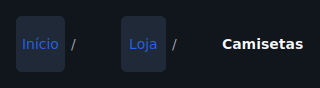
Breadcrumb
Navigation trail with a configurable separator. Non-final items are tappable
when on_select is provided; the last item is always presentational.
from tempestroid import Breadcrumb

Breadcrumb(
    items=["Home", "Products", "Details"],
    separator="/",
    on_select=lambda i: app.navigate_to(i),
    key="bc",
)
| Prop | Type | Default | Description |
|---|---|---|---|
items |
list[str] |
[] |
Labels from root to current page. |
separator |
str |
"/" |
Character drawn between crumbs. |
on_select |
handler → int |
None |
Called with the tapped crumb's index (not the last one). |
Burger
Hamburger menu button — typically toggles a Drawer.
from tempestroid import AppBar, Burger

AppBar(
    title="App",
    leading=Burger(
        on_click=lambda: app.set_state(lambda s: setattr(s, "open", True)),
        key="burger",
    ),
)

| Prop | Type | Default | Description |
|---|---|---|---|
on_click |
handler |
— | Called when the button is tapped. Required. |
glyph |
str |
"☰" |
Icon character displayed. |
Drawer
A controlled lateral panel. When open=False it collapses to an empty box;
when open=True it shows its children at the configured width.
from tempestroid import Burger, Column, Drawer, Row, Text

Row(
    children=[
        Drawer(
            open=app.state.open,
            width=260.0,
            children=[
                Text(content="Menu", key="menu-title"),
                # navigation items...
            ],
            key="drawer",
        ),
        main_content,
    ],
)
Drawer positioning
The Drawer uses the flex model: when open it occupies space in the parent
row/column (it does not float over content). Use a Row with Drawer +
content for the classic side-drawer pattern.
| Prop | Type | Default | Description |
|---|---|---|---|
open |
bool |
False |
Controls whether the panel is expanded. |
children |
list[Widget] |
[] |
Widgets inside the open panel. |
width |
float |
260.0 |
Panel width in logical pixels. |
Layout
Scaffold
Page frame: top bar, growing body, and optional bottom bar. It is the starting point for almost every screen.
from tempestroid import AppBar, NavBar, Scaffold

Scaffold(
    app_bar=AppBar(title="Home", key="ab"),
    body=my_content,
    bottom_bar=NavBar(items=["A", "B", "C"], active=0, on_select=on_tab, key="nb"),
    scroll=True,
    key="scaffold",
)

| Prop | Type | Default | Description |
|---|---|---|---|
app_bar |
Widget \| None |
None |
Top bar widget (typically AppBar). |
body |
Widget \| None |
None |
Main content (fills all remaining space). |
bottom_bar |
Widget \| None |
None |
Bottom bar (e.g. NavBar or Footer). |
scroll |
bool |
False |
When True, wraps the body in a ScrollView. |
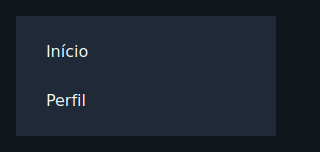
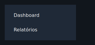
Sidebar
Fixed-width lateral column for navigation or secondary content.
from tempestroid import Button, Row, Sidebar, TapEvent

Row(
    children=[
        Sidebar(
            width=240.0,
            children=[
                Button(label="Dashboard", on_click=on_dash, key="dash"),
                Button(label="Settings", on_click=on_cfg, key="cfg"),
            ],
            key="sidebar",
        ),
        main_content,
    ],
)
| Prop | Type | Default | Description |
|---|---|---|---|
children |
list[Widget] |
[] |
Widgets stacked top-to-bottom in the sidebar. |
width |
float |
240.0 |
Fixed width in logical pixels. |
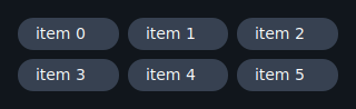
Grid
Fixed-column grid: fills cells left-to-right then top-to-bottom. Short final rows are padded with empty cells to preserve alignment.
from tempestroid import Card, Grid, Text

Grid(
    columns=3,
    gap=12.0,
    children=[
        Card(children=[Text(content=f"Item {i}", key=f"t{i}")], key=f"c{i}")
        for i in range(9)
    ],
    key="grid",
)
| Prop | Type | Default | Description |
|---|---|---|---|
children |
list[Widget] |
[] |
Cells filled left-to-right. |
columns |
int |
2 |
Number of columns per row (minimum 1). |
gap |
float |
8.0 |
Spacing between cells, both horizontal and vertical. |
Selection and input
SegmentedControl
Compact pill-group for single-choice selection.
from tempestroid import SegmentedControl

SegmentedControl(
    options=["Day", "Week", "Month"],
    selected=app.state.period,
    on_select=lambda i: app.set_state(lambda s: setattr(s, "period", i)),
    key="period-ctrl",
)

| Prop | Type | Default | Description |
|---|---|---|---|
options |
list[str] |
[] |
Segment labels in order. |
selected |
int |
0 |
Index of the active segment. |
on_select |
handler → int |
— | Called with the tapped segment's index. Required. |
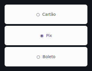
RadioGroup
Vertical single-choice list with radio markers (◉ / ○).
from tempestroid import RadioGroup

RadioGroup(
    options=["Card", "Bank slip", "Pix"],
    selected=app.state.payment,
    on_select=lambda i: app.set_state(lambda s: setattr(s, "payment", i)),
    key="payment",
)
| Prop | Type | Default | Description |
|---|---|---|---|
options |
list[str] |
[] |
Option labels in order. |
selected |
int |
0 |
Index of the chosen option. |
on_select |
handler → int |
— | Called with the tapped option's index. Required. |
Chip
Small rounded pill; can be selectable or purely visual. When on_click is
None the chip is presentational.
from tempestroid import Chip, Row

Row(
    children=[
        Chip(
            label="Python",
            selected=True,
            on_click=lambda: app.toggle_tag("Python"),
            key="chip-py",
        ),
        Chip(label="Kotlin", key="chip-kt"),
    ],
)

| Prop | Type | Default | Description |
|---|---|---|---|
label |
str |
"" |
Text displayed in the chip. |
selected |
bool |
False |
When True, applies the accent color (meaningful with on_click). |
on_click |
handler |
None |
Called on tap; when None the chip is static. |
Rating
A row of stars showing (and optionally setting) a rating. When on_rate is
None, the component is purely presentational.
from tempestroid import Rating

Rating(
    value=app.state.stars,
    max_stars=5,
    on_rate=lambda v: app.set_state(lambda s: setattr(s, "stars", v)),
    key="rating",
)

| Prop | Type | Default | Description |
|---|---|---|---|
value |
int |
0 |
Number of filled stars. |
max_stars |
int |
5 |
Total stars shown. |
on_rate |
handler → int |
None |
Called with the 1-based star value when tapped. |
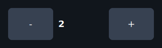
Stepper
Numeric stepper with − and + buttons and a centered value. Respects optional bounds.
from tempestroid import Stepper

Stepper(
    value=app.state.qty,
    step=1,
    min_value=1,
    max_value=99,
    on_change=lambda v: app.set_state(lambda s: setattr(s, "qty", v)),
    key="qty-stepper",
)
| Prop | Type | Default | Description |
|---|---|---|---|
value |
int |
0 |
Current value. |
step |
int |
1 |
Amount added/removed per tap. |
min_value |
int \| None |
None |
Lower bound (unbounded when None). |
max_value |
int \| None |
None |
Upper bound (unbounded when None). |
on_change |
handler → int |
— | Called with the new (clamped) value. Required. |
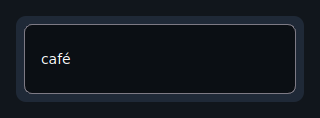
SearchBar
Controlled search field with an optional clear button. The clear button appears
only when on_clear is provided and the field is non-empty.
from tempestroid import SearchBar, TextChangeEvent

async def on_change(e: TextChangeEvent) -> None:
    app.set_state(lambda s: setattr(s, "query", e.value))

SearchBar(
    value=app.state.query,
    placeholder="Search products...",
    on_change=on_change,
    on_clear=lambda: app.set_state(lambda s: setattr(s, "query", "")),
    key="search",
)
| Prop | Type | Default | Description |
|---|---|---|---|
value |
str |
"" |
Current field text (controlled). |
placeholder |
str |
"Search" |
Hint shown when the field is empty. |
on_change |
handler → TextChangeEvent |
— | Called on every edit with the validated event. Required. |
on_clear |
handler |
None |
Called when the ✕ button is tapped; the button only appears when this handler is provided and the field has text. |
Feedback
Banner
Inline status bar with a message and an optional trailing action.
Accepted tones: "info", "success", "warning", "error".
from tempestroid import Banner, Button, TapEvent

async def on_dismiss(e: TapEvent) -> None:
    app.set_state(lambda s: setattr(s, "show_banner", False))

Banner(
    message="Connection restored.",
    tone="success",
    action=Button(label="OK", on_click=on_dismiss, key="ok"),
    key="banner",
)

| Prop | Type | Default | Description |
|---|---|---|---|
message |
str |
"" |
Message text. |
tone |
str |
"info" |
Background color: "info" / "success" / "warning" / "error". |
action |
Widget \| None |
None |
Trailing action widget (e.g. dismiss Button). |
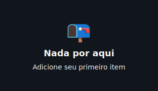
EmptyState
Centered empty-screen placeholder: large glyph, title, subtitle, and optional action.
from tempestroid import Button, EmptyState, TapEvent

EmptyState(
    glyph="📭",
    title="No results",
    subtitle="Try refining your search.",
    action=Button(label="Clear filters", on_click=on_clear, key="clear"),
    key="empty",
)
| Prop | Type | Default | Description |
|---|---|---|---|
title |
str |
"" |
Primary message. |
subtitle |
str \| None |
None |
Secondary line. |
glyph |
str |
"○" |
Large character shown above the title. |
action |
Widget \| None |
None |
Call-to-action widget (e.g. Button). |
Badge
Small inline status pill for a count or short label.
from tempestroid import Badge, Row, Text

Row(
    children=[
        Text(content="Notifications", key="lbl"),
        Badge(label="3", tone="error", key="badge"),
    ],
)
| Prop | Type | Default | Description |
|---|---|---|---|
label |
str |
"" |
Badge text (e.g. "3", "NEW"). |
tone |
str |
"error" |
Background color: "info" / "success" / "warning" / "error". |
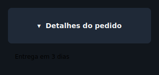
Accordion
A controlled expand/collapse section. The open state lives in the app;
tapping the header calls on_toggle to flip it.
from tempestroid import Accordion, Text

Accordion(
    title="Technical details",
    open=app.state.details_open,
    on_toggle=lambda: app.set_state(lambda s: setattr(s, "details_open", not s.details_open)),
    children=[
        Text(content="Version: 1.0.0", key="ver"),
        Text(content="Platform: Android 15", key="plat"),
    ],
    key="acc",
)
| Prop | Type | Default | Description |
|---|---|---|---|
title |
str |
"" |
Header text. |
open |
bool |
False |
Controls whether the body is expanded. |
children |
list[Widget] |
[] |
Widgets revealed when open. |
on_toggle |
handler |
— | Called when the header is tapped. Required. |
Date and time
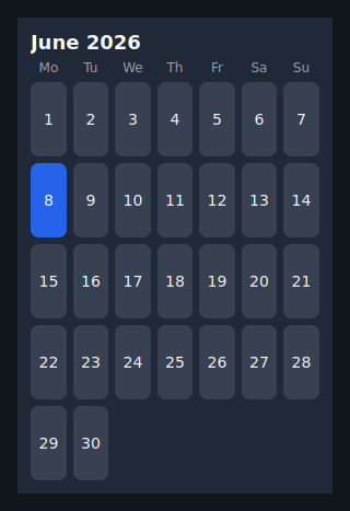
Calendar
A monthly grid of selectable day cells. The month is provided as "YYYY-MM";
the selected day as "YYYY-MM-DD". Omitting month displays the current month.
from tempestroid import Calendar

Calendar(
    month="2026-06",
    selected=app.state.date,
    on_select=lambda d: app.set_state(lambda s: setattr(s, "date", d)),
    key="cal",
)
| Prop | Type | Default | Description |
|---|---|---|---|
month |
str |
"" |
Displayed month as "YYYY-MM" (empty = current month). |
selected |
str |
"" |
Selected day as "YYYY-MM-DD" (empty = no selection). |
on_select |
handler → str |
— | Called with the tapped day's ISO date string. Required. |
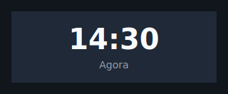
Clock
Digital clock face that renders a pre-formatted time string. The app formats
and ticks the clock through state (see the stopwatch example).
from tempestroid import Clock

Clock(
    time=app.state.time_str,   # e.g. "12:34:56"
    label="UTC-3",
    key="clock",
)
| Prop | Type | Default | Description |
|---|---|---|---|
time |
str |
"" |
Time string to display (e.g. "12:34:56"). |
label |
str \| None |
None |
Optional muted caption below the time. |
Tables
Table
Static data table of typed rows. Each row is a TableRow holding TableCell
values. Optional headers are rendered in bold in the first row.
from tempestroid import Table, TableCell, TableRow

Table(
    headers=["Name", "Role", "Status"],
    rows=[
        TableRow(cells=[
            TableCell(content="Alice"),
            TableCell(content="Engineer"),
            TableCell(content="Active"),
        ]),
        TableRow(cells=[
            TableCell(content="Bob"),
            TableCell(content="Designer"),
            TableCell(content="On leave"),
        ]),
    ],
    key="team-table",
)
| Prop | Type | Default | Description |
|---|---|---|---|
rows |
list[TableRow] |
[] |
Body rows, each holding TableCell values. |
headers |
list[str] |
[] |
Header row labels (bold). |
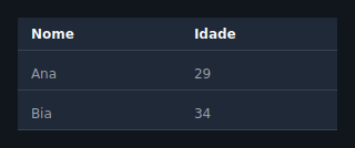
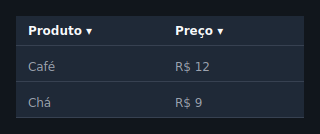
DataTable
Convenience string-matrix table. Provide columns and rows as lists of
strings; use sortable=True to append the ▾ glyph to headers (actual sorting
is done by the app reordering rows).
from tempestroid import DataTable

DataTable(
    columns=["Product", "Price", "Stock"],
    rows=[
        ["Notebook Pro", "$4,999", "12"],
        ["Ergonomic Mouse", "$299", "87"],
    ],
    sortable=True,
    key="products-dt",
)
| Prop | Type | Default | Description |
|---|---|---|---|
columns |
list[str] |
[] |
Column header labels. |
rows |
list[list[str]] |
[] |
Body rows as a string matrix. |
sortable |
bool |
False |
When True, appends ▾ to headers to indicate sortability. |
Brazilian form inputs
These components lower to the Input / MaskedInput primitives wrapped in a
labelled Column (optional label above, the field, and an optional red error
line below). Each one exposes an on_change that receives the new string
value — you never touch the event object. Pair each field with the matching
validator from tempestroid.validators for per-field validation inside a
Form: pass the component as the child of a FormField with the right
validators list, and the Form aggregates the errors and blocks an invalid
submit before any patch.
Ready-made validators
tempestroid.validators ships validate_cpf, validate_cnpj,
validate_email, and validate_phone — pure
Callable[[Any], str | None] functions that return a PT-BR message when the
value is invalid or None when valid. They strip mask characters (dots,
dashes, parentheses) before validating, so "123.456.789-09" validates the
same as its bare digits.
EmailInput
A labelled e-mail field with the e-mail keyboard, a mail icon, and a built-in
pattern (EMAIL_PATTERN).
from tempestroid import EmailInput, FormField, validate_email

FormField(
    name="email",
    validators=[validate_email],
    child=EmailInput(
        value=app.state.email,
        on_change=lambda v: app.set_state(lambda s: setattr(s, "email", v)),
        key="email",
    ),
    key="email-field",
)
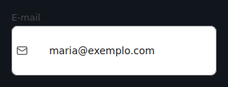
EMAIL keyboard; validate with validate_email.
PasswordInput
A secure password field (masked, with the built-in eye toggle) and a lock
icon.
from tempestroid import FormField, PasswordInput

FormField(
    name="password",
    child=PasswordInput(
        value=app.state.password,
        on_change=lambda v: app.set_state(lambda s: setattr(s, "password", v)),
        key="password",
    ),
    key="password-field",
)
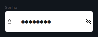
Secure field (secure=True); no mask — pair it with your own strength validator
if you want one.
PhoneInput
A Brazilian phone field, masked (99) 99999-9999.
from tempestroid import FormField, PhoneInput, validate_phone

FormField(
    name="phone",
    validators=[validate_phone],
    child=PhoneInput(
        value=app.state.phone,
        on_change=lambda v: app.set_state(lambda s: setattr(s, "phone", v)),
        key="phone",
    ),
    key="phone-field",
)
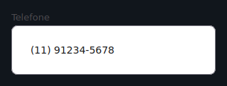
Mask (99) 99999-9999, PHONE keyboard; validate with validate_phone
(accepts 10 or 11 digits).
CPFInput
A CPF field, masked 999.999.999-99.
from tempestroid import CPFInput, FormField, validate_cpf

FormField(
    name="cpf",
    validators=[validate_cpf],
    child=CPFInput(
        value=app.state.cpf,
        on_change=lambda v: app.set_state(lambda s: setattr(s, "cpf", v)),
        key="cpf",
    ),
    key="cpf-field",
)
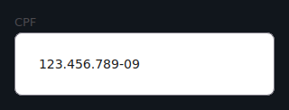
Mask 999.999.999-99, NUMBER keyboard; validate with validate_cpf
(11 digits + check digits).
CNPJInput
A CNPJ field, masked 99.999.999/9999-99.
from tempestroid import CNPJInput, FormField, validate_cnpj

FormField(
    name="cnpj",
    validators=[validate_cnpj],
    child=CNPJInput(
        value=app.state.cnpj,
        on_change=lambda v: app.set_state(lambda s: setattr(s, "cnpj", v)),
        key="cnpj",
    ),
    key="cnpj-field",
)
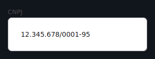
Mask 99.999.999/9999-99, NUMBER keyboard; validate with validate_cnpj
(14 digits + check digits).
AddressInput
A grouped Brazilian address block: CEP (masked 99999-999), street, number,
complement, neighborhood, city, and UF. A single on_change(field_name,
new_value) is called for whichever field changed, where field_name is
"cep", "street", "number", "complement", "neighborhood", "city", or
"state".
from tempestroid import AddressInput

AddressInput(
    cep=app.state.cep,
    street=app.state.street,
    city=app.state.city,
    state=app.state.uf,
    on_change=lambda field, value: app.set_state(
        lambda s: setattr(s, field, value)
    ),
    key="address",
)
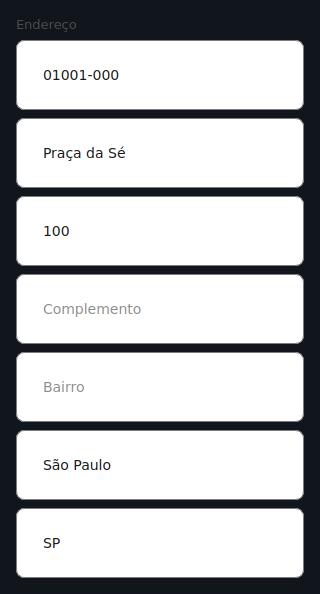
CEP is masked 99999-999 (NUMBER keyboard); the remaining fields are plain
Inputs. No built-in validator — validate each field in the app as needed.
Media inputs
These components lower to the FilePicker and Image primitives. Each one
exposes an on_pick that receives the picked file's URI (from
FileSelectEvent.uri) — you never touch the event object.
ImagePicker
An image picker with an inline preview of the chosen image (a FilePicker plus
an Image preview when a URI is set).
from tempestroid import ImagePicker

ImagePicker(
    value=app.state.image_uri,
    label="Product photo",
    on_pick=lambda uri: app.set_state(lambda s: setattr(s, "image_uri", uri)),
    key="image-picker",
)

| Prop | Type | Default | Description |
|---|---|---|---|
value |
str |
"" |
URI of the chosen image (empty = no preview). |
label |
str |
"" |
Optional heading above the picker. |
on_pick |
handler → str |
— | Called with the picked URI. Required. |
DocumentPicker
A labelled document picker (just the FilePicker, no preview).
from tempestroid import DocumentPicker

DocumentPicker(
    value=app.state.doc_uri,
    label="Receipt",
    on_pick=lambda uri: app.set_state(lambda s: setattr(s, "doc_uri", uri)),
    key="doc-picker",
)
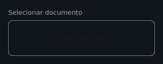
| Prop | Type | Default | Description |
|---|---|---|---|
value |
str |
"" |
URI of the chosen document. |
label |
str |
"" |
Optional heading above the picker. |
on_pick |
handler → str |
— | Called with the picked URI. Required. |
ImagePicture
A circular profile photo: the chosen photo clipped to a circle (or a user
icon placeholder) over a change button. Distinct from Avatar, which shows
initials.
from tempestroid import ImagePicture

ImagePicture(
    src=app.state.photo_uri,
    size=120.0,
    on_pick=lambda uri: app.set_state(lambda s: setattr(s, "photo_uri", uri)),
    key="profile-photo",
)
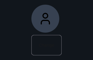
| Prop | Type | Default | Description |
|---|---|---|---|
src |
str |
"" |
URI of the current photo (empty shows the placeholder). |
size |
float |
96.0 |
Circle diameter in logical pixels. |
on_pick |
handler → str |
— | Called with the picked URI. Required. |
Recap
- Components extend
Componentand implementrender(), which returns a primitive subtree — no extra code in the renderers. - Always import from
from tempestroid import ...— never from submodules. Scaffoldis the starting point for a screen: composeAppBar+ content +NavBarin a single widget.- Controlled components (
Drawer,Accordion,NavBar,Calendar…) exposeopen/active/selectedas props — the state lives in the app. - For simple tables use
DataTable; for cells with custom styles useTable+TableRow+TableCell. Badge,Banner, andEmptyStateuse the"info","success","warning", and"error"tones for semantic colorization.
Next steps
➡️ See how to combine these components in complete apps in the
Examples gallery, or explore
Styles to customize the look of any component via the
style prop.