Text, action & indicators
The widgets in this family are the most commonly used building blocks in any
screen: a static text label, a tappable button, and two progress indicators —
ProgressBar to show determinate or indeterminate progress, and Spinner to
signal that something is loading in the background. Combined with layout
widgets, these four elements cover the vast majority of screens in a typical
app.
All widgets in this family are supported by both renderers — the Qt simulator (desktop) and Compose on the Android device.
Text
Displays a sequence of characters without interaction.
from tempestroid import Column, Style, Text

Column(
    style=Style(padding=16.0, gap=8.0),
    children=[
        Text(content="Welcome to tempestroid!", key="title"),
        Text(content="Build Android apps in typed Python.", key="sub"),
    ],
)
| Prop | Type | Default | Description |
|---|---|---|---|
content |
str |
(required) | The text to display. |
Style with Style
Text inherits style from Widget. Use Style(font_size=20.0, color="#333333")
for size and colour, Style(font_weight="bold") for bold text, etc.
Button
A tappable button with a text label. When tapped it fires a TapEvent to the
on_click handler.
from tempestroid import Button, Column, Style, TapEvent, Text
from dataclasses import dataclass
@dataclass
class State:
count: int = 0
def make_state() -> State:
return State()
async def on_increment(e: TapEvent) -> None:
app.set_state(lambda s: setattr(s, "count", s.count + 1))
def view(app) -> Column:
return Column(
style=Style(padding=24.0, gap=12.0),
children=[
Text(content=f"Count: {app.state.count}", key="label"),
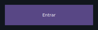
Button(label="Increment", on_click=on_increment, key="btn"),
],
)
| Prop | Type | Default | Description |
|---|---|---|---|
label |
str |
(required) | Text shown on the button. |
on_click |
handler → TapEvent |
None |
Called when the button is tapped. The handler may be zero-argument or accept a TapEvent. |
Material 3 styling with variants
Button also accepts the Chakra-style variant API
(variant/size/color_scheme + theme), which resolves a complete
Material 3 Style from the theme. See
Chakra-style variants.
Zero-argument handler vs TapEvent
on_click accepts either of the two signatures below — use whichever is
most convenient:
ProgressBar
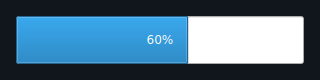
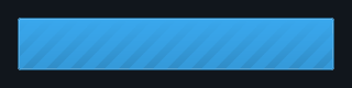
A horizontal progress bar. It can operate in determinate mode (0.0–1.0) or in indeterminate mode (continuous animation).
from tempestroid import Button, Column, ProgressBar, Style, TapEvent, Text
from dataclasses import dataclass

@dataclass
class State:
    progress: float = 0.0
    loading: bool = False

def make_state() -> State:
    return State()

async def on_start(e: TapEvent) -> None:
    app.set_state(lambda s: setattr(s, "loading", True))

def view(app) -> Column:
    return Column(
        style=Style(padding=24.0, gap=16.0),
        children=[
            Text(content="Download in progress", key="label"),
            # determinate mode: 60 % complete
            ProgressBar(value=0.6, key="det"),
            # indeterminate mode: unknown progress
            ProgressBar(indeterminate=app.state.loading, key="indet"),
            Button(label="Start", on_click=on_start, key="btn"),
        ],
    )
| Prop | Type | Default | Description |
|---|---|---|---|
value |
float |
0.0 |
Progress from 0.0 (empty) to 1.0 (complete). Ignored when indeterminate=True. |
indeterminate |
bool |
False |
True shows a continuous animation instead of a fixed value. |
Spinner
A circular activity indicator — always indeterminate. Use it to signal that the app is processing something in the background.
from tempestroid import Column, Spinner, Style, Text
from dataclasses import dataclass

@dataclass
class State:
    loading: bool = True

def make_state() -> State:
    return State()

def view(app) -> Column:
    return Column(
        style=Style(padding=24.0, gap=16.0),
        children=[
            Spinner(size=40.0, key="spin") if app.state.loading
            else Text(content="Loaded!", key="done"),
        ],
    )
| Prop | Type | Default | Description |
|---|---|---|---|
size |
float \| None |
None |
Diameter in logical pixels. None uses the renderer's default size. |
Recap
Text— static label; onlycontentis required. Style it viaStyle.Button— tappable button with a requiredlabel;on_clickreceives aTapEvent(or can be zero-argument). Useapp.set_stateinside the handler to update the UI.ProgressBar— determinate mode (valuefrom0.0to1.0) or indeterminate mode (indeterminate=True).Spinner— circular indicator always animating; optional size viasize.
Next steps: style your widgets with Styles, see how text inputs work in Inputs, or explore complete apps in the Examples gallery.