Action and entry kit
The variant API you saw on Button is the same across the
styled kit: icon buttons, the text-field family, the selection controls and the
sliders. Each carries size / color_scheme (the field family adds
field_variant) and resolves its Material 3 Style against the theme you
pass. This page walks the kit.
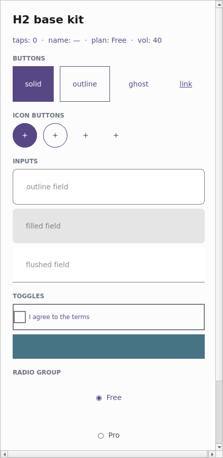
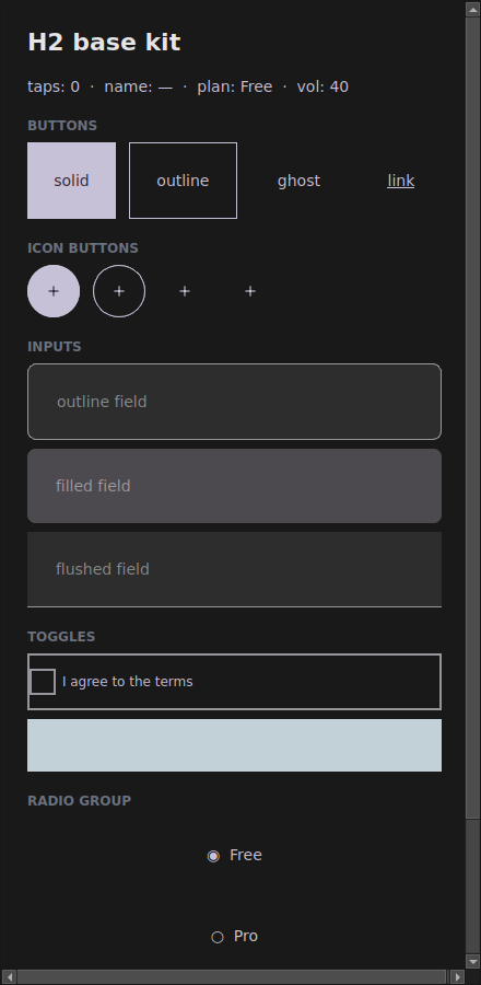
The examples/h2gallery example in the Qt simulator: the same code follows the
app theme — light on the left, dark on the right.
Where the names live
Everything in the kit imports from tempestroid: the widgets (Input,
Checkbox, Switch, Slider, RadioGroup, IconButton, the BR inputs),
the enums Size/Variant/FieldVariant and Theme/Color. tempest_core
is just the engine underneath — you don't need to import it.
The theme=app.theme pattern
The kit's golden rule: always pass the app's live theme to every component.
Because each component resolves its look against the theme it receives, handing
theme=app.theme makes the whole kit follow the app's theme — including dark
mode toggled at runtime via App.set_theme.
from tempestroid import App, Button, Variant, Widget


def view(app: App) -> Widget:
    return Button(
        label="Save",
        variant=Variant.SOLID,
        color_scheme="primary",
        theme=app.theme,  # ← follows the app theme, dark mode included
    )
The examples/h2gallery/app.py showcase does exactly this on every component —
that's why the gallery darkens along with the app when it enters dark mode.
IconButton
An icon-only button, with the same variant API as Button — just square and
circular, with the 48dp touch target. It defaults to GHOST (the
lowest-emphasis, icon-forward treatment). The label carries the accessible
name (contentDescription), since there's no visible text.
from tempestroid import Color, IconButton, Theme, Variant

theme = Theme.from_seed(Color.from_hex("#2563eb"))

add = IconButton(
    icon="add",
    label="Add item",  # accessible name (a11y)
    variant=Variant.SOLID,
    color_scheme="primary",
    theme=theme,
    on_click=lambda: print("clicked"),
)
Curated icons + Material aliases
icon accepts a curated Icons value (or its string) — "add", "search",
"eye", "trash", "settings"… — or an arbitrary platform icon name. The
Qt simulator maps common Material names (photo_camera, history,
person…) to the curated glyphs; the device uses native icons.
The field family
The text fields share the field_variant prop (enum FieldVariant) — a
low-emphasis resting treatment where the color_scheme only tints the
focus/caret/border:
FieldVariant |
At rest |
|---|---|
OUTLINE |
a full border in the outline color (the default) |
FILLED |
a tonal fill (surface_variant), no border |
FLUSHED |
just a bottom rule |
from tempestroid import Color, Column, FieldVariant, Input, Size, Style, Theme, Widget
from tempestroid.widgets import TextChangeEvent

theme = Theme.from_seed(Color.from_hex("#2563eb"))


def inputs(on_change) -> Widget:  # on_change: callable taking a TextChangeEvent
    return Column(
        style=Style(gap=8.0),
        children=[
            Input(
                value="",
                placeholder=f"{fv.value} field",
                on_change=on_change,
                field_variant=fv,
                size=Size.MD,
                color_scheme="primary",
                theme=theme,
                key=fv.value,
            )
            for fv in FieldVariant  # OUTLINE, FILLED, FLUSHED
        ],
    )
The whole field family shares these props: Input, TextArea, Dropdown,
Autocomplete, MaskedInput, PinInput, DatePicker, TimePicker,
FilePicker.
Invalid state = the error role
Pass an error="message" to an Input and the field resolves its
border/label to the error role in every state — focus still thickens the
border to 2px, so the active field reads as "focused and wrong". The focus
state tints the border to the color_scheme accent.
Selection controls
Checkbox, Switch and RadioGroup carry the accent via color_scheme (no
variant — Material 3 gives each selection control a single affordance):
from tempestroid import (
    Checkbox, Color, Column, RadioGroup, Size, Style, Switch, Theme, Widget,
)
from tempestroid.widgets import ToggleEvent

theme = Theme.from_seed(Color.from_hex("#2563eb"))


def selections(on_toggle, on_pick) -> Widget:
    return Column(
        style=Style(gap=8.0),
        children=[
            Checkbox(
                label="I agree to the terms",
                checked=True,
                on_change=on_toggle,   # receives a ToggleEvent
                color_scheme="primary",
                theme=theme,
                key="chk",
            ),
            Switch(
                label="Notifications",
                checked=False,
                on_change=on_toggle,
                color_scheme="secondary",
                theme=theme,
                key="sw",
            ),
            RadioGroup(
                options=["Free", "Pro", "Team"],
                selected=0,
                on_select=on_pick,     # receives the index (int)
                color_scheme="primary",
                theme=theme,
                key="radio",
            ),
        ],
    )
Slider
The slider paints the active track + thumb in the color_scheme accent; size
controls the track thickness:
from tempestroid import Color, Size, Slider, Theme
from tempestroid.widgets import SlideEvent

theme = Theme.from_seed(Color.from_hex("#2563eb"))

volume = Slider(
    value=40.0,
    min_value=0.0,
    max_value=100.0,
    on_change=lambda e: print(e.value),  # SlideEvent
    size=Size.MD,
    color_scheme="primary",
    theme=theme,
)
Documented Qt × Compose divergence
For selection and slider, color_scheme controls color only — the
geometry is fixed by Material 3 (the checkbox shape, the switch track, the
slider thumb). Both renderers match on the resolved color; each platform's
native affordance stays identical in shape. See the
renderer coverage for the full divergence
table.
Brazilian inputs
On top of the field family, tempestroid offers labelled fields ready for BR
forms — each one hands your on_change the masked/validated string value,
so you never touch the event object:
from tempestroid import (
    CNPJInput, CPFInput, Column, EmailInput, PasswordInput, PhoneInput,
    Style, Theme, Widget,
)


def br_form(theme: Theme, on_change) -> Widget:  # on_change: callable(str)
    return Column(
        style=Style(gap=12.0),
        children=[
            EmailInput(value="", on_change=on_change, theme=theme, key="email"),
            PasswordInput(value="", on_change=on_change, theme=theme, key="pwd"),
            PhoneInput(value="", on_change=on_change, theme=theme, key="phone"),
            CPFInput(value="", on_change=on_change, theme=theme, key="cpf"),
            CNPJInput(value="", on_change=on_change, theme=theme, key="cnpj"),
        ],
    )
| BR input | Does |
|---|---|
EmailInput |
e-mail keyboard + mail icon + pattern validation |
PasswordInput |
secure field with the built-in "eye" toggle |
PhoneInput |
Brazilian mask (99) 99999-9999 |
CPFInput |
mask 999.999.999-99 |
CNPJInput |
mask 99.999.999/9999-99 |
Validators included
Pair each BR field with the matching validator in tempestroid.validators
(validate_email, validate_phone, validate_cpf, validate_cnpj) to fill
the error and block an invalid submit.
Full example: the kit gallery
examples/h2gallery/app.py draws the whole kit — Buttons + IconButtons, the
three field_variants, checkbox, switch, radio and slider — all passing
theme=app.theme, inside a ScrollView so it fits on a phone:
On the device, the same view/make_state is loaded by the Compose host; each
component maps to its Material 3 affordance (OutlinedTextField / filled
TextField / Checkbox / Switch / Slider / FilledIconButton …) over the
resolved colors.
Recap
- The styled kit shares the variant API:
size/color_schemeon all,field_varianton the field family. - Pass
theme=app.themeon every component — that's what makes the kit follow the app's theme, dark mode included. IconButtonis an icon-only button (defaults toGHOST); thelabelis the accessible name; theiconaccepts the curated icons or a platform name.- The field family resolves with
field_variant(OUTLINE/FILLED/FLUSHED), is focus-led, and anerrorforces theerrorrole. - Selection (
Checkbox/Switch/RadioGroup) andSlideraccent viacolor_scheme— color only; the M3 geometry is fixed (documented Qt×Compose divergence). - The BR inputs (
EmailInput/PasswordInput/PhoneInput/CPFInput/CNPJInput) hand the masked/validated string value straight toon_change.
Next: surface & layout — Card, Surface, the stack helpers
(HStack/VStack/Spacer), Divider/ListTile. For the full widget catalog
and API reference, see the widgets overview and the
public API.